My Marketing Reset: A Design Journey and Visual Transformation
Follow the creative process behind the logo development for My Marketing Reset, where minimalism meets marketing ingenuity.
In the world of business, where first impressions often determine success, the logo forms a pivotal cornerstone of a brand's visual identity. My Marketing Reset, a digital marketing consultancy poised to redefine strategies for businesses seeking growth, embarked on a journey to develop a logo that embodies simplicity and elegance.
Introduction to My Marketing Reset
My Marketing Reset, an innovative player in the digital marketing arena, focuses on helping businesses rejuvenate and rediscover their potential through modern marketing strategies. With a mission aimed at providing a fresh start, their logo design sought to echo this ethos - a simple, clean, and minimalist emblem that symbolizes a new beginning.
Located in a bustling metropolis, My Marketing Reset stands at the forefront of the marketing world, offering clients a chance to recalibrate their branding and promotional efforts. In an industry continuously evolving, standing out is crucial, which positions their logo as a reflection of their vibrant yet understated character.
The Design Brief
The client expressed key desires for their new logo: simplicity and minimalism, with an openness to creative ideas. While green was the only specific color requirement, the client did not provide a pre-existing logo for reference, allowing the designing team considerable freedom to interpret the brand's vision.
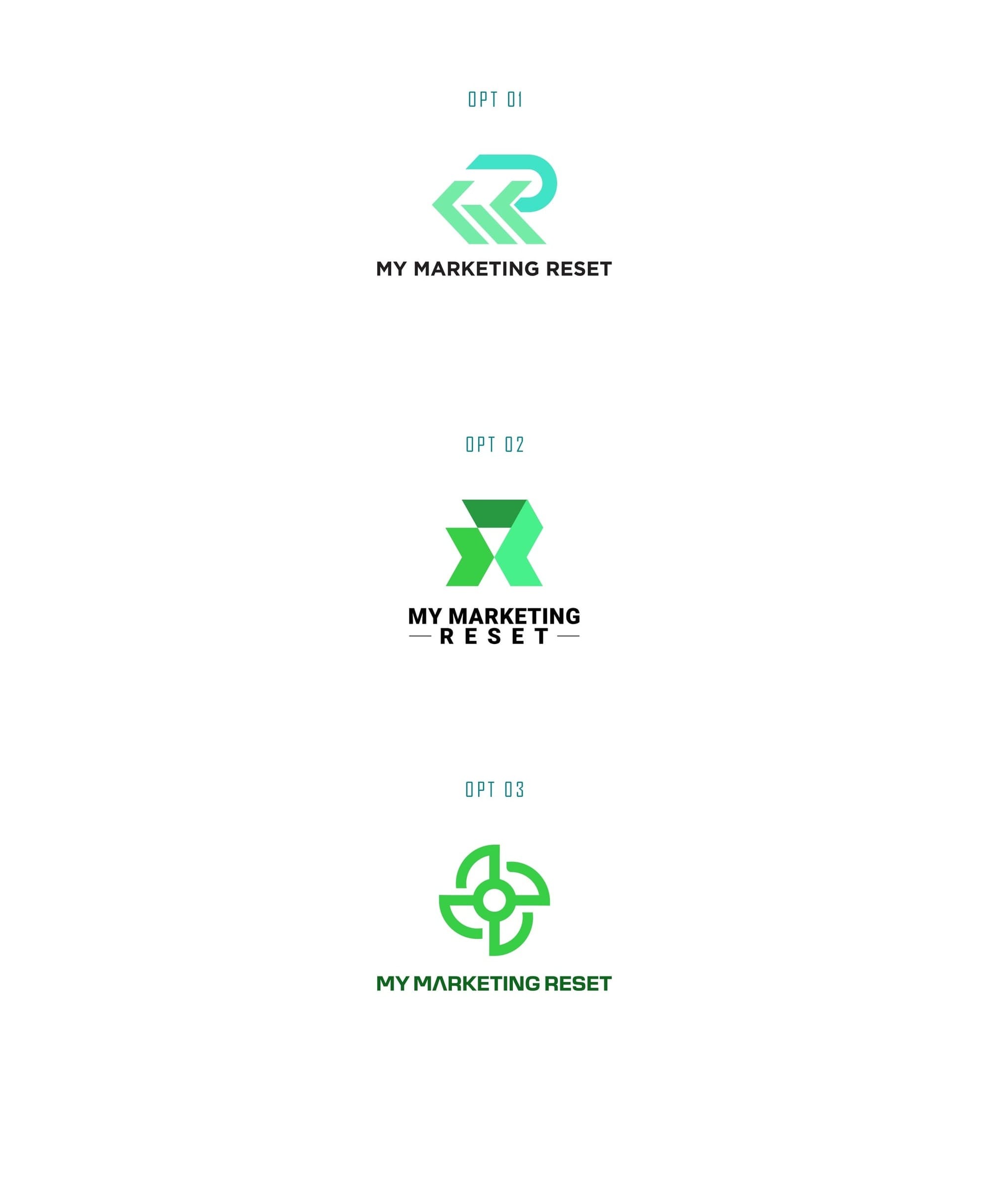
The initial concepts presented three diverse options that encapsulated the essence of My Marketing Reset, each rendered carefully to align with the request for a minimalist approach. Subsequent communications clearly revealed a preference for the second option, highlighting the client's vision for a refined yet impactful design.
Client Feedback and Iterations
Feedback is vital in the design process. My Marketing Reset's preference for the second option catalyzed further refinements. They envisioned the logo on a black background, considering their intent to print it on dark clothing. This demand posed an interesting challenge to ensure the design would remain striking and legible against a black backdrop.
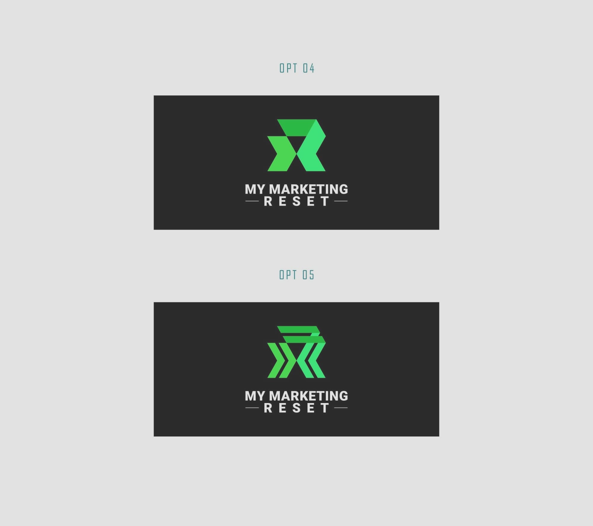
The design team promptly responded by adding depth and ensuring that the chosen concept traversed seamlessly from digital renderings to tangible prints. This iterative process marks the dynamic collaboration between the client and designers, showcasing the sculpting of a brand's identity.
Finalizing the Aesthetic
After several iterations, the refined second logo withdrew triumphant as the emblem of My Marketing Reset. Embracing the art of modern typography, the Aroboto Black font selection played a significant role in lending the logo a sense of strength and clarity, resonating perfectly with the brand’s aspirations. The bold typeface emblemizes the formidable yet approachable nature of My Marketing Reset's services.
Showcasing Real-World Applications
With the final design approved, the team explored multiple real-world mockups to showcase the logo in action. From grand billboards to unassuming business cards, the logo was tested across diverse applications ensuring that My Marketing Reset's identity was seamlessly integrated into every potential touchpoint with their clientele.
Conclusion
The transformation of My Marketing Reset's visual identity reflects an exquisite synergy between modernity and minimalism. It serves as a testament to the power of design in encapsulating a brand's philosophy while paving the way for a renewed market presence. This case study not only chronicles the meticulous process behind crafting a logo but also highlights the subtle impact this visual facet can have in narrating a brand's tale.