Crafting Identity: The Carbon-Woodcraft Branding Journey
Explore the branding journey of Carbon-Woodcraft, a UK company merging carbon fiber and walnut wood, visually articulated through a sleek new logo.
In an era where branding tells a story as much as it conveys an identity, the visual representation of a company becomes paramount. Carbon-Woodcraft, a UK-based enterprise, epitomizes this philosophy by merging two distinct elements—carbon fiber and American black walnut—into luxurious bespoke creations. The journey to articulate this synthesis through design begins with a simple yet evocative logo.
The Genesis of a Vision: Client’s Initial Brief
Carbon-Woodcraft approached the design agency with a vision as refined as its products. The aspiration was straightforward: a logo that encapsulates elegance and class, reflecting the unique interplay between high-tech carbon fiber and the natural warmth of walnut wood. To guide this creative endeavor, the client provided a conceptual starting point and an affinity for the color carbon black.
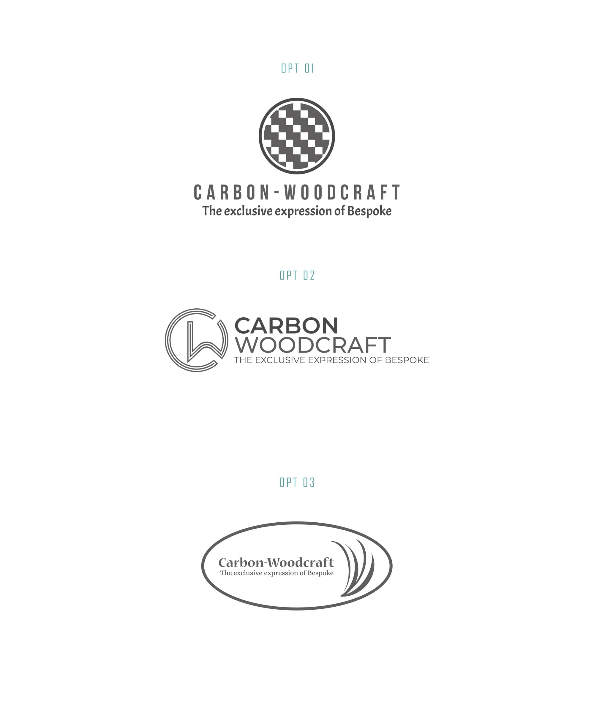
Navigating the Design Terrain: Initial Drafts
The design team’s first draft introduced three distinct logo options, each a visual exploration of the Carbon-Woodcraft ethos. Among the presented options, the second iteration, particularly the ‘CW’ monogram, resonated with the client. This selection paved the way for further refinement, steering the project towards a harmonious balance of sophistication and simplicity.
Refining Elegance: Client Feedback
Guided by the client's predilection for the ‘CW’ symbol in the second option, the design team delved into potential enhancements. The client requested font variations, intrigued by the Amsterdam 4 typeface yet uncertain of its fit. This feedback loop underscored the collaborative spirit essential in crafting a brand identity that resonated authentically.
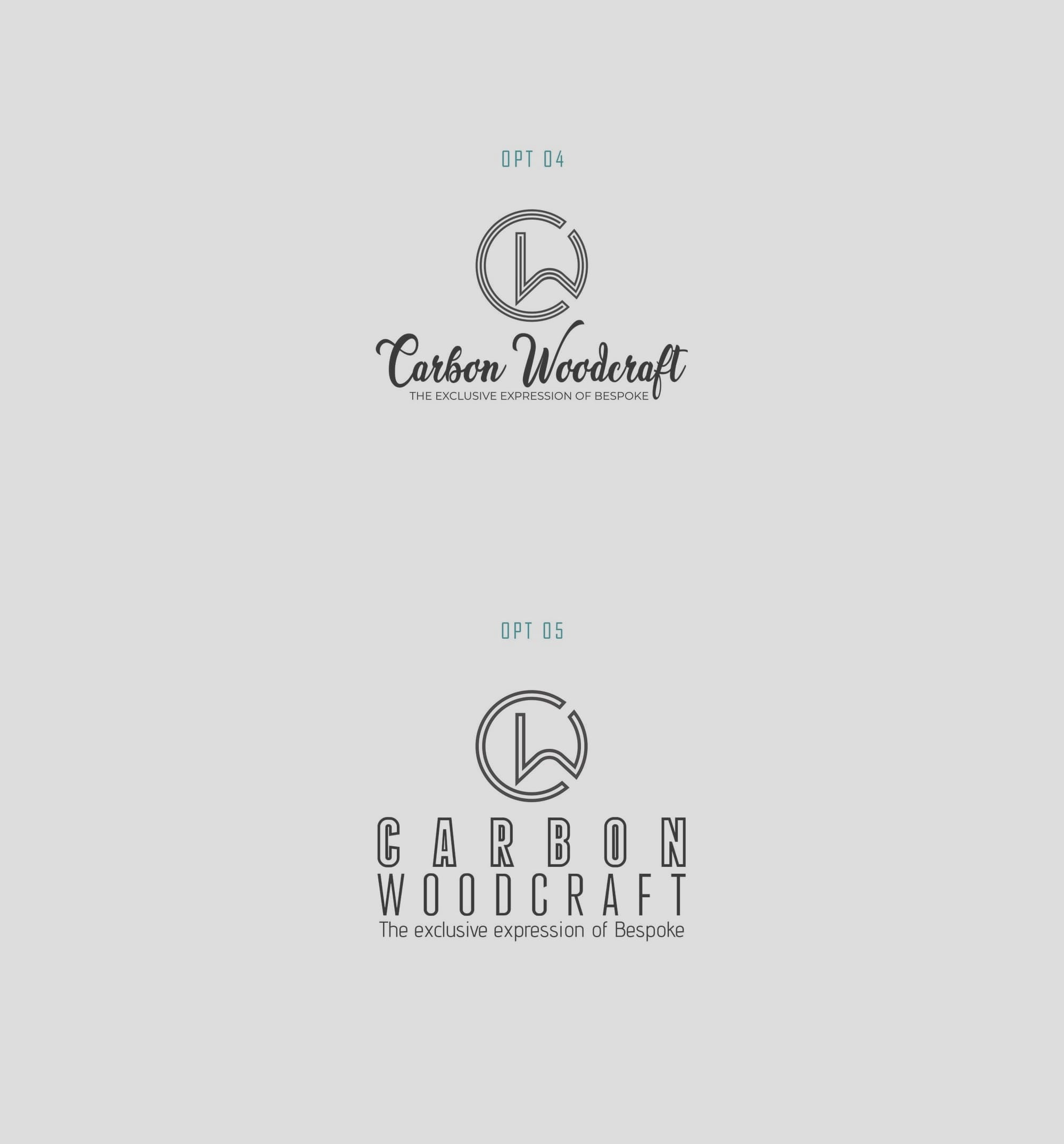
The Search for the Perfect Typeface
The pursuit of a fitting typeface led the design team to Franchies Bold, a choice that complemented the logo’s sleek contours while exuding an air of exclusivity. This typographic selection became integral to imbuing the final design with a sense of bespoke craftsmanship, core to Carbon-Woodcraft’s brand narrative.
The Culmination: Finalized Logo
The design journey concluded with a logo that drew unanimous approval, marrying modernity with artisanal charm. This finalized iteration served not only as a visual marker but as an emblem of the company’s ethos: 'The exclusive expression of Bespoke.' The successful integration of the 'CW' symbol, set in Franchies Bold, communicated the luxury and artisanal quality inherent to Carbon-Woodcraft's offerings.
Carbon-Woodcraft stands as a testament to thoughtful design acting as an ambassador of brand values. The logo, now emblazoned across the company’s array of products and promotional materials, eloquently conveys a narrative that goes beyond materials. It speaks to the dedication to quality and the intersection of technology and tradition.
Real-World Application: The Logo in Action
The practical application of the logo across different mediums emphasizes its robust design. From billboards to branded merchandise and even vehicle livery, the Carbon-Woodcraft logo perpetuates its story in varied contexts. This real-world presence reinforces the brand’s prestige and helps carve a niche in the competitive luxury market.
The successful collaboration between Carbon-Woodcraft and the design agency underscores the transformative power of thoughtful branding in defining a company and its aspirations. As the brand forges ahead, its logo stands as a beacon of its commitment to luxury craftsmanship, where every design choice is a deliberate expression of its core values.