Virtulus: Crafting Connections in the Digital Frontier
A detailed account of the design journey to create the logo for Virtulus, an innovative platform fostering secure social connections and knowledge exchange.
In the ever-evolving landscape of digital interaction, one platform is poised to redefine the way we connect and collaborate. Virtulus, a name that echoes the virtual sphere with principles associated with strength and unity, embodies a transformative vision for online communication. This case study unveils the meticulous design journey undertaken to forge the emblem of Virtulus, an online platform offering text-based public and private chatrooms, endowed with real-time secure messaging and a growing repository of tutorials and knowledge articles.
Understanding the Brand Essence
Virtulus is not just another chat service on the cloud. It is a nexus for social connections and knowledge transfer, deeply integrated with end-to-end encryption to assure user privacy. The task of creating its logo demanded a design that would distill these core values into a symbol that would resonate with its audience. The vision was not elaborate, relying instead on the creative prowess of the design team to manifest a visual identity as sophisticated as the platform's ambitions.
Client's Vision and Design Brief
The client articulated a vision that leaned towards a neutral palette with dark greys accented by hints of yellow, reminiscent of the hues found on digital platforms like PiggyBankMachine. The absence of vivid pinks and a focus on subtlety and class was essential. Virtulus's logo needed to reflect not only the potential for social networking but also the educational essence woven into its architecture.
With the main focus on crafting social connections through secure channels and facilitating knowledge sharing, the client left the avenues of creativity wide open, hoping to incorporate these elements into the conceptual framework of the logo.
Design Team's Execution
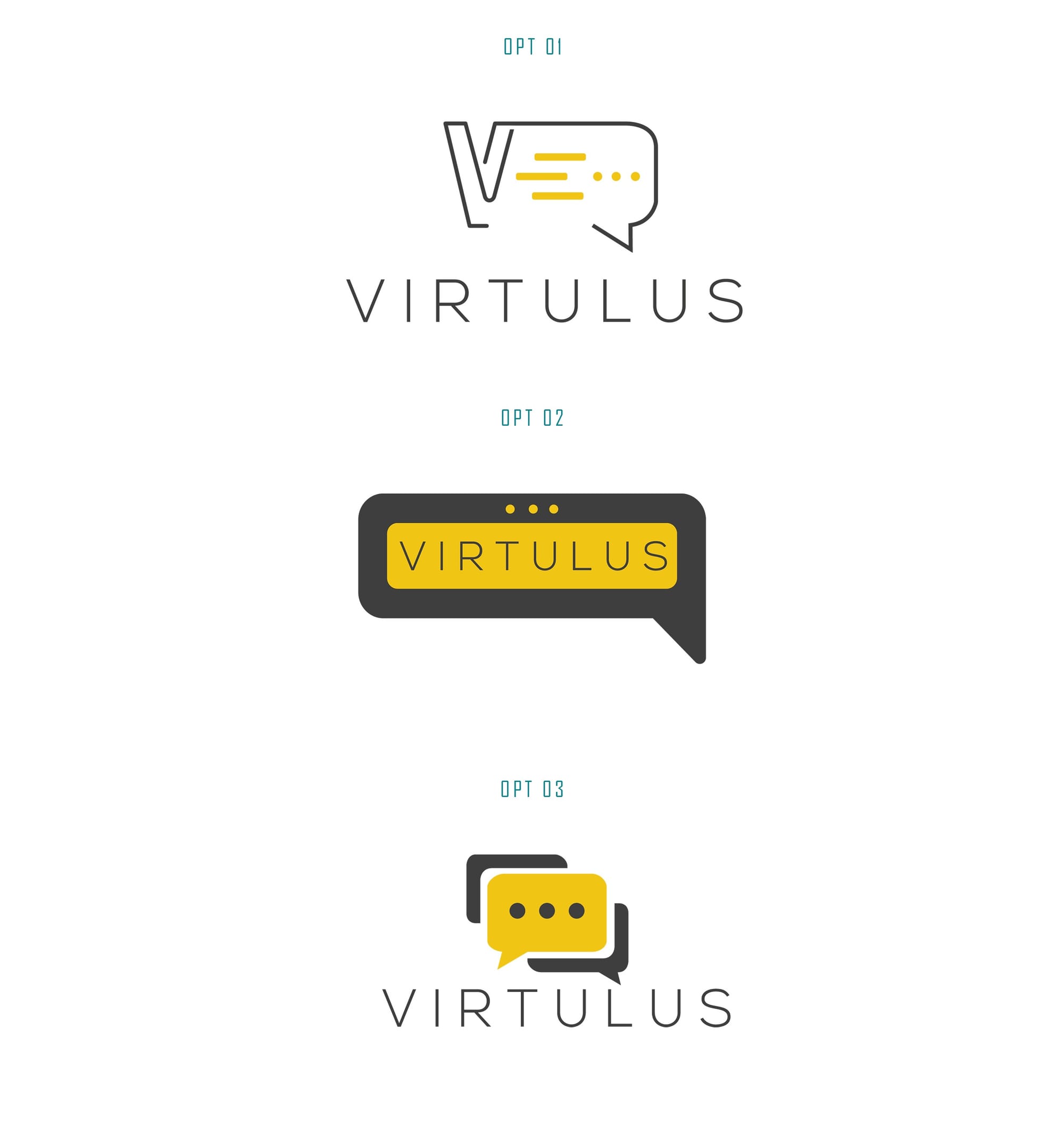

The design team promptly rose to the challenge, unrolling several concept sheets to capture the nuances of Virtulus. The iterative design process saw the creation of multiple logos, each uniquely trying to encapsulate different aspects of Virtulus within a coherent visual narrative.
The first design, noted for its minimalistic approach, sought to capture the simplicity and directness of secure messaging. Another option brought forth a bolder interplay of geometric shapes, visually representing structured networks of knowledge and connection. The third design option emerged as the optimal choice, elegantly weaving together modern typography with a symbolic icon that subtly mirrored the cyclical nature of connection and communication in virtual spaces.
Client Approval and Finalization
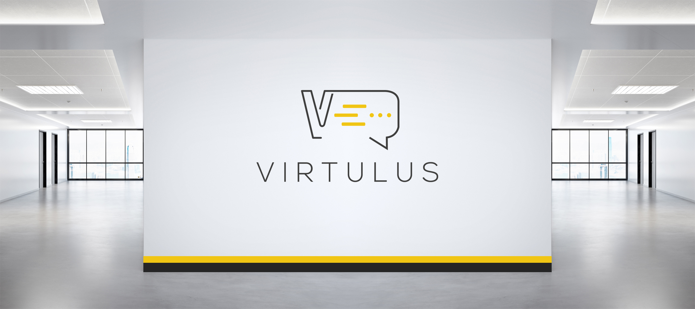
After careful deliberation, the client favored the third design option. This winning design encapsulated the essence of Virtulus, gracefully acknowledging the platform's dual focus on secure connectivity and the communal exchange of knowledge.
The selected version harmonized the design brief's color requirements with the thematic elements of social interaction and learning. In its refined geometry, it suggested solidity and dependability, key attributes for a service promising privacy and secure knowledge exchange.
Real World Application
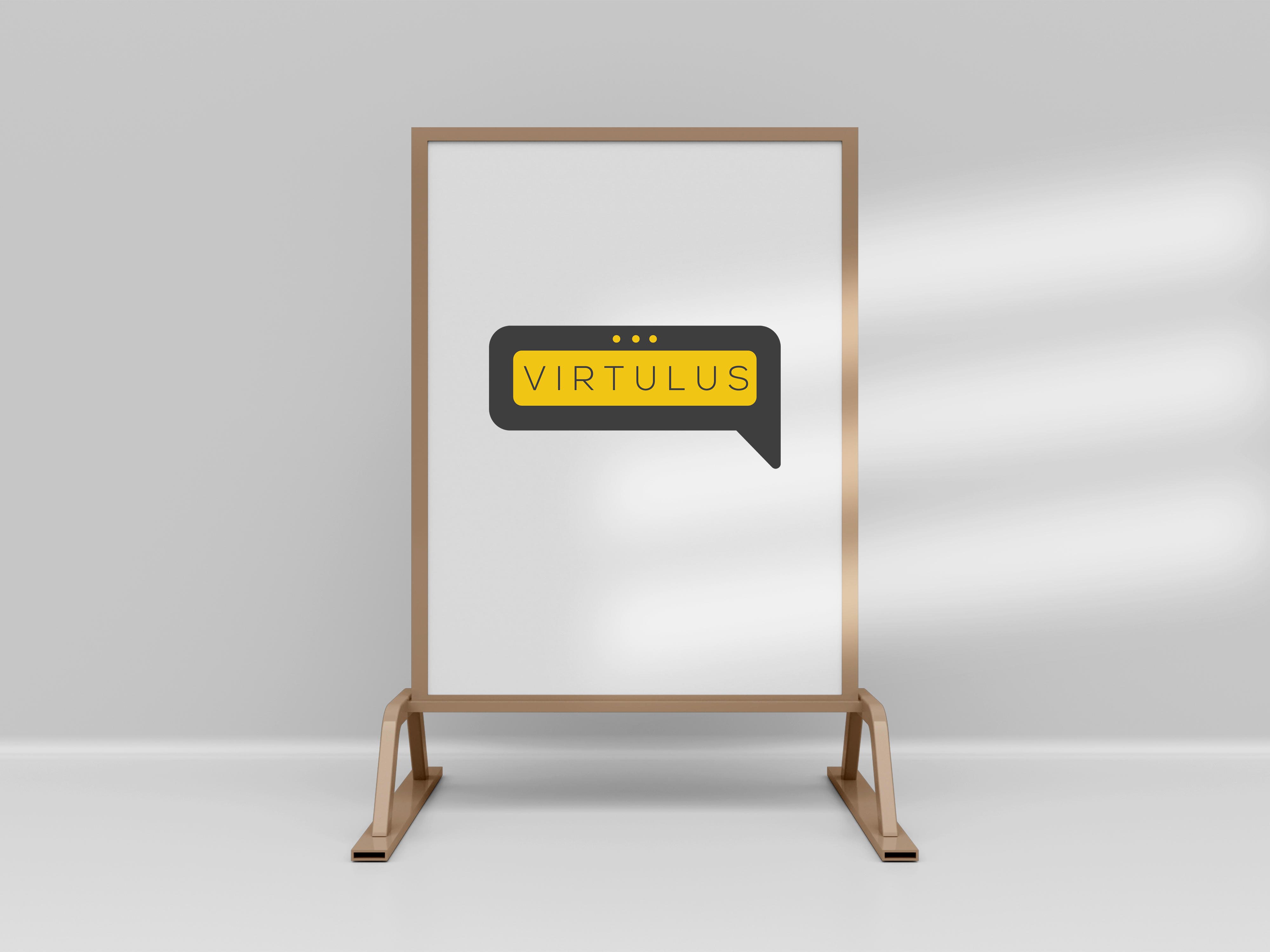
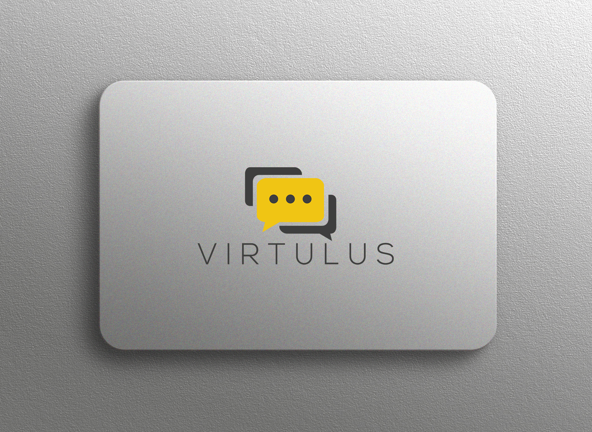
With the logo refined and approved, the final iterations have been successfully applied across various mediums, from digital screens to everyday products such as notebooks and laptops, underscoring its versatility and seamless adaptation to multiple contexts. This imagery not only validates the logo's adaptability but also reflects the dynamism that Virtulus embodies as it makes a distinctive mark in the digital realm.
In conclusion, this branding endeavor emphasizes the strategic blend of design creativity and brand-specific insight, cementing Virtulus as a visual beacon for connection and enlightenment in the virtual world.
Start your brand journey today.
