Urban ATM Management: Redefining Trust and Reliability in Financial Services
Discover the thoughtful rebranding journey of Urban ATM Management, as it seeks to inspire trust and reliability through a modern minimalist logo design.

The world of financial services thrives on trust and reliability, crucial attributes for Urban ATM Management, a burgeoning company that has embarked on a remarkable rebranding journey. Situated at the intersection of cutting-edge technology and dependable service, Urban ATM Management sought a visual identity that would encapsulate its core values while responding aptly to the dynamic demands of its industry.
Understanding the Client's Vision
Urban ATM Management specializes in selling and operating ATM machines in merchant-owned stores, ensuring a seamless cash dispensing service for customers. As a pioneering entity in ATM-related products and services, including parts sales and equipment refurbishment, the company desires a brand identity that establishes credibility and instills confidence.
The client emphasized the importance of creating a logo that would resonate with themes of trust, success, and professionalism. Choosing colors like green, red, yellow, and blue, the company aimed to evoke trust, success, and excitement in its customer base.
The Design Team's Approach
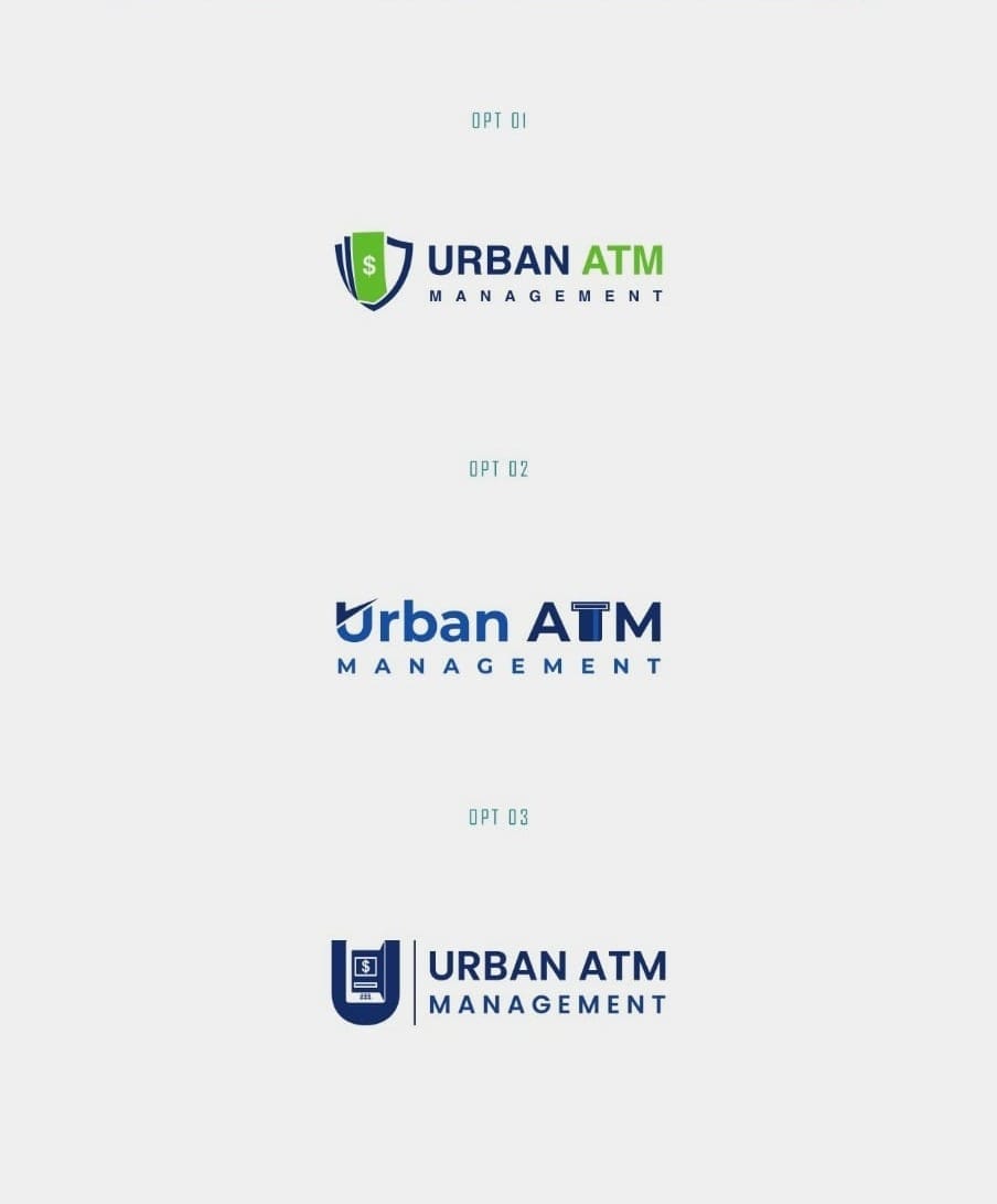
From the onset, the design team's objective was clear: create a logo that harmonizes innovation with traditional professionalism. Presented with a clean slate, the team crafted multiple logo options, each exploring different aspects of the company's ethos, and showcasing them through practical mock-ups.
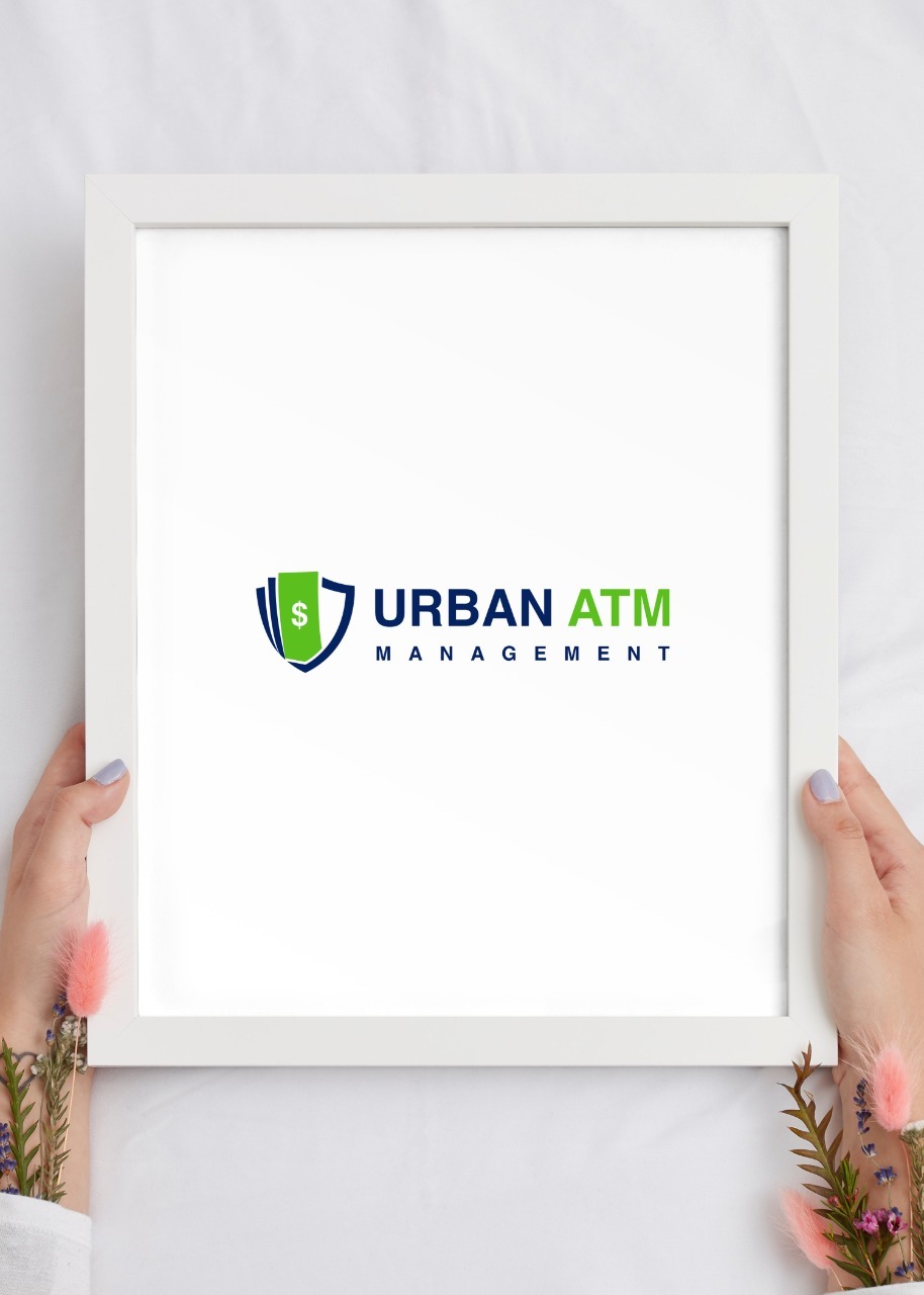
The Winning Design
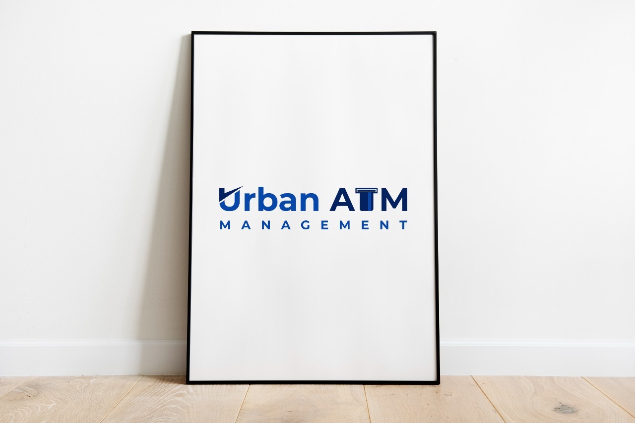
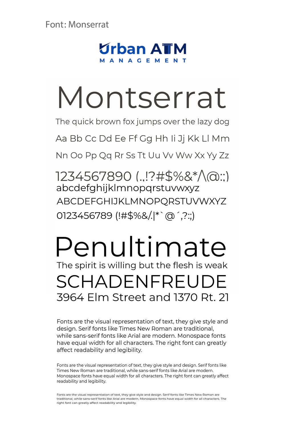
After a meticulous evaluation of presented options, Urban ATM Management selected option #02. This design stood out by encapsulating the core values of trust, accessibility, and modern financial reliability. The logo's precise typography, crafted using the Montserrat font, offers an elegant yet modern character, affirming the brand’s commitment to professionalism and approachability.
Montserrat, with its roots in urban typography and its clean, geometric design, perfectly complements the logo, affording it a contemporary appeal while maintaining clarity and legibility across various branding touchpoints.
The seamless integration of the logo across digital platforms, ATM interfaces, and printed marketing materials ensures a consistent and professional brand presence, reinforcing the company’s strategic vision.
Final Deliverables and Real World Application
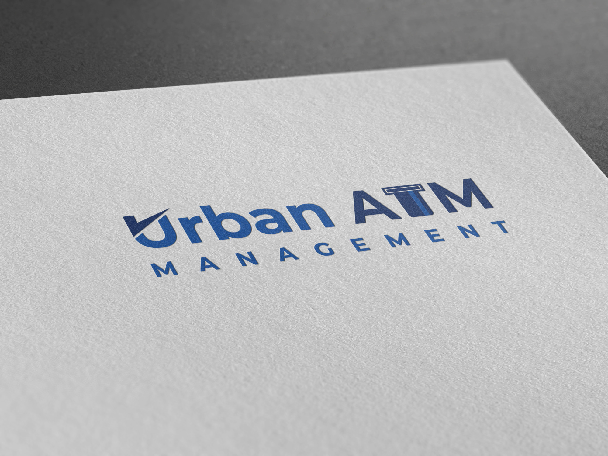
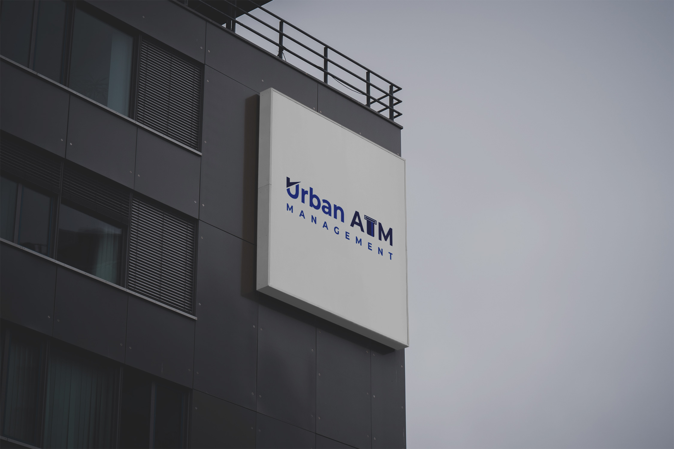
The final logo was delivered across various mock-ups showcasing its versatility and real-world application. From promotional mugs to signage, Urban ATM Management’s new visual identity promises cohesion and elegance at every customer touchpoint.
Conclusion
Urban ATM Management’s journey to a redefined visual identity reveals much about the company’s foresight in an industry where trust is invaluable. This rebranding is not just about a new logo; it is about constructing a narrative of reliability and modernity, ready to meet market challenges and opportunities with renewed vigor.
Start your brand journey today.


