Unveiling the Celestial: Centre Badr des Sciences Receives a Brand New Face
Explore the story behind Centre Badr des Sciences' new logo and how it encapsulates enlightenment akin to a full moon.
In a world where ordinary often overshadows the extraordinary, Centre Badr des Sciences steps into the spotlight with a fresh identity that mirrors the illuminating nature of its purpose. Situated in the realm of education, Badr, meaning 'full moon', symbolizes enlightenment, growth, and aspiration, setting the stage for an emblematic rebrand that speaks volumes.
A New Dawn for Education
Unveiling a logo that not only characterizes the entity but also deepens its philosophical ties was no small feat for the design agency behind this transformation. Centre Badr des Sciences, a private educational center, embarked on a journey to redefine its visual identity to resonate with its core message: inspiring through education, much like the full moon illumines the darkness.
The Client's Vision
The project began with a simple yet profound brief. The client sought a logo that would encapsulate the essence of 'Badr', showcasing the vibrancy and expansiveness akin to a full moon. This center, with a mission to enlighten minds and expand horizons, desired an emblem that visually aligned with its philosophical ethos.
Designer's Initial Dive
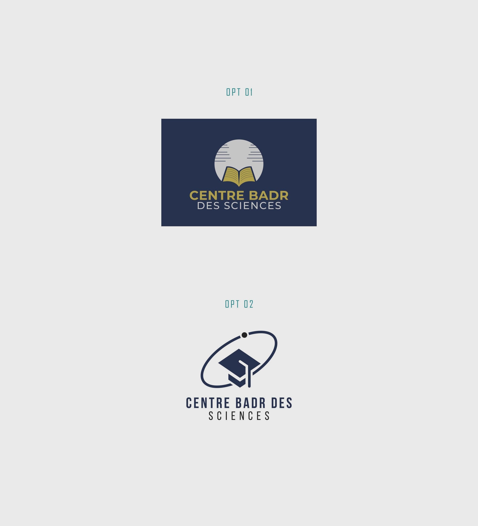
The design team, tasked with this celestial mandate, initially offered two options. Both concepts aimed to distill the essence of Badr into a singular emblem. However, neither initially resonated with the client, sparking a constructive dialogue on the path forward.
Taking Client Feedback to Heart
Client feedback is fundamental in a design's evolution. In this case, an image accompanied the client's response, offering a visual cue for the desired aesthetic evolution. The design team, agile and receptive, embraced the feedback and sought to refine their approach.
Refining Towards the Perfect Moon
Armed with fresh insights, the design team presented another set of concepts. This round introduced two more options, focusing more closely on the client's vision.
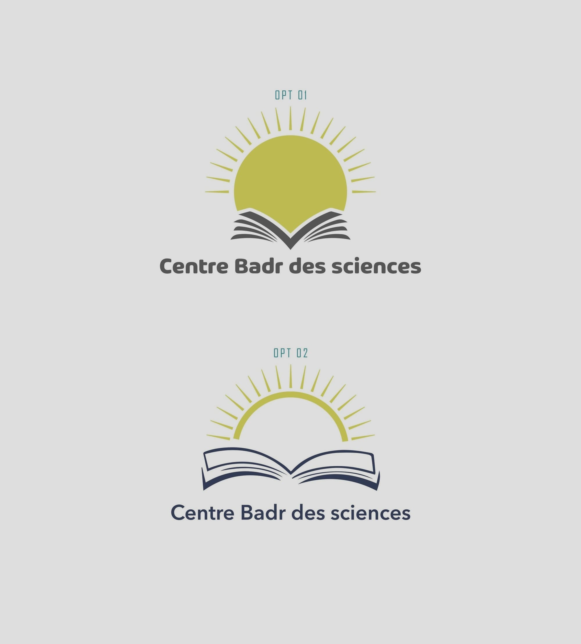
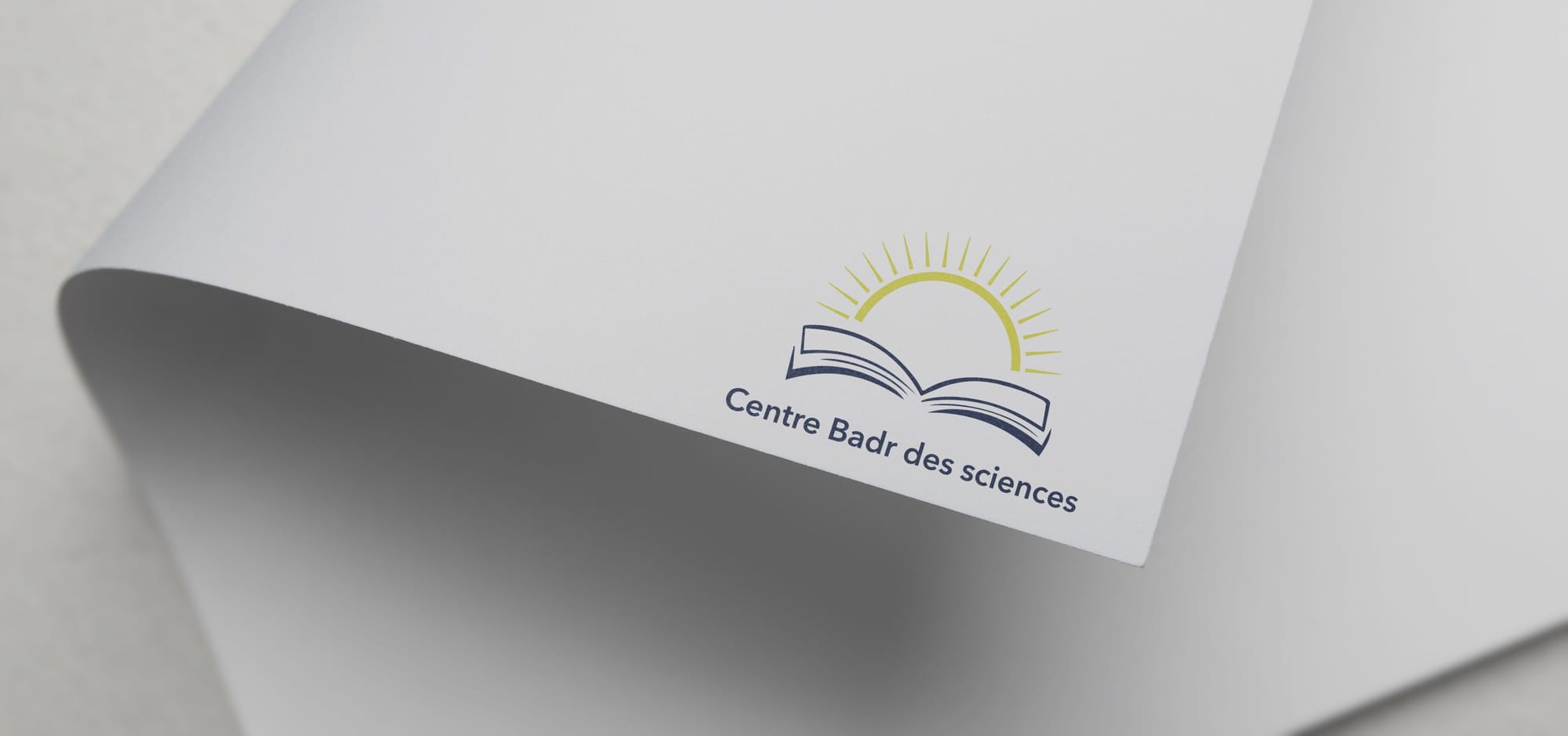
It was Option 3 that emerged victorious, capturing the client's heart and aligning with the center's mission. The design translated the concept of an enlightening educational journey into a visual form, one that stands under the metaphorical full moon of knowledge.
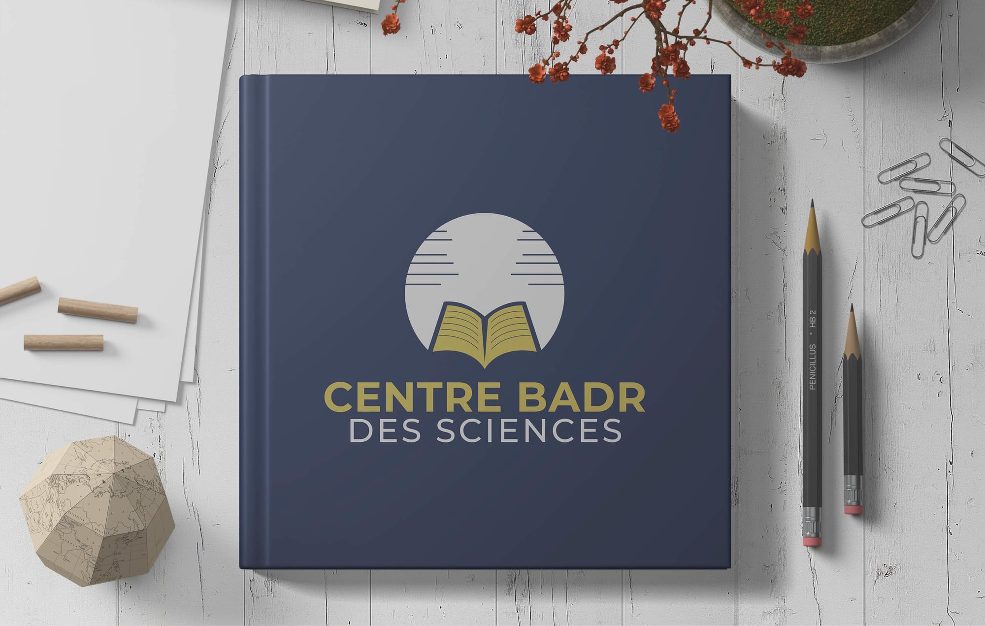
The Winning Design & Its Typeface
The selected logo employs the Arlon Bold typeface, known for its modern, clean lines and authoritative presence. This font choice complements the overarching theme of brightness and clarity, acting as a steadfast pillar in the logo's composition.
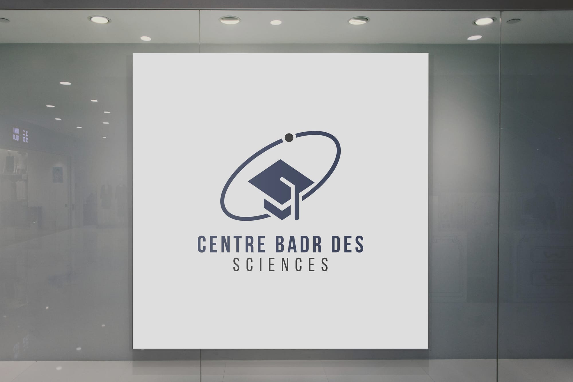
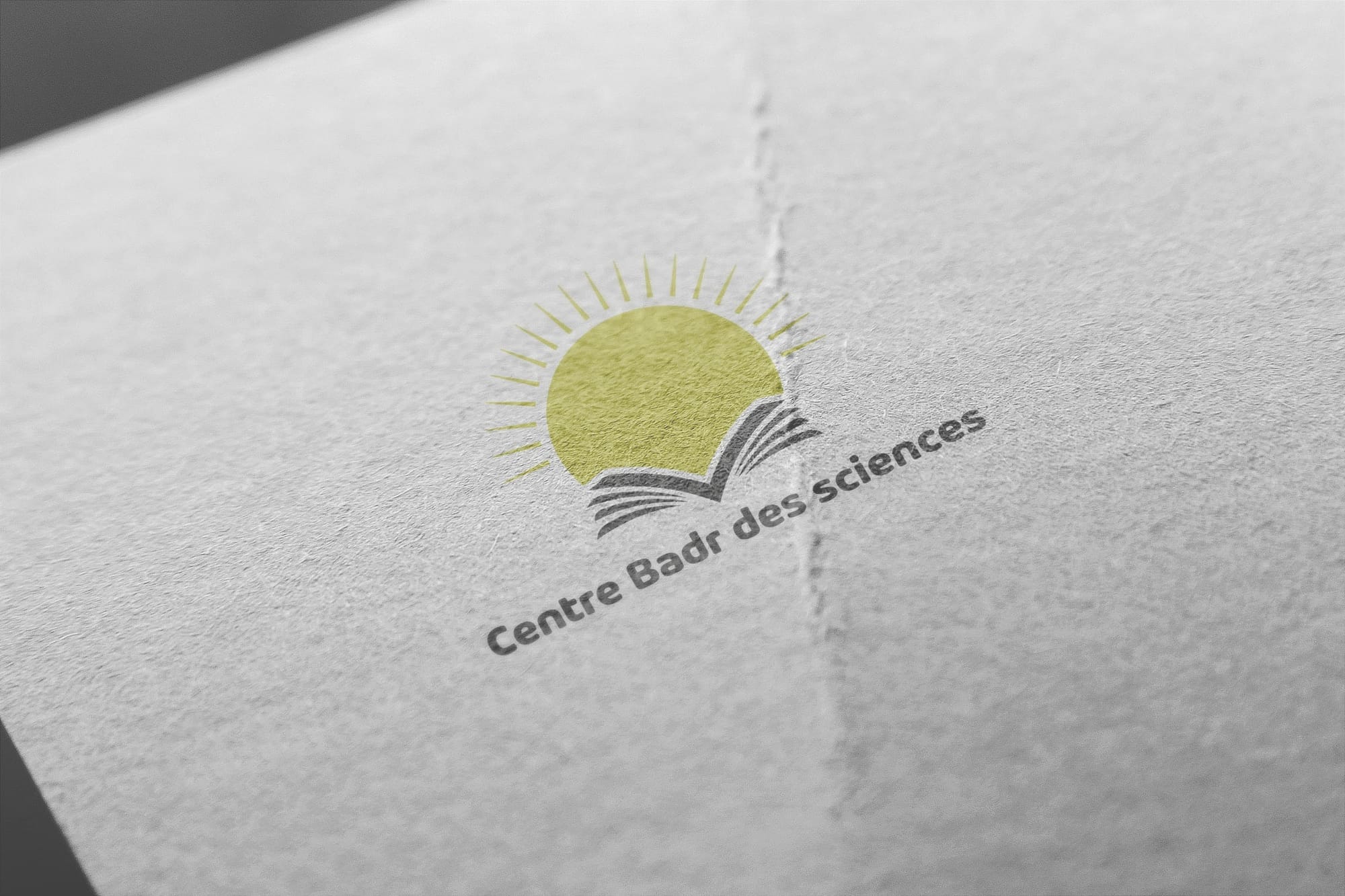
Real-World Applications
To witness the logo's transformative power, observing it in real-world applications is imperative. Whether on a t-shirt, magazine, shopfront, or business card, its design stands out, much like the brightest lunar phase.
Conclusion
Centre Badr des Sciences' new logo brings forth an era of enlightenment for its educational endeavors. Reflecting the serenity and wisdom of a full moon, it sets the center apart as a beacon of knowledge in the educational landscape. The relationship between client and designer was pivotal, evidenced through robust collaboration and a shared vision for excellence. In this partnership, both parties gazed beyond the horizon to shape a symbol of learning and growth.
Start your brand journey today.
