Unveiling Ghostler: A Logo Design Journey Into the Chill of Creativity
Explore the creation of Ghostler's logo, a harmony of ghostly aesthetics and cooler elements realized through thoughtful design.
In the evocative realm of design where creativity melds with strategy, Ghostler stands as a testament to innovative thought brought to life. Untangling its ethereal name, 'Ghostler' conjures an image that is both spectral and cool—a fitting visage for a brand seeking to redefine the concept of chilled products. Harnessing the power of branding magic, let's journey into the making of Ghostler's logo, a design that holds the potential to captivate and refresh.
The Birth of Ghostler
The inspiration behind Ghostler's branding emerges from a simple yet profound concept: Ghost + cooler. This blend transcends literal meanings to evoke a sense of mystery and chilled elegance. Positioned within the cooling industry, Ghostler's identity appropriately mirrors the brand's commitment to delivering both aesthetic pleasure and functionality. With such an intrigue-driven foundation, the need for a logo that conveys these intricate ideas becomes paramount.
Client Vision
The initial brief from the client was succinct and pointed—a logo featuring a 'G' embodying the essence of a ghost while subtly hinting at the essence of a cooler. The envisaged design was expected to capture qualities of coldness, creating a visual interplay between the spectral and the refreshing. The client aimed for a logo where the letter 'G' itself would become the iconic centerpiece, encapsulating the full brand name beneath or surrounding it.
Design Team's Expedition
Receivers of the challenge, the design team took their first steps into manifesting this ghostly monogram. The initial drafts introduced a variety of interpretations, each exploring the phantasmal yet icy duality Ghostler sought to express.
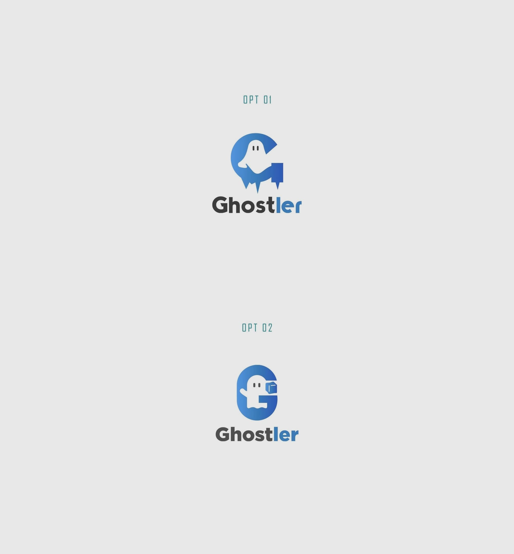
The reveal of these options depicted a harmonious dance between spectral forms and cooler aesthetics, achieving a rare balance of simplicity and depth. Each option presented a nuanced weaving of elements that echoed cold specters through the lens of typographic elegance.
Final Selection
The client's decisive feedback crowned Option 1 as the quintessential embodiment of Ghostler's ethos. This winning design integrated a distinctive ghostly silhouette with an angular modernity that hinted at both chill and mystique. Designed with Typographica, the font selection further lent an air of sophistication and minimalism. The clean lines and refined strokes offered a modernist contrast to the ghostly curves, making it a fitting medium for portraying Ghostler’s cool incantation.
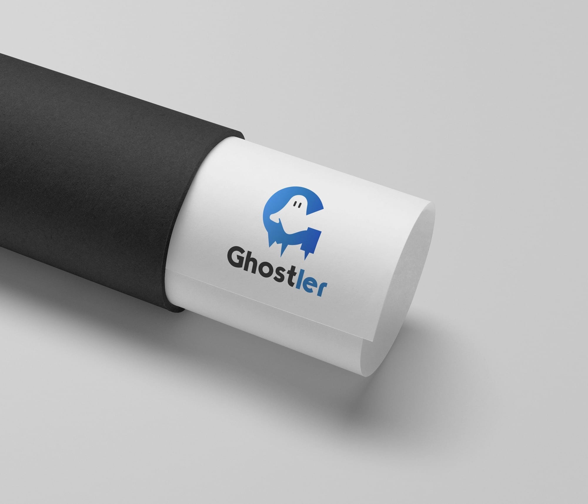
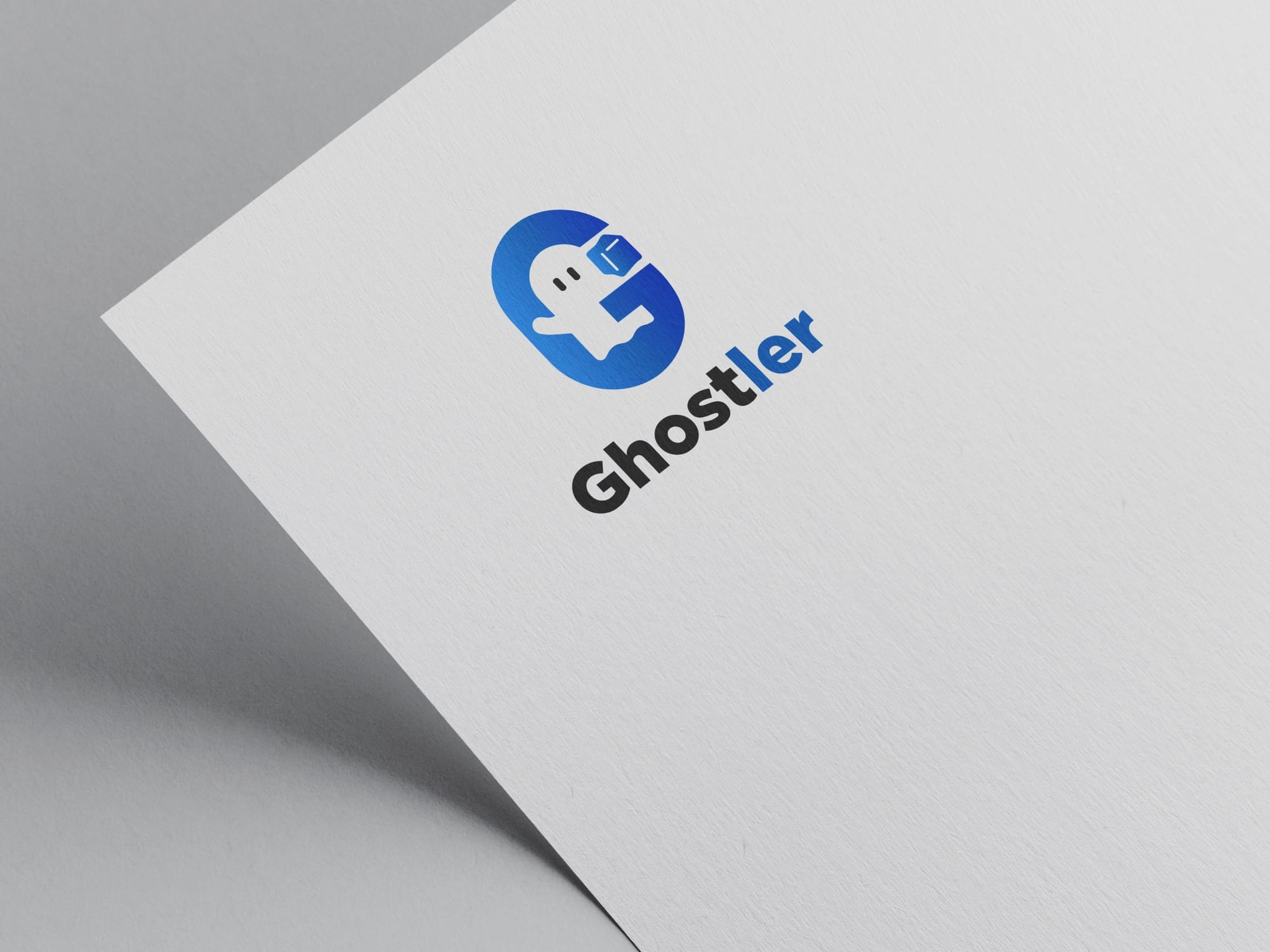
A Glimpse Into Real-World Applications
The success of a brand logo often rests in its adaptability to real-world needs. Ghostler's branding came to life through a series of final mockups that portrayed the logo across various mediums—from impeccably designed merchandise to bold storefront displays. Each rendition reinforced the brand's identity while enhancing its visibility and impact.
The Path Forward
The design odyssey of Ghostler returns full circle, from an initial idea to a tangible brand presence that is both captivating and coolly spectral. As Ghostler embarks on delivering its unique products to the market, the logo serves as a herald of chill, transforming simple ideas into a brand successfully draped in creative ambition.
Start your brand journey today.
