Unveiling e-Motive Technology: A Journey Through Design and Innovation
Explore the creative rebranding of e-Motive Technology, a Norwegian leader in electric vehicle testing, through a detailed analysis of their new logo and brand identity.
e-Motive Technology, a Norwegian enterprise devoted to electric vehicle testing, recently underwent a captivating rebranding initiative. This design journey not only involved crafting a new logo but also an entire brand overhaul that aligns with their forward-thinking ethos. A design that captures the spirit of motion while nodding to technological sophistication was the ultimate ambition behind this endeavor.
The Philosophical Undercurrents of e-Motive
The name 'e-Motive' is rich with philosophical underpinnings. It invokes the essence of movement and emotion, two principles central to an industry on the brink of profound change. With innovation sweeping the automotive world, e-Motive finds itself perfectly situated to lead the charge in this new era of electrification. Based in a country synonymous with sustainability and cutting-edge technology, e-Motive’s rebranding was as much a necessity as it was a strategic decision to declare its place in the automotive arena.
Initial Client Brief and Vision
e-Motive provided a precise yet open-ended brief, aligning their aspirations with a preference for the color green, synonymous with electric vehicles. This requirement mirrors the growing ecological consciousness within the industry and their determination to remain environmentally responsible while testing cutting-edge technology. The initial client presentation conveyed these values through existing documents.
Design Team's Exploration and Proposals
The design team's journey began with an exploration of varied logo inspirations. The preliminary designs presented a range of options melding sleek typography with futuristic motifs.
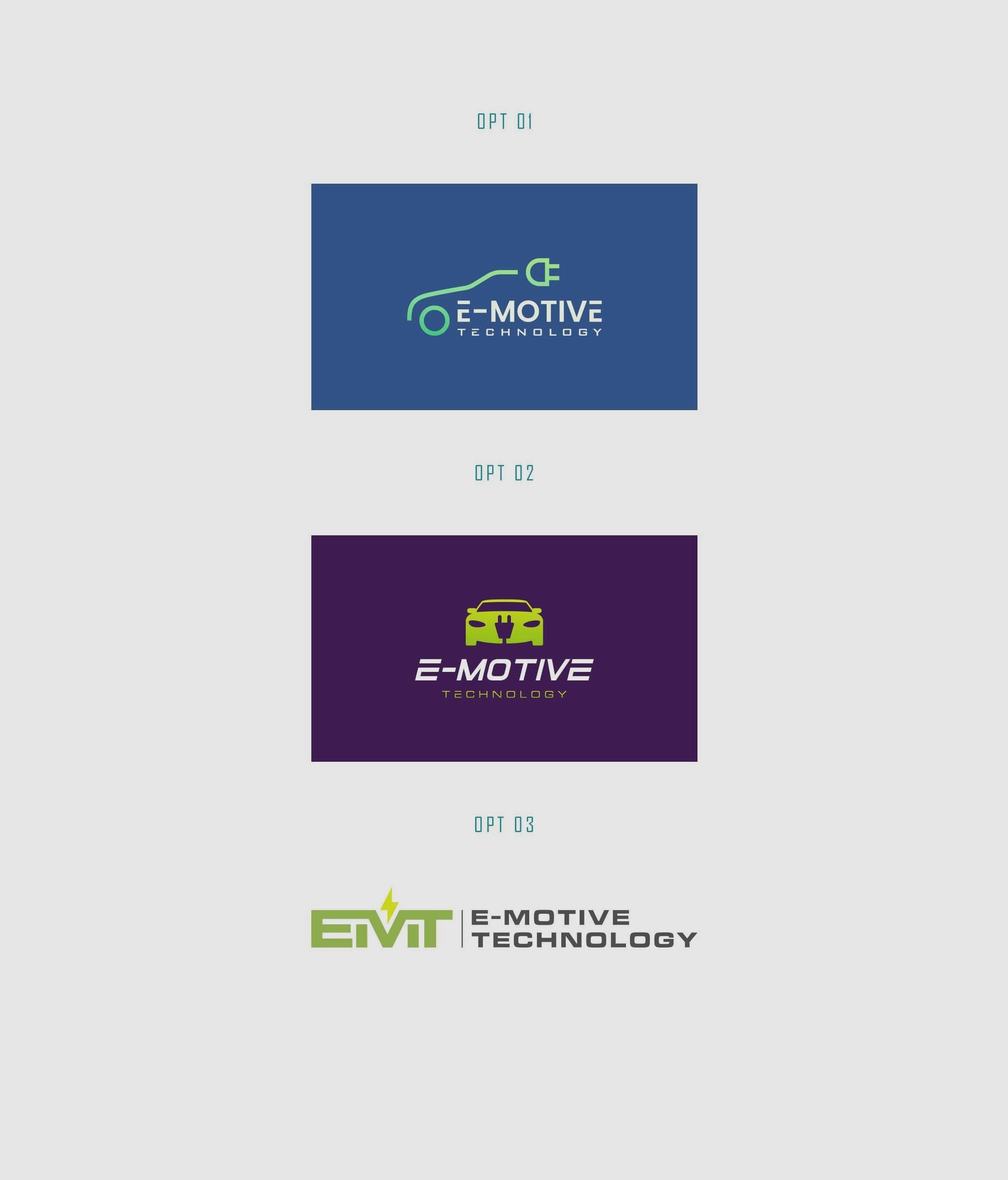
After reviewing these options, the client favored Option 4, which reflected their brand identity with its clean lines and dynamic feel.
Refining the Selection
The client's appreciation of Option 4 led to further refinement stages. A request was made to adjust the capitalization from a lowercase 'm' to a capital 'M', whilst maintaining equilibrium across all letters.
Finalizing Design and Applications
The ultimate selection featured lowercase letters to preserve contemporary aesthetics, which suited e-Motive’s progressive stance in the automotive field.
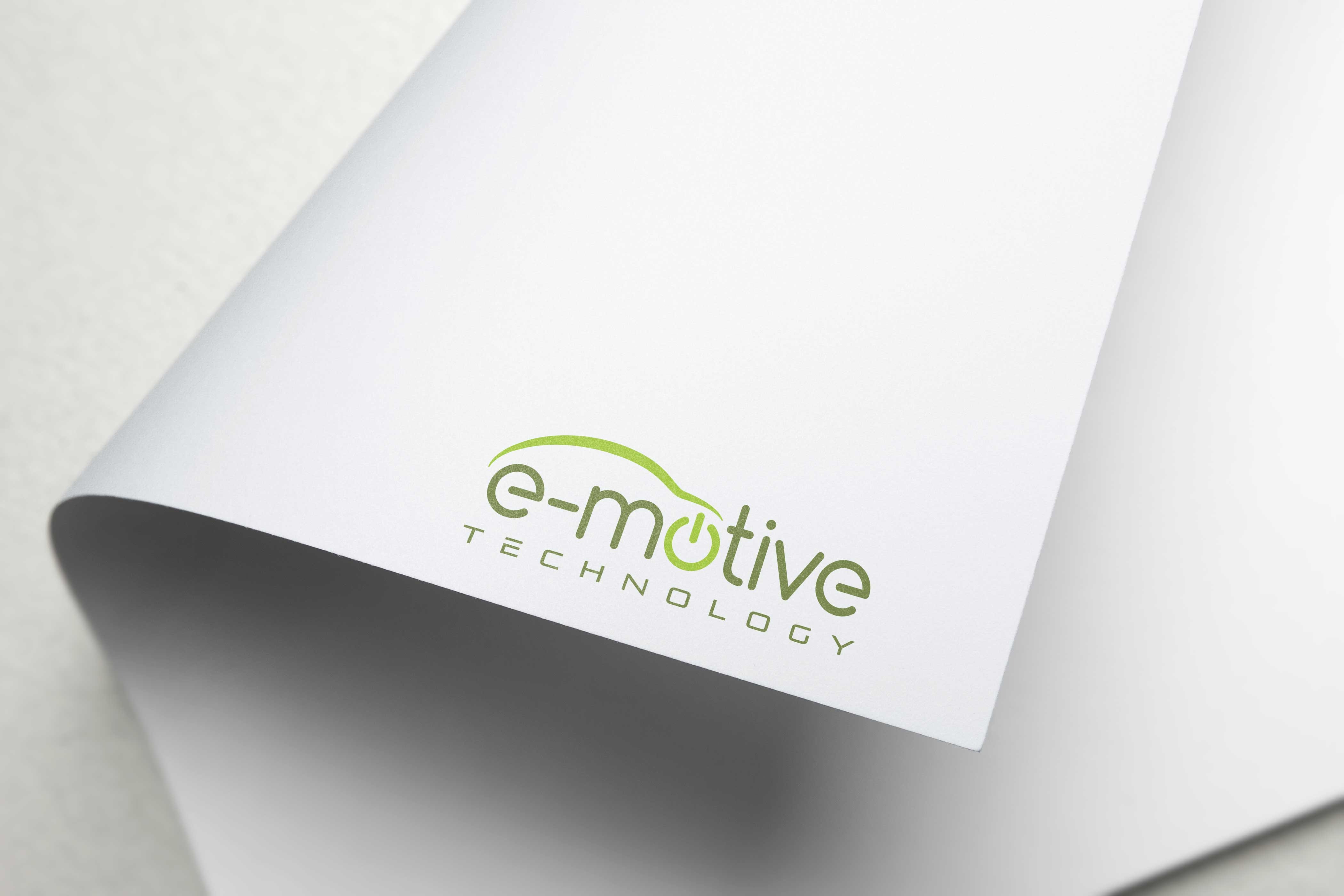
The bespoke font ‘Comfortaa’ adds a playful roundness to the logo, complementing the brand’s ethos of connectivity and collaboration.

Bringing Identity to Life
The design process extended into creating business cards and an email signature, thoughtfully integrating the brand identity. An interesting note was the client's specific request for subtle enlargements and adjustments to the logo positioning on the business cards — a testament to their meticulous nature.
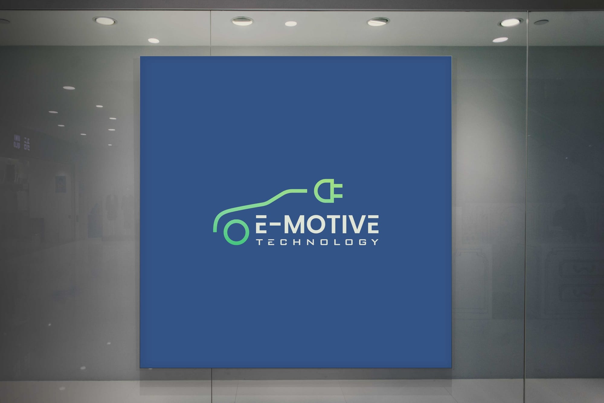
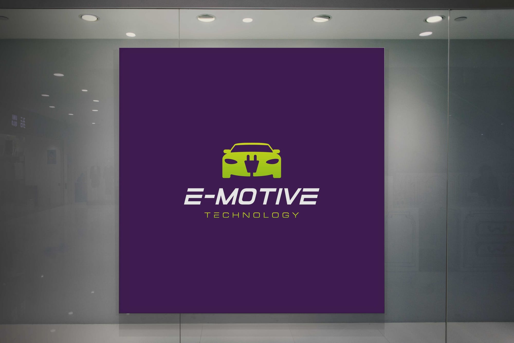
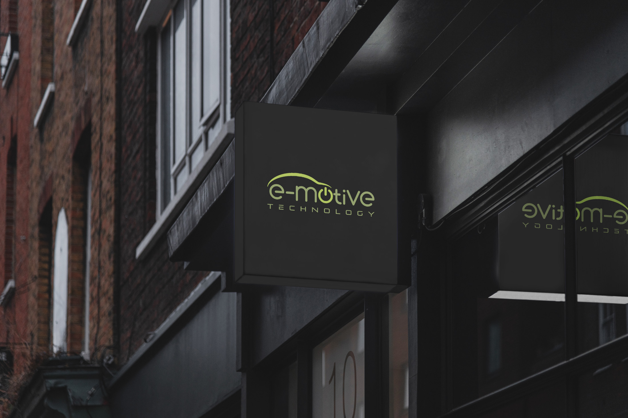
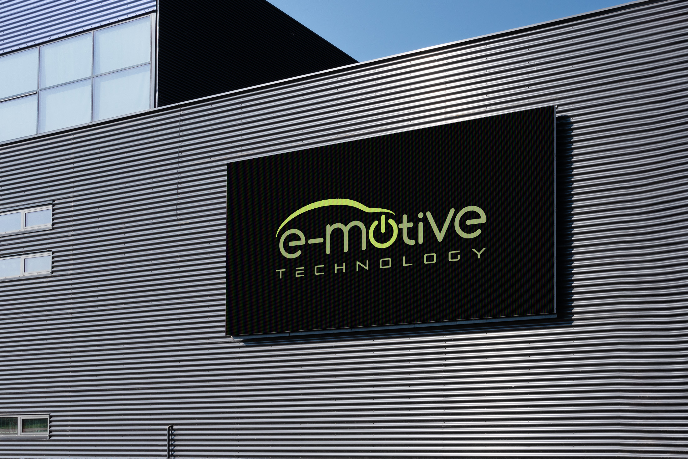
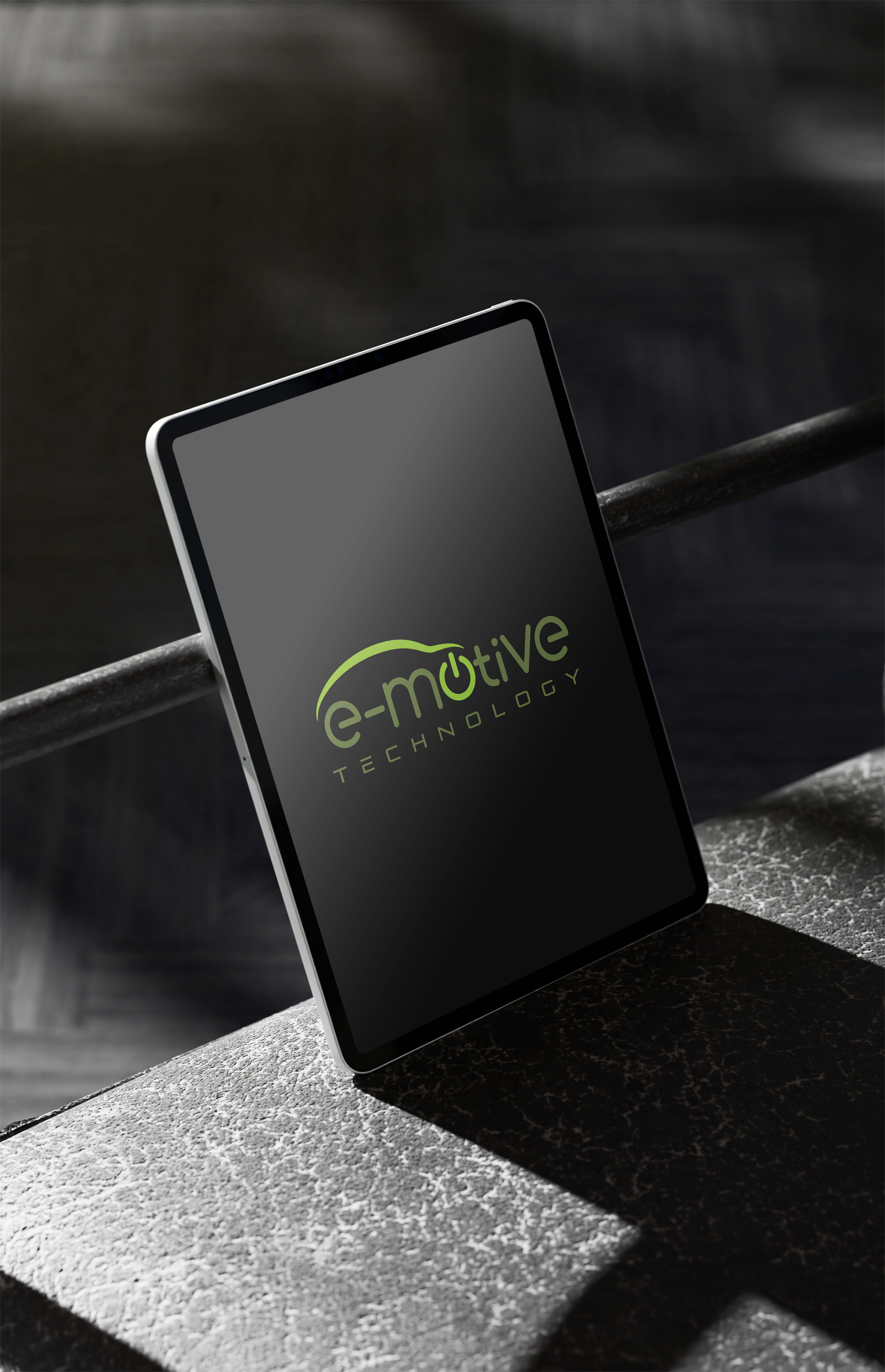
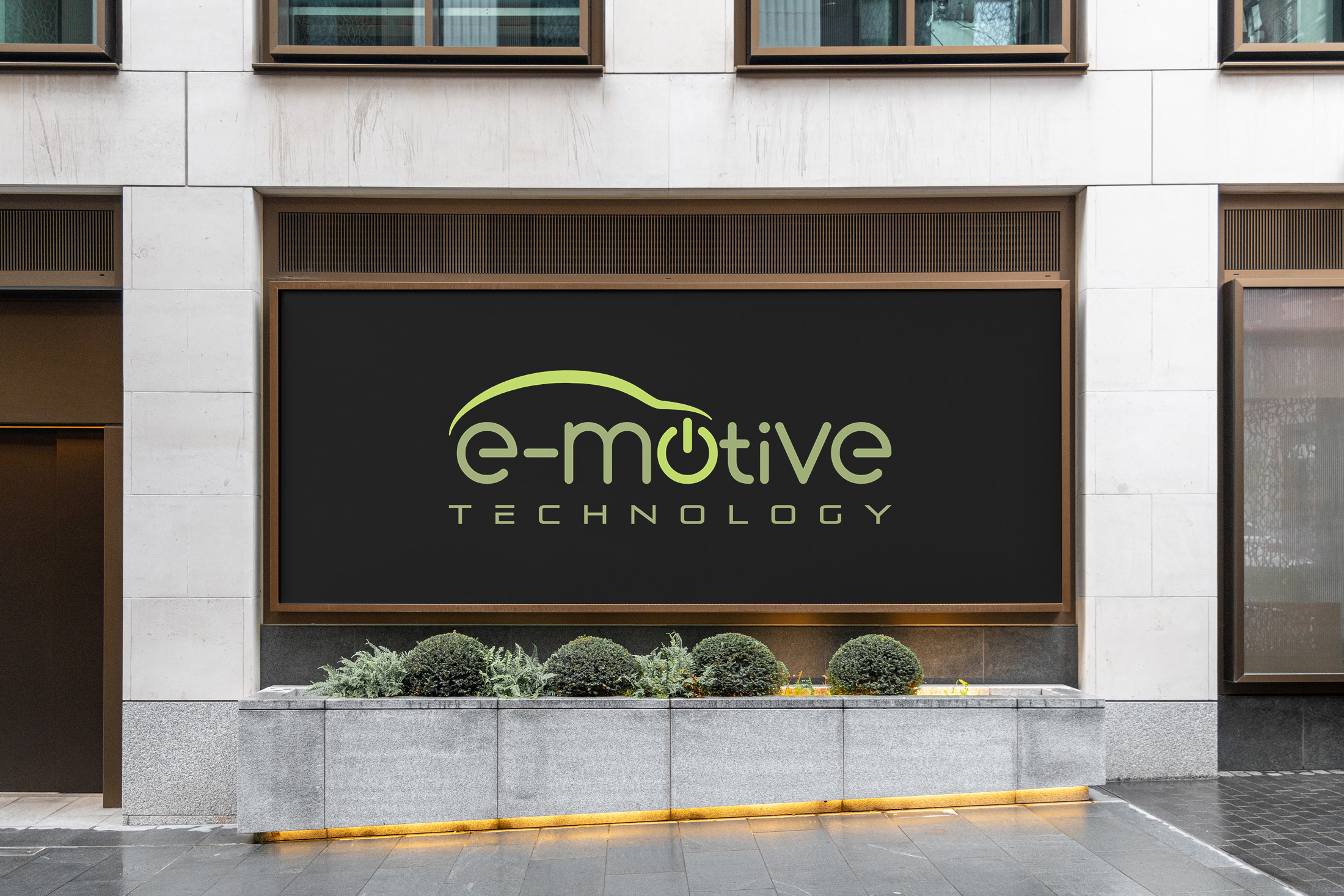
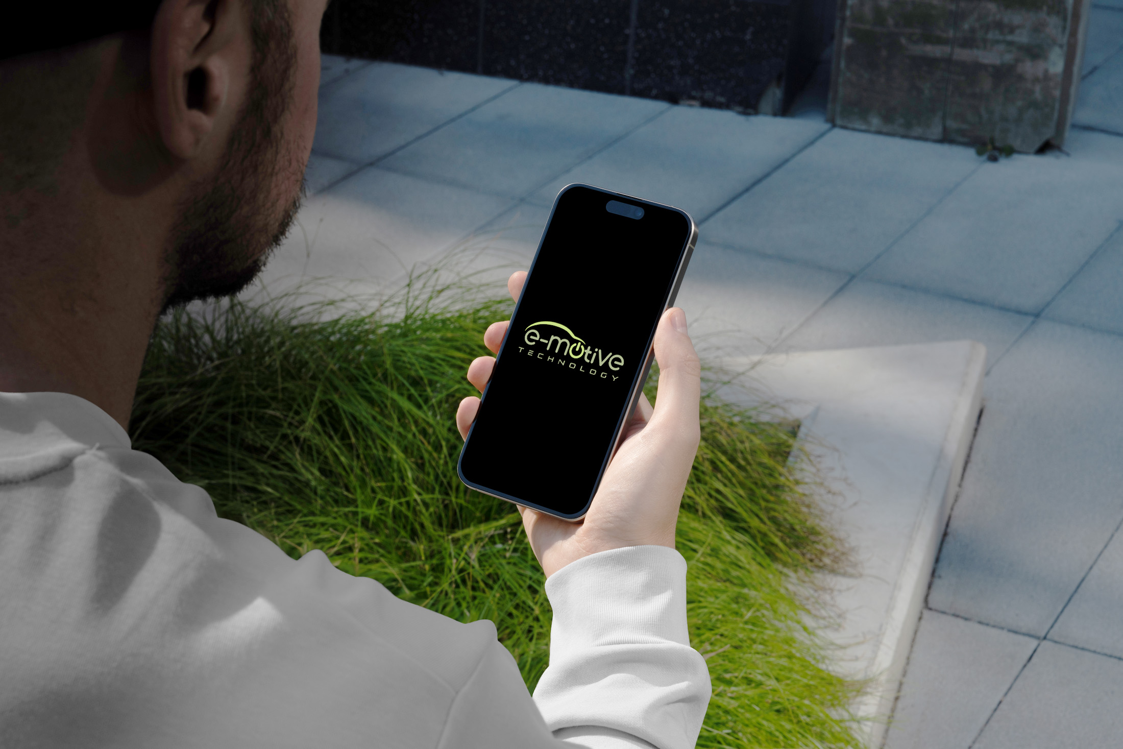
Branded Mockups and Real-World Application
The final logo was unveiled across several high-impact mediums, including digital screens and billboards. Demonstrating the brand’s versatility, these applications showcase e-Motive’s presence in both physical and digital forums.

Reflections on the Rebranding Journey
e-Motive Technology’s rebranding encapsulates their commitment to advancement. It’s a storytelling mosaic made tangible through thoughtfully crafted design. Every line and curve, alongside the strategic use of color, contributes to a narrative that distinguishes e-Motive as a pioneer in electric vehicle testing.
In harmony with technological transformation, e-Motive’s new brand identity is a beacon of their growth trajectory — one that thoughtfully bridges the distinctions of innovation and emotion.
Start your brand journey today.
