Transcending Boundaries: The Creative Journey of Lakeland Physiotherapy & Sports Medicine's New Identity
Explore the thoughtful and transformative branding journey for Lakeland Physiotherapy; Sports Medicine, crafted with an eye on heritage and modernity.
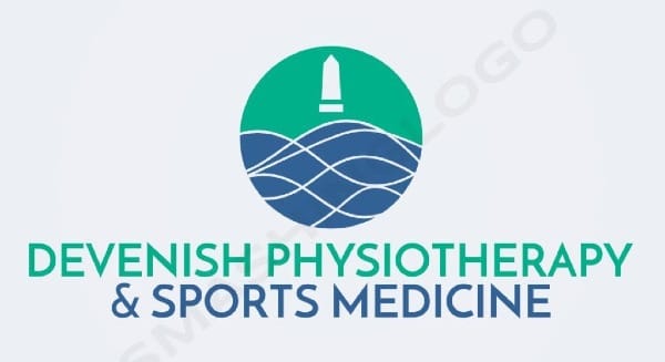
When embarking on a branding journey, a company seeks not just a visual identity but an essence that captures its vision, values, and vitality. Lakeland Physiotherapy & Sports Medicine from picturesque Lakeland, known for its commitment to holistic health and well-being, recently underwent such a transformative process. The reimagining of their logo showcases a synergy of heritage, geography, and modern design philosophy.
Client's Vision: Merging Heritage with Modernity
At the heart of Lakeland Physiotherapy's vision was a desire for an abstract representation that defies the cliché elements of anatomy-focused logos common in the physiotherapy field. Instead, the integration of silhouette imagery capturing Lakeland's exquisite island was key, ensuring the identity was unique and resonant with their location. Their color palette of blues and greens was a nod to nature's calming hues, naturally associated with peace, trust, and health.
Design Team's Response and Options
Presented with the brief, the design team embarked on an exploration of abstract forms. The first set of logo concepts provided two strong contenders, each echoing the island's silhouette while encapsulating an abstract dynamic form suggestive of movement and vitality, key tenets in physiotherapy.
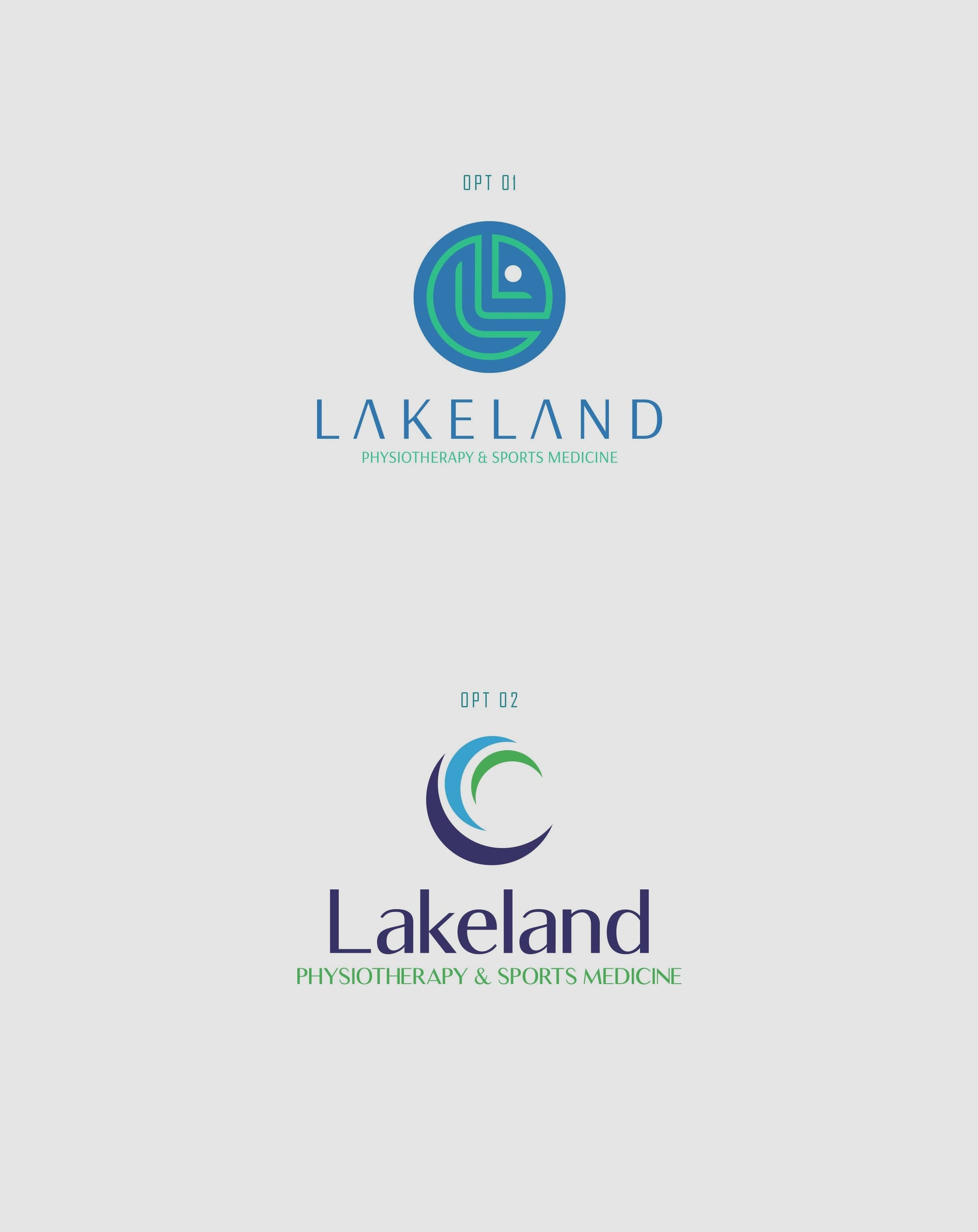
Incorporating Local Identity
The client was drawn particularly to Option 1, suggesting the incorporation of a local architectural element, the tower featured in the images they provided. This request added a layer of cultural depth and grounded the design in a recognizable local icon, further enhancing the brand's narrative and visual authenticity.


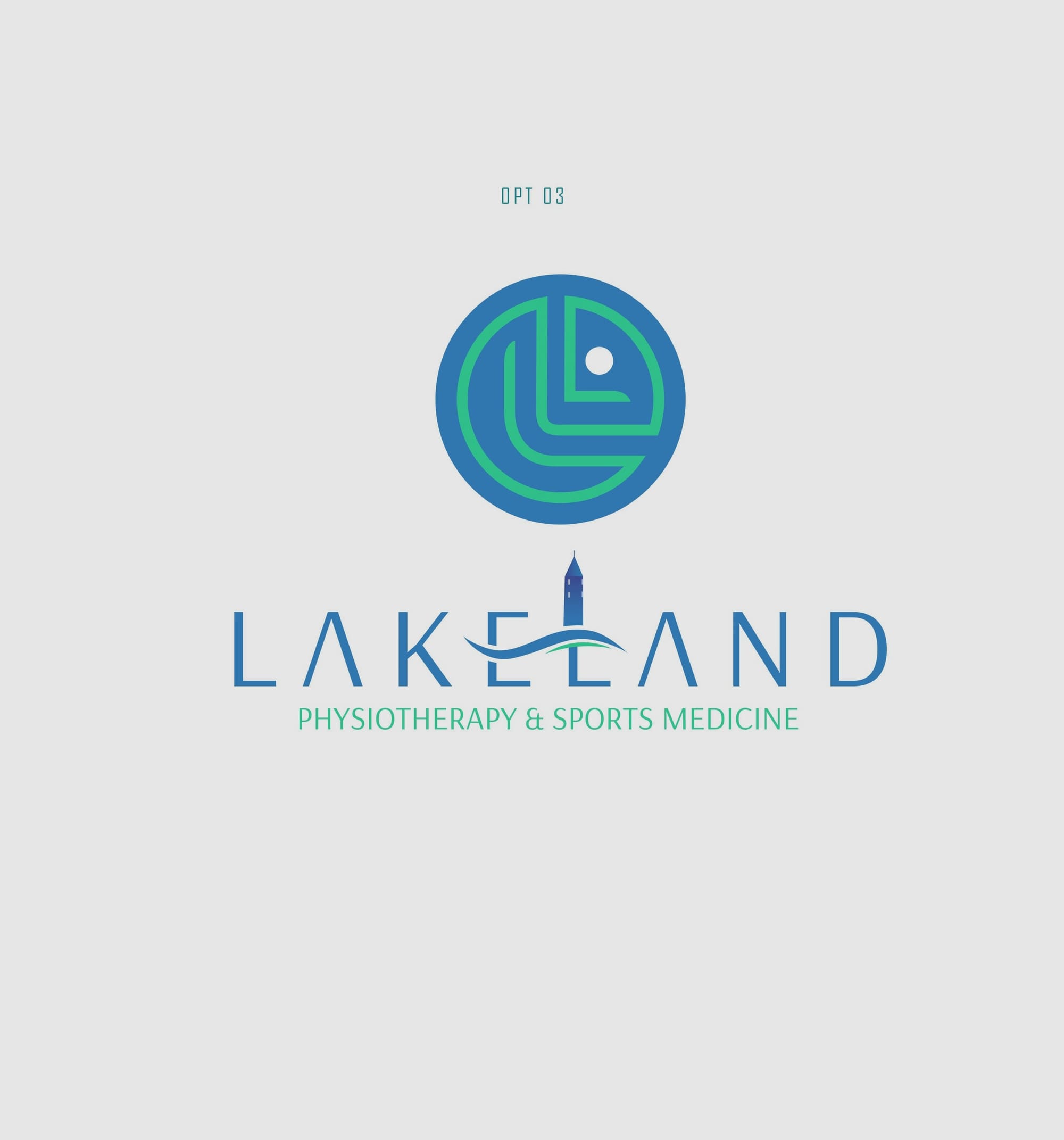
The Evolution of Design
Responding to this feedback, the design team adeptly integrated the tower's silhouette into the logo, maintaining the original abstract dynamism while adding this new dimension. This shift required balance so as not to overpower the logo's original intent but instead to enhance the narrative depth.
Toward Finalization
The client’s final input included a refinement request, opting for a clean look that maintained only the prominent top windows of the tower. These iterations celebrated the interplay of modernity and tradition and concluded with the selection of Option 5 as the definitive logo choice.
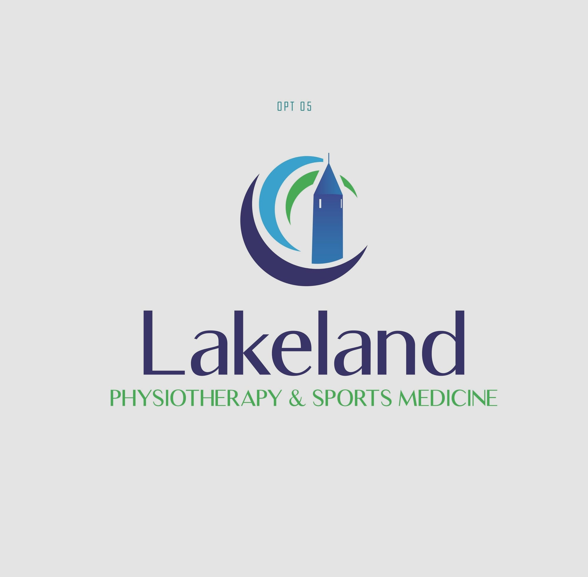
The Final Flourish: Luxia Font
A complementary font choice was essential. Luxia, with its clean lines and modern elegance, was selected for the logo's typography. This font further contributed to the overall aesthetic by offering clarity and readability, all while enhancing the modern ethos of the design.
Real-World Applications
The ultimate success of a logo lies in its application across various mediums. Lakeland's new logo translated beautifully across multiple touchpoints, from signage and apparel to digital and print media, ensuring consistent and impactful brand recognition.
Lakeland Physiotherapy & Sports Medicine's new branding is an elegant blend of timeless aesthetics and modern design principles. It stands as a testament to the collaborative power of design, embodying a brand's values in a manner that is both visually striking and deeply rooted in the local context.
Start your brand journey today.
