The Williford Brothers: Crafting a Brand Identity for Leadership and Life Discourse
Explore the design process behind The Williford Brothers podcast logo, a visual identity that merges life, leadership, and laundromats with elegance.
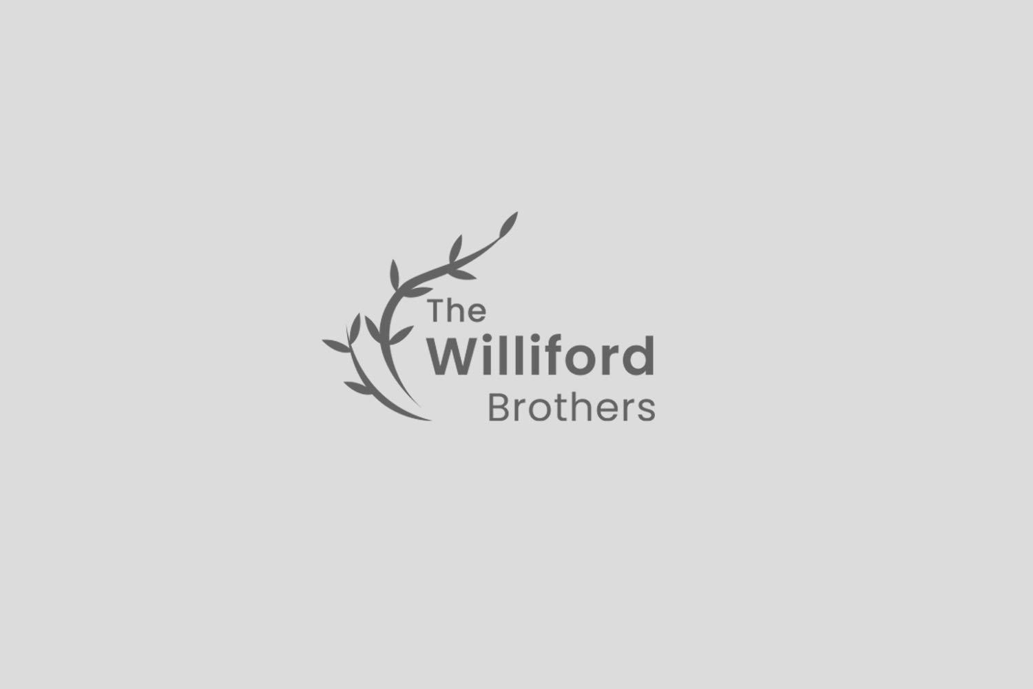
The Williford Brothers stand as a modern discourse platform, marrying the intricacies of life and leadership with a novel twist: laundromats. Their podcast aims to engage audiences with compelling narratives and insights, a mission that demands an equally compelling brand identity. To manifest this vision visually, they embarked on a journey with our creative design agency, opting for our express 24-hour logo design service.

Client's Vision and Inspiration
From the outset, The Williford Brothers identified a clear vision for their logo. Their directive was precise yet imaginative: a logo that can alternate between 'TWB' and the full moniker 'The Williford Brothers.' They aspired for a design that leveraged the hues of gold, yellow, blue, and orange. Such a palette speaks to a rich narrative and uplifting energy, mirrored in the discussions they wish to cultivate. Furthermore, they suggested an olive branch as a symbolic element, bringing a touch of classicism and peace to their modern dialogue platform.

Initial Concepts by the Design Team
Our design team embraced the inspirational elements provided by The Williford Brothers, channeling the essence of their podcast into two distinct logo options. The first concept made use of a bold typeface and the harmonious color blend requested. It incorporated a stylized olive branch that gracefully intersected the lettering, adding a layer of elegance while nodding to peace and wisdom.
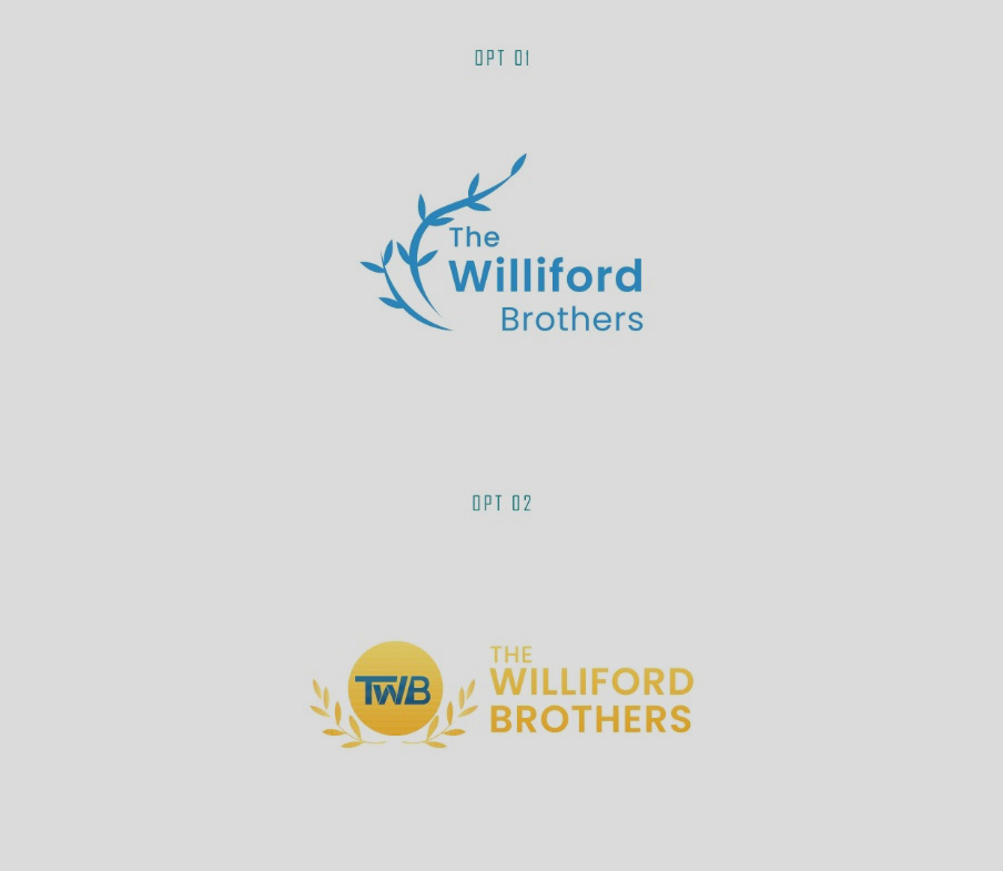
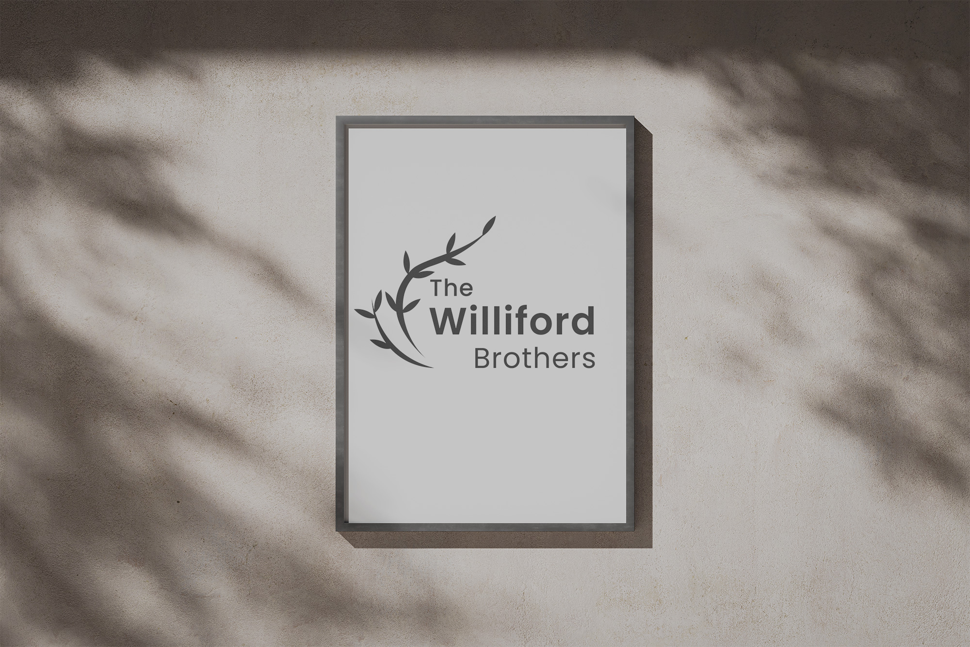
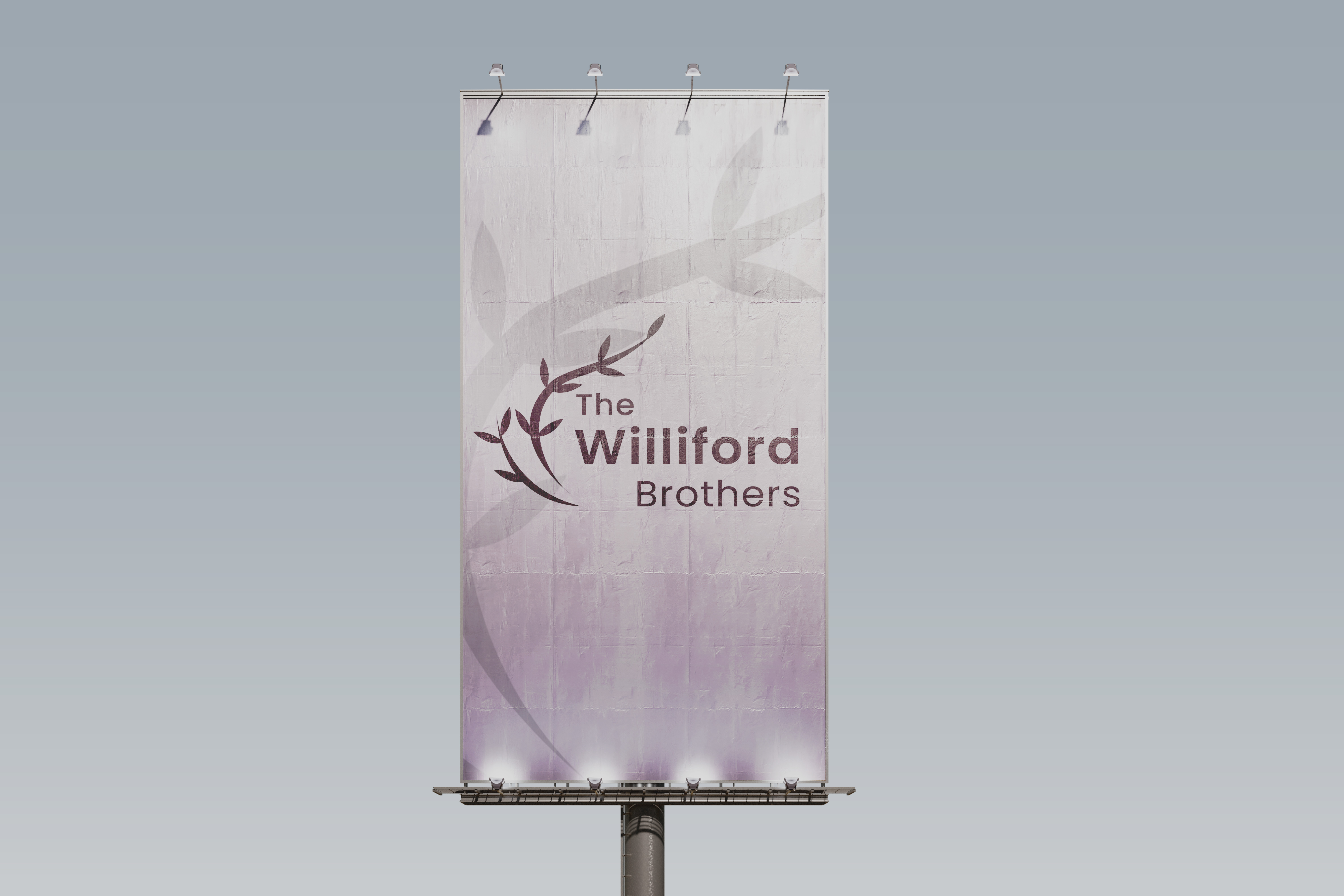
The first concept took a more simplified approach, diverging from the visual references initially shared by the client. Despite its minimalism and departure from the expected direction, it resonated strongly with the client; so much so that they ultimately chose to move forward with this design.
Bringing the Vision to Life
Upon presentation, The Williford Brothers were swift in their approval, resonating immediately with the versatility and symbolism of the designs. The final logo would become a visual representation of their brand, ready to adorn their podcast cover, promotional materials, and signage with sophistication and clarity.
A Logo That Embodies Narrative
The culmination of this design journey delivers more than a logo; it presents a narrative. The Williford Brothers are equipped with a visual identity that encapsulates their unique blend of content, ready to captivate and inspire their audience. The olive branch, in its timeless appeal, serves as a bridge between the intellectual and the practical, much like their podcast intends to do with leadership and life. In this collaboration, a simple branding exercise evolved into a holistic encapsulation of a bold vision, poised to resonate with listeners and viewers alike.
Start your brand journey today.

