The Transformative Rebranding Journey of GrowLexi AGENCY: A Case Study
Explore the creative journey of GrowLexi AGENCY's rebranding, where symbolism met strategy in crafting a resonant identity.
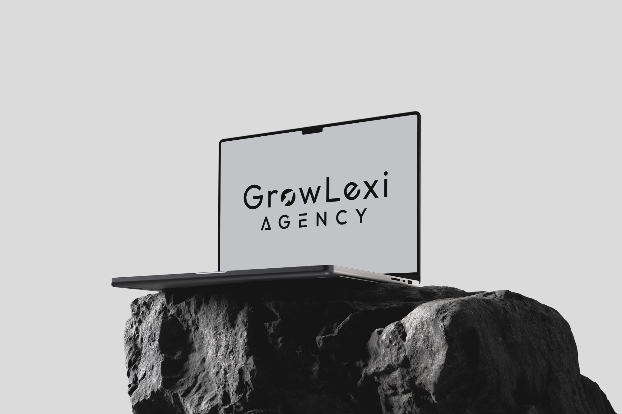
Navigating the intricate pathways of branding, where creative essence meets strategic objectives, the journey embarked upon by GrowLexi AGENCY, manifests an exemplary case of transformation through mindful design. This case study reveals how a symbol — a simple arrow — became the emblematic beacon guiding the agency to an evolved visual identity.
Founded on the motto "growth through understanding," GrowLexi AGENCY operates at the nexus of strategic insights and creative solutions, offering consultation and management services. Their name, an amalgamation of 'growth' and 'lexicon,' denotes a burgeoning vocabulary of opportunities. With this foundation, the agency sought a visual representation that encapsulated its ethos of ascending growth and clarity.
Initial Brief and Concept Development
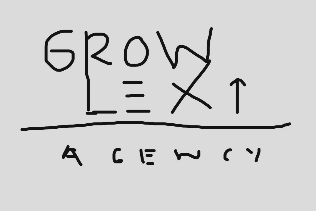
The project set off with a briefing from the client, summarized in a logo sketch, laying the ground for a design narrative intertwined with arrows and mountains. This conceptual framework aimed to incorporate an arrow between the letters 'ex' in Lexi, serving as a symbolic representation of upward growth akin to climbing a mountain. A keen emphasis on a color palette of blue, black, and white was established to maintain a professional yet approachable aesthetic.
Design Exploration
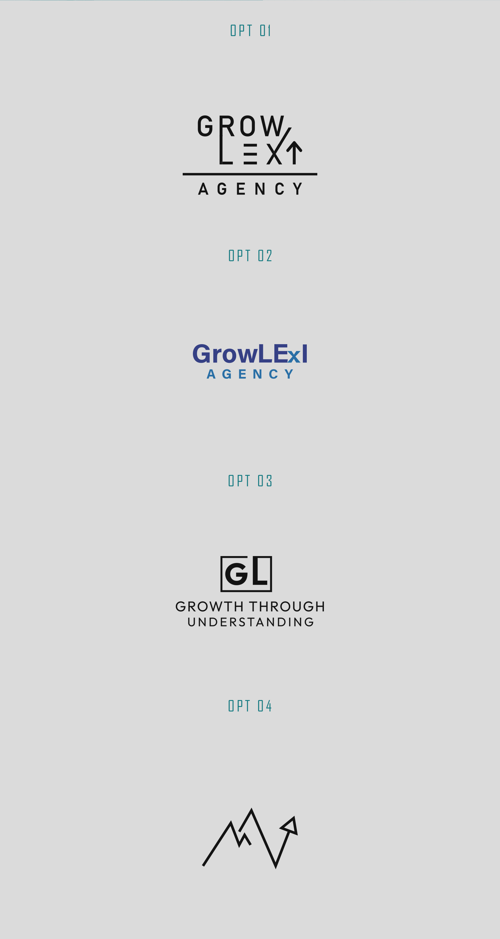
The design team responded with a series of original concepts, emphasizing the significance of an arrow in both standalone and integrated forms. Initial responses included a suite of logo iterations, exploring the interplay of typography and arrow motifs. The preliminary designs resonated with the client's vision, yet refinement was essential to capture the nuanced essence of 'Lexi' and the dynamic growth it stood for.


Client Feedback and Refinement
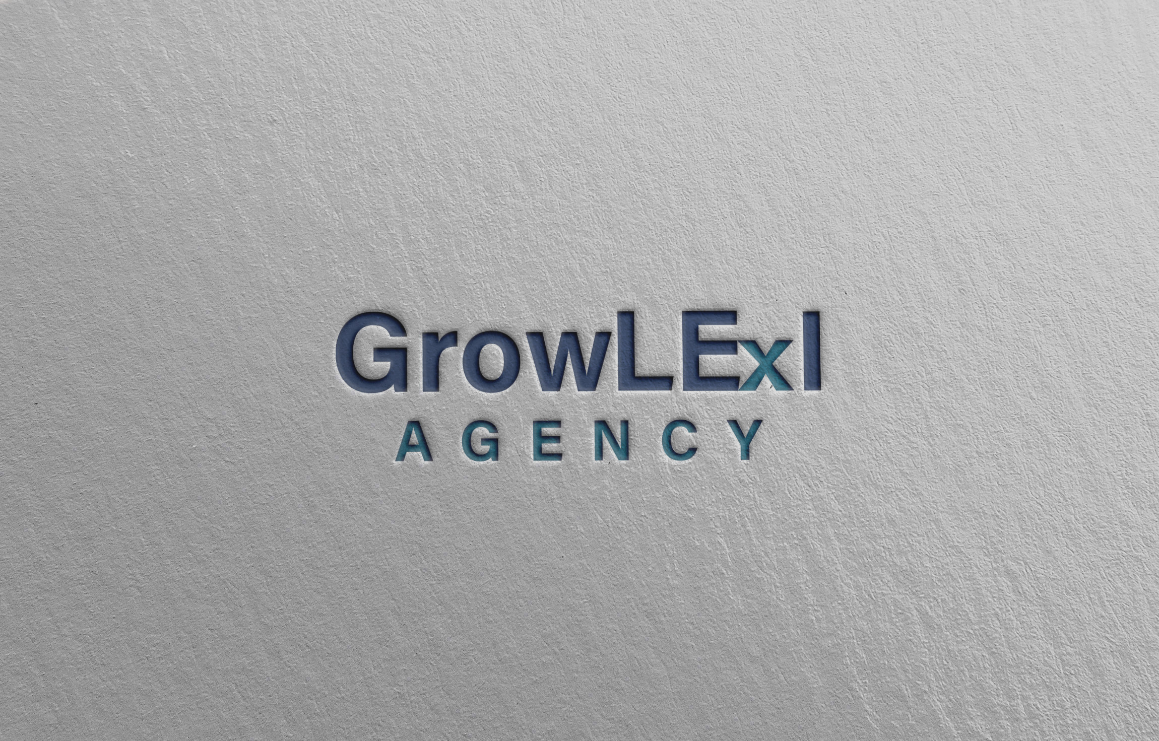
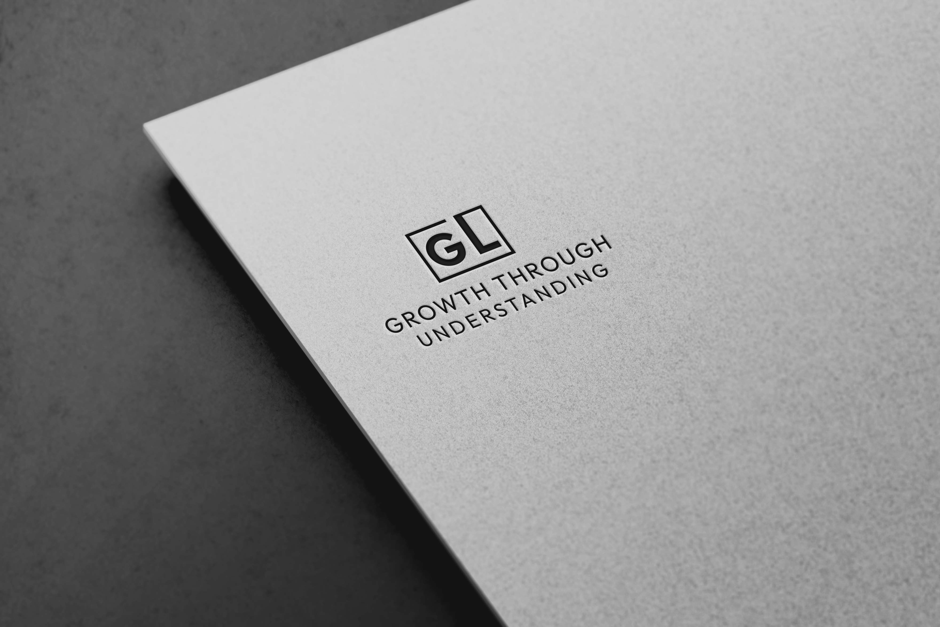
The client, engaging deeply with this creative process, provided detailed feedback focusing on aspects such as the alignment of the 'E' and the overlay of elements within the logo. This feedback loop epitomizes the collaborative nature of creative design, where designer expertise and client vision coalesce. Additional adjustments involved enhancing the distinctiveness of the 'i' in Lexi and the integration of the arrow within the social media abbreviation 'GL.'
Final Design and Outcome
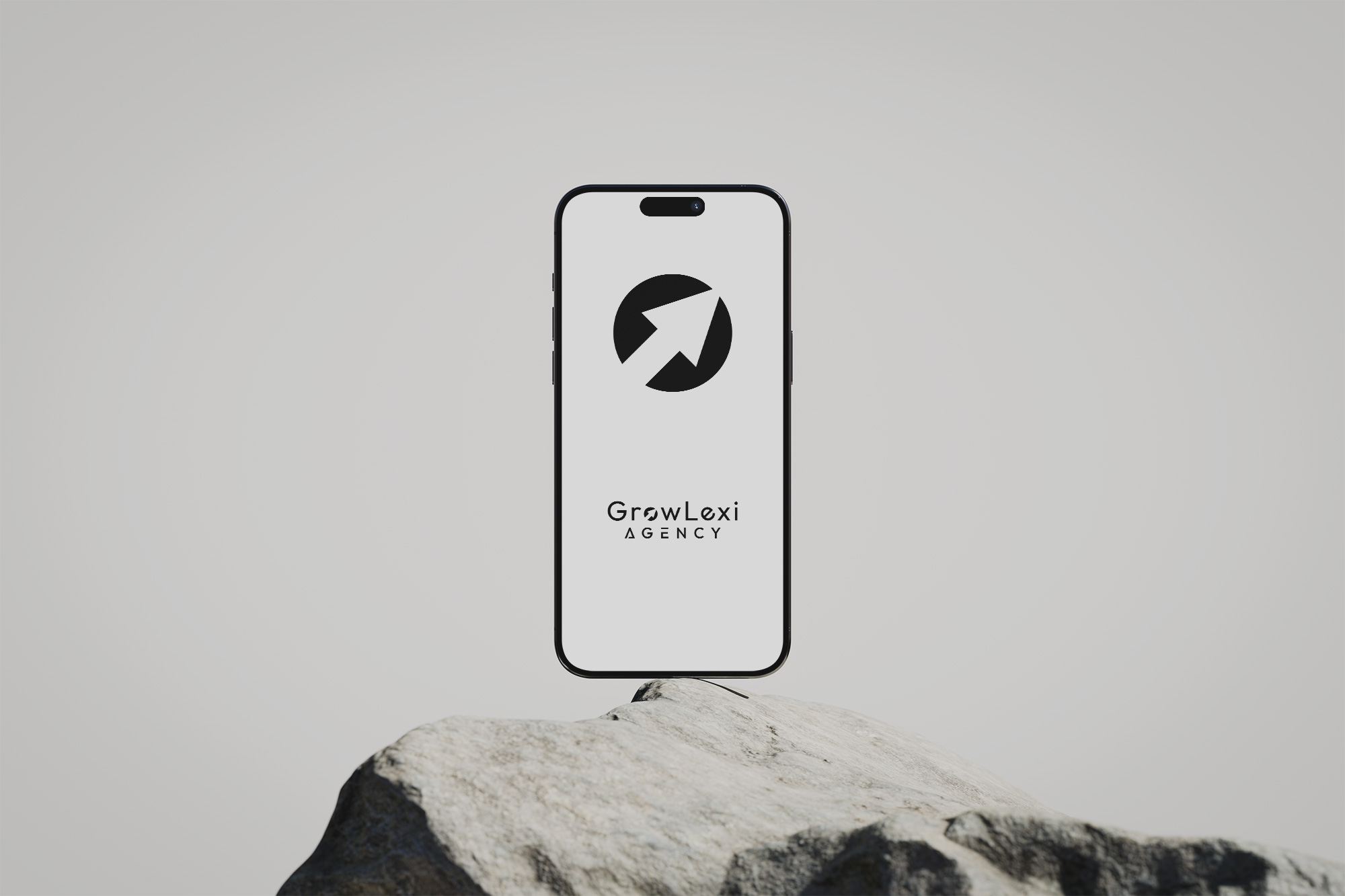
The design team responded with altered variations, where creative iterations reinforced the brand’s core philosophy. The arrow's strategic placement and form became central, symbolizing the agency's mission of directional growth. This emblem served not only as a design feature but as a philosophical anchor, rooting the agency in its commitment to progress and understanding.
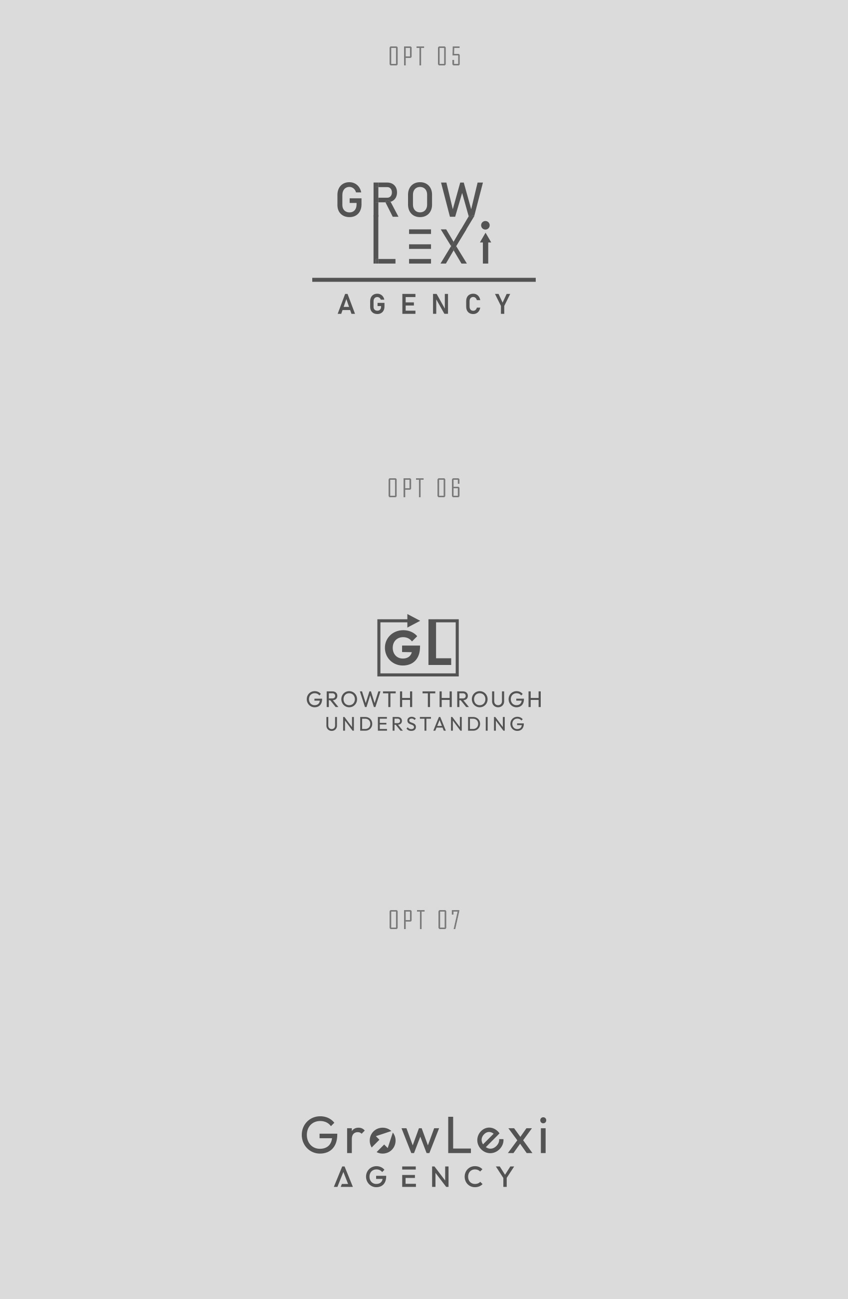
Ultimately, the final logo resonated with a profound sense of completion, aligning visually and thematically with GrowLexi AGENCY's aspirations. The approved design embraced a seamless fusion of typography and symbolism, illustrating a narrative of strategic ascension. The logo, now set in motion, acts as a perpetual storyteller, conveying the essence of GrowLexi AGENCY's brand journey; perhaps akin to a river that navigates through valleys, seamlessly merging understanding with growth.

Start your brand journey today.


