The Transformation of Better Me Fitness: Crafting a Brand Identity Through Design
Better Me Fitness partnered with a design agency to develop a unique logo that reflects self-improvement and empowerment through thoughtful visual design.
The fitness industry, distinguished by its perpetual evolution and dynamism, offers a challenging yet invigorating landscape for branding. For Better Me Fitness, based in the heart of New York City, navigating this terrain demanded a fresh, unique brand identity that would resonate with its vision and clientele. The journey toward creating a distinctive logo embodies a story of creativity, philosophy, and strategic visual design, intertwining elements of personal development and focus.
Reimagining Identity: The Client's Vision
As the name suggests, Better Me Fitness revolves around the philosophy of self-improvement and empowerment. The founder's brief was clear: the logo needed to be sleek, unique, and poised for use across fitness apparel and equipment. Central to this design was the synthesis of the initials 'B' and 'M', with the phrase "Better Me Fitness" subtly underpinning these elements. The client emphasized their desire for a logo that nobody else had, challenging the creative agency to craft something truly original and thought-provoking.
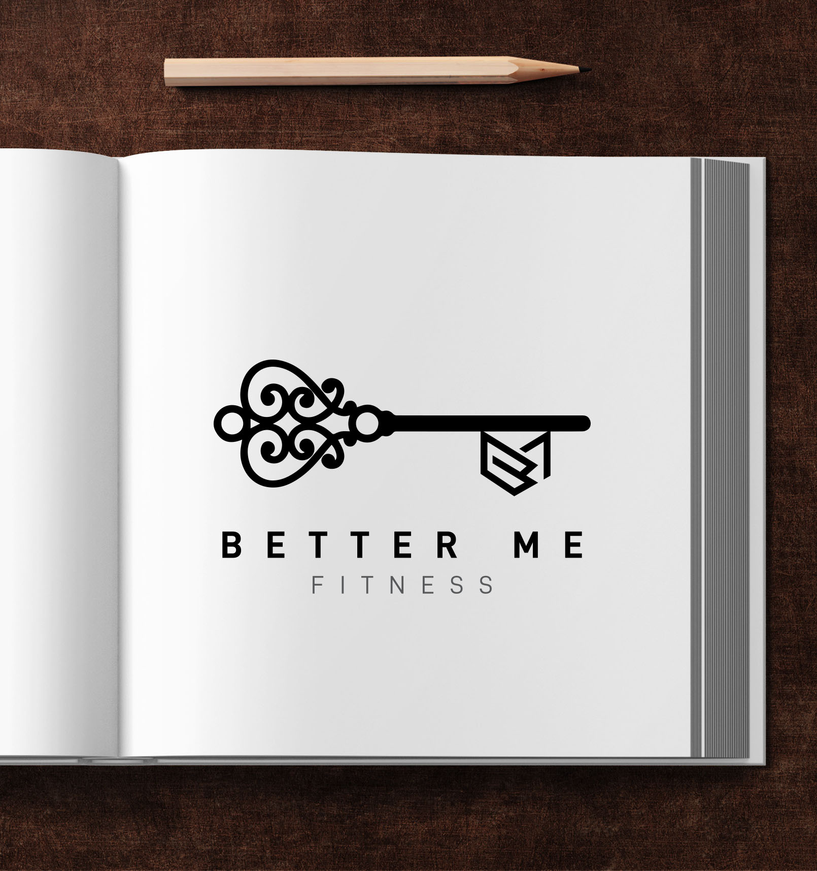
Moreover, the founder envisioned a logo that symbolically incorporated a key, a metaphor for unlocking one's potential through fitness. This detail revealed the depth of thought behind the brand, marrying personal growth with physical activity in a compelling narrative.
Design Challenges and Initial Concepts
Given the competitive nature of the fitness market, the design team had to navigate multiple challenges to fulfill the client's vision. The initial proposals, featuring an elegant yet robust integration of the letters 'B' and 'M', were presented in a series of black and white variations. These drafts were designed to highlight the minimalist and bold style the client sought.
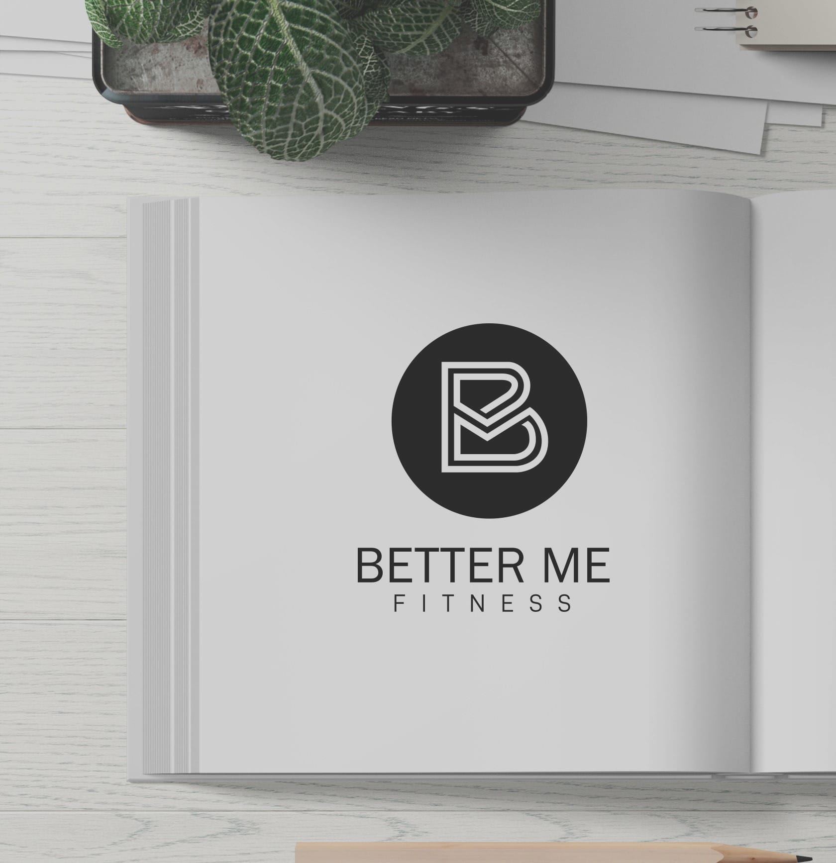
While these drafts captured the core identity, the client requested further refinement, seeking a design that balanced visibility with subtlety. They expressed a preference for bolder logos and smaller textual elements, thus allowing the initials to take precedence.
Refining the Logo: Adapting to Feedback
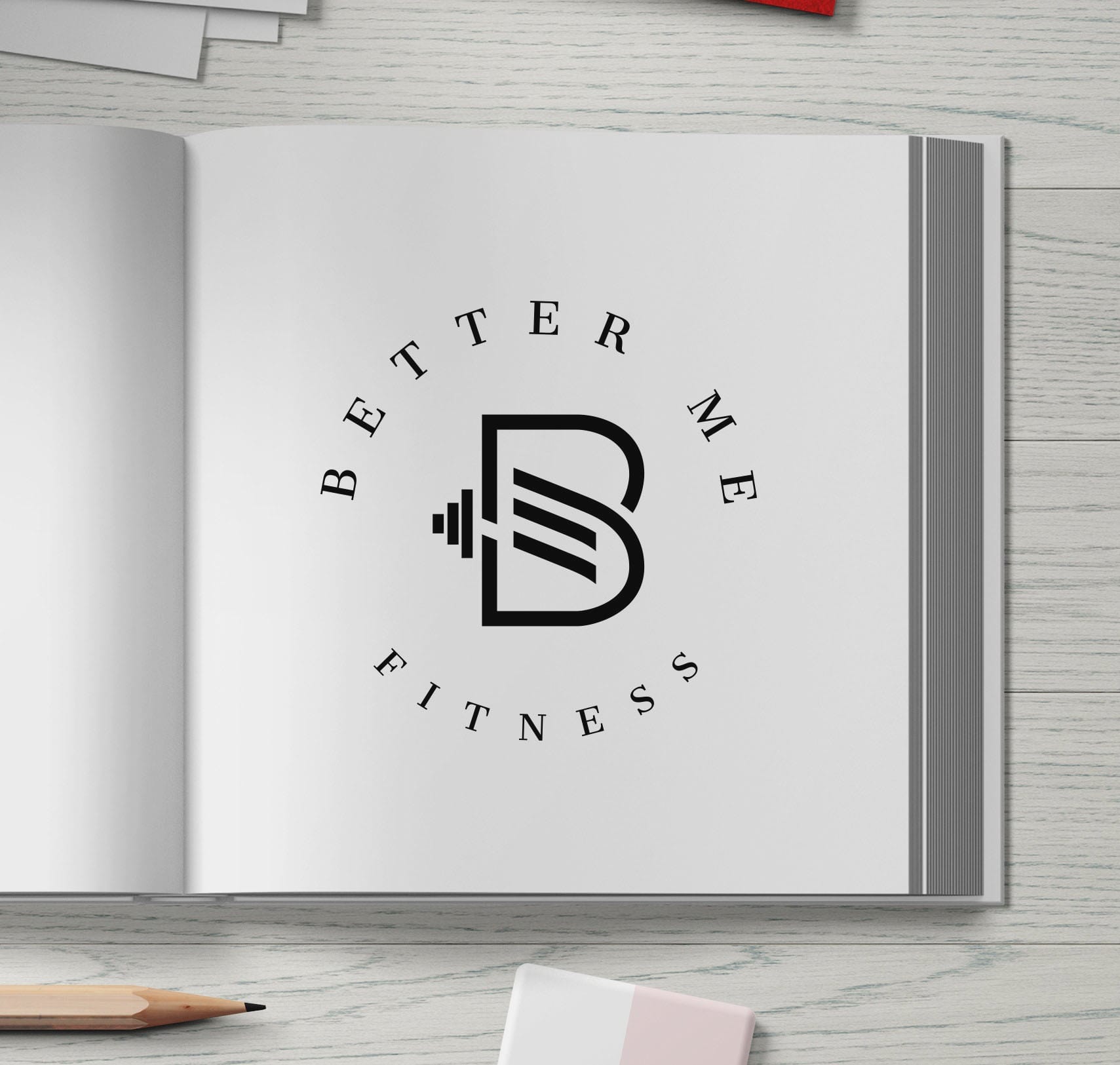
The iterative process continued with the design team meticulously adjusting the logo's proportions. The spotlight was placed on the bold 'BM', ensuring it drew the viewer's attention. Concurrently, the text 'Better Me Fitness' was rendered in a less prominent font, adhering closely to the client’s request for a visible yet understated presence.
Final Approval and Real-world Application
The project concluded with the client approving the final design, a sleek, bold logo that realized their vision of merging philosophical elements with practical design. This logo now graces Better Me Fitness apparel and equipment, standing as an emblem of personal empowerment and excellence.
In conclusion, Better Me Fitness's journey to redefine its brand identity is a testament to the transformative power of thoughtful design. The brand not only reinforces its mission of self-improvement but also stands as a unique voice in the crowded fitness market, promising an amplified experience for its clients.
Start your brand journey today.
