The New Era of Strength: Rebranding FD Fitness
Discover the design journey behind FD Fitness's rebranding and how a modern logo encapsulates timeless strength.

In a world where fitness meets identity, FD Fitness emerges as a brand that seeks to redefine the landscape with a compelling new logo design. The journey of its rebranding is not just a story of visual transformation but an exploration of how design can encapsulate the essence of a business while appealing to its core audience.
Based in the vibrant city of fitness enthusiasts and athletes, FD Fitness has always understood the power of a strong brand identity. However, as the need to resonate with a broader audience grew, so did the desire to update its logo—a visual emblem meant to inspire strength, endurance, and timelessness. The company sought something fresh and modern, yet rooted in the ethos that 'Power is ageless.'
The Logo Design Challenge
The design brief for FD Fitness was straightforward yet ambitious. The logo needed to be noticeable across workout gear, with a color palette of blue and white to evoke feelings of trust and professionalism. There was no reference logo, which left the canvas wide open for creativity and innovation.
Design Team's Exploration
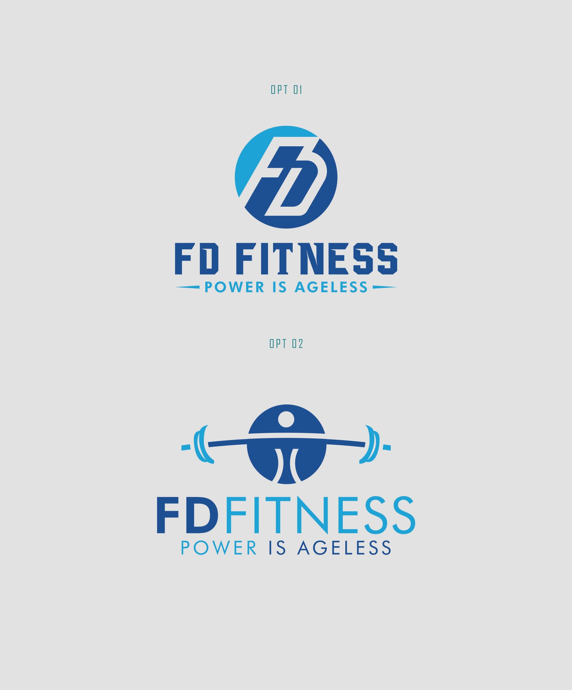
The design team embarked on crafting a logo that would embody FD Fitness's core values. They delivered two distinct options, each carefully considering how the logo would be perceived on athletic gear.
The design iterations sought to balance contemporary aesthetics with timeless strength. Using the calming and reliable blue palette, they enhanced the logo's ability to project power and serenity in equal parts.
Choosing the Right Symbol
Ultimately, the client selected Option 1. It was an emblematic choice that resonated deeply with the brand's message of ageless power, encapsulating both dynamism and stability. This choice also highlights the ability of well-considered design to speak volumes without uttering a word.
Typography in Design
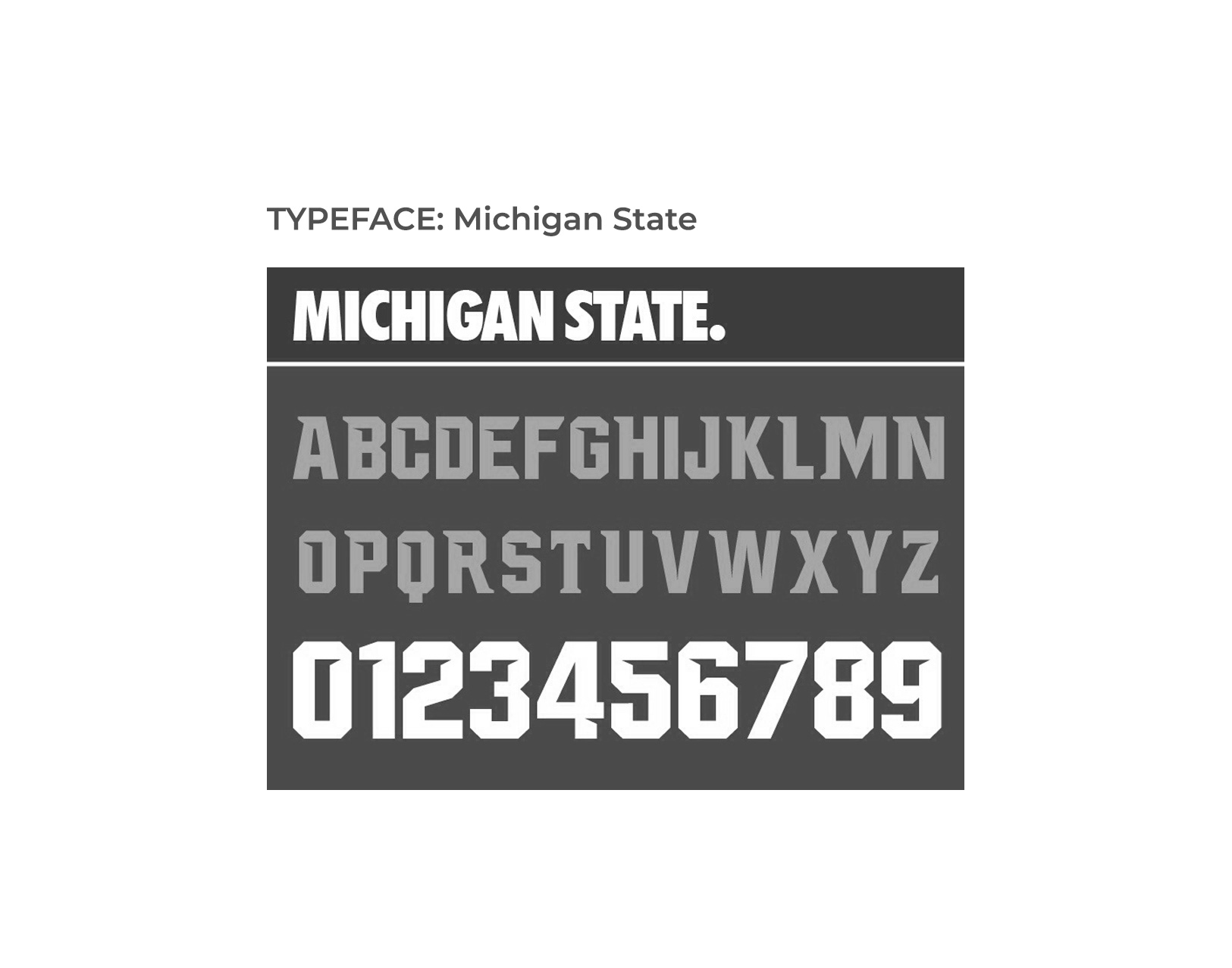
The approved font, 'Michigan State,' was a deliberate selection to complement the brand's visual language. Known for its robust yet elegant lettering, the font provided a perfect match to the intention behind FD Fitness's image.
The Final Unveiling
The final deliverables showcased the logo in various contexts, each embodying the spirit of the brand. From apparel to everyday items, the logo seamlessly fit into every aspect of a fitness enthusiast's life, reinforcing brand recognition through consistent and thoughtful design.
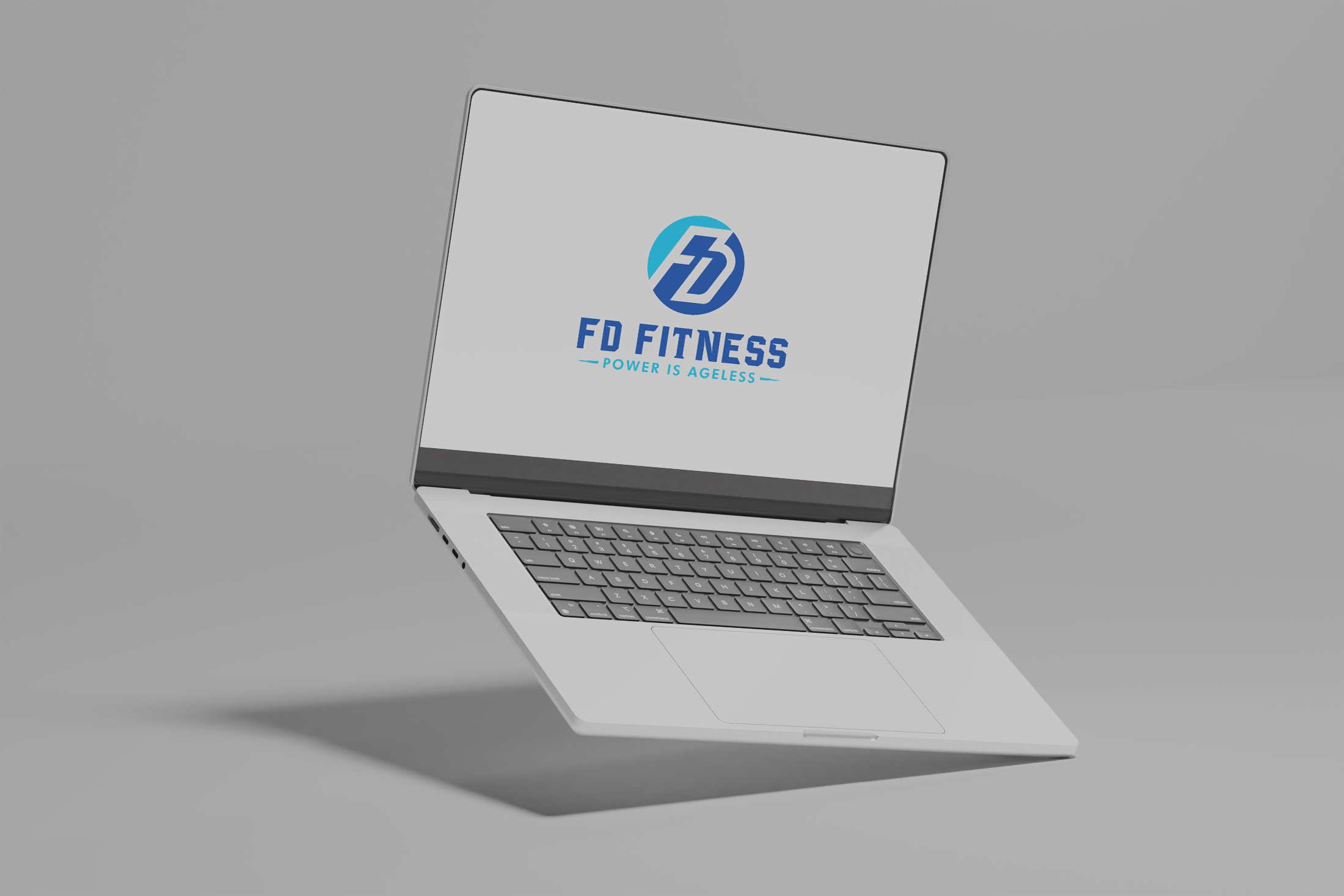
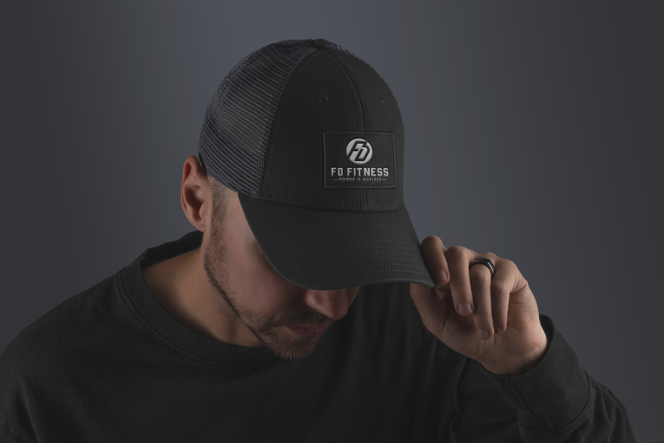
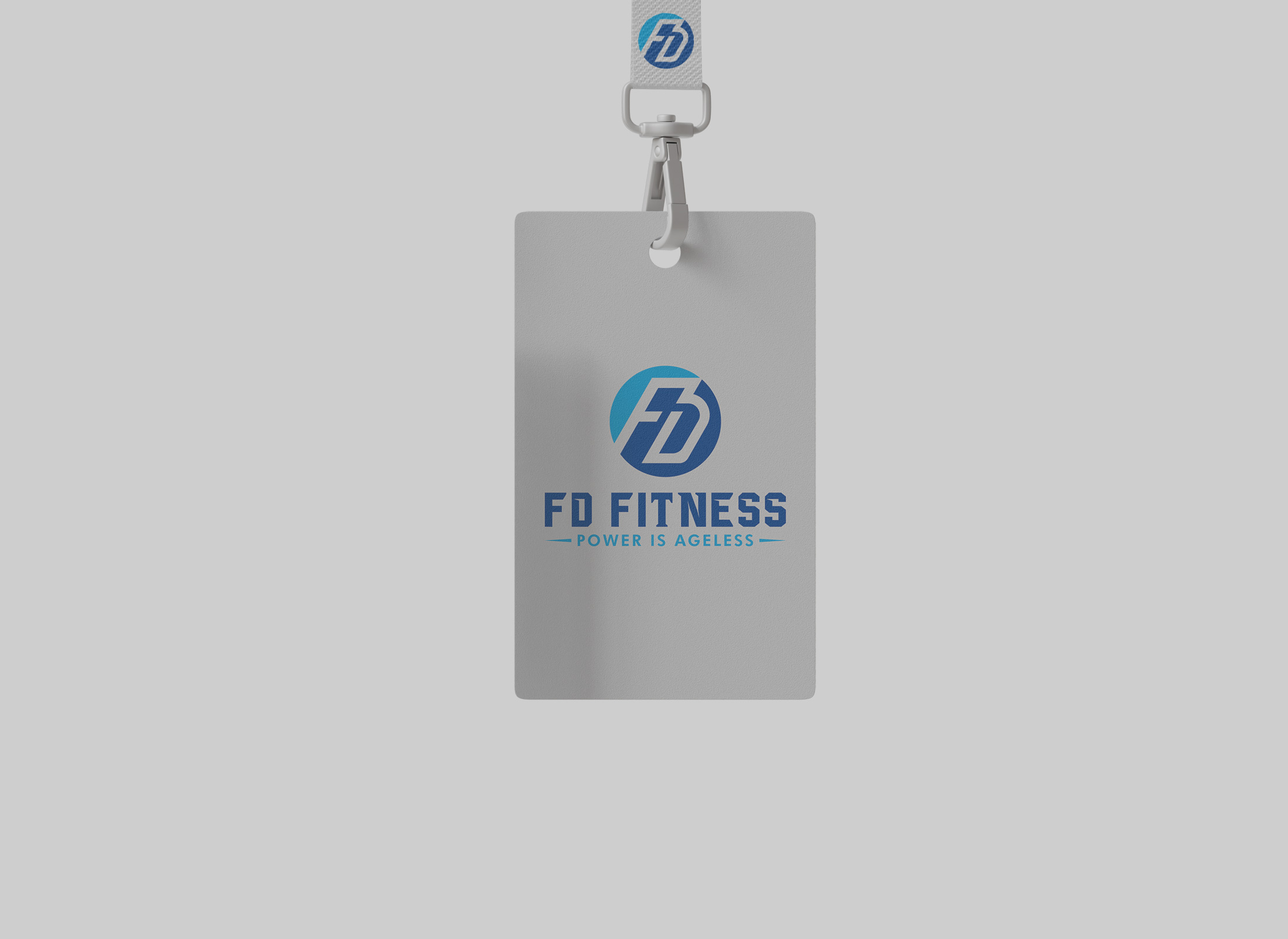
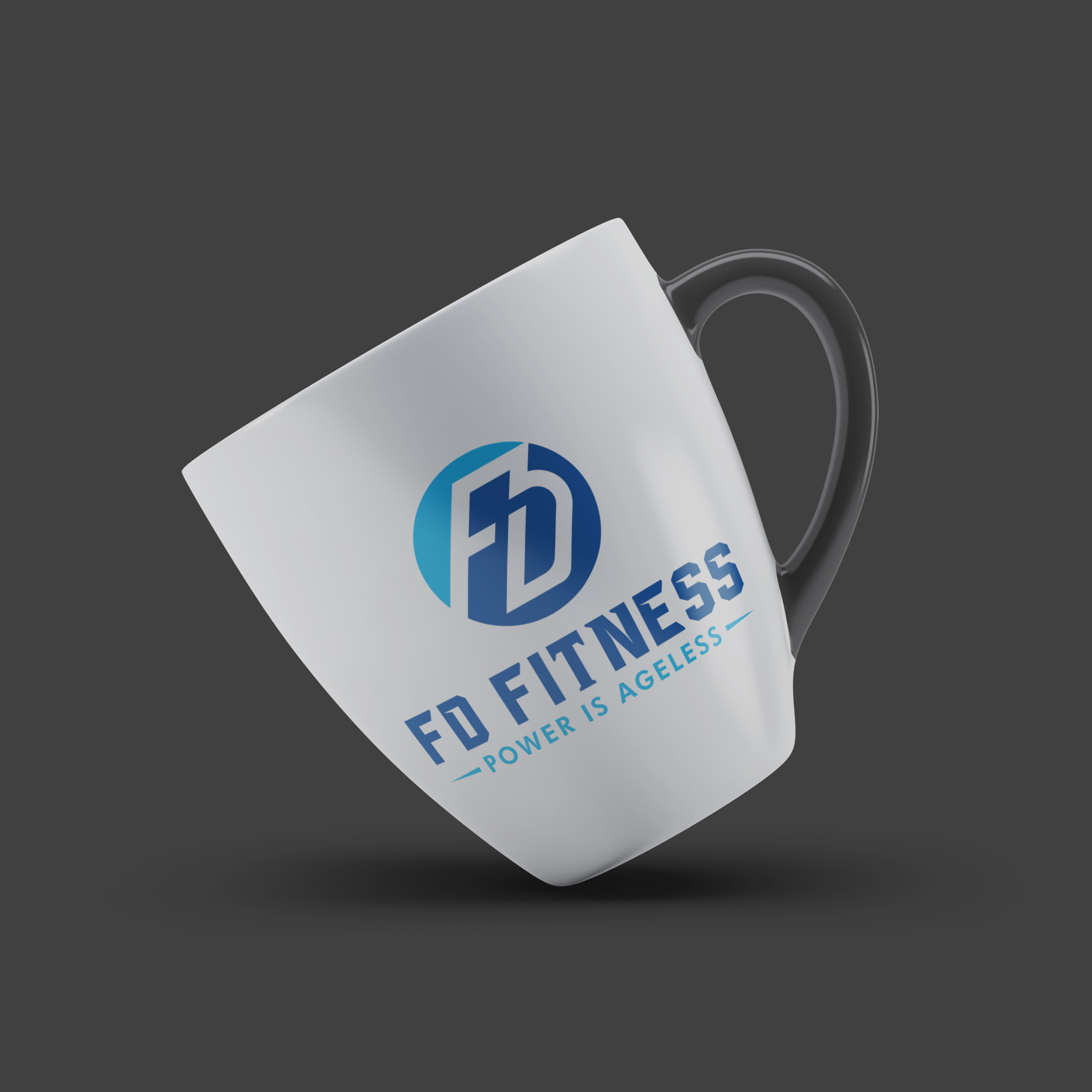
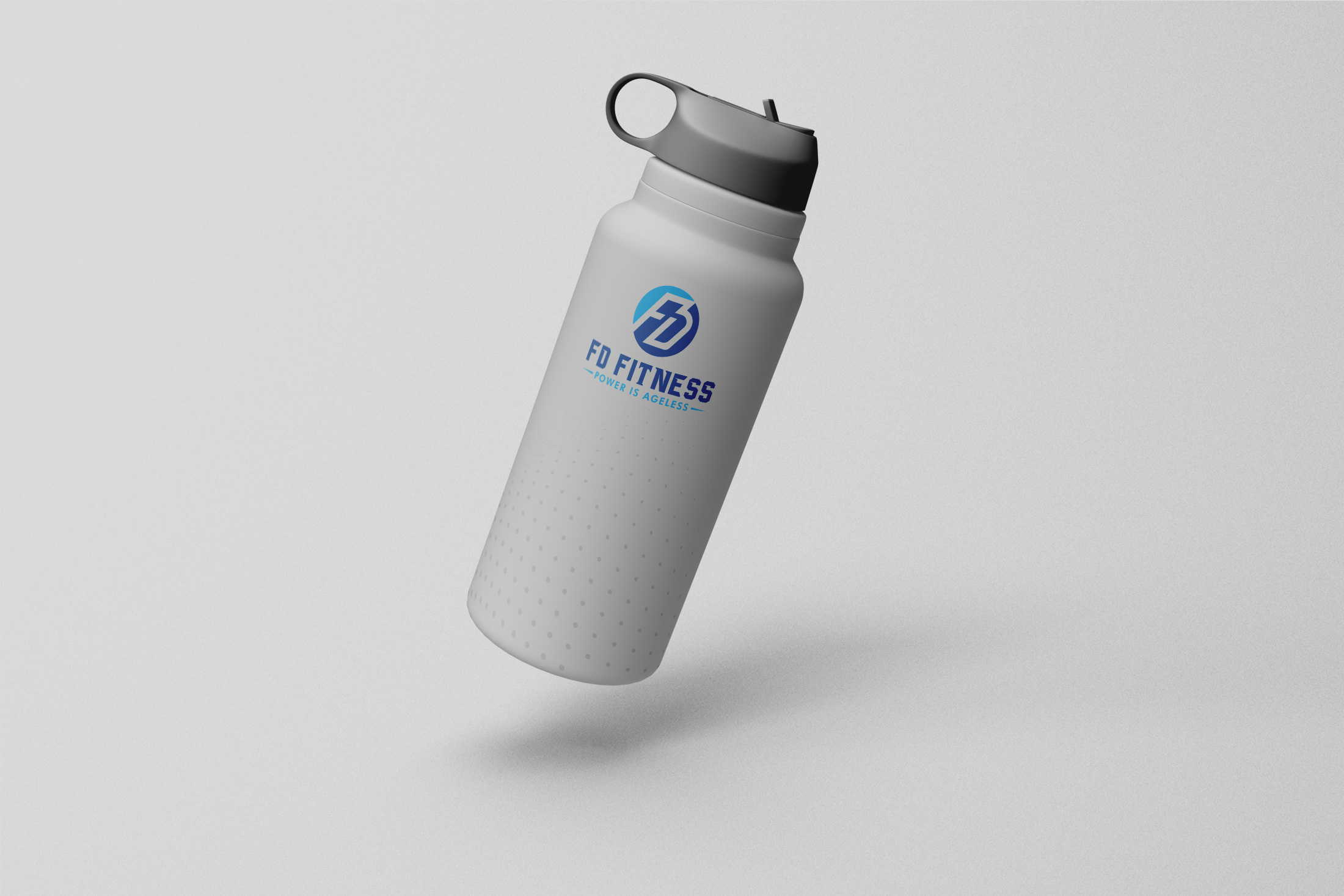
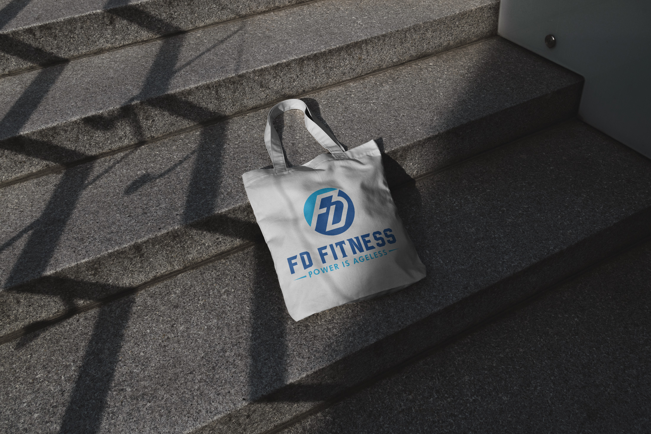
FD Fitness's new logo is a testament to strategic design. It seamlessly blends the philosophy that strength transcends age with practical elements to enhance recognition and appeal in the competitive fitness market. Brand design, much like physical fitness, is a journey of evolution, reflection, and refinement.
Start your brand journey today.


