The Metamorphosis of Team Legacy: A Visual Tale of Financial Empowerment
Explore how Team Legacy reshaped its logo to embody financial empowerment with a feminine touch, setting a new standard in the industry.
In the ever-evolving world of financial services, where the stakes are as high as the expectations, branding plays a pivotal role in conveying the essence of a business. Team Legacy, a burgeoning financial service provider, recently embarked on an aesthetic journey to reshape its visual identity. This metamorphosis was driven by the ambitions of its founder, Isabel Carrasco, a leader in her field whose name itself is synonymous with impact, unity, and wealth.
A Feminine Yet Professional Aesthetic
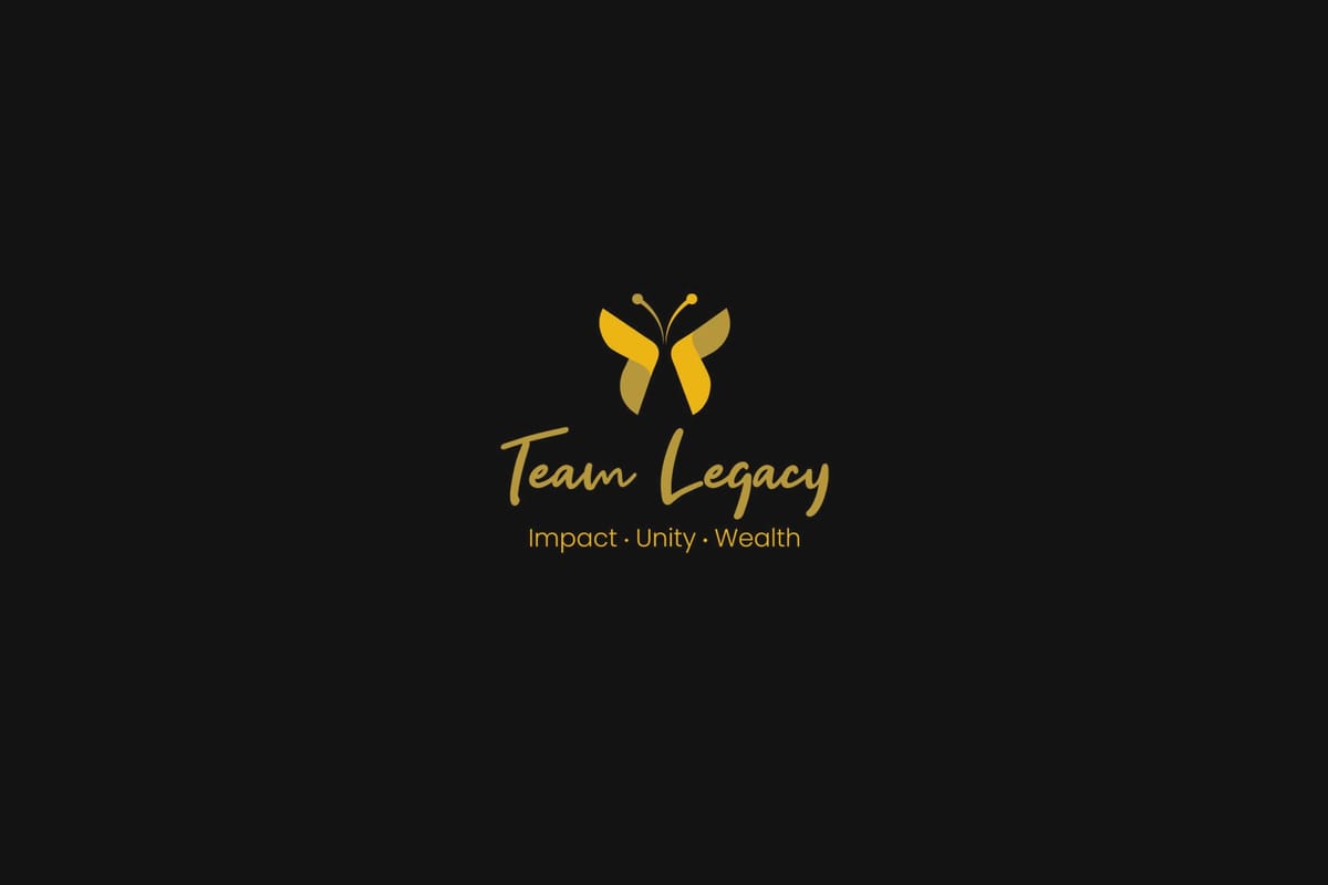
The brief was clear: create a logo that blended femininity with professionalism, embodying the attributes of a strong businesswoman. Central to this was the inclusion of a butterfly, a symbol of transformation and grace, without it being a distraction. The color palette selected included pinks, purples, fuchsia, and gold, offering a delicate yet luxurious feel.
The Initial Design Process
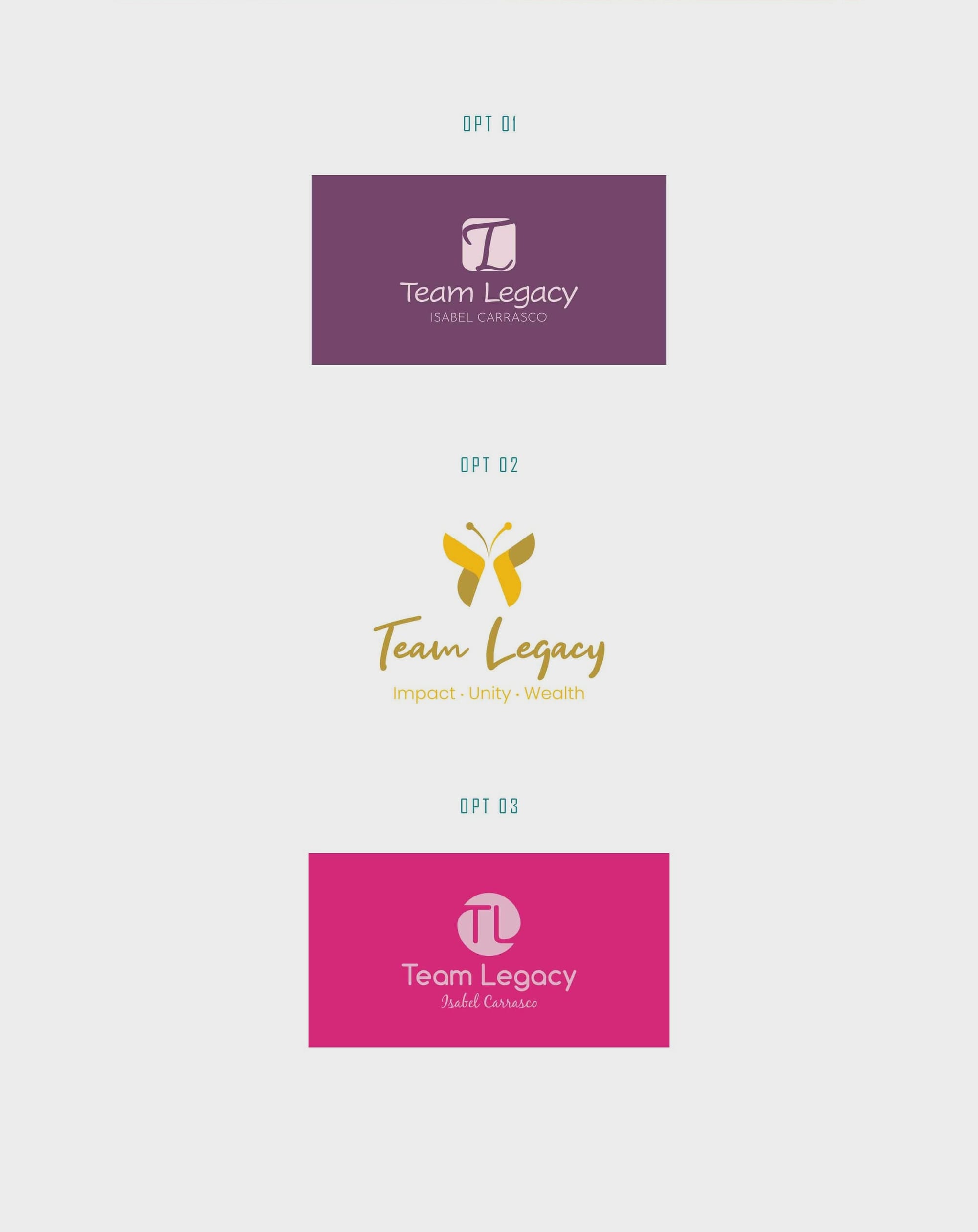
The design team presented the first round of logo options with variations depicting the name 'Team Legacy' in cursive type, embracing the elegant curves preferred by the client. One design prominently featured a butterfly, aligning well with the brief. The options were designed to be soft yet commanding, capable of encapsulating the ethos of financial empowerment with elegance.

Refining the Vision
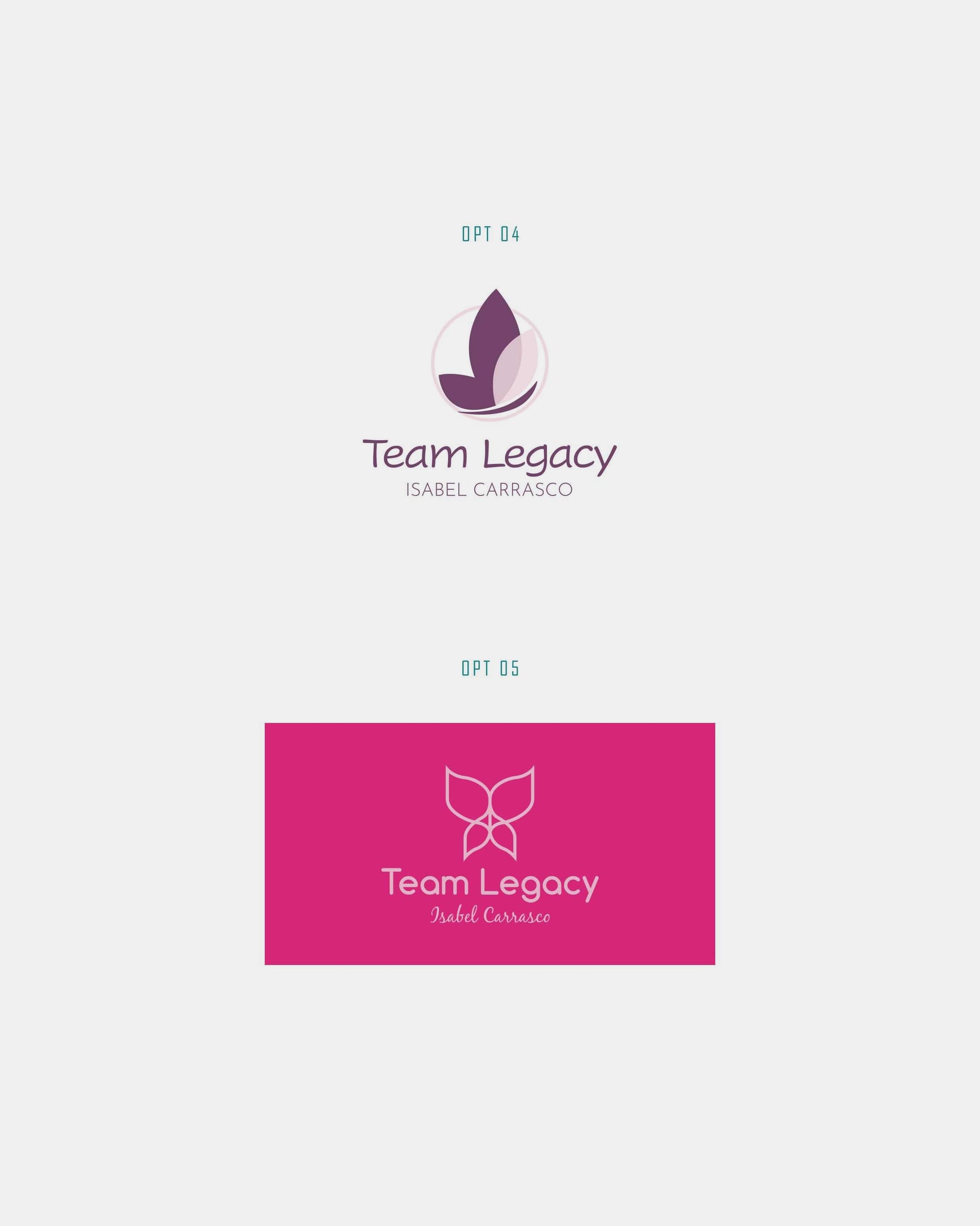
Feedback from the client led to a direction where more designs were iterated upon to include the butterfly. The initial versions were re-evaluated, and alterations were made to incorporate this crucial element in subtle, non-dominant ways. The challenge remained in maintaining the overall harmony between the imagery and the typography.

Color and Typography
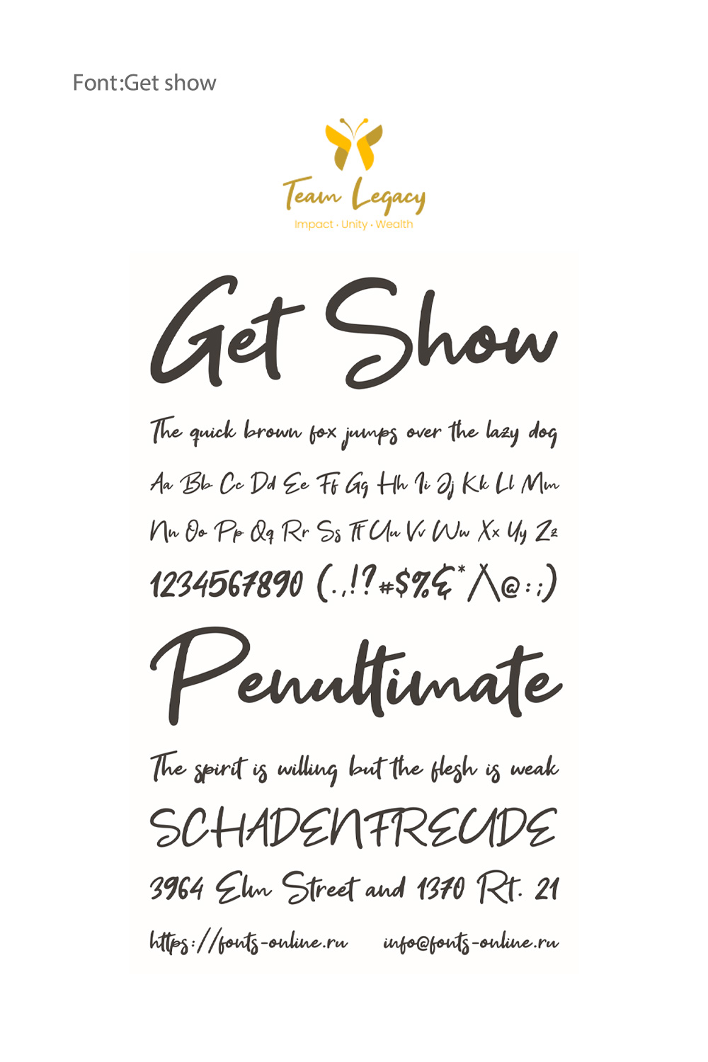
In an attempt to fulfill the allure of sophistication as requested by the client, the choice of typeface was pivotal. The final logo employed the 'Get Show' font, known for its legible cursive form. This font fluently weaves the brand’s name with a sense of elegance while preserving clarity. In one mock-up, the colors of the butterfly were adjusted to showcase combinations of purples and fuchsia, instilling dynamism within the design. Variations led the typographic color to follow suit, aligning with the hues of the emblem.
The Final Embodiment
The final logo stands as a confident representation of the brand’s spirit modern yet enduring, simple yet meaningful. Its refined form ensures adaptability across digital and print platforms, while its design language conveys strength, credibility, and vision. More than just a logo, it is a story in symbol form a visual statement that embodies the brand’s journey, purpose, and promise for the future

Mockups: Bringing Design to Life
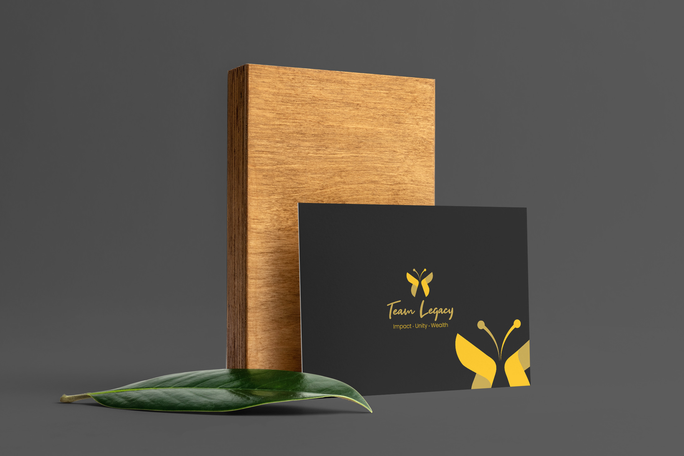
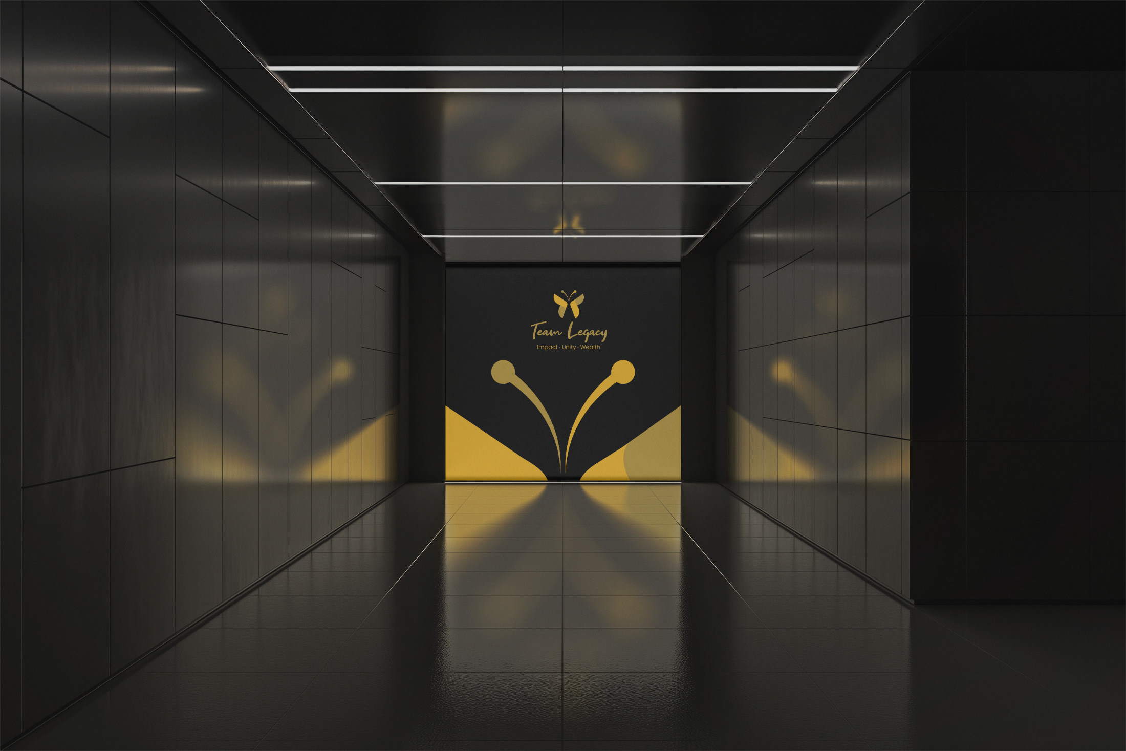
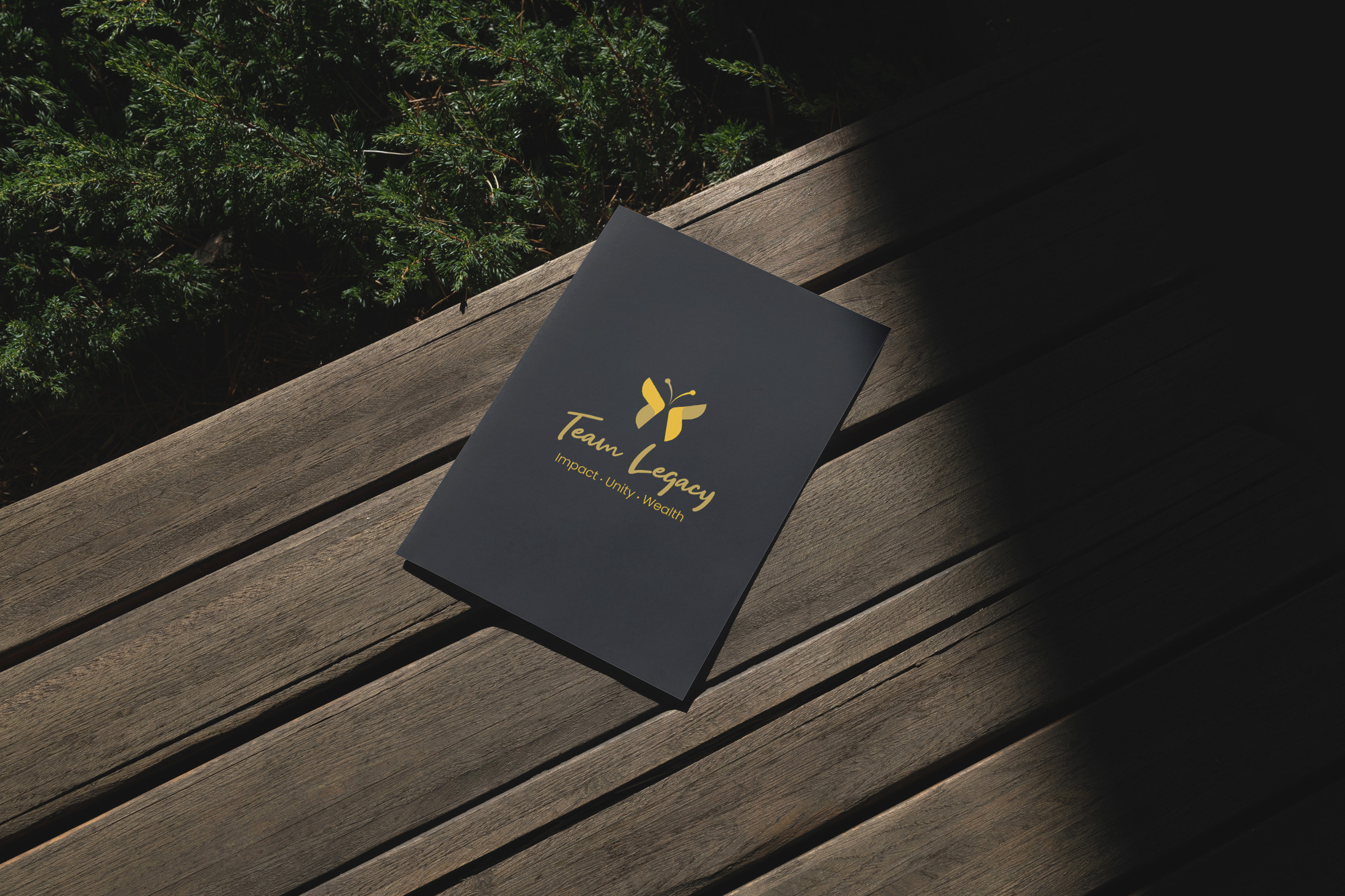
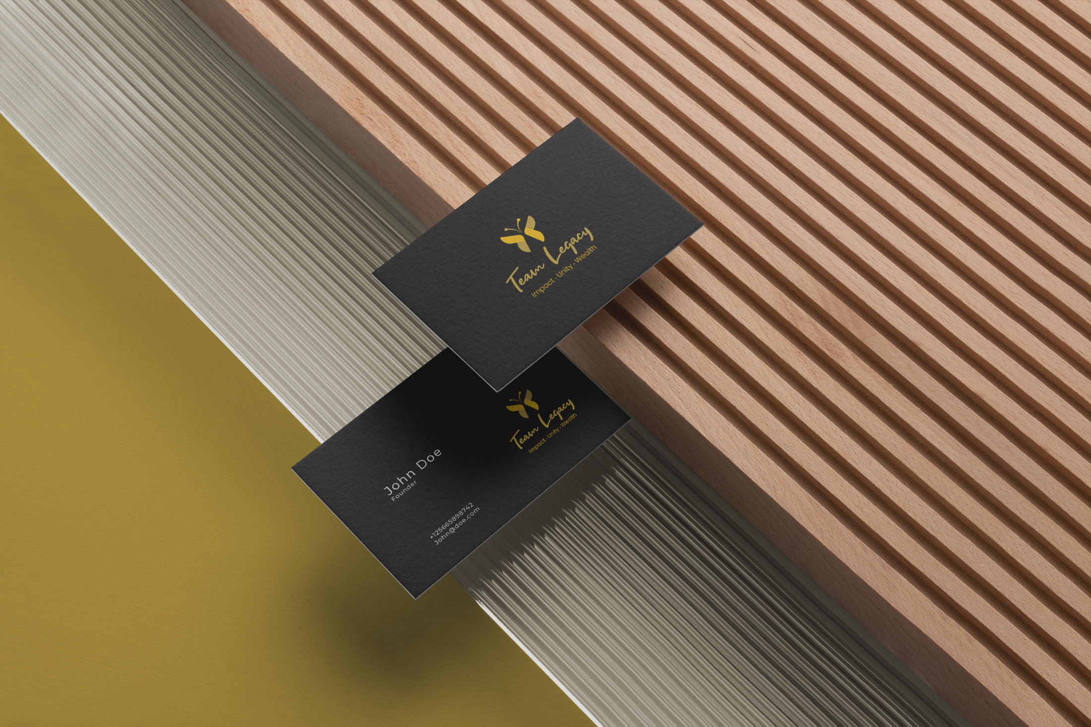
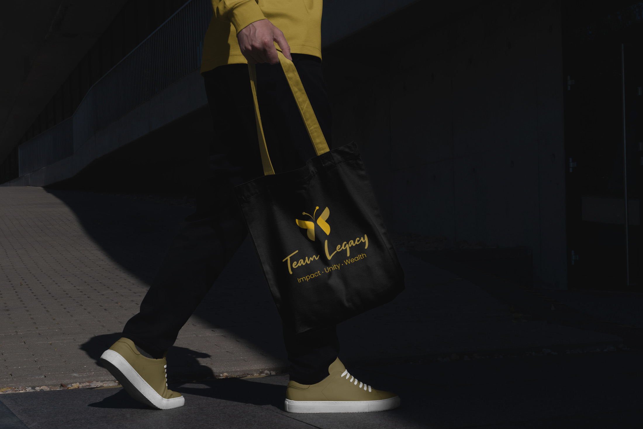
As the saying goes, 'a picture is worth a thousand words'. This sentiment reverberates in the mockups reflecting the logo's placement on diverse platforms, each contextually enhancing the brand’s sophistication. The final mockups capture the brand's charm across various mediums like tote bags, t-shirts, and billboards, offering a holistic view of its applicability in real-world scenarios.

Conclusion
In the world of finance, where strength and sophistication are coalesced, the visual narrative of Team Legacy triumphantly expresses a brand’s voyage into its true essence. Seamlessly marrying design with identity, this project stands as a testament to how thoughtful design can effectively communicate a brand’s ethos while paving the way for its clients to feel understood and empowered.
Start your brand journey today.

