Templum: The Art of Crafting a Divine Identity
Explore Templum's journey in crafting a logo that intertwines sacred temple symbolism with the elegance of the cosmetics industry, creating a brand both timeless and luxurious.
In the world of branding, few projects harmonize historical reverence with modern aesthetics as gracefully as Templum. The fledgling cosmetics company, whose name is derived from the Latin word 'temple,' conjures images of sacred spaces and divine beauty. This evocative naming choice provided a thematic blueprint for the design team tasked with forging the brand's visual identity.
Understanding the Brief: A Temple of Beauty
Templum, a nascent venture in the cosmetics industry, sought a logo that embodied the sanctity and elegance implied by its name. The client's request centered around incorporating a pyramid or triangle, elements that symbolize the architectural grandeur of ancient temples. Gold, brown, and earth tones were highlighted as the preferred color palette, alluding to the natural elegance and timelessness of temple architecture.
With their inspiration set by the historic Temple of the Moon in Teotihuacan, Mexico, the client desired a logo that integrated these elements with the brand name 'Templum' in an extended font style, suggesting an air of sophistication and luxury.
The Creative Exploration
The design team embarked on this creative journey by illustrating a series of initial concepts that visually interpreted the brief. The first round of designs drew inspiration from the geometrical precision and symmetry often found in sacred architecture.
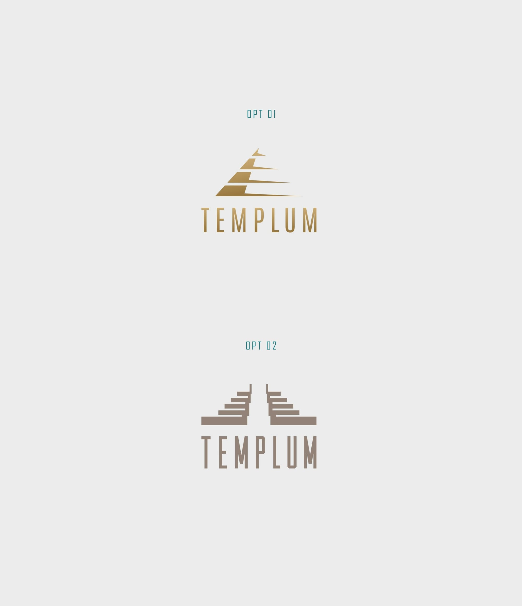
Each design offered a unique interpretation, from an iconic pyramid silhouette accentuating the typography to subtler integrations of triangular motifs within the letterforms themselves. The responses celebrated the mystique and majesty inherent in the concept of temples.
Design Refinement and Client Feedback
The client, captivated by the initial presentations, swiftly gravitated towards the first design. This choice balanced elegance with boldness, featuring a stylized pyramid that soared above the brand name Templum, crafted in a refined typeface.
The chosen design's strength lay in its minimalistic representation of a temple's form juxtaposed with the clean, elongated font, embodying the tranquil yet majestic ethos of the brand.
Typography: The Significance of Choice
The selected font, Antonio, is a sans-serif typeface known for its clean lines and elegant proportions. This choice resonates with Templum's narrative, providing a modern yet classic feel that complements the brand's thematic inspirations. Antonio's structured formality and style imbue the brand with a distinguished, accessible aesthetic.
The Final Reveal: A Testament to Sacred Beauty
The culmination of these efforts is a logo that pays homage to Templum's aspirations as a brand and the philosophical roots of its namesake. The finalized design uses gold gradients and earth tones to convey a sense of opulence and warmth.
Upon release, the visual identity of Templum manifests across various brand touchpoints, each iteration reinforcing the synergy between Templum's mission and its symbolic iconography. The brand logo adorns everything from product packaging to business cards, encapsulating the essence of divine beauty.
Final Thoughts
Templum stands as a testament to how thoughtful branding can capture the client’s vision and elevate their business narrative. In merging the sacred and the luxurious, Templum has found its place as a guardian of beauty, where every application of their products serves as a ritual. Through careful consideration of history, form, and color, the design successfully instills an almost reverential regard, echoing the core belief that in beauty, as in temples, the divine resides.
Start your brand journey today.
