Summit Naturals: Crafting an Identity for Nature's Best
Explore the journey of branding Summit Naturals, a company blending simplicity with nature's essence for the modern consumer.
In today's bustling world, where the pursuit of health and tranquility intertwines with the demand for authenticity, the name Summit Naturals rises to the fore as a beacon of hope for wellness enthusiasts. Emerging in the natural supplements industry, this brand embraces the ethos of pristine simplicity, rooted in the mountainous allure that its name evokes. But how does one encapsulate the essence of nature in a logo? Let's unpack the journey that transformed Summit Naturals from a concept into a visually compelling brand identity.
The Foundation of Natural Brand Evolution
Understanding the industry context Summit Naturals operates in is crucial. The market for natural health products has been seeing a steady climb. With a consumer base that increasingly values organic and sustainable products, the need for branding that communicates purity becomes ever more critical. Located in a region where the natural beauty of landscapes inspires tranquility, Summit Naturals aspires to capture this ambiance in a brand that feels both fresh and grounded in nature.
Client Vision and Design Direction
The initial client briefing furnished a canvas colored by a clear vision: a clean, simplistic logo that is easy to read and encourages purchasing intent. With a slogan of “Find your peak”, the brand aims to invite consumers to reach their best selves through natural means. The preferred palette of blueish-green tones was naturally suggestive of seas, mosses, and the vast outdoors.
Initial Creative Offerings
The design team's initial proposals presented two distinct options. The first, a conceptual representation of a summit with stylized peaks. The second option, which eventually won the client’s approval, was a refined design imbued with elegance and an organic charm. This design effortlessly conveyed a sense of height and aspiration, aligning symbolically with the brand’s narrative of natural peaks.
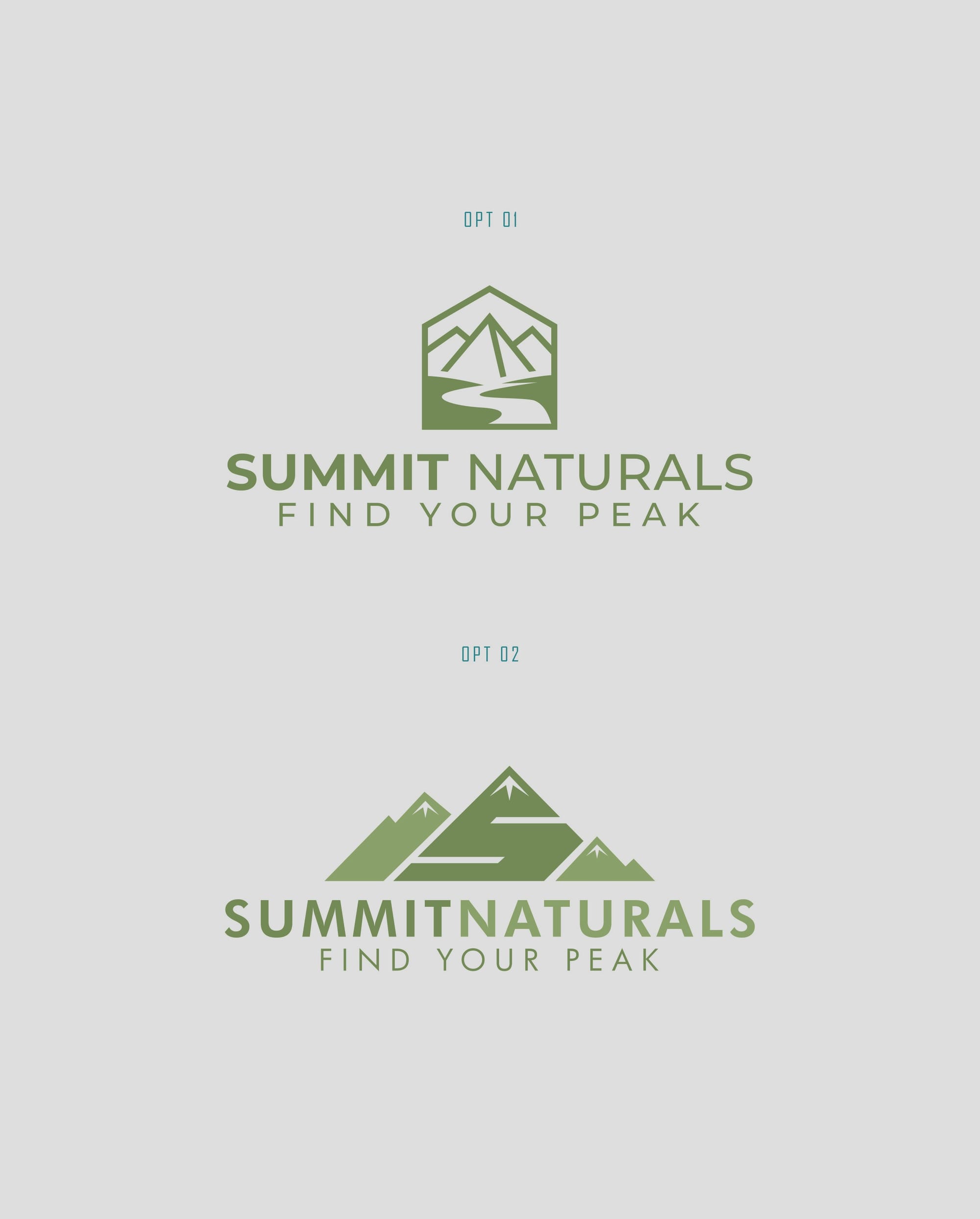
The Chosen Logo and Typography
Option two, the client's favorite, was executed using the Futura typeface. Known for its geometric precision and clean lines, Futura is a nod to the balance between modernity and nostalgia. Such a choice is congruent with the brand’s need for clarity and contemporary appeal. It stands tall, just like its summit inspiration, capable of drawing an audience towards a journey of health and peak wellness.
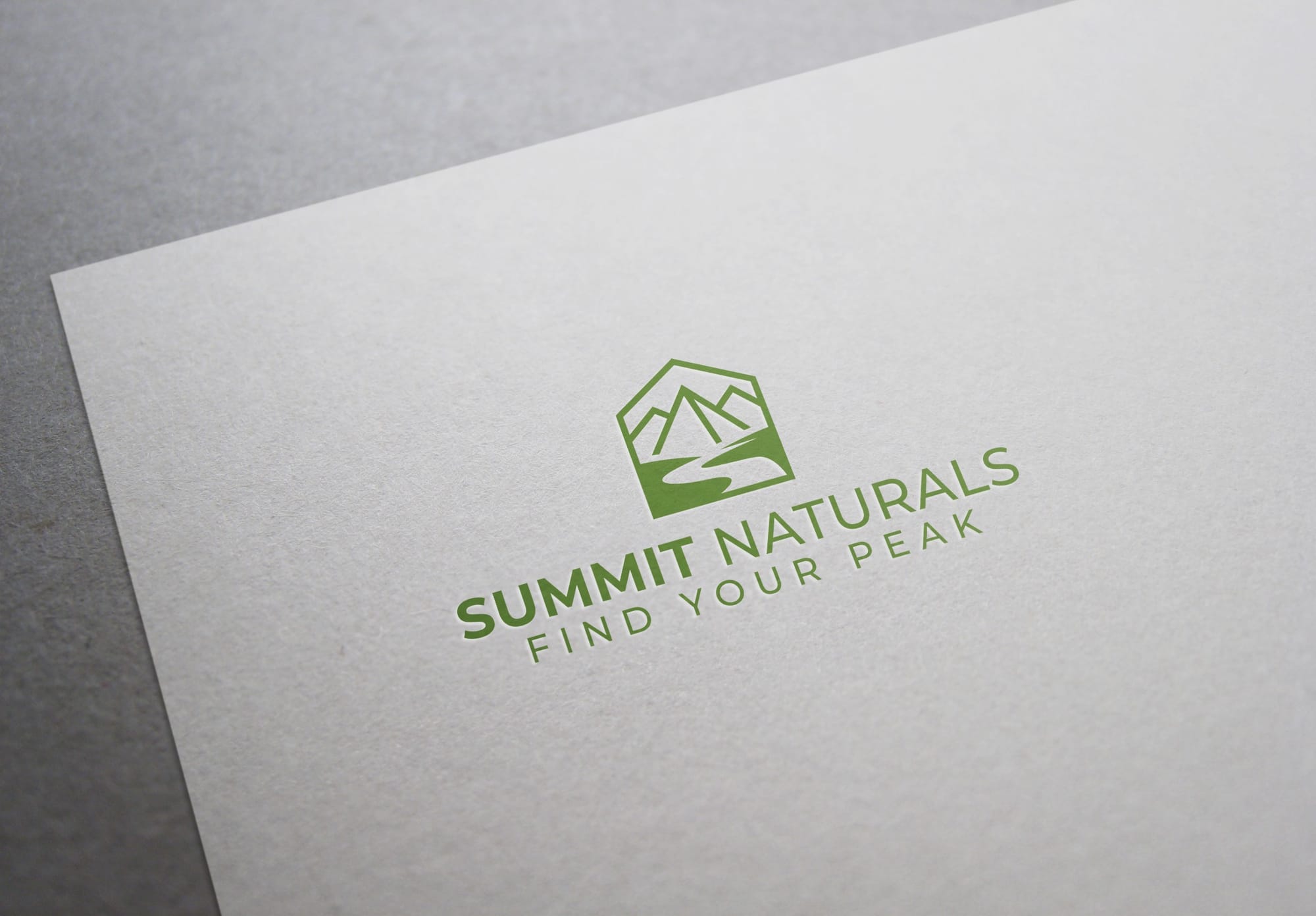
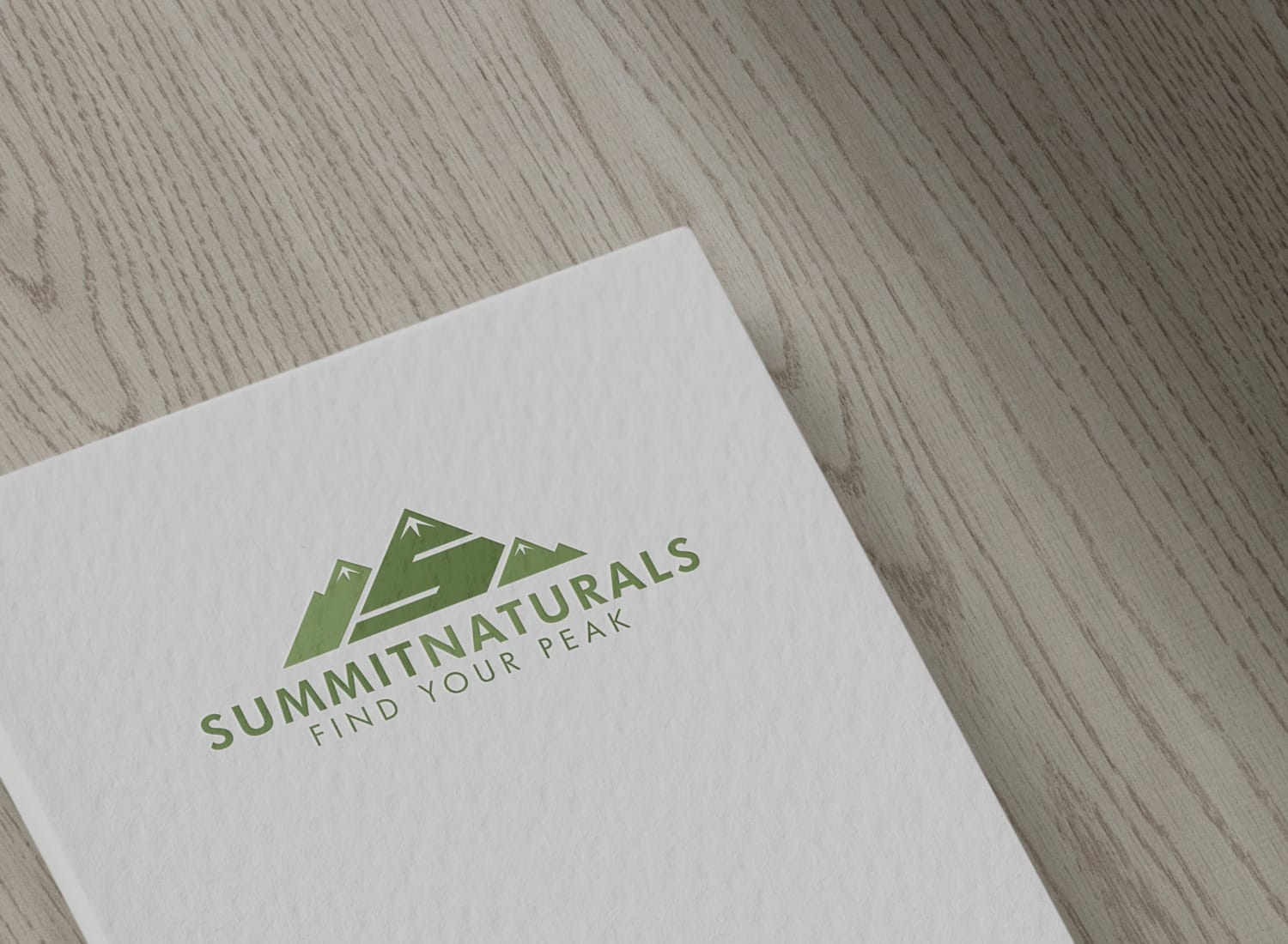
Bringing the Brand to Life
The final logo's real-world applications were demonstrated across various branding materials integral to Summit Naturals' offerings. From packaging bath salts to physical store signage, the logo was designed to scale with the brand’s aspirations of authentic growth and presence in the marketplace.
The Culmination of a Design Journey
Summit Naturals has successfully charted its course in the natural product landscape. With a clear and compelling visual identity, it steps forward as a purveyor of nature’s bounty, providing consumers with an emblem of quality and purity. As they reach their peak, so too does their branding, echoing the serene heights of the natural world. The journey, much like climbing a mountain, starts at the base with a vision and progresses steadily upward to find its summit.
Start your brand journey today.
