Sulit Countertops: Crafting Elegance in Stone Through Rebranding
Explore the rebranding journey of Sulit Countertops, showcasing the evolution from old identity to a refined brand capturing luxury and craftsmanship.
The art of brand identity is as delicate as the patterns found in fine marble, requiring a keen understanding of balance, form, and texture. For Sulit Countertops, a Tennessee-based company specializing in granite, marble, and quartz countertop fabrication and installation, the journey to create a logo that embodies both elegance and craftsmanship became a creative expedition worth recounting.
Understanding Sulit - A Name With Inherent Meaning
The name 'Sulit' carries significant weight. In Filipino, it translates to 'worth' or 'value,' a fitting description for a company aiming to deliver value through finely crafted countertops. However, the company's existing branding did not reflect this deep-seated ethos. The redesign needed to capture the essence of 'Sulit' while providing a visual nod to the natural elegance of the stone craft.
Client's Vision and Initial Concepts
The client approached the design team without any slogan but was enthusiastic about exploring one that reflected the core meaning of 'Sulit.' The color palette of black, white, and red was up for revision, with an inclination towards a more refined terracotta tone. This transformation aimed to convey warmth and sophistication woven into the brand's visual language.

An early mockup revealed a conceptual nod to construction, unintendedly suggesting a building company's identity rather than that of countertop specialists. Feedback was decisive, urging a pivot to a representation more aligned with the elegance and finesse associated with marble slab aesthetics.
Design Exploration - From Concepts to Finalization
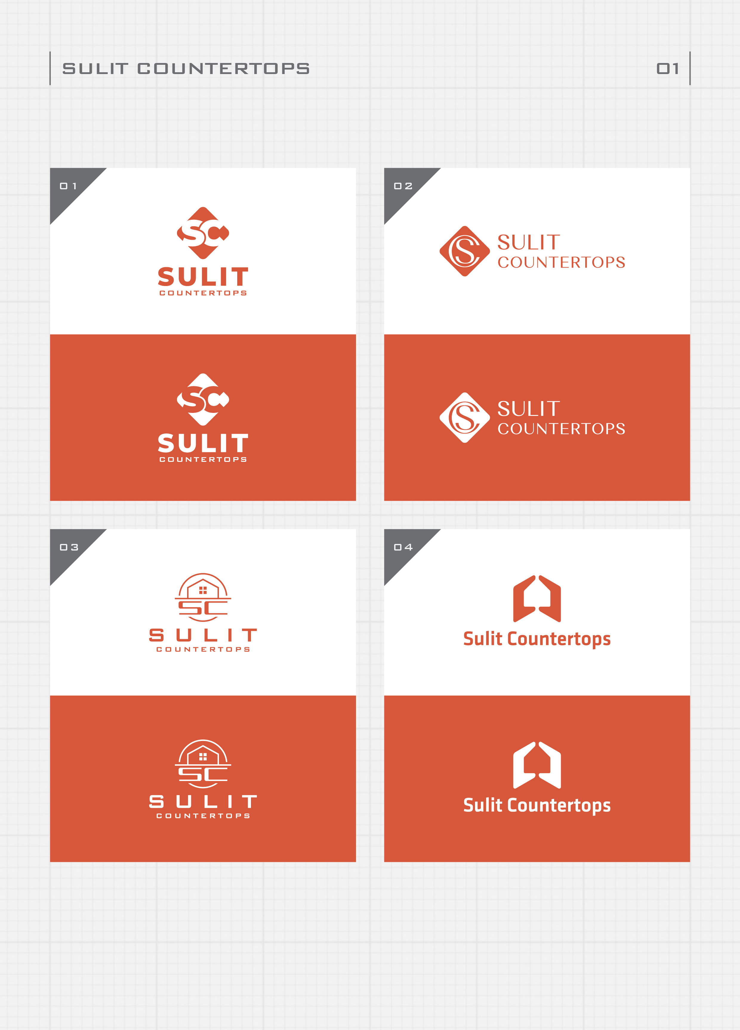
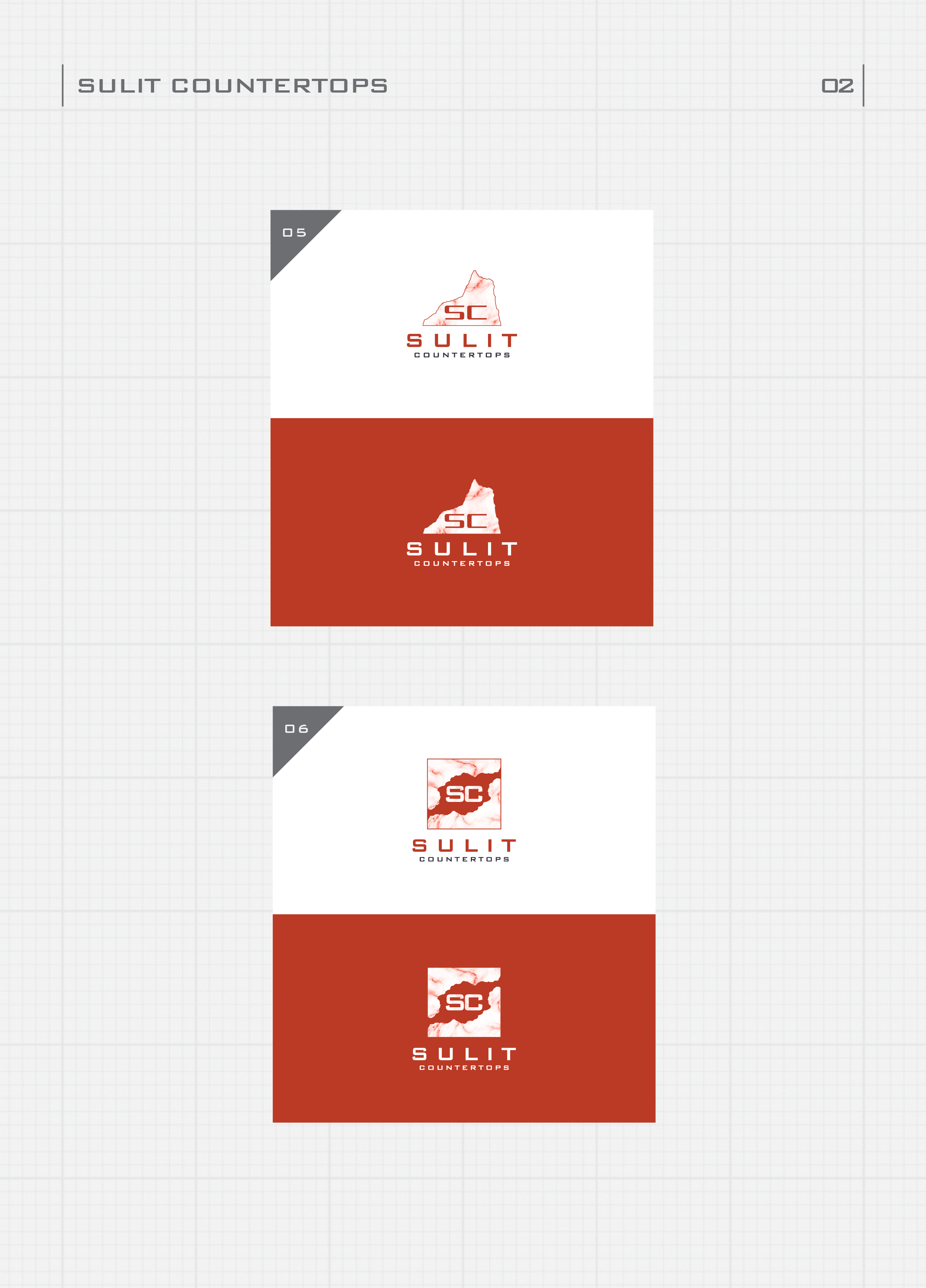
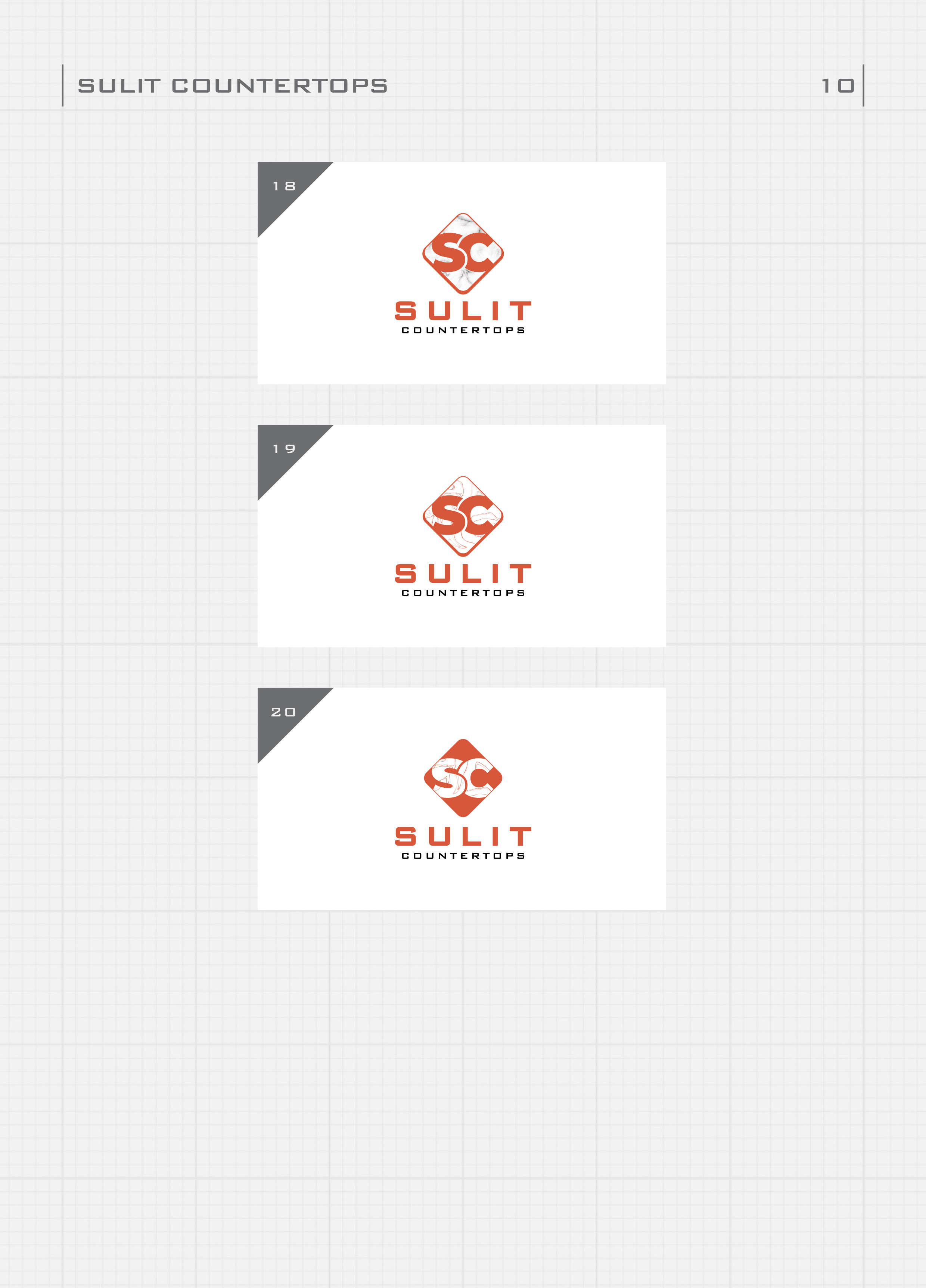
Initial concepts explored variations of initials 'SC' seamlessly integrated with the company's name. The client favored a font that was modern yet timeless, offering a unique blend of distinction and readability. Yet, the logo symbol above the text was reimagined multiple times, requiring iterations that included a visual reference to a marble slab.
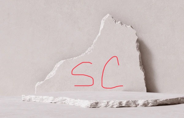
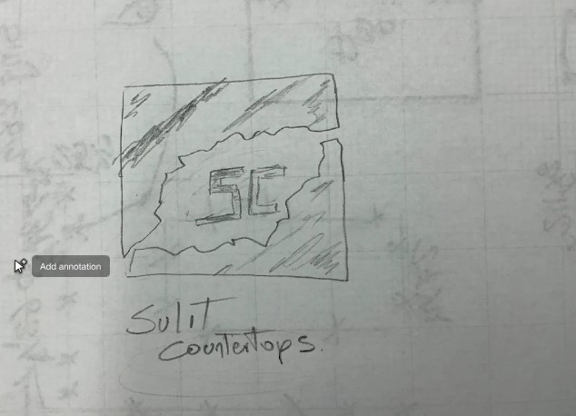
A critical moment of feedback proposed shifting from circular to more rectangular shapes within the logo symbol to emphasize the polished edges of countertops. The client also shared initial sketches, which served as inspiration and a visual anchor for the design direction. In response, the design team developed variations that delicately balanced sharp, geometric cuts resembling stone facets, highlighting precision and craftsmanship, and paying homage to the artistic process in stone fabrication.
Crafting a Defined Identity
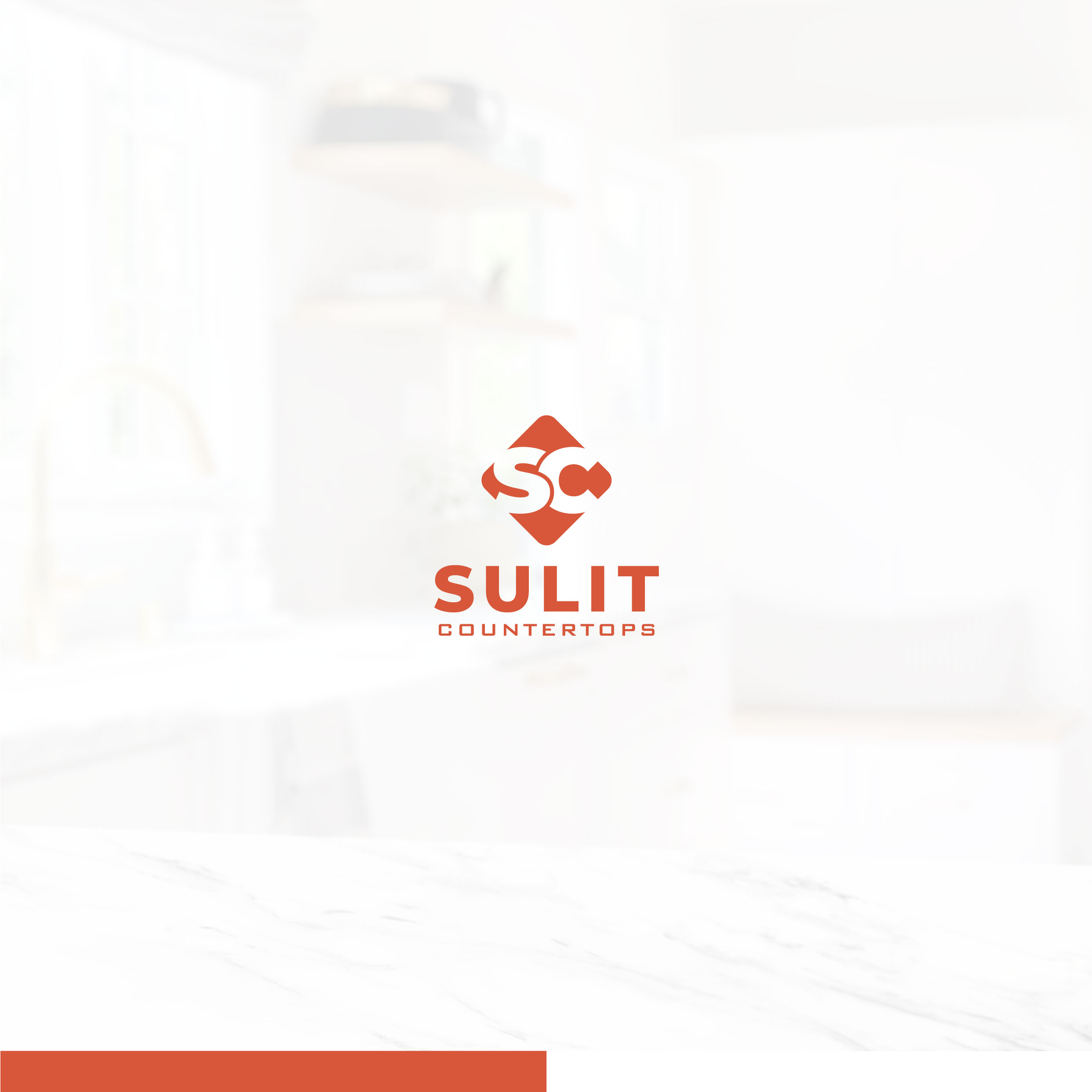
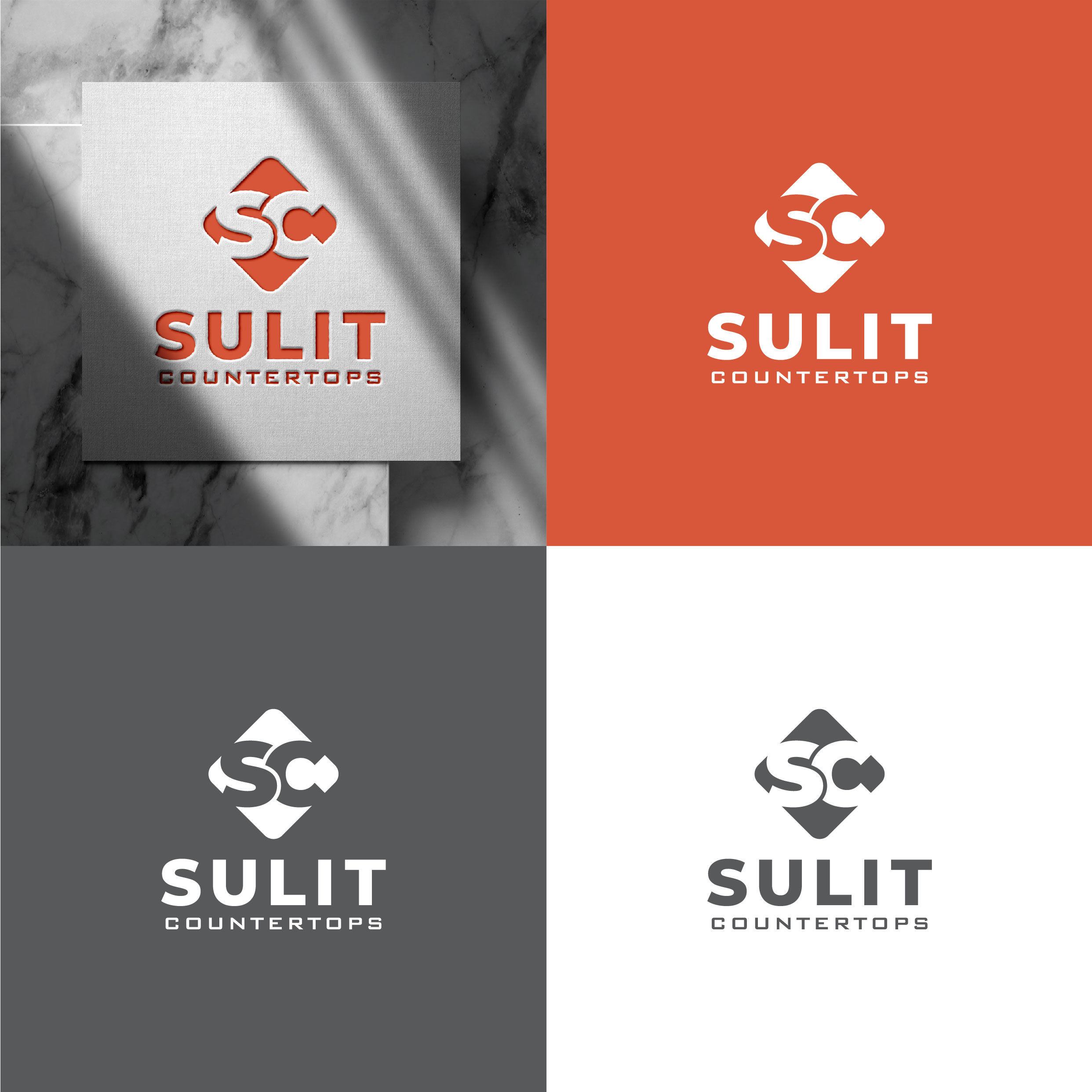
In the final lap of design modifications, exploration focused on color schemes that retained the classic black and white counterpoint, enriched by a bolder red accent. The logo evolved further by removing the symbol's border and considering the play of textures to prevent blending into white surfaces.
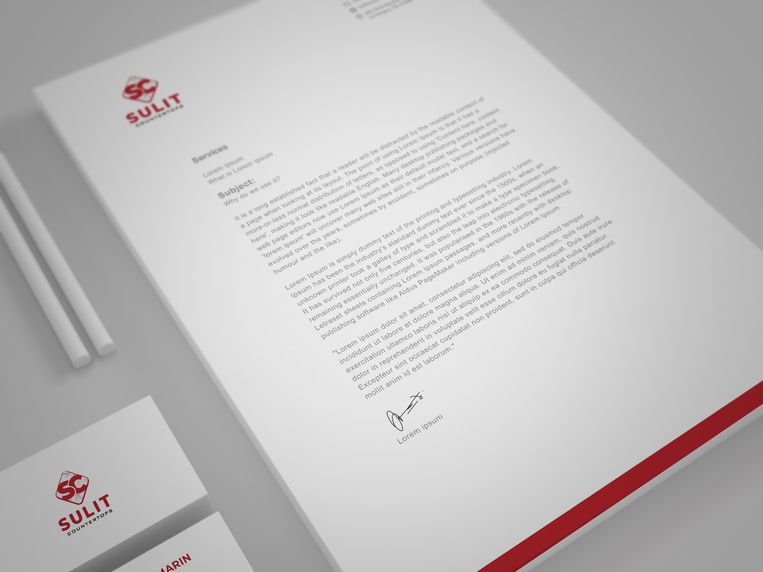
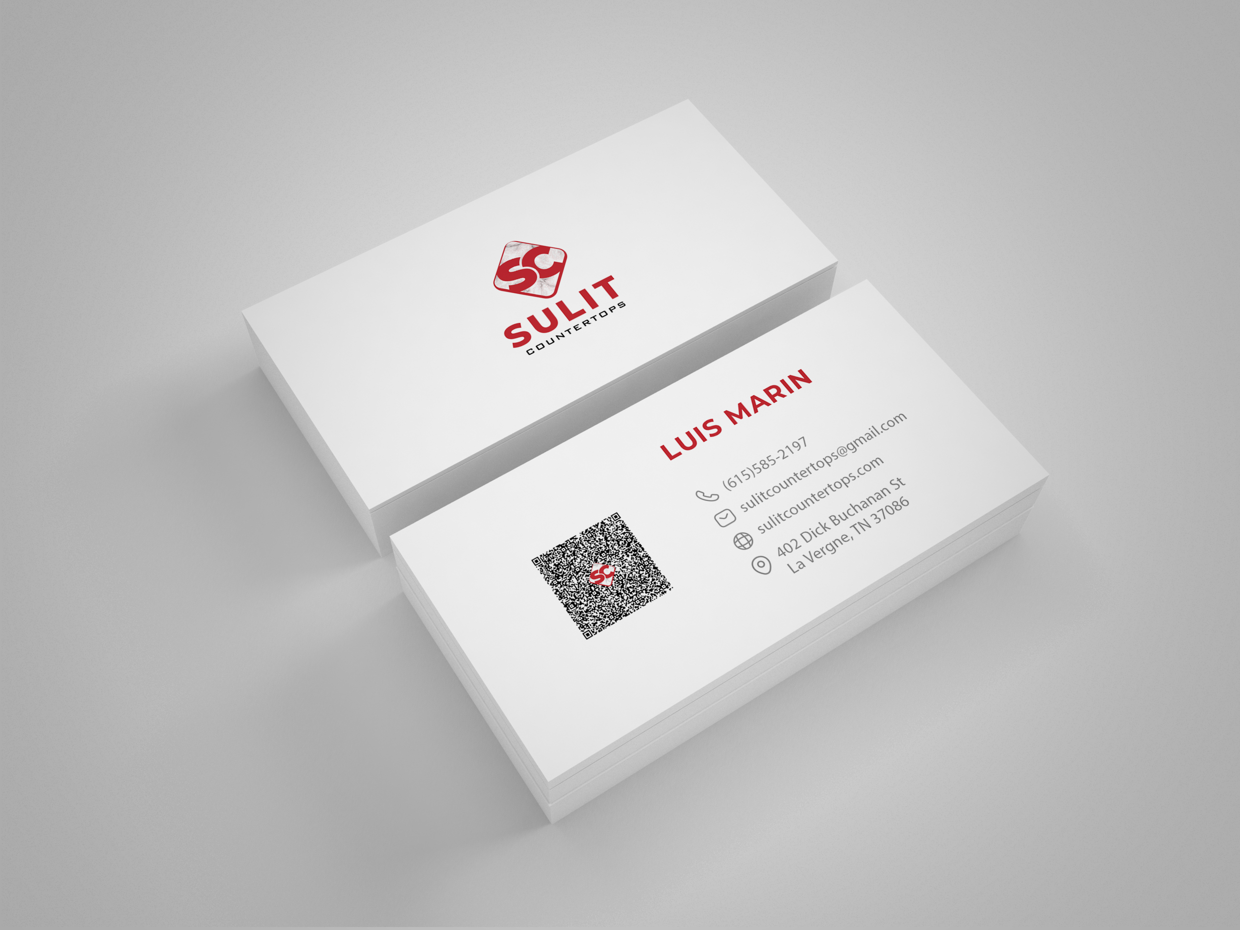
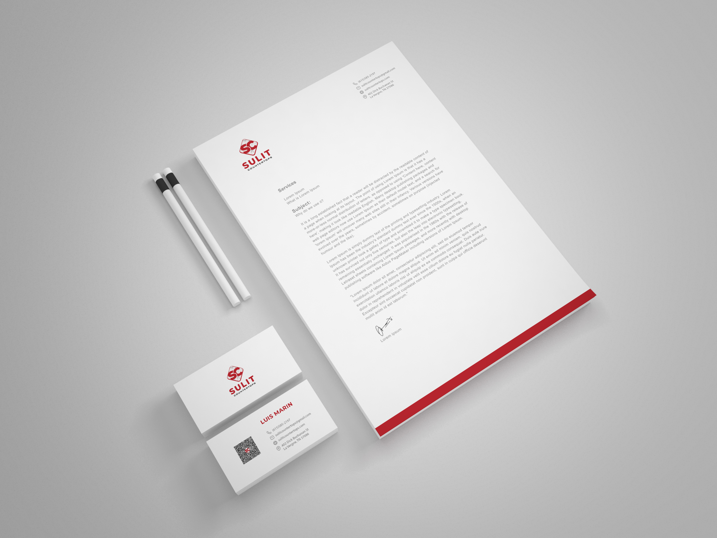
This visual storytelling carried through to practical applications, introducing avenues for QR codes on business cards for a modern touch of accessibility and connection. The resulting identity not only visually represented craftsmanship and value but also spoke to the personal touch and functionality Sulit Countertops extends to its clientele.
Reflecting on Finishing Touches
The culmination of the rebranding journey showcased Sulit Countertops’ refreshed identity, uniquely blending subtle sophistication with the tangible essence of their craft. The final designs reflected a brand positioned as a purveyor of premium stone solutions, deeply proud of its Filipino heritage while catering to the U.S. market with precision and style.

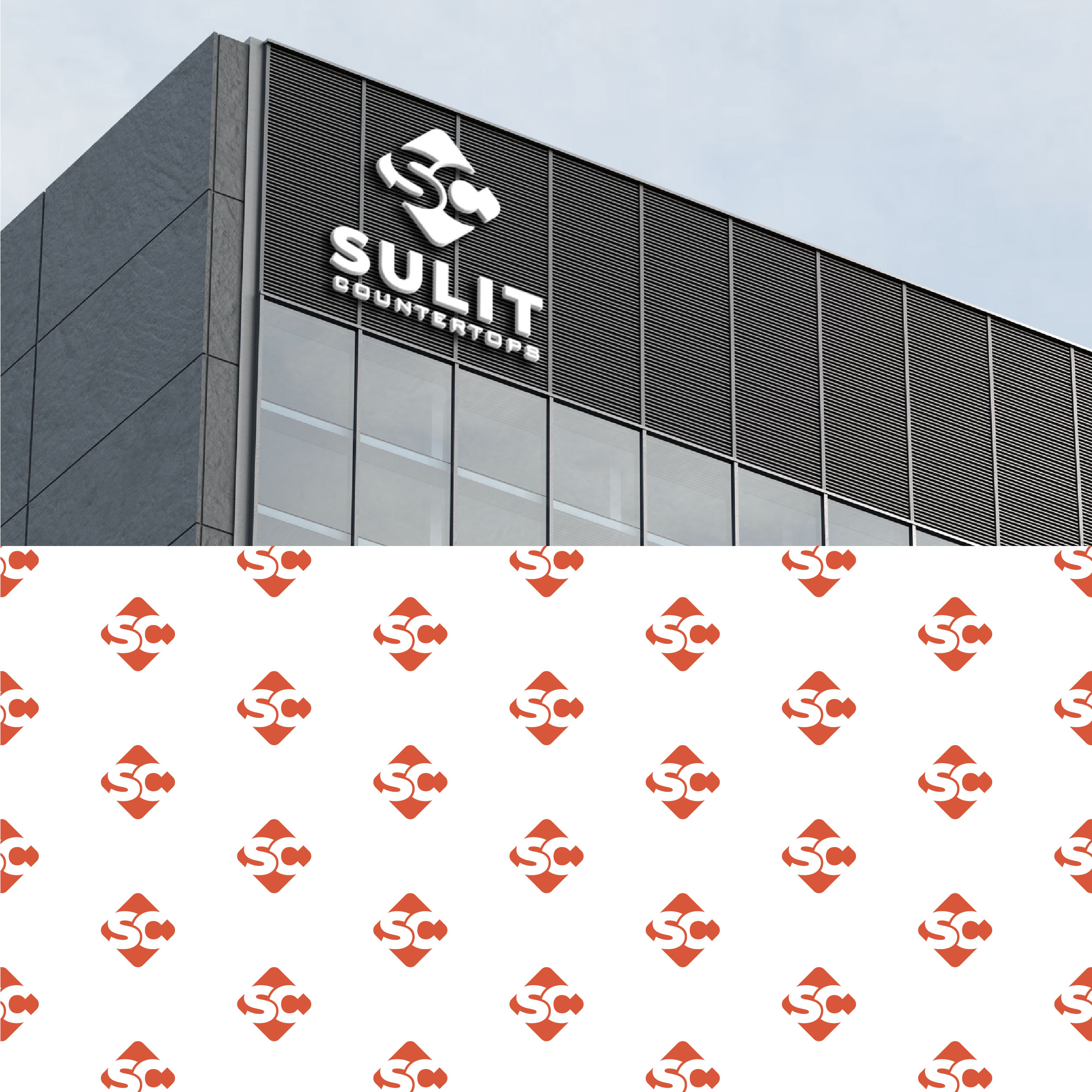
The updated logo found its presence across various mediums, including corporate stationery and digital platforms, each harmonizing with the brand's refined aesthetics and values. A solidifying testament to the notion that a thoughtfully considered brand identity can indeed become symbolic of the timeless quality and value Sulit Countertops delivers to its clients, one elegant stone slab at a time.


In the broader context, Sulit Countertops has not only polished its image but stands ready to make waves in an industry seeking the perfect balance between beauty and functionality, setting the stage to transform living spaces with surfaces that spell luxury and durability.
Start your brand journey today.
