StickSense: A Seamless Transition into Modern Branding
Discover the branding journey of StickSense, a German embroidery brand, as they delicately meld creativity and practicality in their logo design.
An Introduction to StickSense
In the heart of Germany, StickSense operates with the precision and dedication typical of the country's famed engineering. This small yet vibrant embroidery company prides itself on transforming ordinary clothing into expressive canvases for personal and corporate identity. With a mission to embroider almost any design on a wide range of garments, StickSense needed a logo that conveyed both its traditional craftsmanship and innovative spirit.
Graphically representing such a nuanced business can be a challenge. Fortunately, the design team embarked on this task with a clear understanding, threading the needle between creativity and function. The journey to rebranding StickSense reveals a careful consideration of elements, culminating in a logo that is as practical as it is visually striking.
The Initial Brief and Conceptual Challenges
StickSense's requirements for their new branding dictated that the logo must be capable of being embroidered, ruling out overly intricate details. The color palette was to reflect subtle sophistication with anthracite as the backdrop and a tranquil pastel for the logo itself. An additional request was for the logo to denote professional embroidery machinery, a subtle nod to the Melco EMT16x machine's industrial capabilities.
The challenge was to design a logo that symbolized the brand's proficiency in embroidery while maintaining an aesthetic that was both modern and easily embroidered. The consideration of machine compatibility required the design team to balance art with practicality.
Design Iterations and Collaboration
Initially, two design options were shared with StickSense. The second design with a distinct border captured the board's attention. Enthused by its direction, they suggested enhancing the needle's prominence, emphasizing clarity of function.
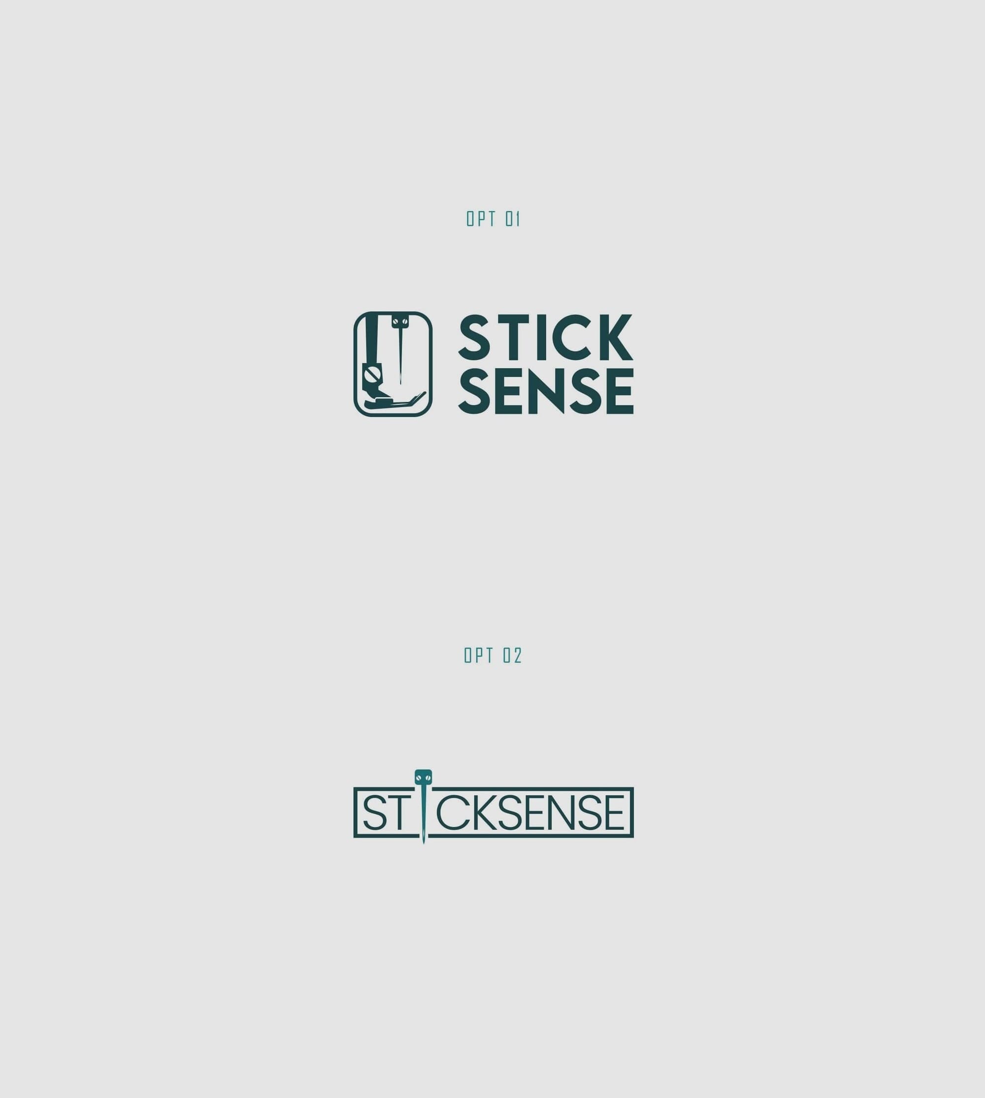
Early design concepts
The design team then integrated a more pronounced needle feature and delivered a series of refined options. This iteration included five distinct variations, each offering subtle adjustments to explore balance and functionality.
After reviewing these new options, StickSense selected the third option for final adjustments, further requesting a wave-like thread feature that would weave through the needle, a creative touch that added movement and context to the logo.
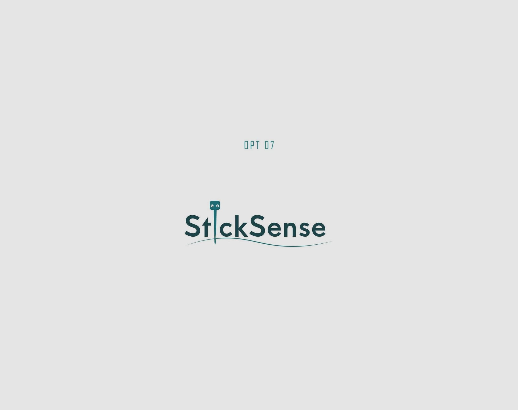
The result was expressive without sacrificing the core requirement of embroidery feasibility.
The Final Outcome and Mockup Applications
The client ultimately chose the first logo option, reaffirming StickSense’s commitment to excellence and adaptability. Featuring the Lemon Milk font, the logo communicates an assertive yet approachable personality aligned with the brand’s values. Its dynamic thread element introduces a refined touch of elegance, ensuring versatility across both digital and embroidered applications.
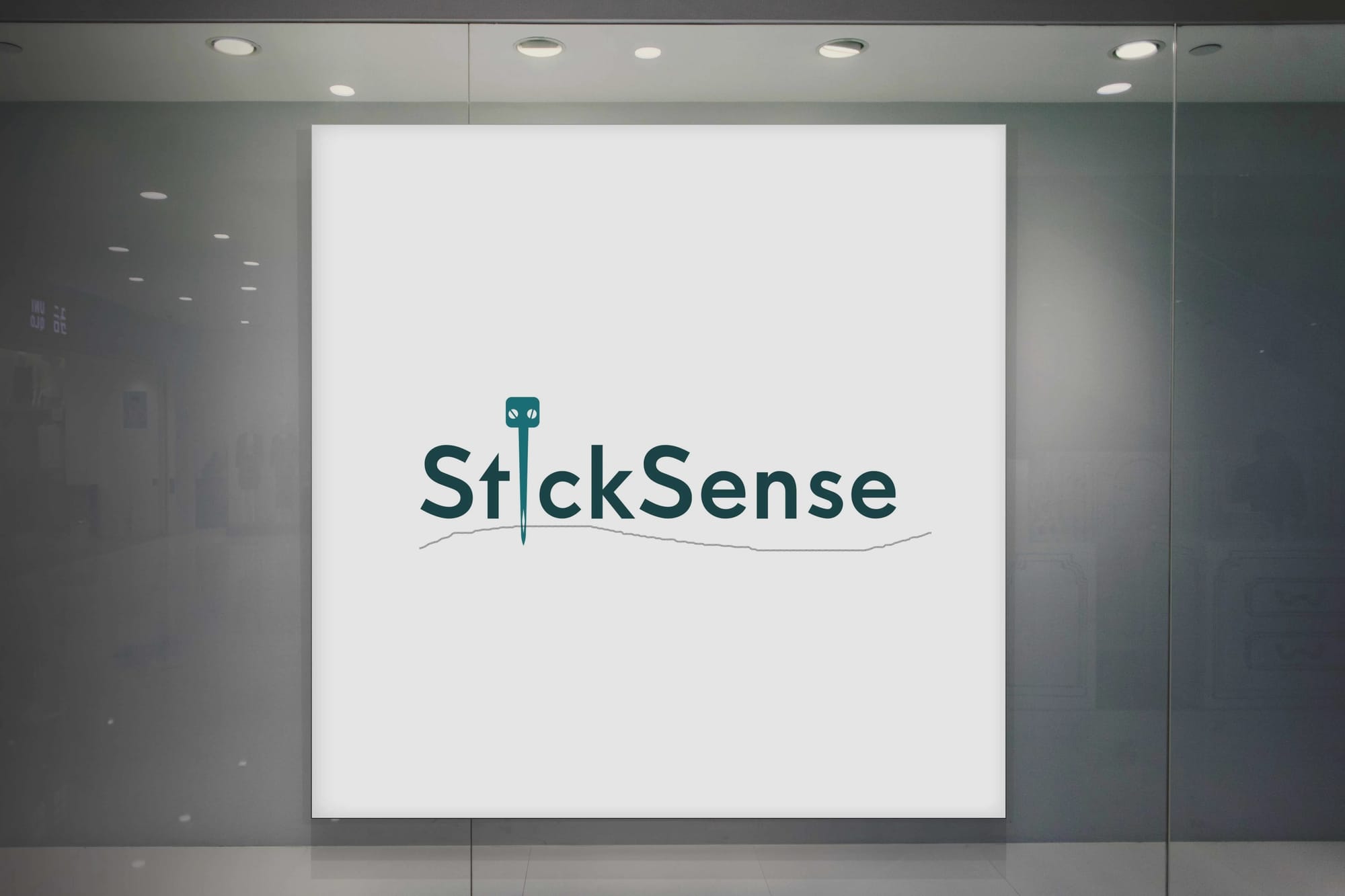
StickSense's final logo has been applied across various mediums, including signage, apparel, and business cards, showcasing its versatility. The logo's adaptability to different scales ensures visibility and clarity in all its applications.
The project is a lesson in the synergy between design elements and practicality. StickSense ventured beyond conventional design, proving that even the smallest details, like a thread through a needle, can narrate a powerful brand story. The logo stands as a sophisticated emblem of their craft, bridging traditional embroidery with modern branding needs.
Start your brand journey today.
