Starwipe Productions: A Journey Through Rebranding in the Film and Podcasting Industry
Discover the inspired rebranding journey of Starwipe Productions, a creative entity in the film and podcasting sectors that merges retro influences with modern design.
In the vast seas of the entertainment industry, where competition is fierce and brand identity is key, Starwipe Productions embarked on a unique rebranding journey. Based in the bustling creative hubs of Atlanta, GA, and New York City, NY, this film, television, and podcast company specializes in true stories, with a notable focus on true crime.
The name 'Starwipe Productions' itself is a cheeky nod to an editing technique that harkens back to the golden days of the 1980s and 1990s. As the company sought to update its visual identity, the goal was clear: create a clean, static logo suitable for written presentations, scripts, and broadcasts.
The Creative Challenge
This creative challenge of balancing nostalgia with modern sensibilities began with an intriguing logo brief from the client. Starwipe Productions did not specify any color leaving a wide canvas open for exploration. The central aim was to craft a logo that seamlessly fits into various media platforms while remaining visually striking.
Exploring Concepts
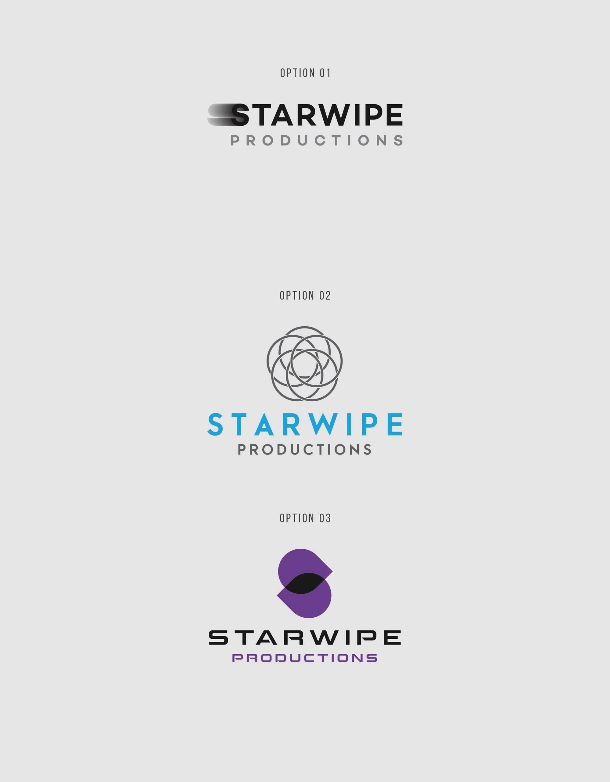
In response to the brief, the design team presented several initial concepts, each one pushing the boundaries of typography and iconography. The client's feedback showed a leaning toward the first option, albeit with requests for certain adjustments. These included selecting a thinner font for 'Productions,' repositioning the text, and a creative incorporation of a star within the letter 'A' of 'Starwipe.'
The power of collaborative creativity was highlighted in these exchanges, showcasing a design process that is both iterative and dynamic. Feedback led to further refinements as seen in the revised logo options.
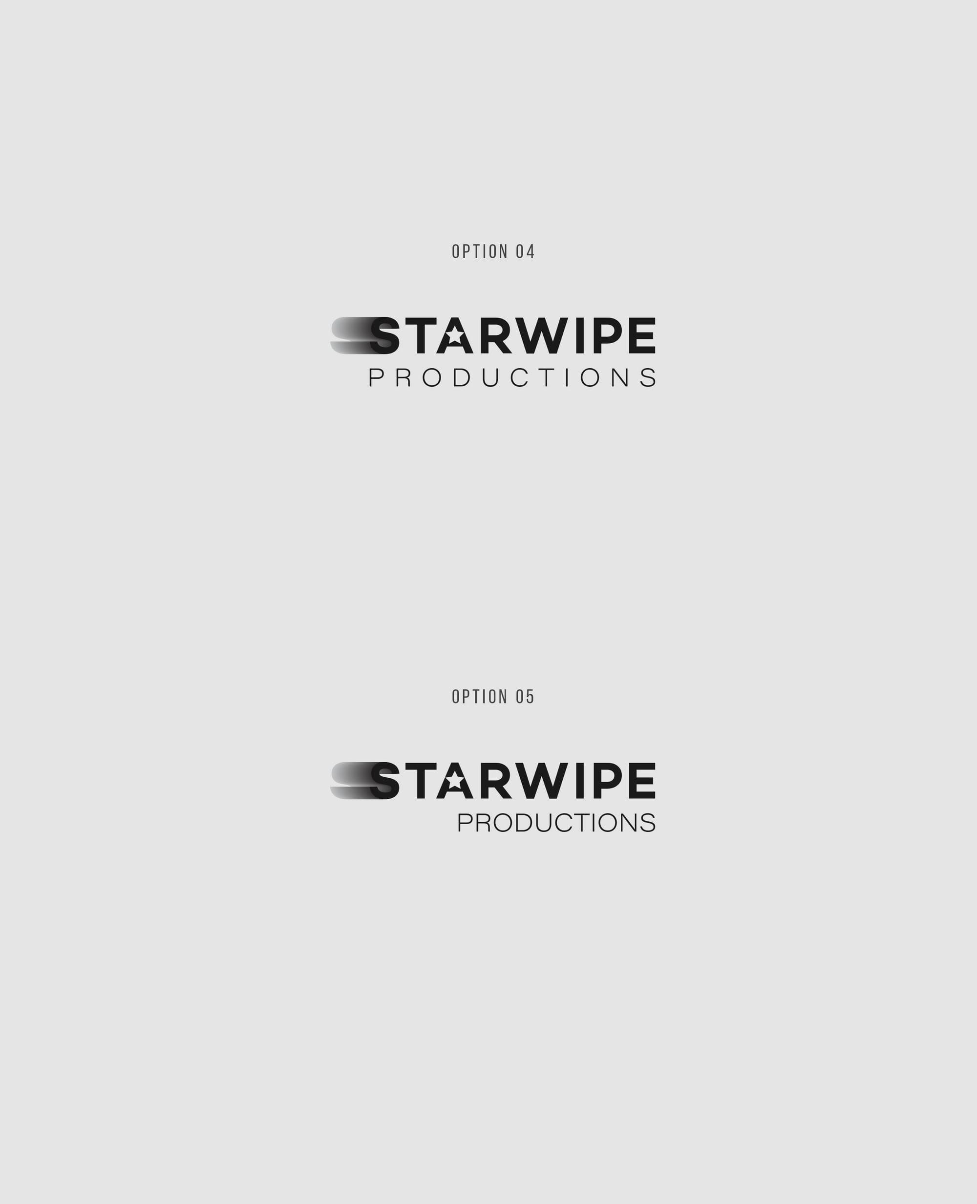
The Final Selection
The final selection, Option #04, was a product of this synergistic effort, encapsulating the desired aesthetic with precision. It cleverly integrates the star element within the 'A,' a subtle yet effective nod to the beloved 'starwipe' technique, while also meeting modern design aesthetics with its clean lines and balanced text weight. The choice of the font, Campton, further enhances the logo's fluidity and readability, lending a contemporary feel that does not overshadow the brand's retro homage.
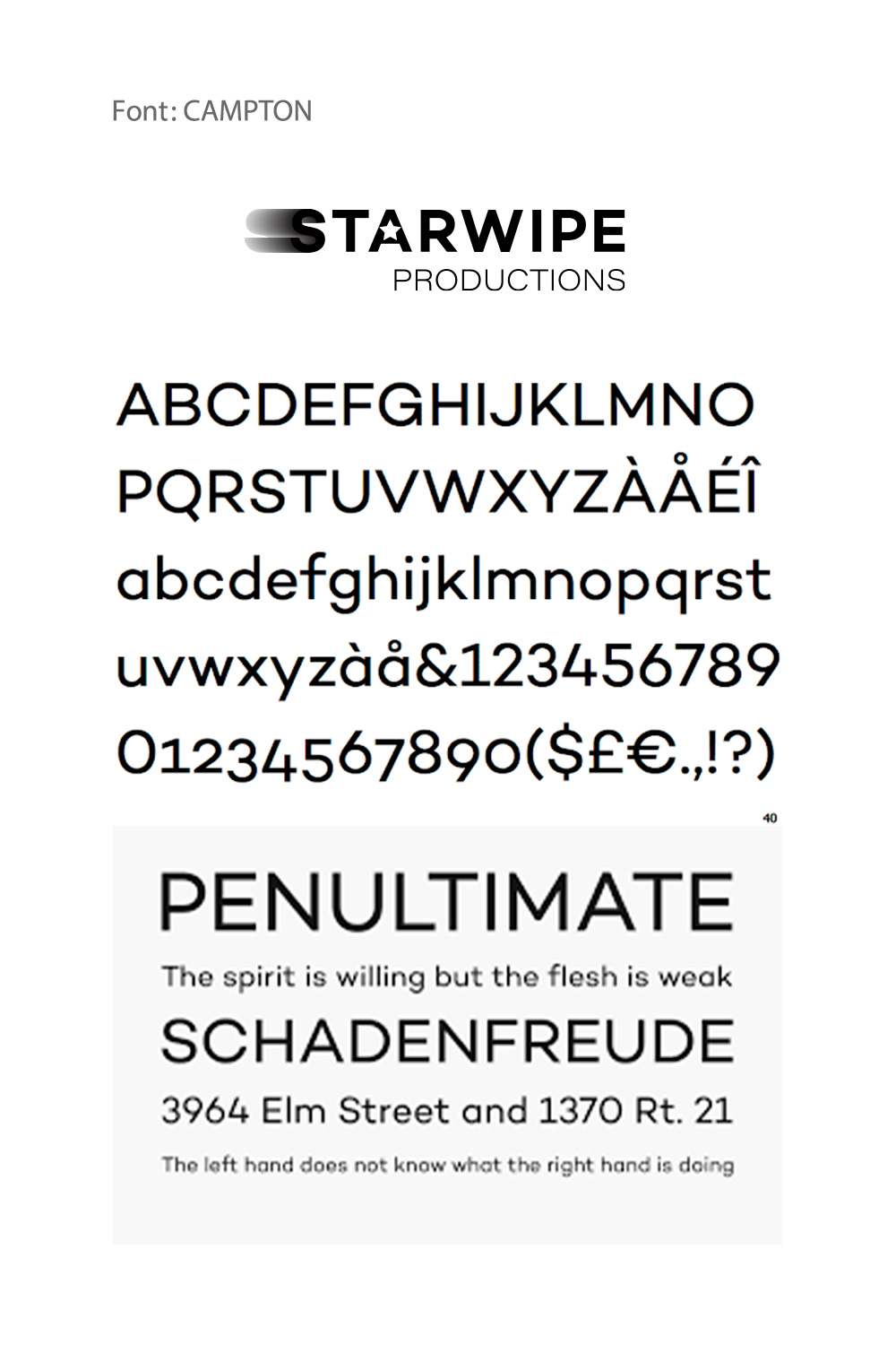
Campton, known for its versatility and modern touch, plays a pivotal role in achieving this balance. Its geometric sans-serif style offers clean forms and effective readability, crucial for a logo intended for diverse media applications.
Real-World Application
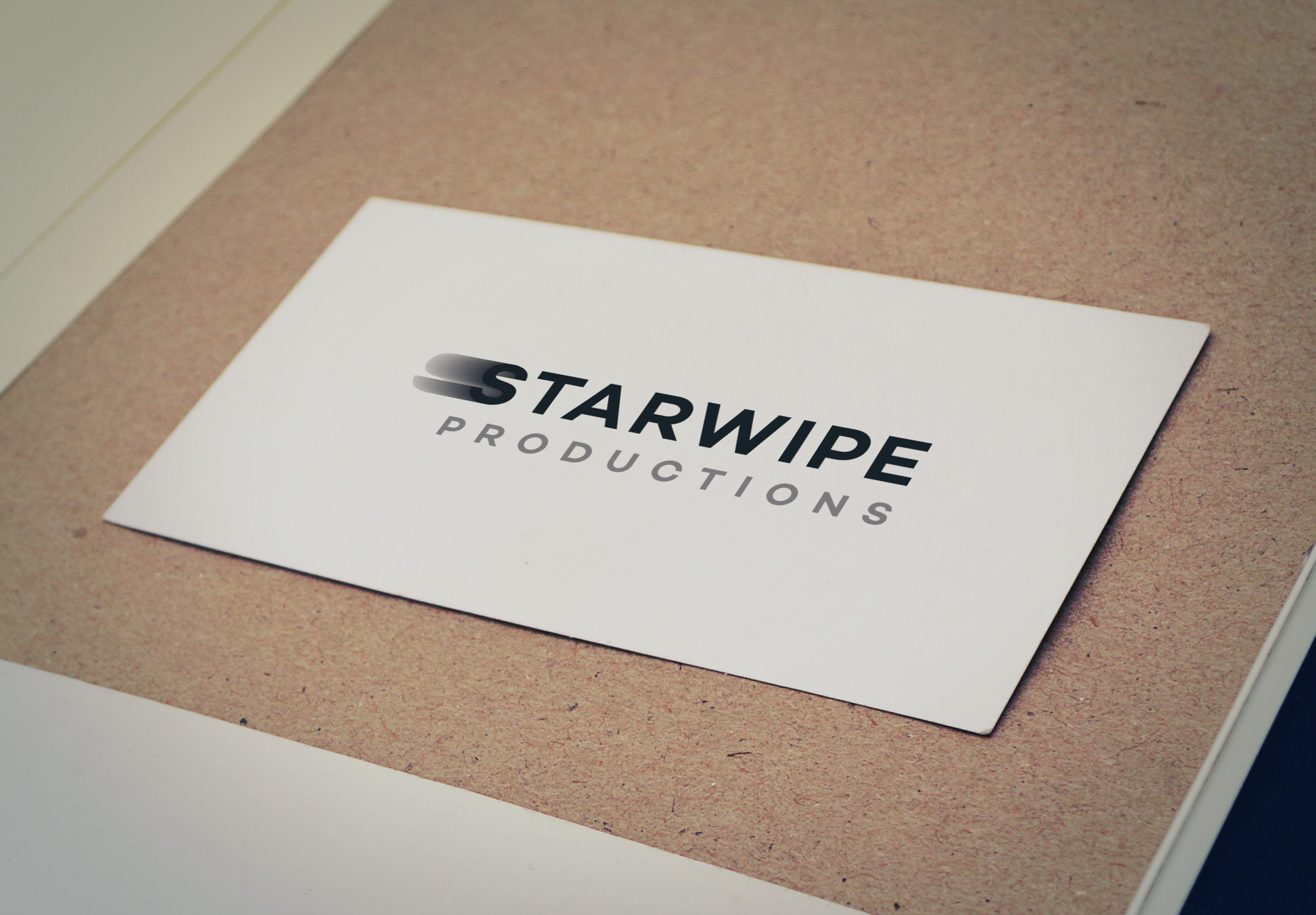
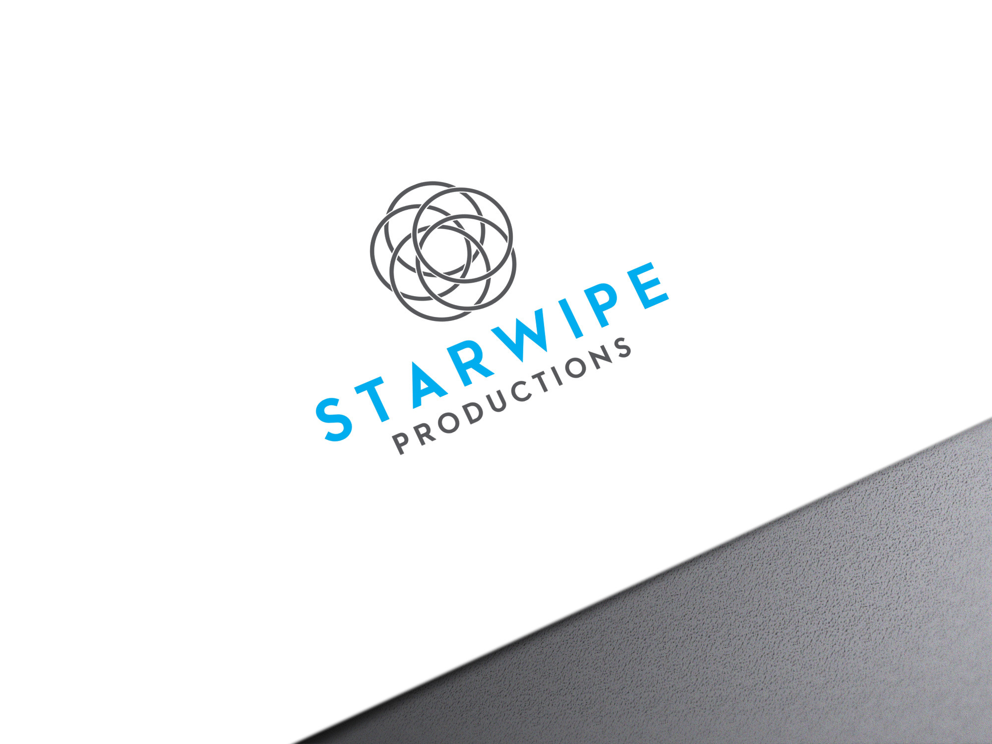
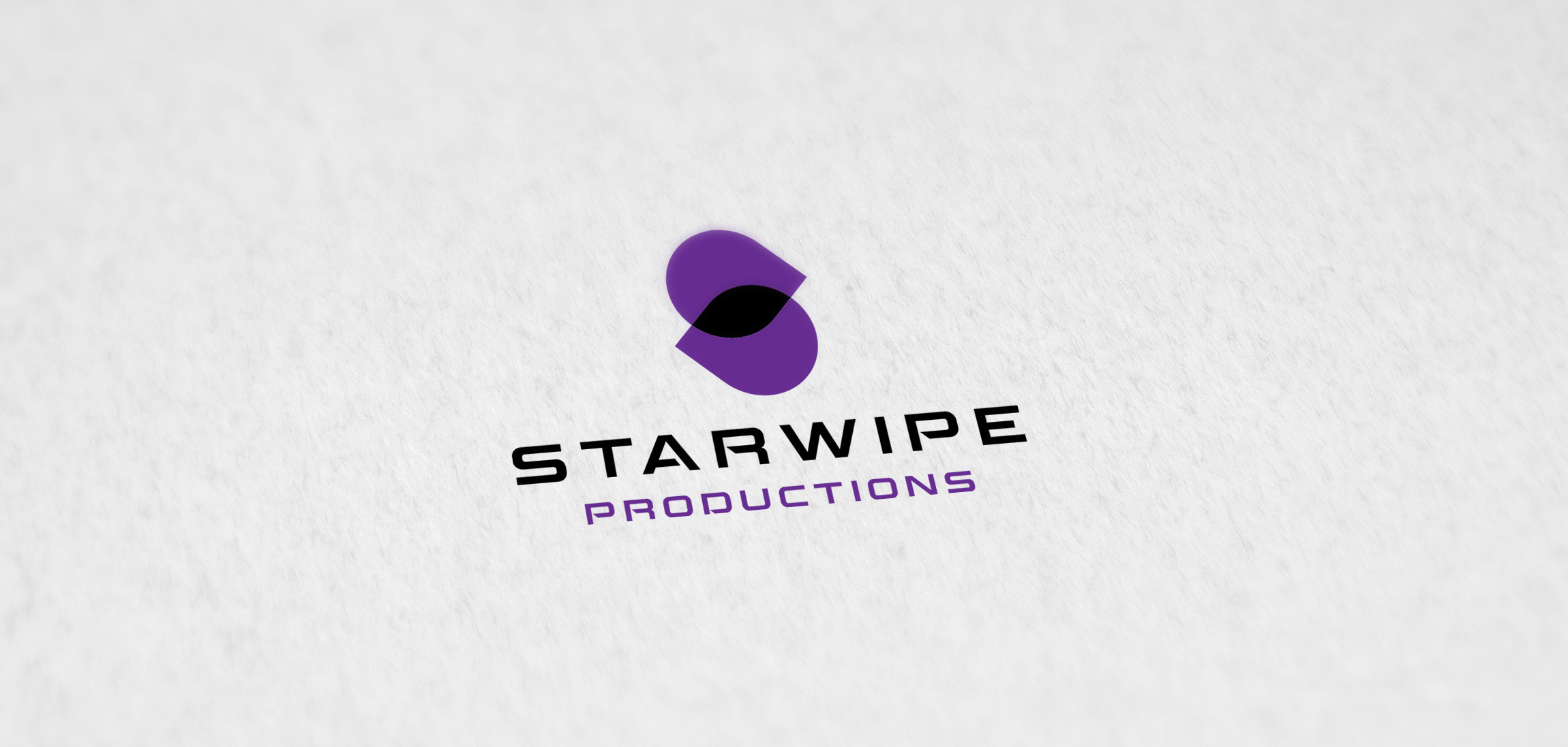
The newly rebranded logo was then put to the test in various real-world applications, from merchandise to outdoor advertising. These mockups not only underscore the adaptable nature of the logo but also its striking presence across different mediums.
These visualizations are not just a showcase of aesthetic appeal but a testament to the logo's functional design, which retains its clarity and impact regardless of scale or medium.
Conclusion
The rebranding of Starwipe Productions emerges as a reminder of the power of thoughtful design. It seamlessly merges retro nostalgia with contemporary appeal, effectively capturing the dual essence of the brand's journey and creative vision. This case study highlights how an impactful rebranding effort can breathe new life into a company's identity, positioning it for renewed visibility in the ever-evolving entertainment landscape.
Start your brand journey today.
