Sordmax Connoisseur Inc: A Rebranding Endeavor in Professional Services
Discover how Sordmax Connoisseur Inc revamped its brand identity to reflect its core values and market position in the HR consultancy sector.
The world of professional services, particularly human resources consultancy, hinges on the ability to build trust and convey expertise. Sordmax Connoisseur Inc, a notable player in this domain, sought to reinvent its brand identity through a carefully orchestrated rebranding project. The endeavor aimed to meld tradition with modern elements, forging a visual language that resonates with its corporate ethos and client base.
Understanding the Vision
Sordmax Connoisseur Inc, rooted deeply in consultancy, understands the pivotal role of strategic branding. Envisioning a design that encapsulates both reliability and forward-thinking ideals, the team embarked on a journey to elicit a logo that bridges these elements adeptly.
The keyword ‘Connoisseur’ reflects an expert judgment on matters of taste, aligning perfectly with the nuanced elements of consultancy. Philosophically, a ‘connoisseur’ bears witness to the aesthetics of fine discernment, making it a fitting descriptor for an HR and business support agency intent on delivering tailored solutions.
The Design Journey
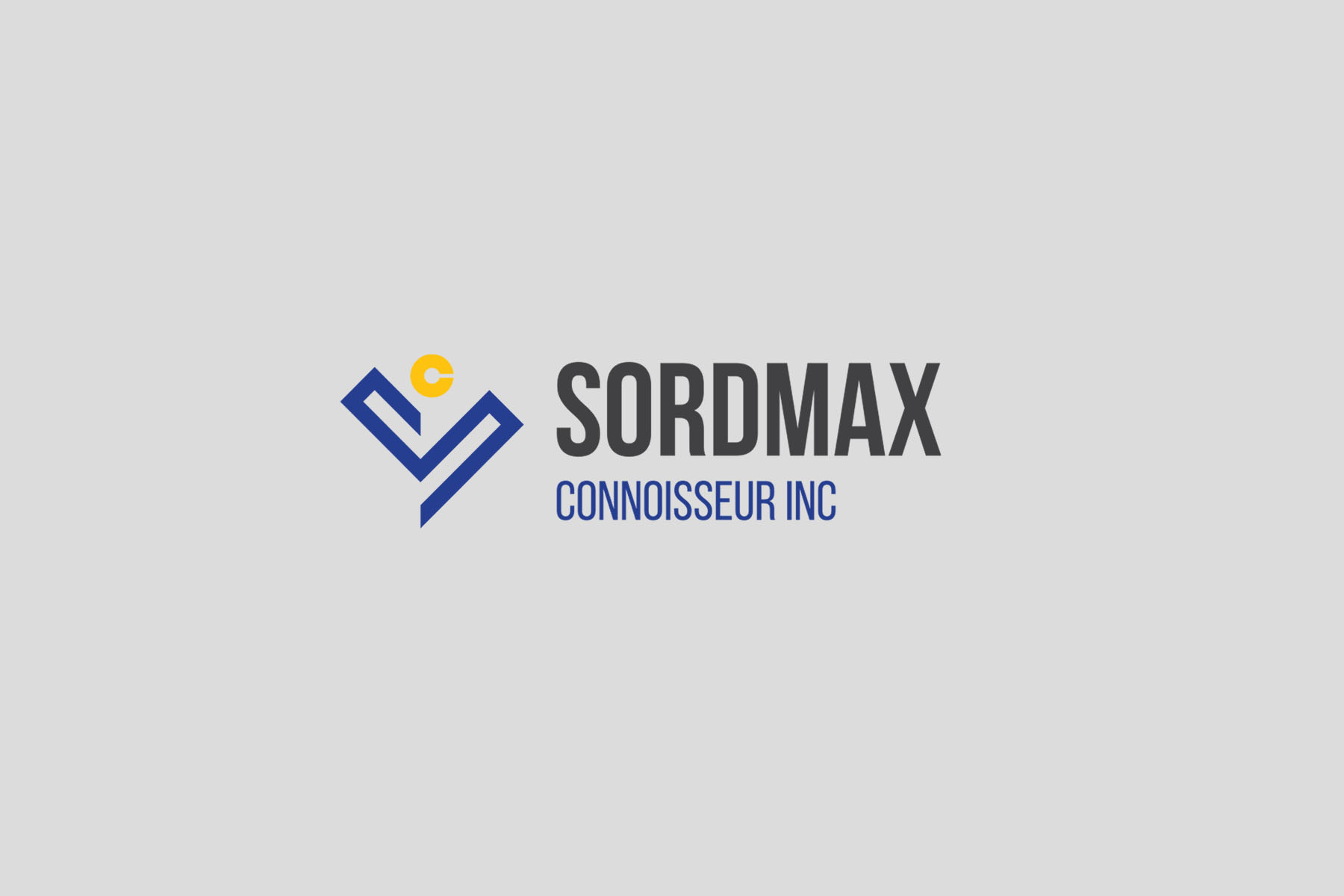
Color choice bore significance in the logo’s development, emphasizing the client-preferred hues of white and blue. These shades traditionally symbolize clarity, professionalism, and tranquility, evoking sentiments that are desirable within human resources and business circles.
The design team’s initial response showcased a quartet of options, each encapsulating different design philosophies while maintaining a cohesive theme. The composites were constructed to represent Sordmax Connoisseur Inc’s dedication to providing bespoke services through a lens of innovation and introspection.
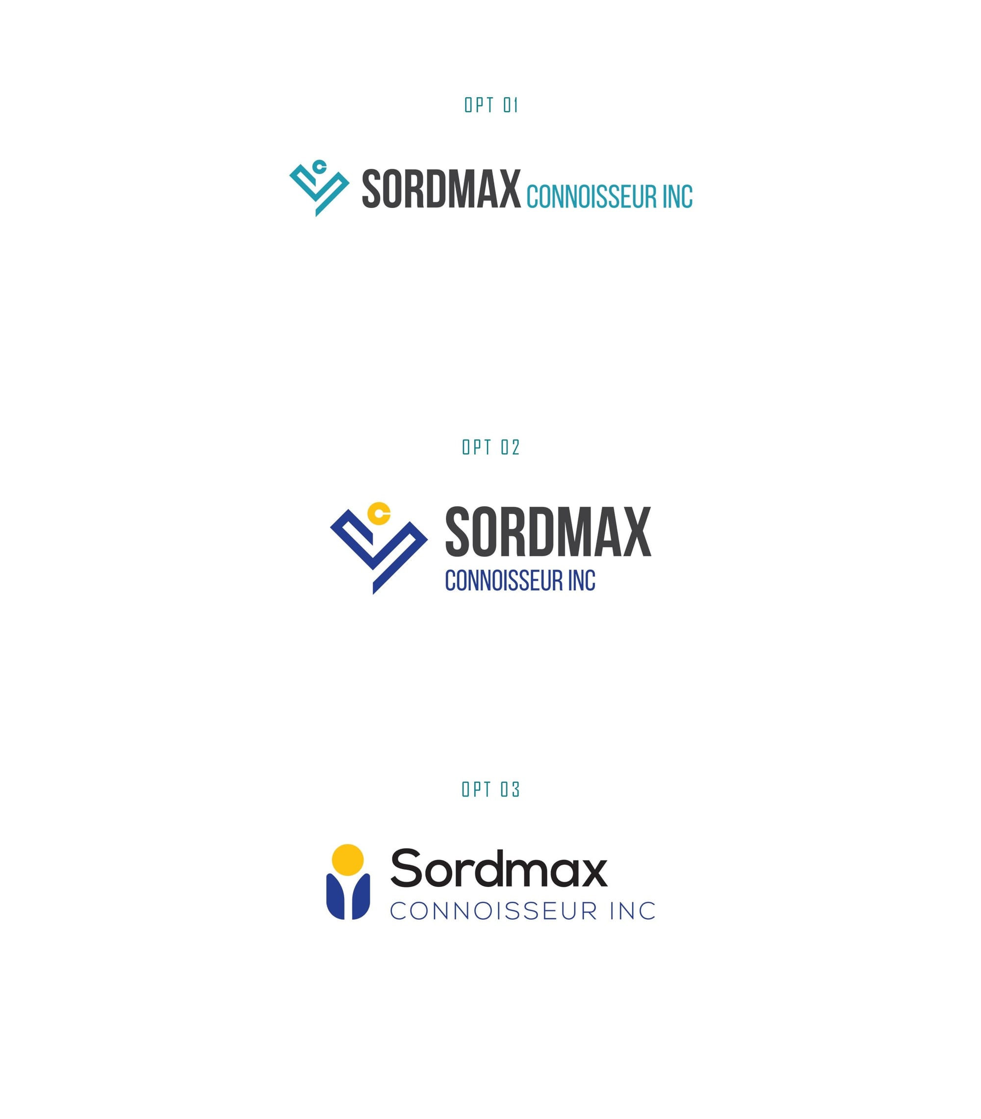
The Chosen Design
From the possibilities presented, Option 2 emerged victorious. This selection met Sordmax Connoisseur Inc's stylistic and strategic branding criteria, embodying their unique position in HR consultancy. Keenly chosen for its balance of bold typography and subtle grace, the design reflected the company’s steadfast commitment to excellence.
Fundamentally, the elegant typeface “Bebas Neue” was integral to the final design. This font, known for its clean lines and modern appeal, provided the perfect complement to Sordmax’s vision. Its usage in the logo underscores the company’s strategic diction: clear, powerful, and timeless.
Real-World Application
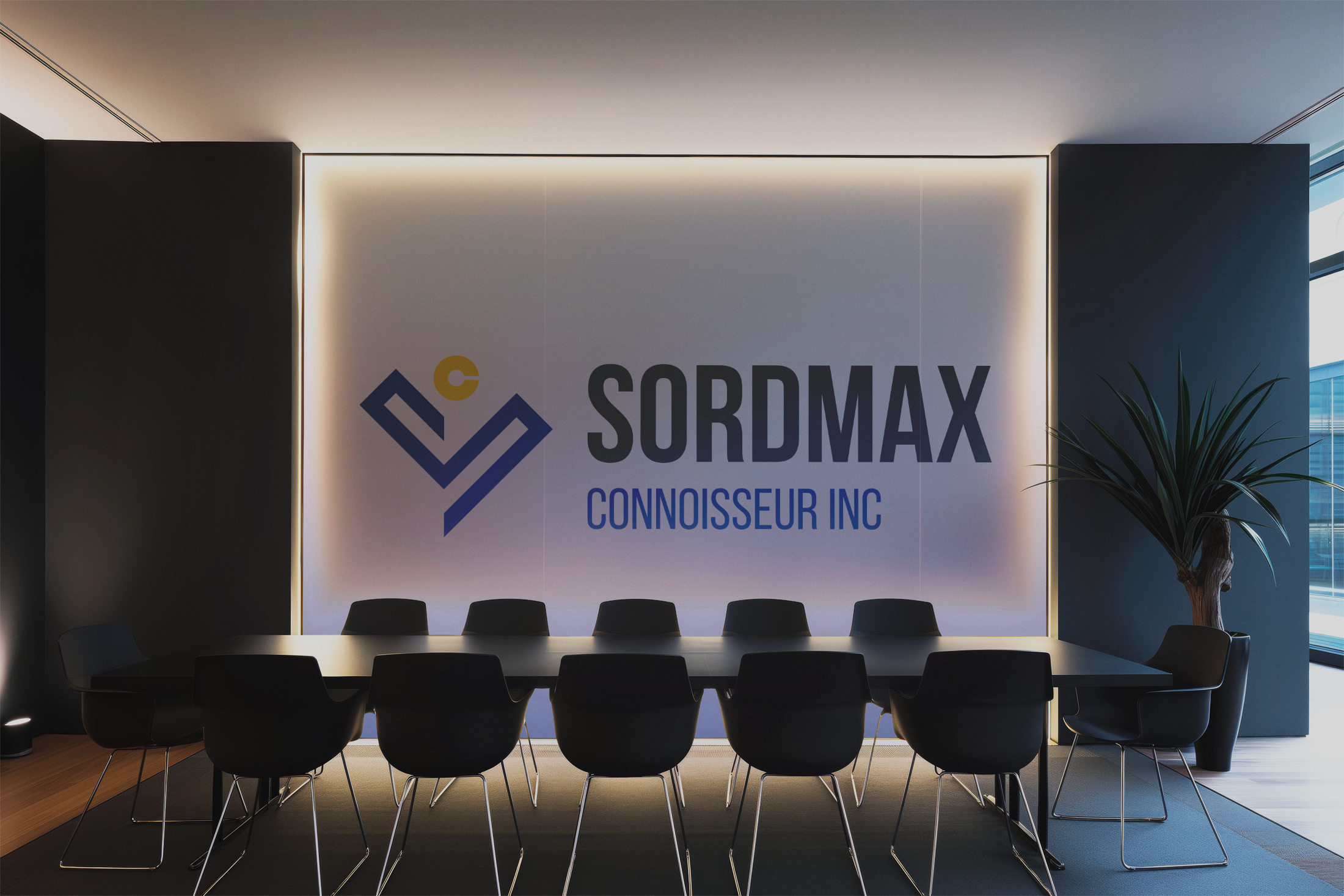
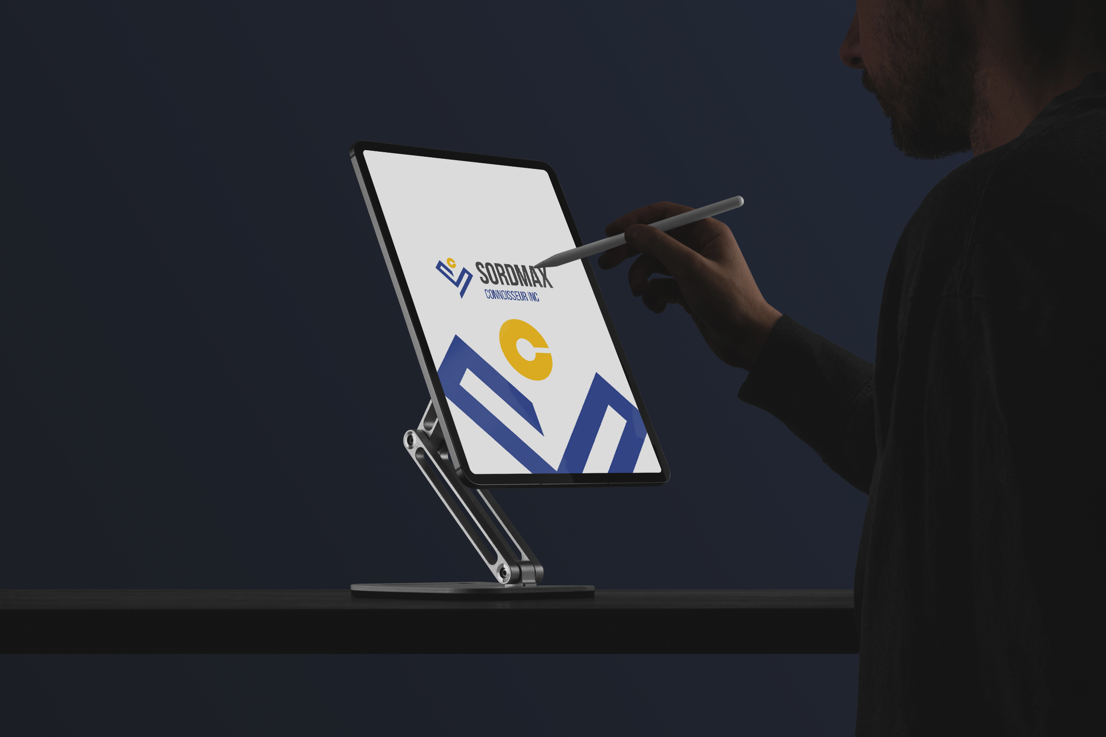
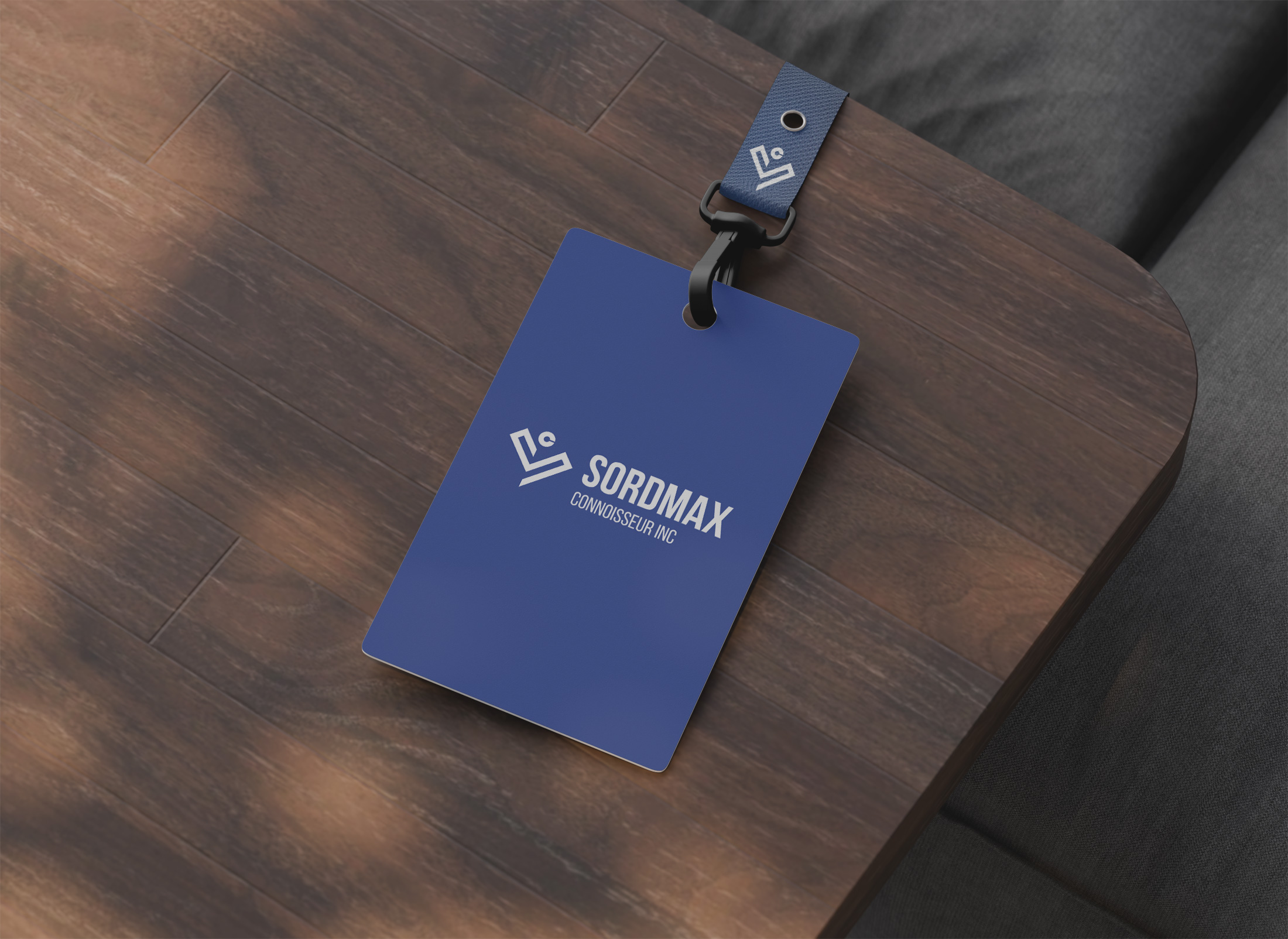
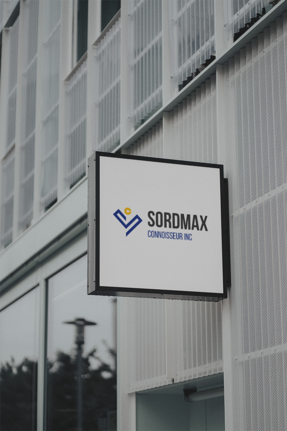
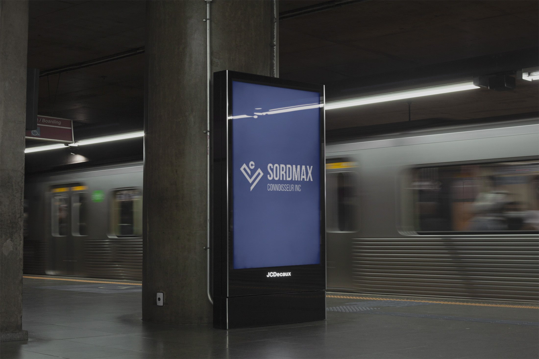
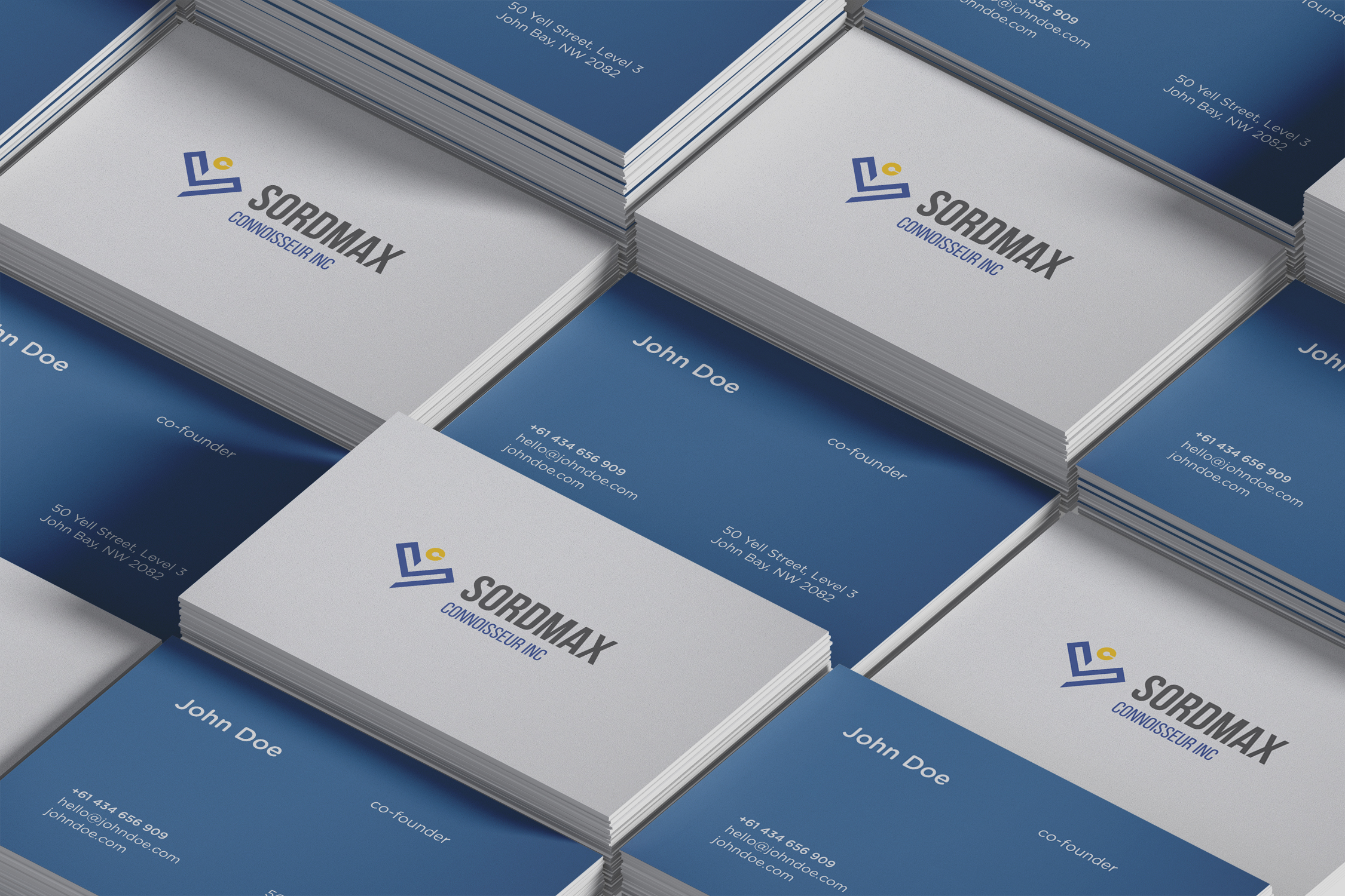
The real litmus test for a logo’s efficacy lies in its application. Sordmax’s new brand symbol was realized across various corporate avenues, demonstrating its flexibility and enduring aesthetic appeal. From business cards to conference room signage, the brand’s visual identity emerged seamlessly across platforms.
Conclusion
Sordmax Connoisseur Inc’s branding journey exemplifies the profound impact of design in shaping corporate identity. It articulates the firm’s ethos and mission through visual storytelling, captivating both clients and colleagues alike. Amid a world where first impressions reign supreme, Sordmax’s renewed visual identity stands as a beacon of its commitment to excellence and innovation in the field of human resources consultancy.
Start your brand journey today.
