Sailing Ahead: Crafting the ebaat x Versabatt Logo Collaboration
The story behind the logo collaboration between ebaat and Versabatt, shaping a new visual identity that captures their pioneering spirit in electric boating.
In the serene yet bustling industry of electric boating, ebaat stands distinct with its sustainable approach to maritime travel. Collaborating with Versabatt, a leader in versatile battery technology, the two entities embarked on a project for which the cornerstone was a compelling logo. The challenge was clear: merge distinct brand identities into one cohesive mark that resonates with innovation and sustainability.
Understanding the Vision
Ebaat's journey in electric boating has been transformative, leveraging cutting-edge technology to revolutionize how we navigate waterways. This symbiosis with Versabatt’s battery solutions speaks to a larger narrative of technology meeting environmental consciousness. The goal was to create a logo that encapsulates this spirit seamlessly.
Initial Design Direction
The project kicked off with clear directives from ebaat: merge the visuals of two existing logos into a unified brand signature. This meant retaining the foundational elements of the ebaat logo, while integrating the power statement 'powered by Versabatt.' The design team's approach was to reflect the prowess of electric boating combined with the robust energy solutions from Versabatt.
Initial concepts presented by the design team showcased three distinct options. Each option experimented with font, layout, and composition, giving careful consideration to the balance between ebaat's established brand and Versabatt's aspirational energy philosophy.
Client Feedback and Design Tweaks
The client leaned toward the third logo option but requested refinements. The feedback was focused; the 'powered by' needed a sleeker font, while 'Versabatt' had to emerge with a bold statement, reflecting its importance in the collaborative venture. Notably, the client provided an additional visual reference to guide these adjustments, emphasizing the need for text balance and prominence.
Refinement and Finalization
The design team swiftly integrated the feedback, focusing on nuanced typography adjustments. The refined logo exhibited 'Versabatt' as a robust visual anchor, underpinning ebaat with a sleek typeface that whispered technological elegance. The final concept brought together the steadfastness of both brands with a visual language that conveyed their alliance in advancing electric boating. The subsequent approval from the client echoed their satisfaction.
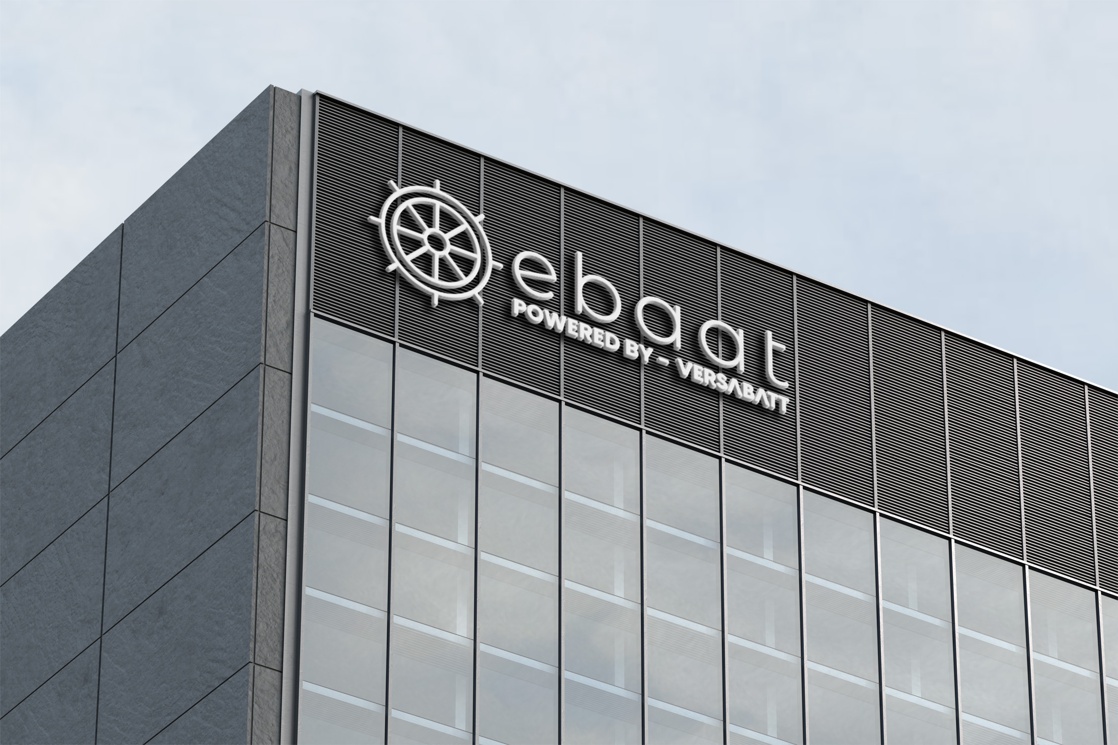
The Final Logo: Beyond Aesthetic
The final logo is more than a mere visual identifier. It represents a shared mission between ebaat and Versabatt, symbolizing reliability, eco-conscious innovation, and a sturdy commitment to future-forward technology.
This logo is now a herald of technological progression that proudly sits upon vessels, ensuring that ebaat's electric promise and Versabatt's empowering solutions are instantly recognizable.
Looking Forward
The collaboration between ebaat and Versabatt is a testament to how strategic partnerships in design can elevate brand identities. As both companies look forward to rolling out pioneering solutions on the water, this logo will stand as a perennial reminder of their shared journey—fusing technology with a sustainable vision that sails beyond the horizon.
Start your brand journey today.
