Reinventing Compliance: The Everything OHS Logo Rebranding Journey
Explore the meticulous journey of Everything OHS in rebranding its logo to better convey its simplifying approach to compliance.
Rebranding Everything OHS: Simplifying Compliance with Style
In the ever-evolving world of occupational health and safety (OHS), where compliance remains the linchpin for operational excellence, standing out with a resonant brand identity becomes imperative. Everything OHS, an Australian-based company dedicated to simplifying compliance processes, embarked on a rebranding quest to refashion its visual identity while underscoring its commitment to ease and reliability.
Understanding the Brand's Essence
Everything OHS operates within a competitive sector, providing comprehensive compliance solutions that streamline complex regulatory requirements in workplace health and safety. In a niche driven by precision and trust, visual representation through branding carries significant weight. The company decided to revamp its logo, a pivotal element that communicates its core mission: "Compliance Made Easy."
The Artistic Pursuit: Client’s Aspirations
The client's initial brief was clear and concise, echoing their affinity for an established style. The reference point was a logo style guide from "Zemodo," which captivated them with its color palette and structured design. Their desired motif was a "tick" symbol, emblematic of approval and accuracy, perfectly in tune with the OHS ethos. The project demanded variations to ensure a precise fit, with the color scheme given special attention: orange, grey, and black, later fine-tuned to orange HEX #EF4C23.
Design Team’s Creative Process
With clear directives, the design team embarked on their creative journey. They began by curating a selection of tick icons, each embodying a distinct stylistic flair. The aim was to capture a unique balance between modernity and the assurance long associated with checking off a list. Various iterations of the logo were shared in the initial stages, such as innovative versions of the tick combined with the brand name in differing scales and layouts.
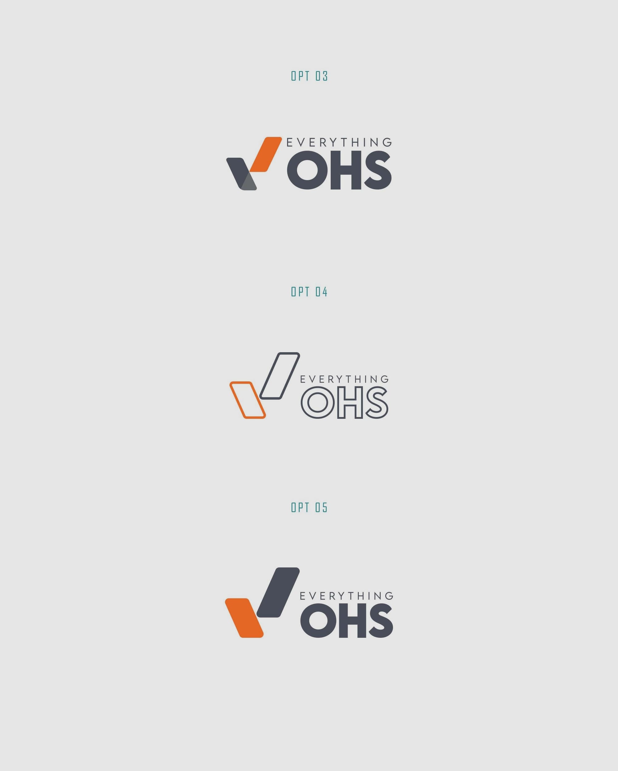
The designers meticulously adjusted proportions and colors, aligning with the precise orange specification the client identified, and ensured that the text size harmonized within the logo's visual hierarchy.
The Chosen Path: Final Selection
After careful deliberation and feedback loops, option six emerged victorious. This version balanced the tick's symbolic weight with the brand text, ensuring a memorable imprint. The chosen font, LEMON MILK, contributes to the design's clean and modern aesthetic, with its geometric simplicity conveying an aura of professionalism and trust.
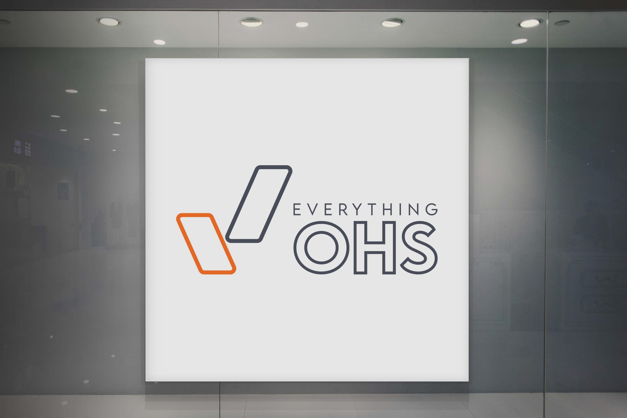
Real-World Application: The Final Mockups
The rebranding transcended theoretical design and was later showcased in real-world mockups. These mockups, ranging from digital screens to tangible merchandise like tote bags and t-shirts, affirmed the logo's versatility and impact. Each mockup reinforced Everything OHS's refreshed brand identity, sustaining its mission to make compliance effortlessly achievable.
CONCLUSION
Through this refined visual update, Everything OHS solidifies its place as a compassionate guide in the custodianship of workplace health and safety, making compliance not just an obligation but an accessible and simplified process for all.
Start your brand journey today.
