Reimagining Industrial Symbolism: Vestischer Paletten Service's Minimalistic Approach to Branding
Explore the transformative journey of Vestischer Paletten Service’s new logo design, coupling modern aesthetics with industrial efficiency.
Vestischer Paletten Service GmbH & Co. KG, known for its enduring dedication to quality in the logistics sector, sought a fresh identity to encapsulate its values with a minimalist visual language. Based in Germany, with a focus on the efficient movement and management of pallets, VPS embarked on a collaborative journey with a creative design agency, aiming to express their functional essence through a sleek and subdued logo.
In the realm of logistics, where functionality often eclipses creative pursuits, VPS's desire to fuse utility with artistry presented a unique opportunity to redefine industry norms. Acknowledging the symbolic nature of the pallet as not just a tool, but as an emblem of the company’s operational success, VPS sought a design embodying efficiency and excellence.
Initial Concepts: Aligning Aesthetics with Purpose
The project's initial phase involved exploring various design directions that visually communicated VPS's core mission. The preliminary designs introduced a monogram approach, integrating the initials 'VPS' with the silhouette of a pallet. This was an attempt to marry the industrial heritage of VPS with a contemporary graphic aesthetic.
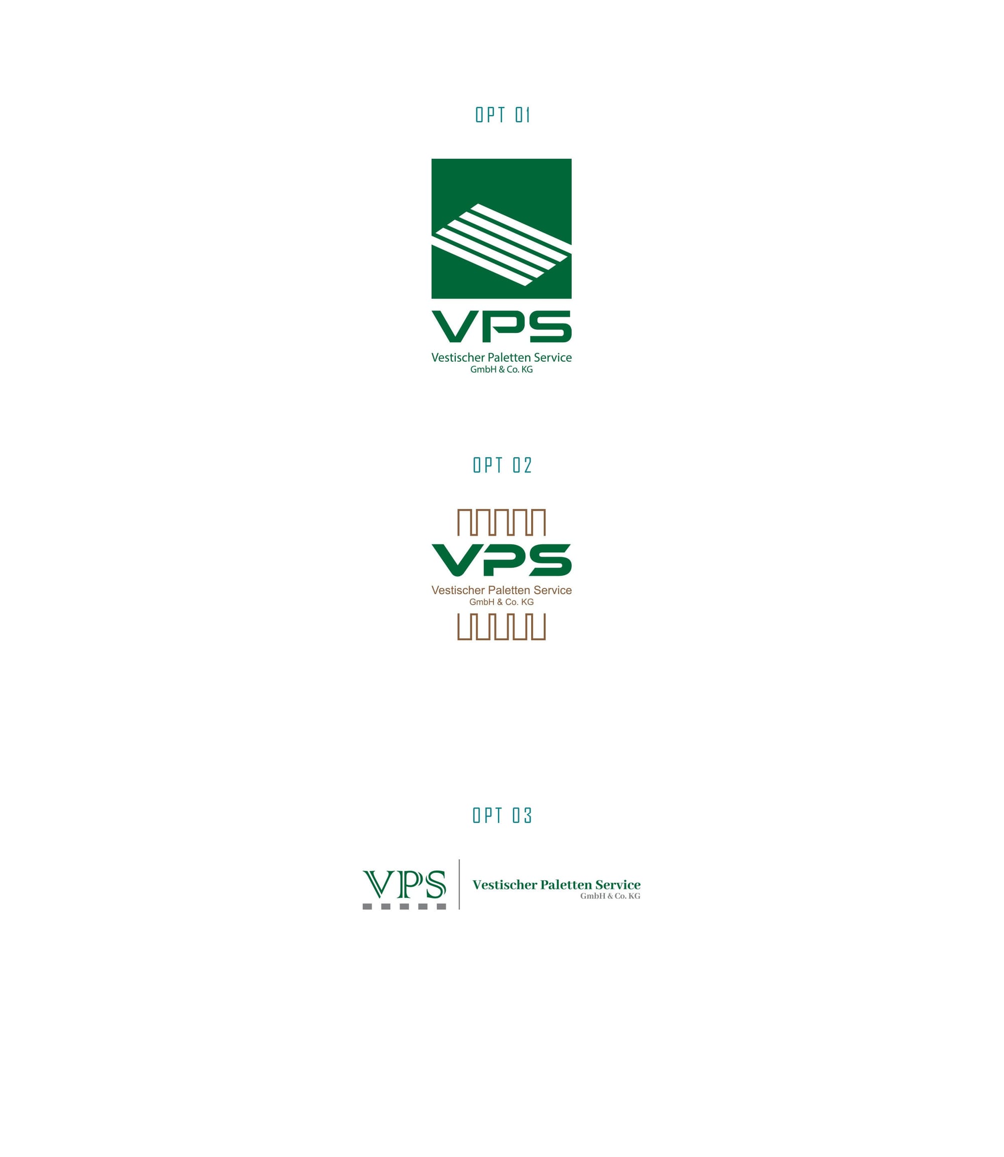
Three logos were presented, each experimenting with the interplay between text and graphic elements. However, one design immediately resonated with the VPS team—a version flaunting a minimalist depiction of a pallet, subtly incorporated beneath the bold VPS letters.
Client Feedback and Iterative Design
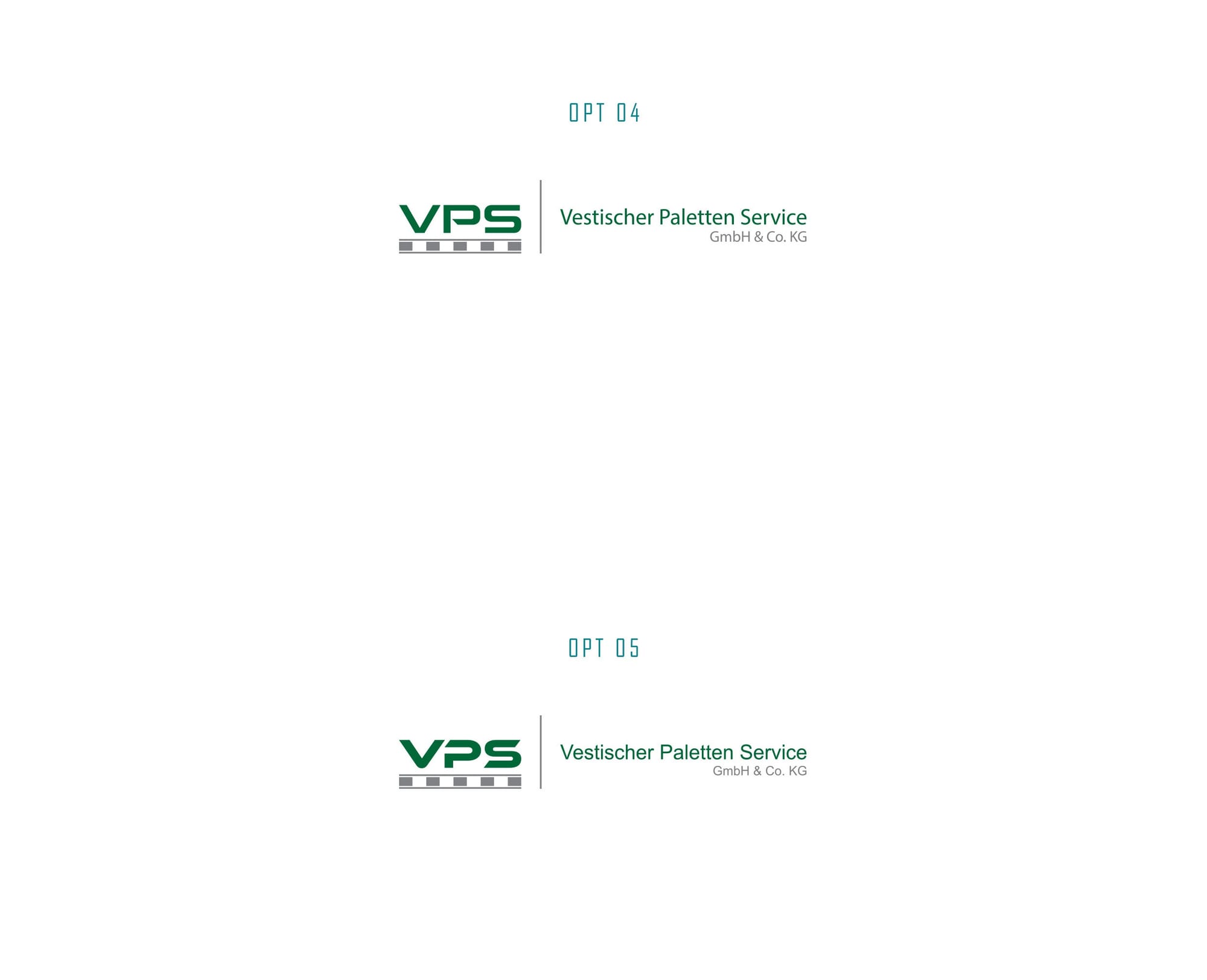
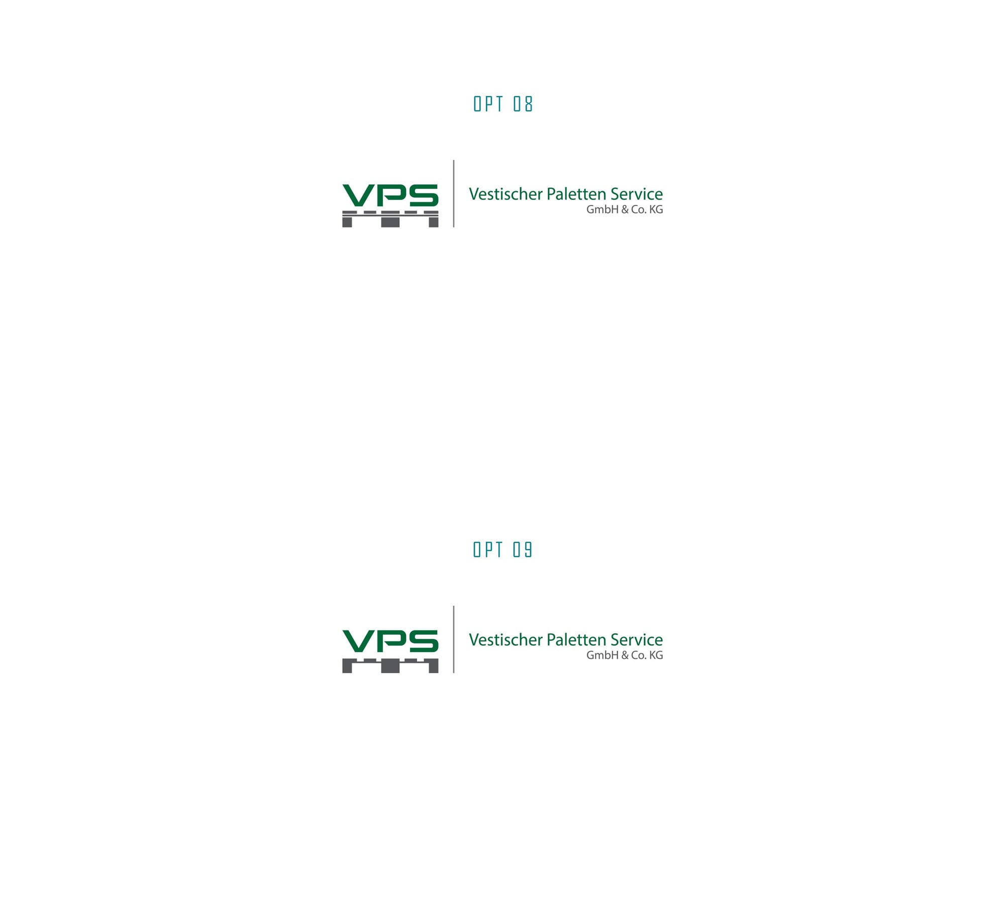
The choice of logo No. 03 as a favorite underscored the client's vision, but requisite refinements were identified. The client's input sought a simpler font, aligned with the initial designs, and a more explicit representation of a pallet in the logo’s composition. The design team embraced this feedback, iterating the design to enhance its symbolic accuracy without compromising its minimal charm. The revisions embraced a cleaner typographic choice, similar to that of logos No. 01 and 02, meeting the client's preference for simplicity.
Refining Symbolic Elements
To better convey the essence of a pallet while maintaining minimalism, reference images provided by VPS inspired the design team to subtly tweak the graphical representation. These refinements ensured that the logo did not lose its iconic potential, steering clear of excessive detail while preserving a strong connection to the company’s core operations.
The Final Outcome: Celebrating Simplicity and Functionality
The final design, crowned as the winning option, featured the Ethnocentric and Arial fonts, harmonizing modernity with a touch of timeless utility. These typefaces, although diverse, interplay to establish a balanced composition that visually articulates VPS’s brand ethos.
In its final iteration, the VPS logo successfully combines visual subtlety with an emphatic nod to the pallet, reinforcing VPS’s brand as a leader in logistical ingenuity. This rebrand not only encapsulates VPS’s dedication to service excellence but also strategically positions them within a modern marketplace where brand perception often intersects with operational prowess.
Application in Real-World Contexts
What truly contextualizes the logo's success is its real-world application. Whether printed on containers or proudly displayed on transportation vans, the logo’s adaptability symbolizes constant innovation and adaptability—foundational values at VPS.
As VPS continues to expand its footprint within the industry, the new branding stands as a testament to their ability to marry tradition with modernity, setting a benchmark for future endeavors in industrial branding.
Start your brand journey today.
