Reimagining Clarity with TXK Surgery's Bold Rebrand
TXK Surgery redefined its brand, evolving from Texarkana Surgical Specialists to a bold new identity that reflects its commitment to advanced, patient-centered care.
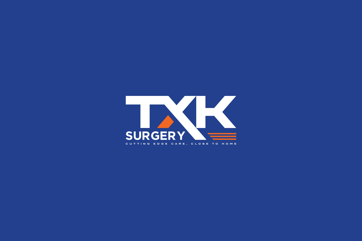
Amid the dynamic tapestry of Texarkana, a city straddling the state line between Texas and Arkansas, is a medical practice that embodies the identical blend of precision and personalized care: TXK Surgery. Formerly recognized as Texarkana Surgical Specialists, the brand embraces a contemporary simplification, reflecting not just a new name but a new vision. At its core, this transformation aims to convey a harmony of modernity and proficiency, captured succinctly in the slogan, ‘Cutting edge care, close to home.’
The Challenge and Direction
The task before the design team was to encapsulate a complex blend of skill and simplicity into a logo that would signal both expertise and approachability. TXK Surgery sought a logo that was not just representative; a desire underscored by the client's preference for a 'simple clean modern logo', but also evocative of its commitment to cutting-edge technology and intimate care.
Colors chosen for the logo were royal blue, black, gray, and accented with orange to exude trust, professionalism, and a hint of innovation. The mandate reflected an aesthetic not just modern, but distinctly professional befitting a surgical specialty.
Journey through Design Options
Upon receiving the brief, the design agency responded with initial options that respected the brand’s roots while leaning into modern typographic structures. The options varied in their exploration of spatial relation between 'TXK' and 'surgery', grounding the initials while allowing 'surgery' to emphasize the focus of the practice.
The client gravitated towards option three but expressed the desire for increasing 'surgery's’ prominence against a white backdrop—a move to ensure its readability and focus.
Visual Refinement and Approval
Following client feedback, refinement saw the word 'surgery' gaining subtle prominence. Integrating orange more prominently with blues, grays, and silver hues offered a modern contrast, echoing the advanced techniques the brand stands for. This choice synthesized an image as scientific as it was welcoming.
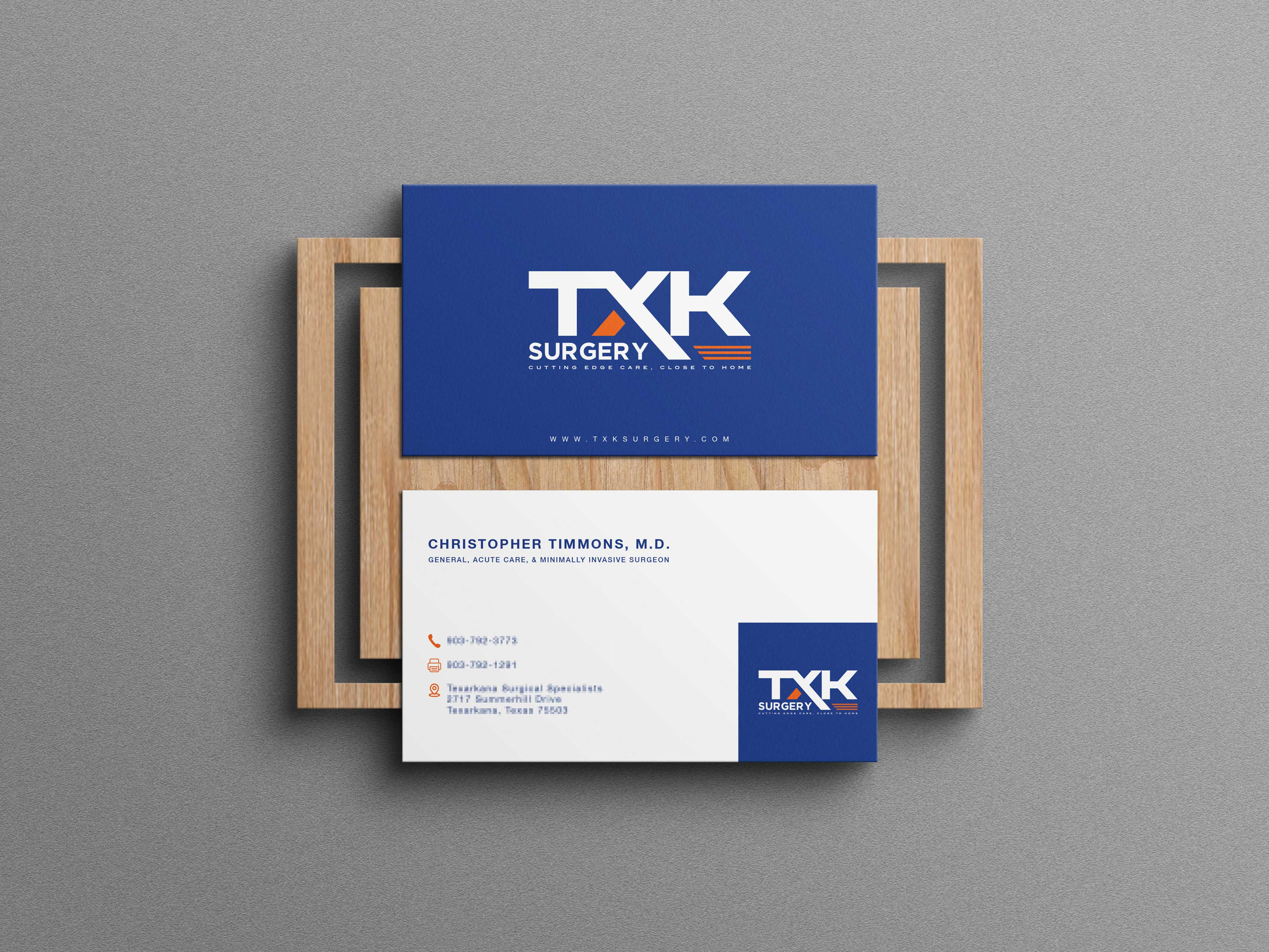
Beyond the logo, the branding extended to business cards, echoing the design's clean confidence, pairing personal and corporate necessities into a sleek portrayal of professional identity. The cards reflect the balanced sophistication of a practice that values its professional network as well as the community it serves.
A Modern Identity Set for Mosaic Landscapes
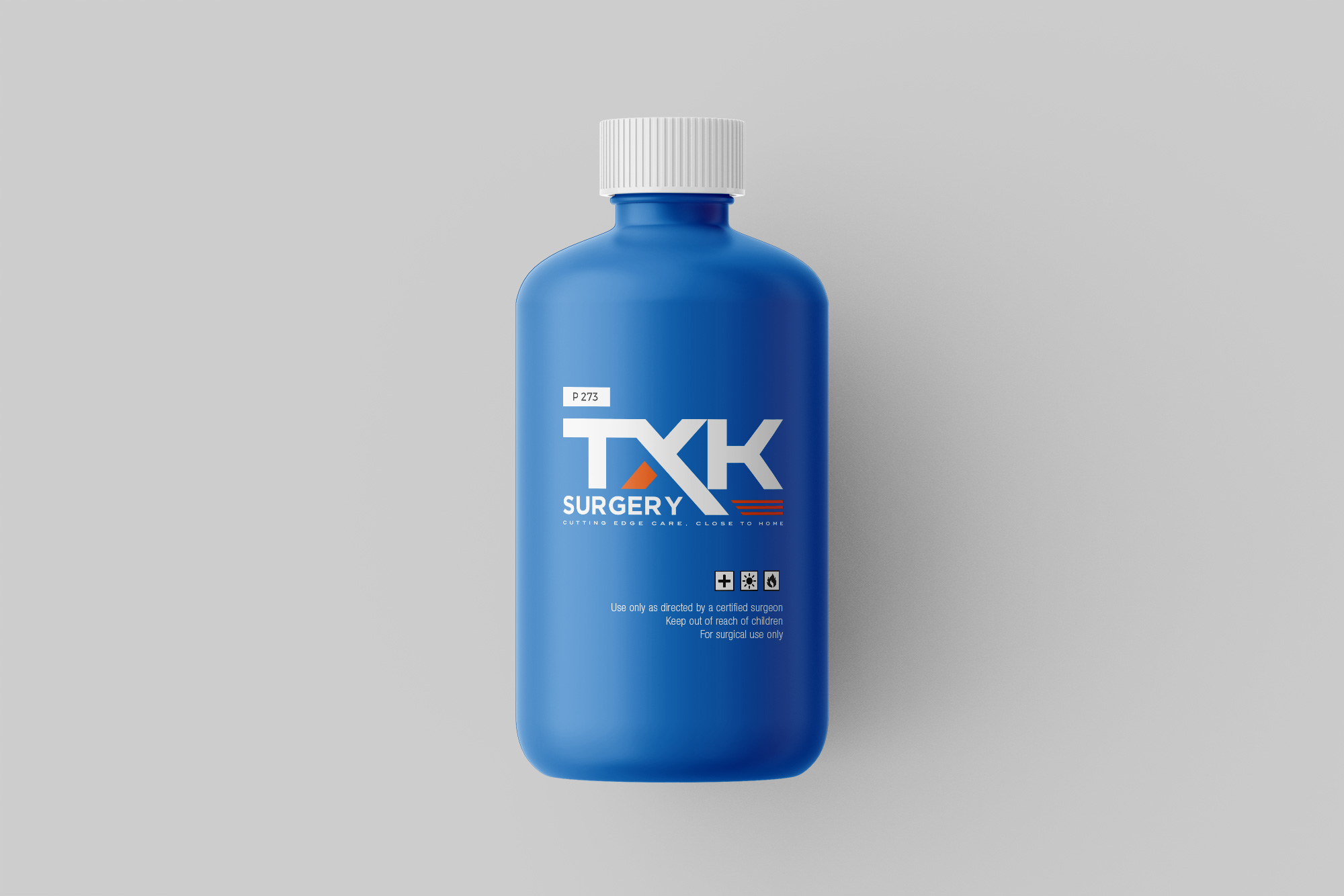
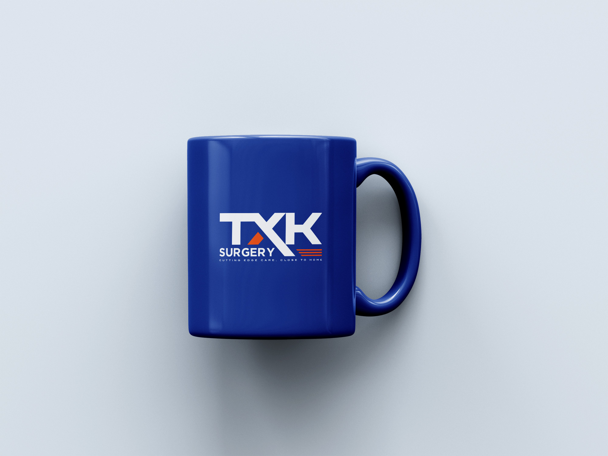
Replete with business applications, the new logo transcended stationery into digital realms, showcasing flexibility across various media applications. The rebranding had to respect the locality it symbolized yet venture forth into broader regional imaginations.
At a time where healthcare continues to underscore the importance of immediacy and locality, TXK Surgery is positioned as a beacon of innovative practice and local engagement through this redesigned identity. It combines the artful practice of surgery with branding’s transformative capacity to tell a compelling story.
The rebranding journey of TXK Surgery thus acts as a testament to the power of thoughtful design that captures and communicates a brand ethos succinctly. This careful approach ensures TXK Surgery stands as a stalwart institution underlined by trust and care—the epitome of 'Cutting edge care, close to home.'
Start your brand journey today.
