Redesigning Trust: The Branding Journey of Lothian Home Buyers
Delve into the creative process behind Lothian Home Buyers' new logo. Discover how designs shaped with empathy align with the fast-paced real estate market.
In the bustling realm of real estate, where trust and immediacy often intersect, branding becomes more than just an aesthetic endeavor. It's about creating a visual narrative that embodies the essence of a business ethos in a single glance. Lothian Home Buyers, a vibrant player in the fast-paced world of home buying, embarked on a rebranding expedition with the creative team tasked with crafting a new identity that would reflect their welcoming and empathetic ethos, punctuated by their slogan ‘Fast Home Buyers.’
The Philosophical Undertones of a Name
The name 'Lothian' already bears a rich historical and cultural significance, reminiscent of the Lothian region in Scotland, an area known for its striking countryside and vibrant cultural life. In this context, the name suggests a sense of permanence and reliability, qualities that are indispensable in the real estate market. By harnessing these profound undertones, Lothian Home Buyers strives to anchor itself as a beacon of trust and professionalism in the industry.
The Project Brief: A Journey of Empathy and Warmth
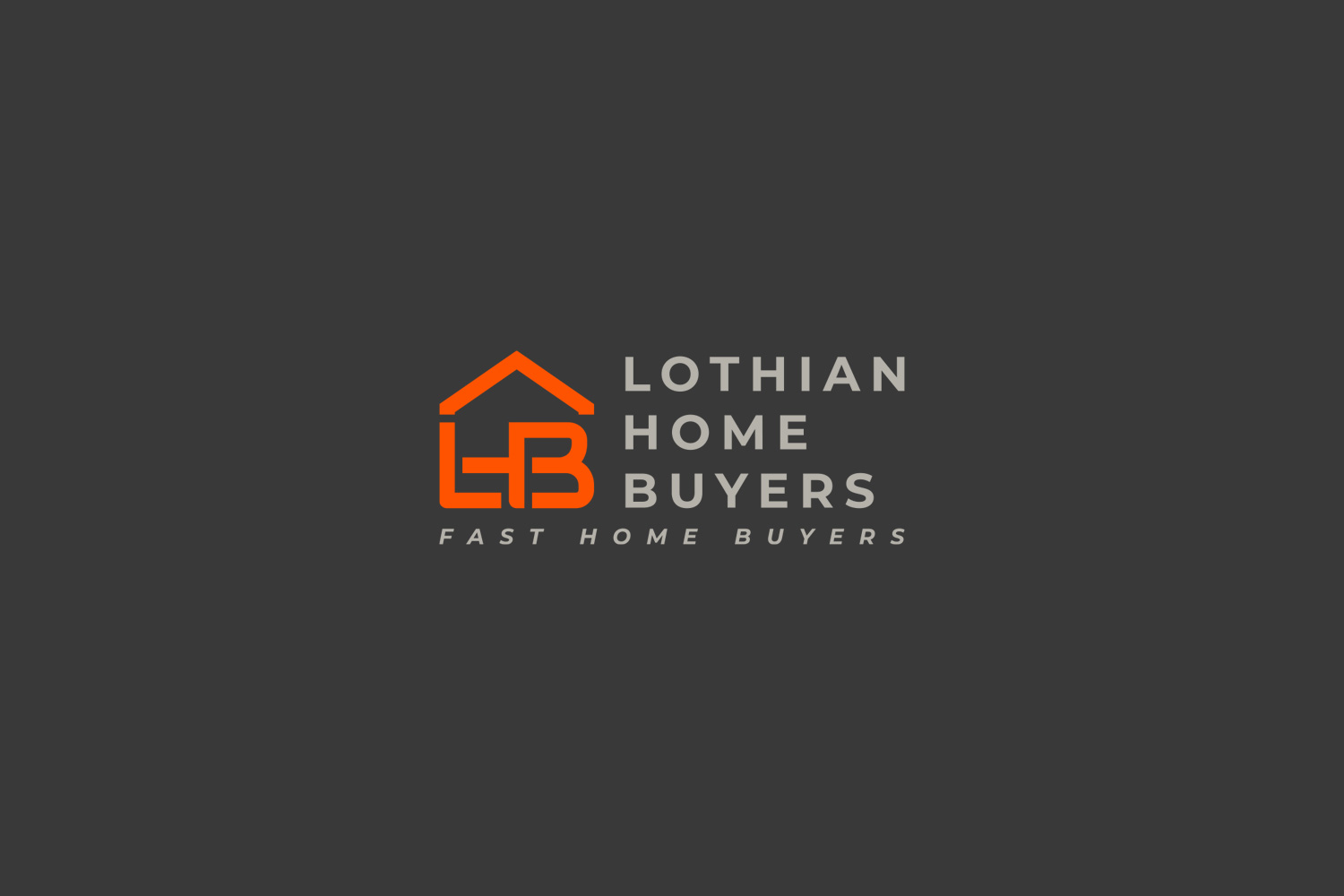
Lothian Home Buyers reached out to the design team for an express delivery, emphasizing the importance of a color palette led by vivid oranges to convey warmth and a welcoming aura. Their aim was to develop a logo that is empathetic yet lively, echoing the rapid yet human-centric approach they adopt within the property market.

They envisioned a logo that would instantly communicate their core values while standing out amid the overwhelming array of competitors.
The Creative Intervention: Curating Options
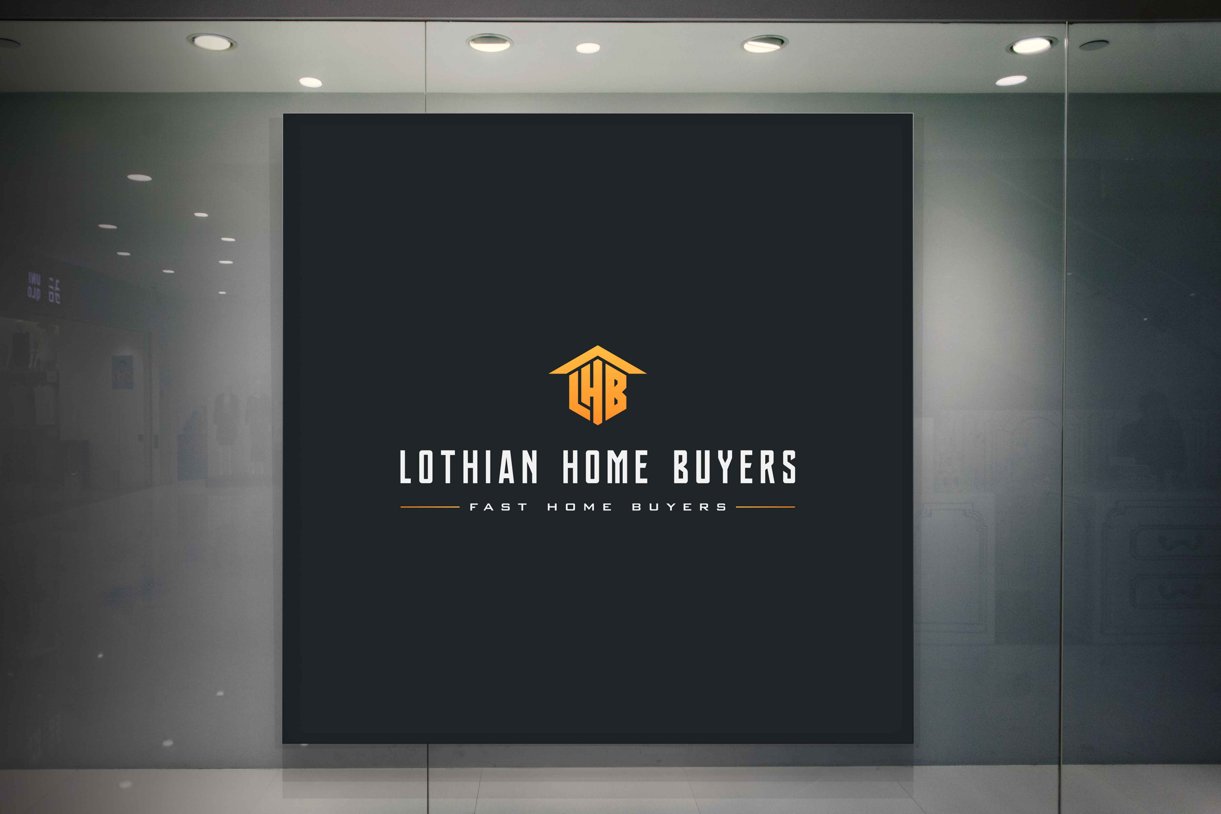
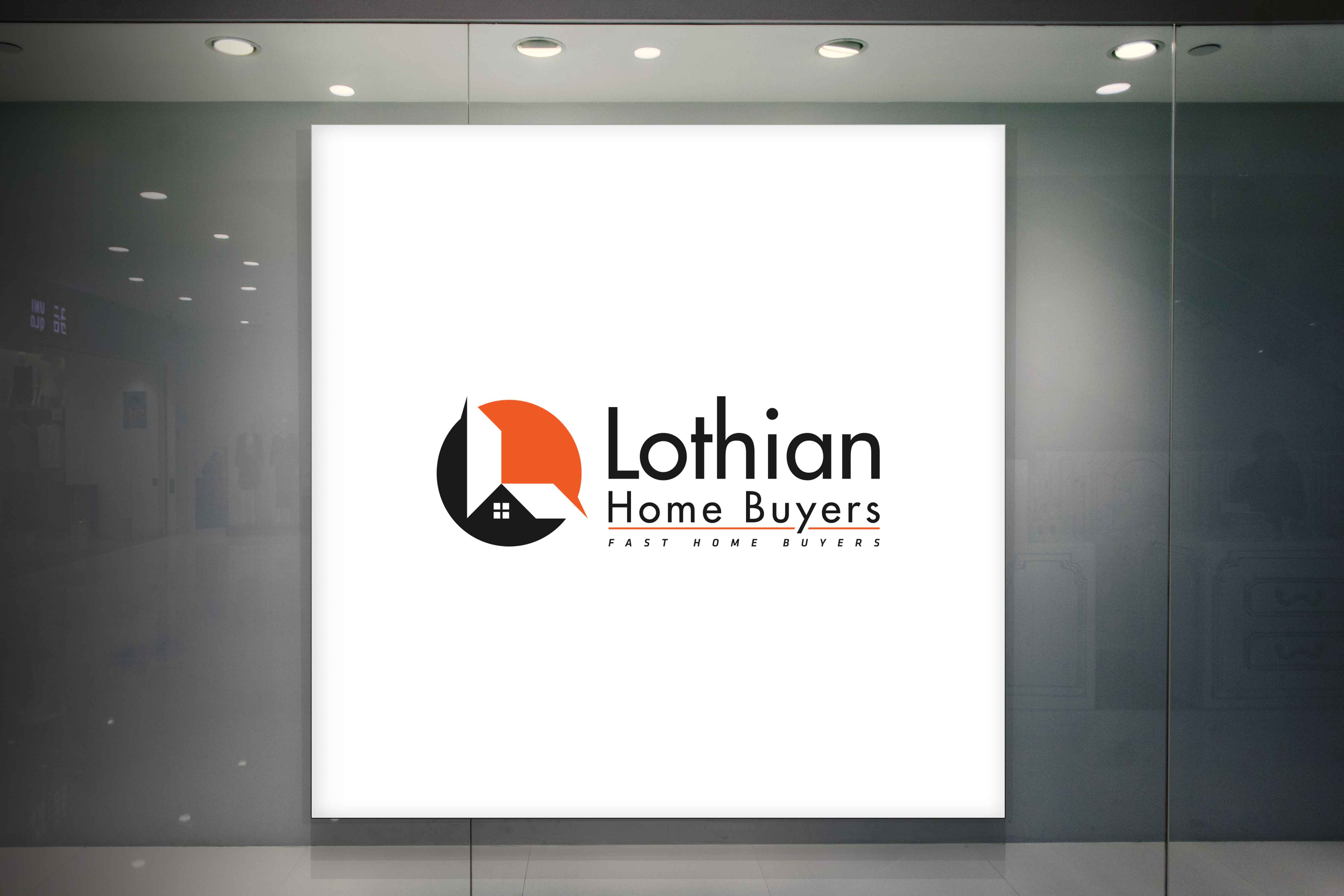
Responding swiftly to the client's need for a 24-hour turnaround, the design team set to work. Three vibrant options emerged from their creative endeavors, each embodying the essence of 'Lothian' through a blend of dynamic typography and engaging visual elements.
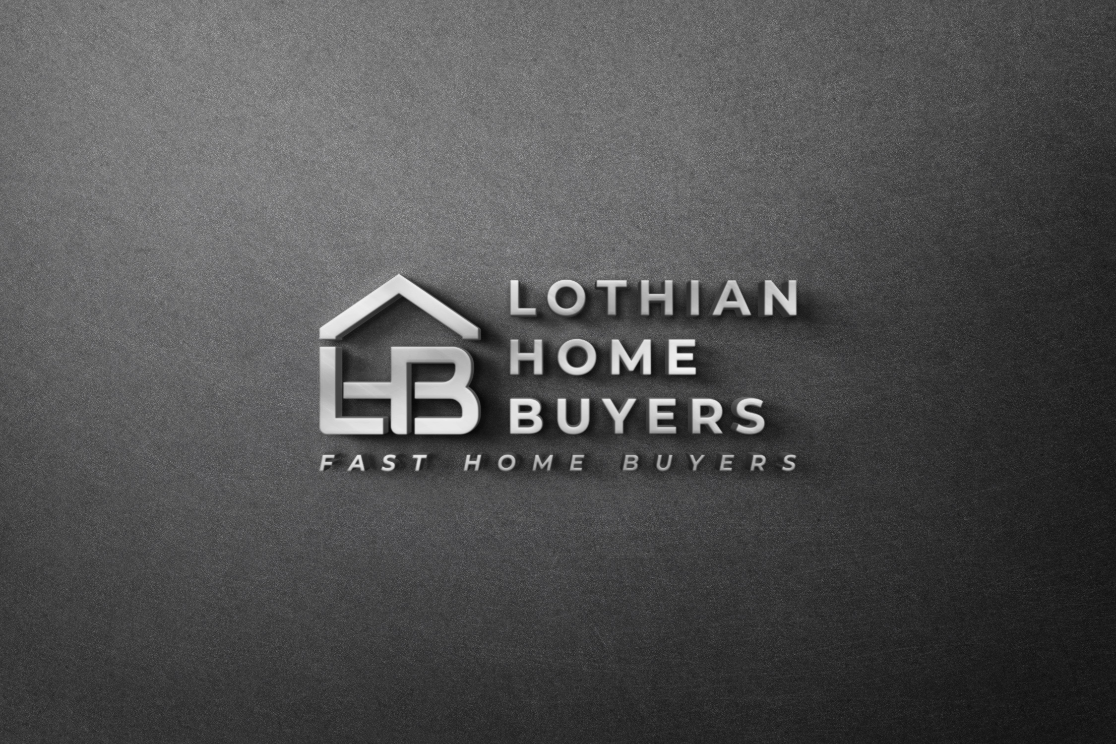
Final Selection: Embracing Vibrancy and Speed
Ultimately, it was the second option that resonated most with Lothian Home Buyers. This design encapsulated the vibrancy of the orange palette, carefully intertwining legibility with aesthetic appeal, aligning impeccably with the fast-paced nature of their service. The client expressed admiration for the striking balance achieved in such a time-sensitive task.
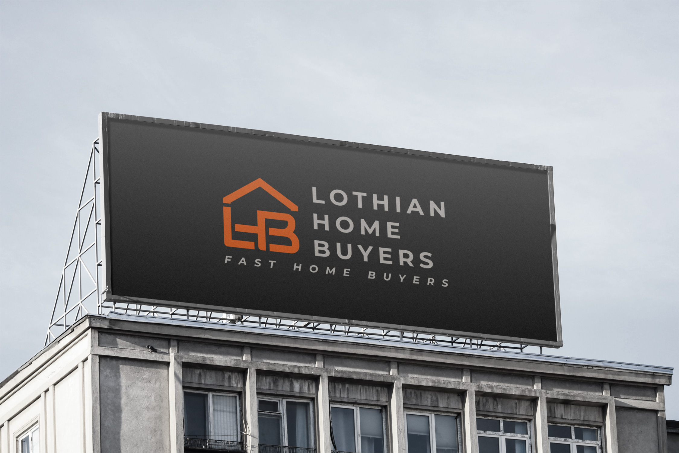
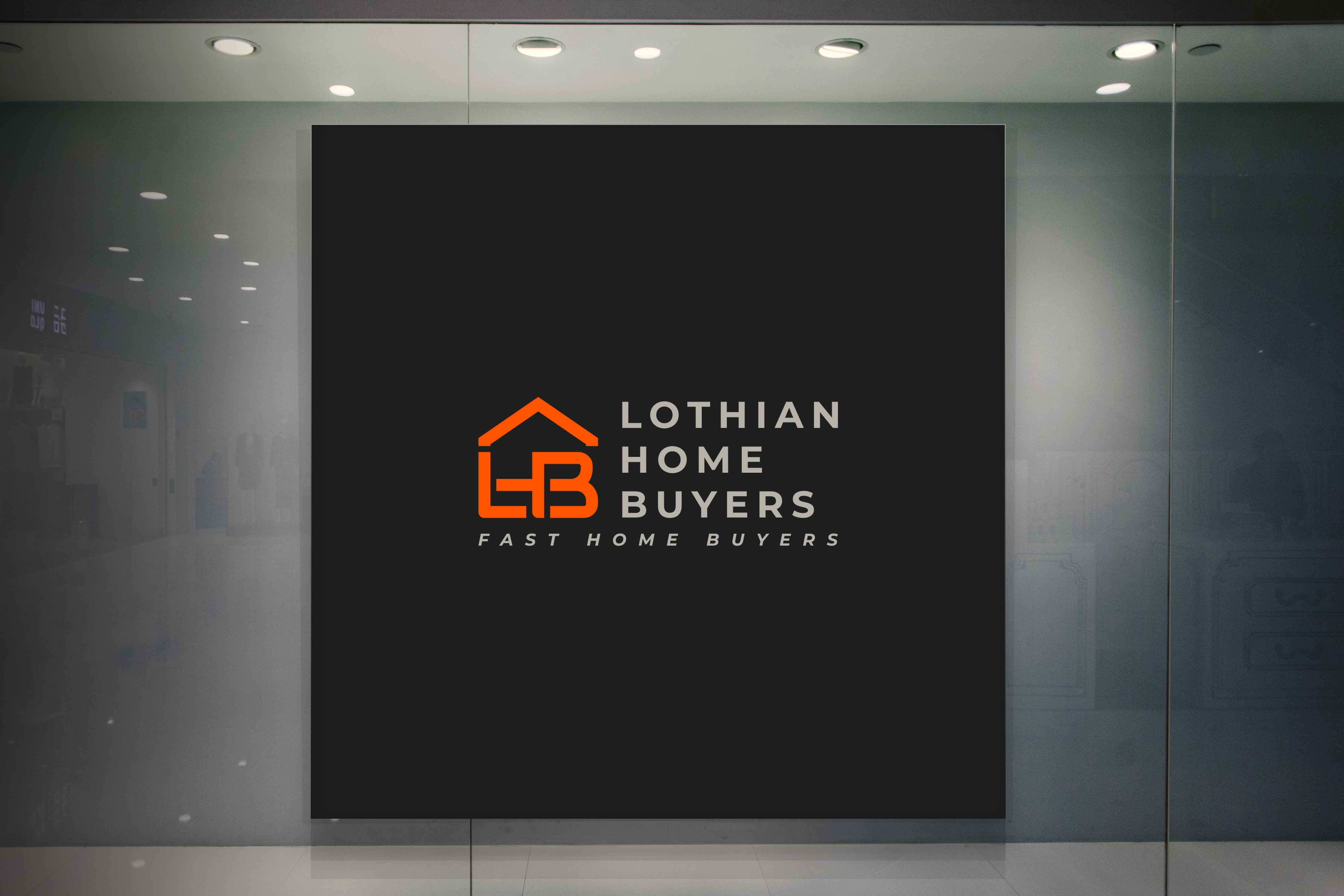
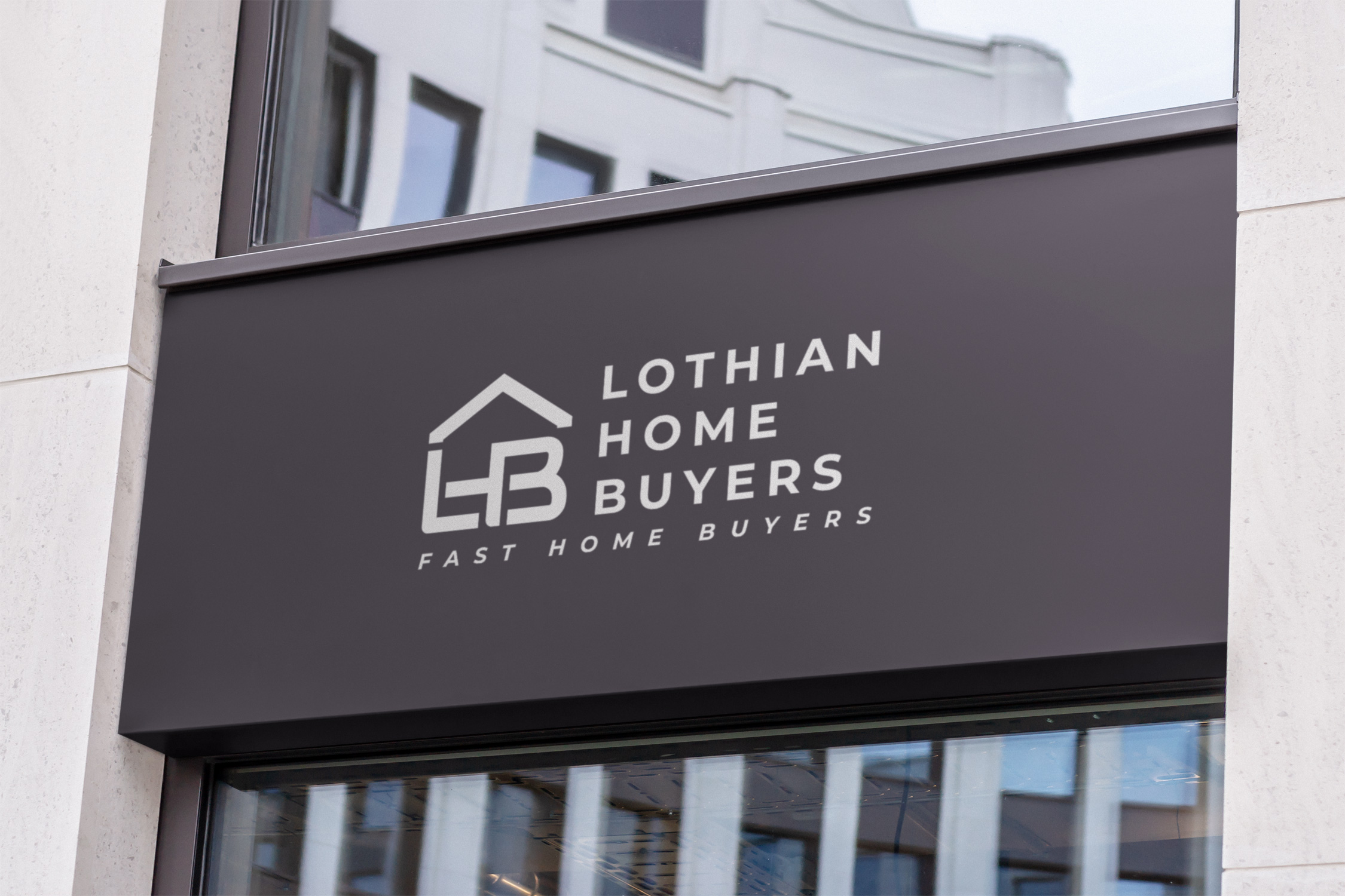
Realizing the Vision: Logo in Action
The final deliverables displayed the transformative power of this rebranding. Whether it graced a billboard or a storefront, the logo maintained its integrity, facilitating instant recognition and association with the Lothian ethos. The consistent, bold imagery captured in the mockups illustrates how design can leverage brand visibility in a practical setting, reinforcing both the emotional and visual dimensions of Lothian Home Buyers' fresh identity.
Conclusion: Design Tales of Trust, Speed, and Artistry
This project highlights the derivative strengths of empathetic design, fastidious project management, and the meticulous execution of tight deadlines. In the ever-competitive landscape of real estate, where first impressions are pivotal, Lothian Home Buyers is set to make an indelible mark, heralded by its renewed visual identity.
Start your brand journey today.
