Redefining Fashion Identity with Brush and Needle's Rebranding Journey
An intricate journey of redefining brand identity, the Brush and Needle case study showcases cultural expression through design, encapsulating fashion as an art form.
In the world of creative design, every project reveals a tapestry of inspiration, collaboration, and artful execution. Such is the narrative of Brush and Needle—a brand determined to carve its niche by intertwining fashion with cultural artistry. This case study uncovers their journey, from the initial client briefing to the final celebration of an evocative logo, encapsulating the brand’s ethos.
The Artistic Genesis
Brush and Needle, a brand seamlessly operating at the crossroads of art and fashion, is dedicated to crafting unique clothing that emanates stories of cultural significance. Located at the heart of creativity, this brand prioritizes customizing fabric patterns to honor their cultural roots, embodying the philosophy that fashion is an artistic expression.
Client's Vision and Initial Direction
The rebranding initiative commenced with Brush and Needle seeking to redefine its visual identity. With the slogan 'Fashion through art' as their guiding beacon, they expressed a desire to cultivate a logo that captured the breadth of their unique approach. Their request was simple yet profound; a black and white color scheme yielding strength and timelessness.

Upon engaging with the design team, the client shared their previous logo, laying the groundwork for a deeper transformation. They emphasized a subtle incorporation of the brush and needle, wishing instead for the initials 'B' and 'N' to take precedence, reflecting boldness in every stitch and stroke.
Exploratory Designs and Client Feedback
The design team responded with an array of initial concepts, each option oscillating between different interpretations of the brand's core values. These included logo options with a serene blend of art-inspired typography and monochromatic sophistication.


Despite the diverse range of designs, the client sought something distinguishable. They desired a more assertive expression in the typography, coupled with a moderately abstract manifestation of the brush and needle,a representation of the balance between subtleness and boldness.
Refinement and Resolution
Galvanized by the candid feedback, the design team embarked on refining their concepts with renewed clarity. They presented options with prominent and stark lettering, subtly weaving together the sensibility of brushes and needles.

Ultimately, a blend of past and present designs captured the client's satisfaction. Merging typography from Option 01 with the iconography of Option 02 enabled Brush and Needle to arrive at a harmonious logo, emblematic of a fashion brand in tune with artistic expression.
The Final Celebration
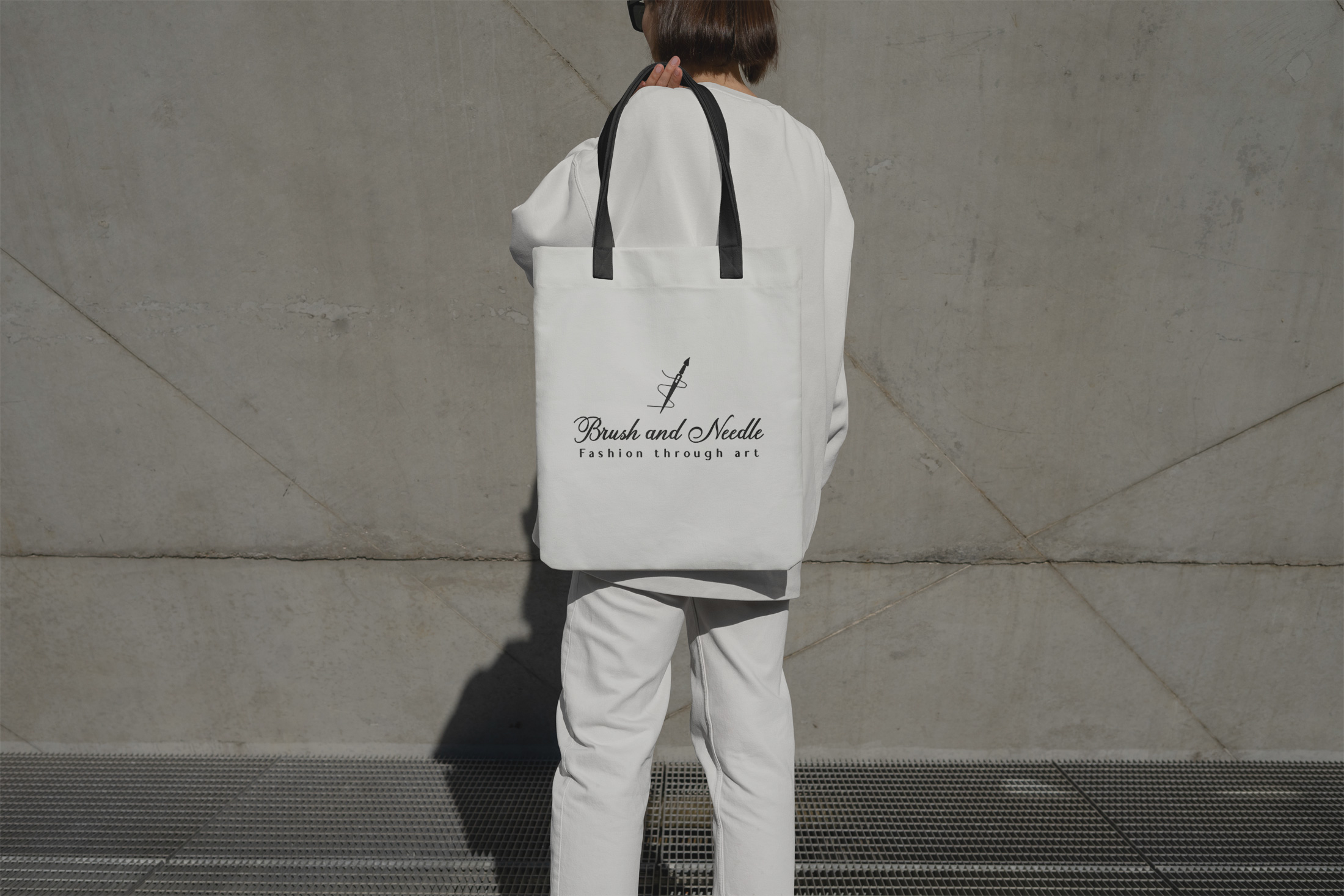
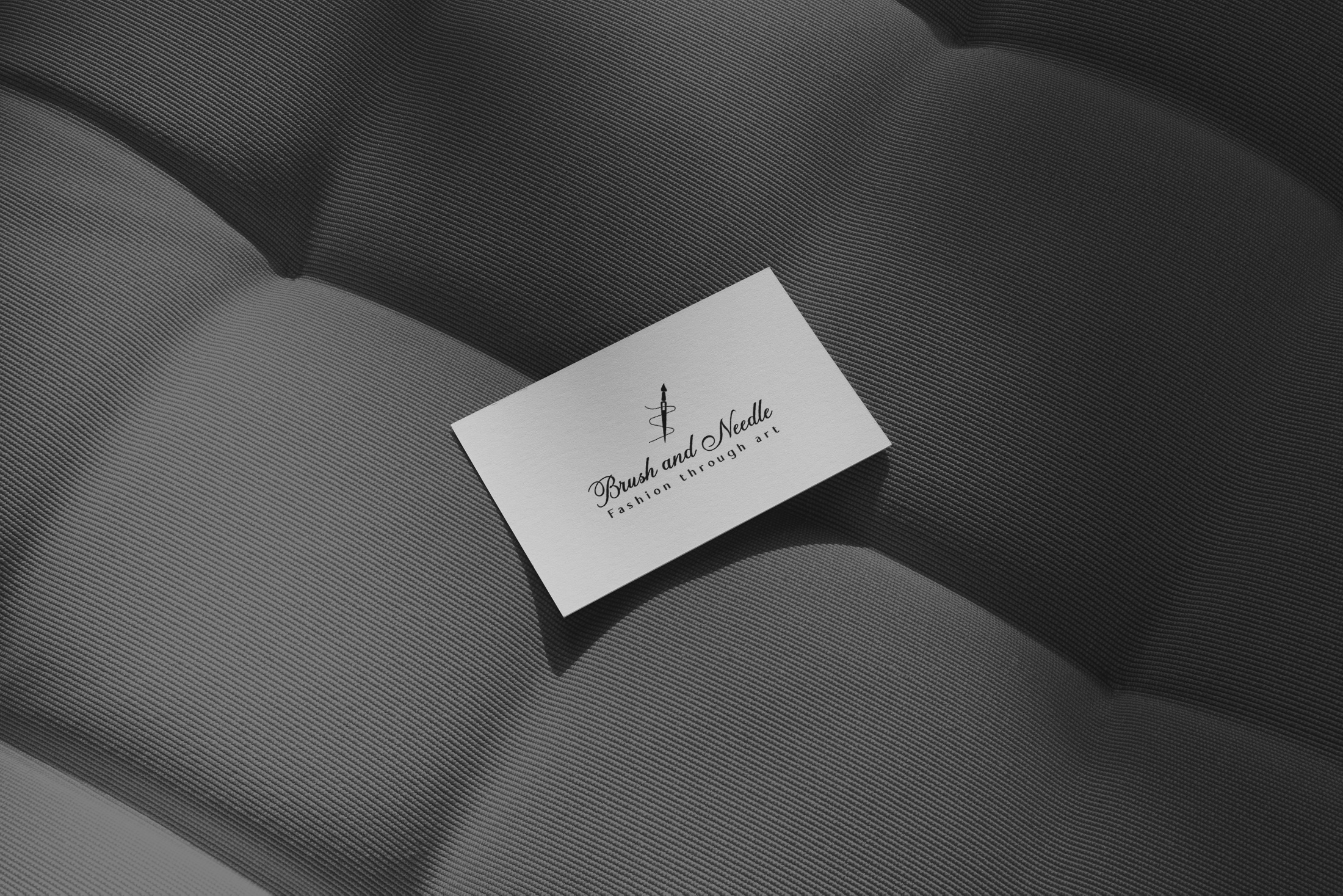
The conclusion of this design odyssey was marked by the presentation of the final logo, an emblem that enshrines 'Fashion through art' in bold strokes and balanced artistry.

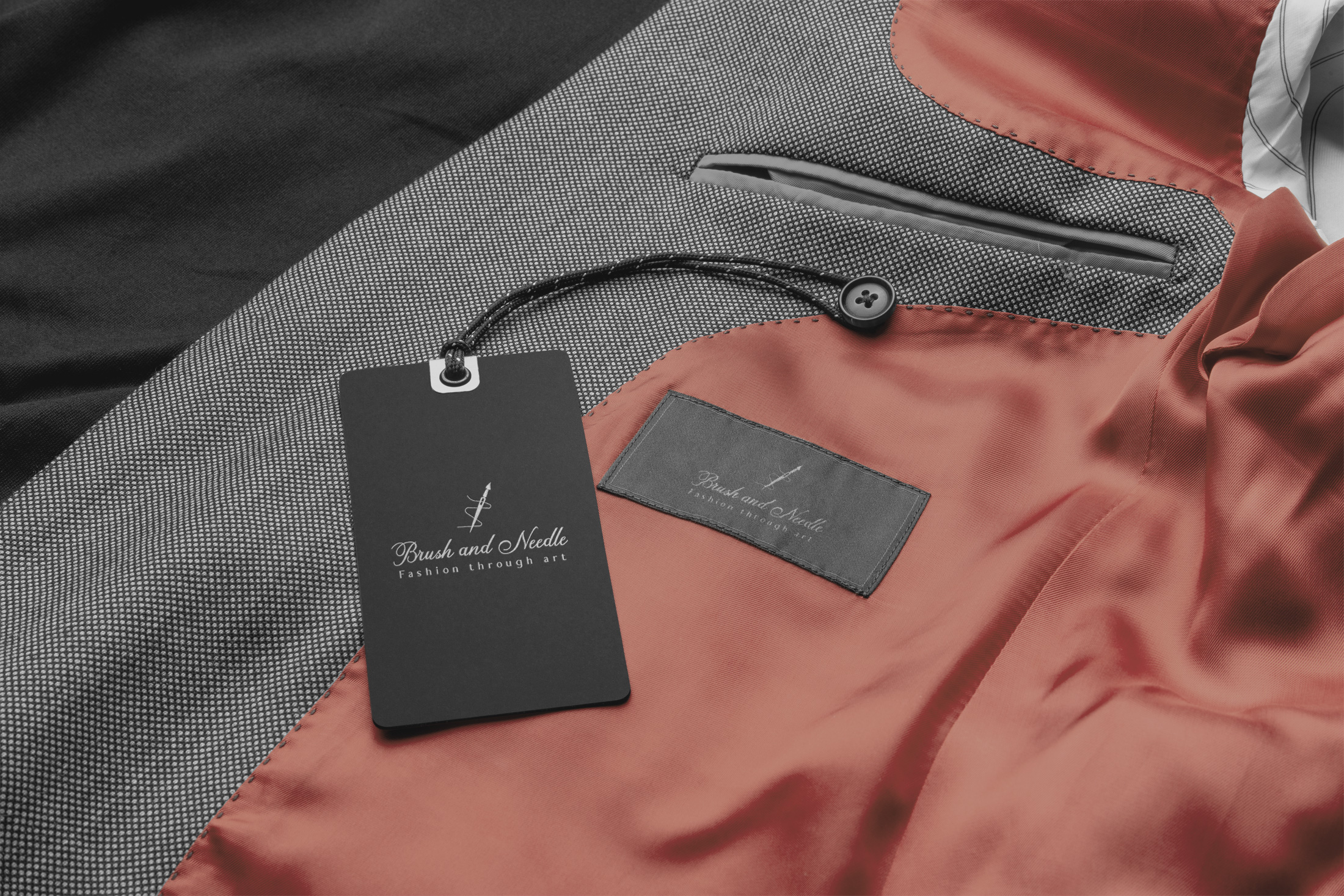
This rebranding venture illustrates Brush and Needle’s commitment to preserving the sanctity of cultural narratives while fashioning a modern identity that resonates with its audience. The case study stands as a testament to creative synergy, proving how reimagining a brand identity can be as transformative as it is insightful.
Start your brand journey today.


