Rebranding Excellence: KeepSelling's Transition into the Modern Market
Explore how KeepSelling underwent a transformative rebranding process through a design that reflects its innovative approach to sales consulting.
In the fast-paced realm of sales and market innovation, standing out is paramount. KeepSelling, a company dedicated to elevating sales teams by focusing on consulting, software, and community, sought a logo redesign that would encapsulate its multifaceted approach. The project began with an intriguing blend of philosophical and practical elements, inviting the design team to weave a narrative reflective of KeepSelling's mission.
Minimal & Elegant
The initial client brief proposed simplicity yet versatility, with the preference for black and white or a vibrant green. The aim was to create a logo that mirrored the three pillars of their business and worked seamlessly across various media.
Creative & Descriptive: From Typography Trials to Concept Exploration
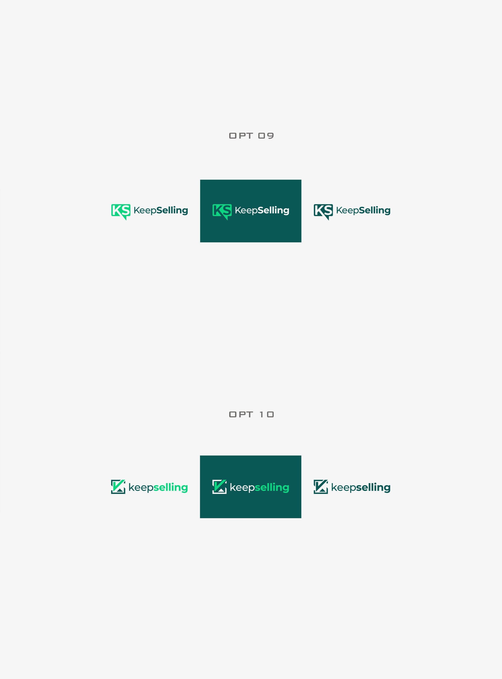
Early iterations explored modern typography options, including Open Sans and Inter, yet the design team was tasked with exploring beyond these boundaries to present a fresh perspective. The first array of options presented a variety of styles focusing on the acronym 'KS', with some integrating speech bubble elements, invoking critiques related to platform misassociations.
The client's feedback was direct and insightful, steering away from chat box motifs which misrepresented the professional ethos of KeepSelling. Instead, the focus shifted to a boxed representation of 'KS', a nod towards both simplicity and strength.
Font And Final Touches
What followed was a symphony of design pivots leading to a logo that not only satisfied the client but resonated with their vision. The chosen design incorporated Montserrat, a font synonymous with modernity and elegance, effectively grounding the brand's contemporary yet approachable identity.
Execution and Brand Adaptability
The final designs showcase adaptability across platforms, performing with equal grace in digital and print formats, from business cards to expansive brand applications. Each iteration of the logo is an assertive reminder of KeepSelling's dedication to its services and community.
Presentation of the final deliverables spans multiple practical applications, including promotional materials and real-world mockups. A poster mock-up highlights the logo's impact at scale, while branded items such as tote bags and trucks emphasize the design's versatility.
CONCLUSION
The KeepSelling rebranding story exemplifies how thoughtful design can embody the ethos of a company, skillfully navigating market demands while capturing the essence of its inspirational journey. This visual evolution underscores the importance of design thinking in establishing a brand identity that is as compelling as it is functional.
Start your brand journey today.
