PRTYRZ: Crafting an Electrifying Identity in the Festival Fashion Industry
Delve into the creative process behind PRTYRZ's logo design, exploring a new brand's journey into festival fashion with an electrifying identity.
In the ever-evolving world of festival fashion, where vibrancy meets organized chaos, a new player is making its mark. Meet PRTYRZ, an online store on the cusp of launching its collection of glowing bunny ears and other festival gadgets. The logo design journey for this energetic brand encapsulates more than just visuals; it’s a narrative of creativity, adaptability, and vibrant expression that mirrors the dynamic festival culture.
The Brand's Vision
PRTYRZ aims to become a staple in the festival fashion industry by selling unique glowing accessories that festival-goers and party enthusiasts can proudly sport. These accessories, starting with the quintessential bunny ears, are designed to infuse fun and flair into any event. The brand seeks to project an image that is both high-quality and approachable, making it essential for the logo to reflect these ideals without being overly playful.
The Design Journey
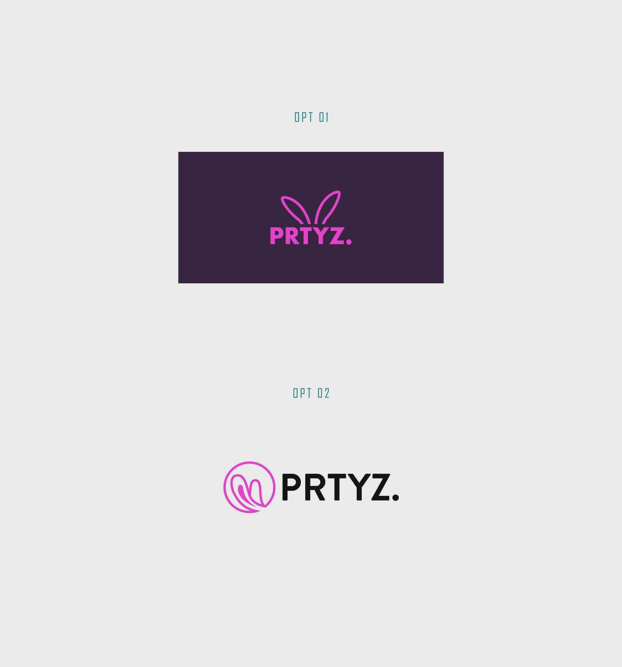
The project's inception began with a clear and focused brief provided by the client, who wanted a logo primarily centered around the brand name, using black as the main text color with a pink accent. However, the requirement was for a design that wasn't pigeonholed into niche themes like bunny ears and could serve a broader range of festival products.
The design team responded with a series of initial concepts. These were aimed at finding a visual harmony that spoke to both the youthful and premium aspects of the brand. The designs were displayed in an initial logo sheet, each with its own unique touch.
Design Revisions
The client decided on the second design option, showing preference for its aesthetics. However, they requested an adjustment to the brand name from "PRTYZ." to "PRTYRZ." with variations in color that would complement a lighter background effectively. Furthermore, they permitted the exploration of hues beyond pink, encouraging a broader creative palette.
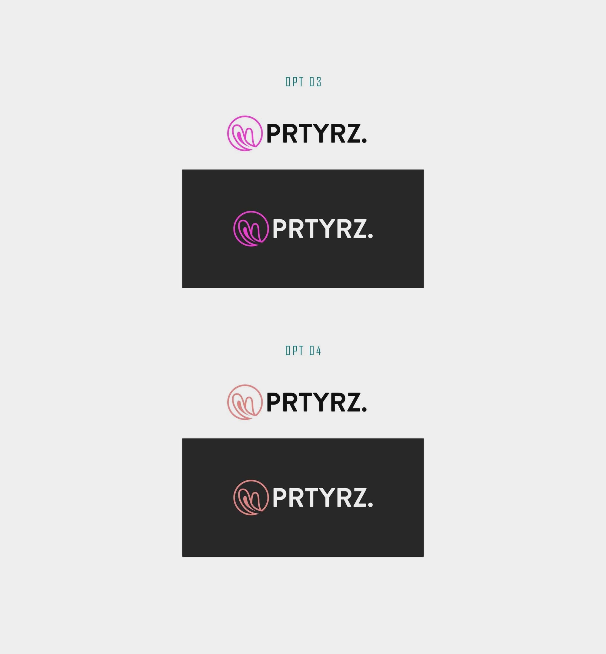
The Final Touch
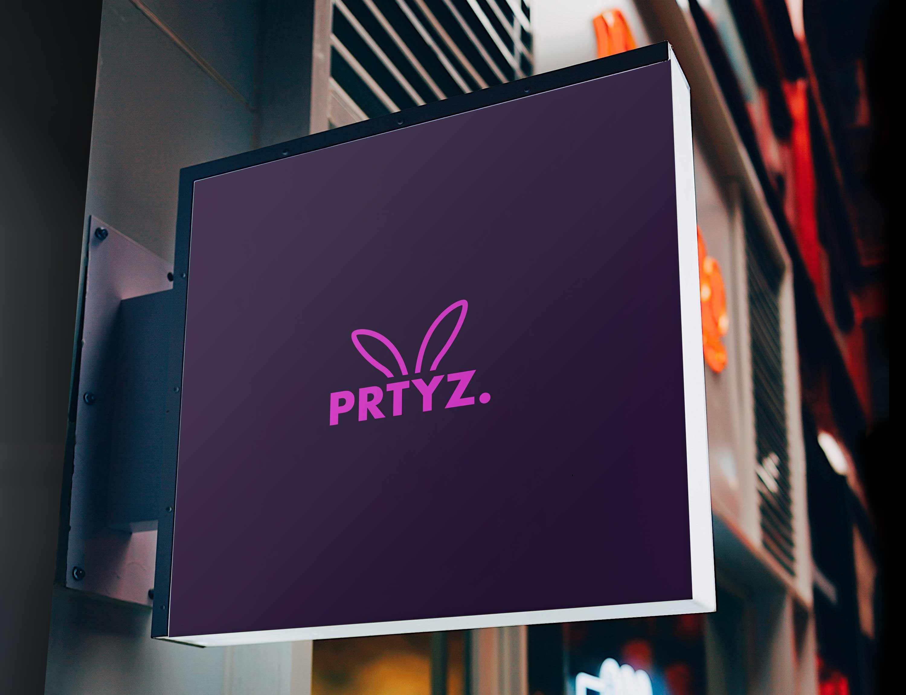
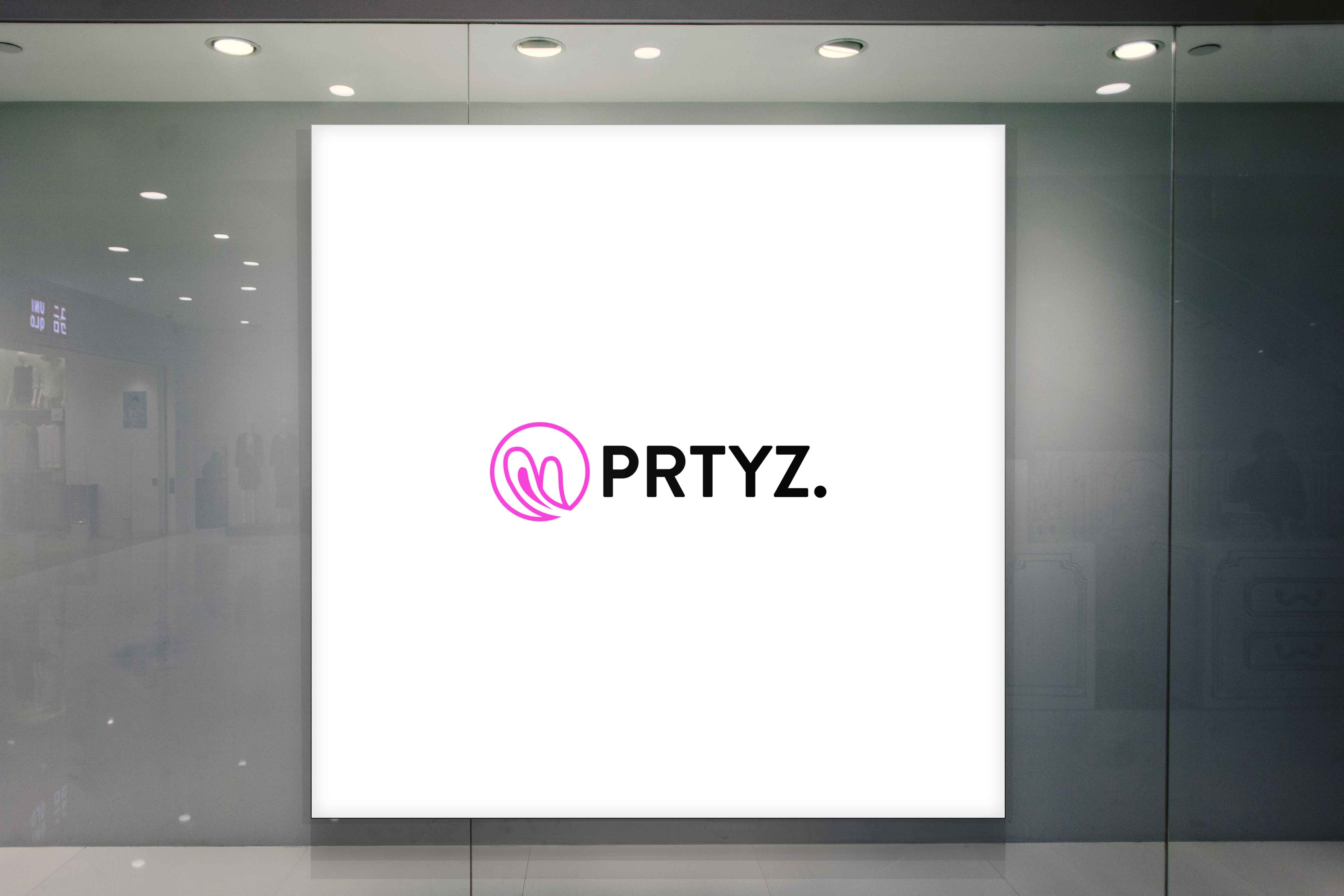
After the name adjustment and thorough exploration of color schemes, the project received the client's approval. The chosen logo was both versatile and appealing, showcasing a modern look that resonated with the brand's target demographic. The final design was applied across various branding materials, affirming its adaptability within different contexts.
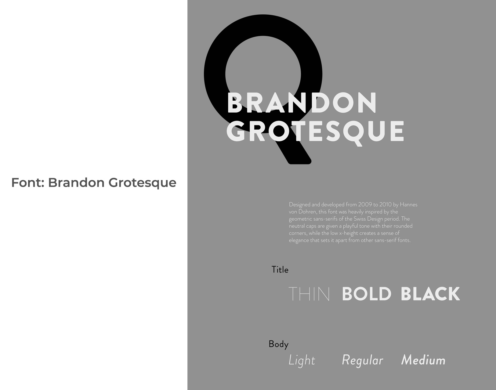
The Typeface: Brandon Grotesque
Integral to the logo's design is the use of the Brandon Grotesque typeface, a sans-serif font known for its geometric precision and clean lines. This typeface aligns perfectly with PRTYRZ's desire for a clean yet dynamic aesthetic that speaks to a younger audience while maintaining an air of sophistication.
The journey to the final logo for PRTYRZ showcases how strategic design can capture a brand's essence, effectively translating its vision into a symbol that resonates with its audience. As the brand steps into the competitive realm of festival fashion, armed with a distinct identity, it paves the way for an engaging interaction with style-savvy consumers eagerly awaiting to express themselves freely and vibrantly.
Start your brand journey today.
