One of One Investments: Reimagining Identity in the Real Estate Market
Discover how One of One Investments redefined their brand identity to showcase individuality, crafting a logo that resonates with their unique, client-focused approach.
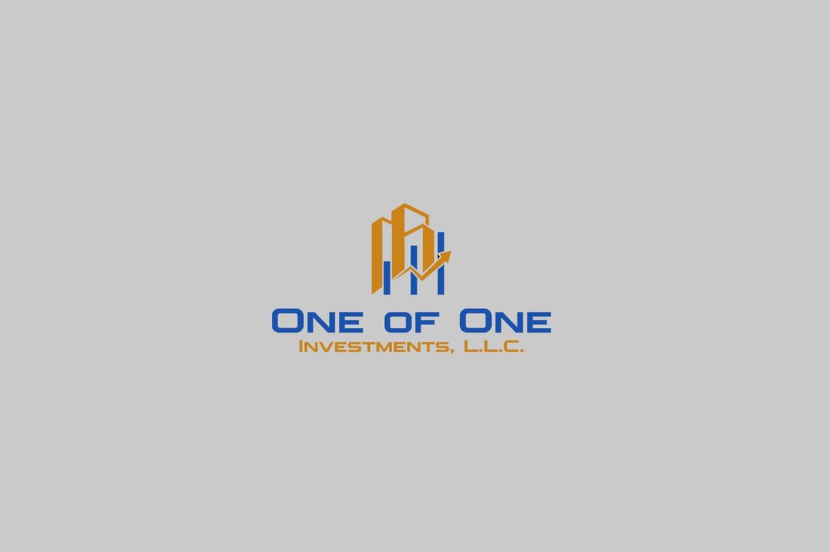
In the bustling sphere of real estate, where market dynamics dictate swift decisions and strategic foresight, ensuring brand distinction can be the key to sustained success. This notion of distinctiveness was central to the rebranding journey undertaken by One of One Investments, L.L.C., a firm renowned for its tailored services to individual investors across the vibrant American property landscape.
From the outset, One of One Investments sought to encapsulate the unique essence of their clientele within their reimagined visual identity. As highlighted in their brief to the design team, the brand aimed to express the individuality of each client, reflecting the tailored approach that distinguishes their services in the real estate market.
Initial Design Explorations
The design team embarked on an exploration of potential symbols and typography that could convey this philosophy. The initial design concepts presented a range of options, each crafted to embody different facets of individuality within the investment realm. The first round of design iterations featured a series of potential logos with varying degrees of complexity and style.
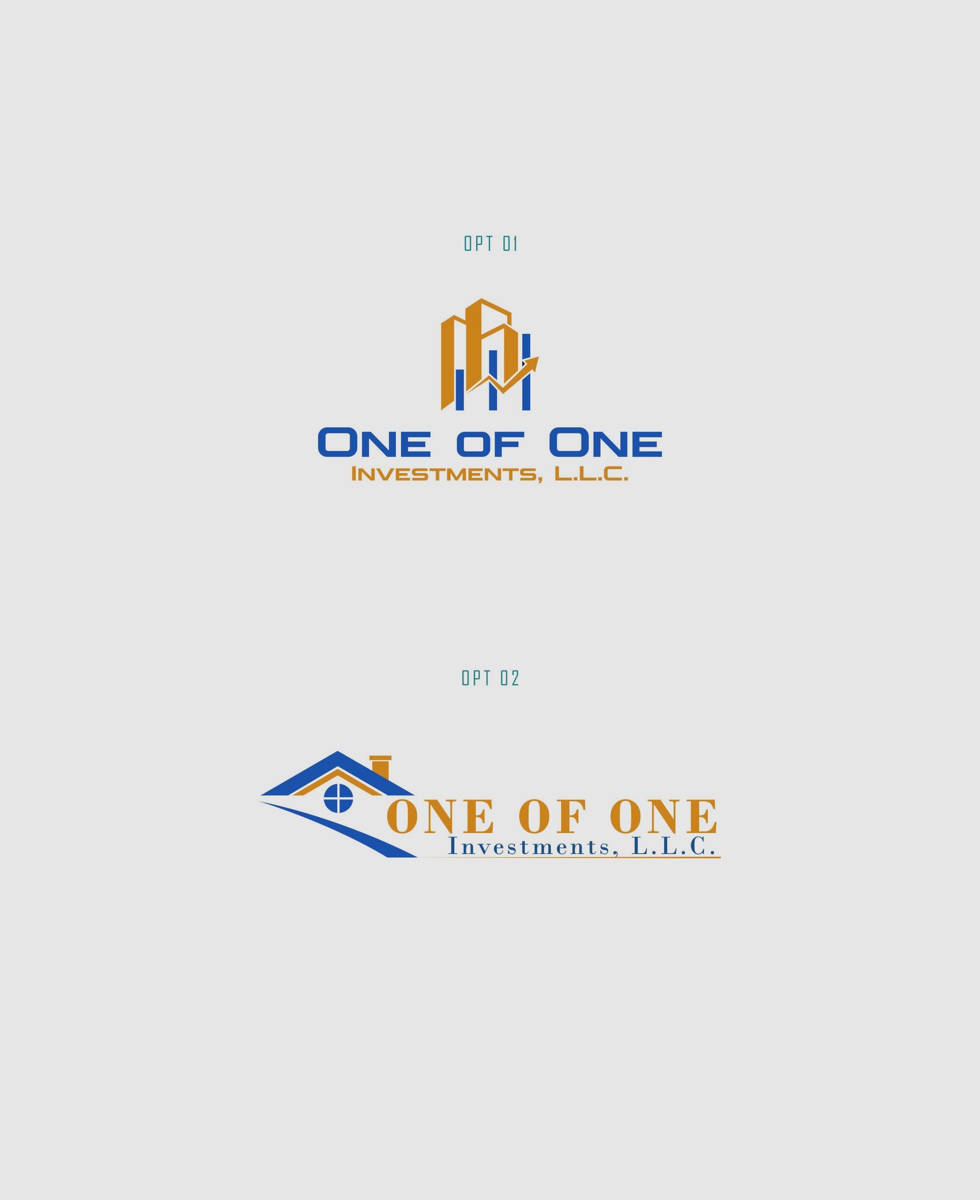
Each option represented a distinct take on the brand narrative, playing with elements of modernity, professionalism, and the symbolic nuance of individuality. However, it was option one from the initial presentation that resonated most with the client, setting the stage for further refinement.
Refinement and Client Feedback
Feedback from the client was pivotal in steering the design process toward a final iteration. The client appreciated the chosen color scheme and font from the first design option but desired a less intricate logomark. Their vision leaned towards a classic, vintage coin aesthetic that embodies timelessness and credibility.
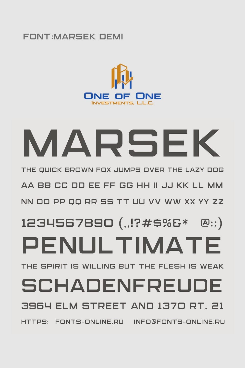
The design team responded creatively, developing a logomark that seamlessly blended these elements into a cohesive and impactful representation. Utilizing the Marsek Demi font, known for its contemporary yet robust structure, the final logo achieved a balance between modern accessibility and traditional assurance.
The Final Outcome
The refined logo, as chosen by One of One Investments, encapsulates the delicate interplay of individuality and expertise that defines their brand. The visual identity is both striking and minimalistic, ensuring it remains memorable and distinguishable across various mediums and contexts.
The final deliverables beautifully illustrate this transformation. From digital screens to potential business signage, these image mockups showcase the logo's versatility and appeal in real-world applications.

This rebranding initiative not only amplifies One of One Investments’ market stance but also poignantly reflects their core philosophy: celebrating the singularity of each client and their individual journey in the real estate investment world.
Conclusion
The rebranding journey of One of One Investments is a study in harmonizing strategic vision with creative design. As a brand that prizes individual distinction in the marketplace, their new logo stands as a testament to their commitment to their clients' unique investment narratives, ensuring that their brand identity is as unique as the services they provide.
Start your brand journey today.


