Ökoloader: Revolutionizing Home EV Charging with a Sustainable Focus
Explore the journey of creating the Ökoloader brand, an eco-friendly solution for electric vehicle charging, with a focus on lifestyle and nature.
The transition to sustainable energy solutions has been ushering in a new era of innovation. Home electric vehicle charging points are becoming indispensable tools for modern lifestyles that focus on environmental responsibility. Leading the charge in this domain is Ökoloader, a brand dedicated to providing eco-friendly wall box solutions for EV charging.
The journey to creating a visual identity for Ökoloader began with a clear vision: to blend lifestyle, nature, and cutting-edge technology seamlessly. With the surge of electric mobility, the Ökoloader wall box aims to saturate the market with a solution that not only complements the trend but also leads it.
Client's Vision: A Nature-Infused Lifestyle
The client's briefing called for a design that embodied the themes of eco-friendliness, clean energy, and the iconic presence reminiscent of brands like Tesla. Ökoloader's mission was not merely to provide a functional product but to integrate it into an eco-centric lifestyle. The goal was to produce a logo that would visually encapsulate this ethos, making nature and technology partners in progress.
The word 'Ökoloader' itself is a testament to the fusion of 'eco' and 'loader', pointing to both functionality and sustainability. The brand name conjures images of verdant landscapes and forward-thinking technology.
Design Iterations: From Concept to Clarity
The design team set forth on this creative expedition with a range of visual concepts. Three initial logo variants were delivered, each seeking to capture the essence of Ökoloader's vision.
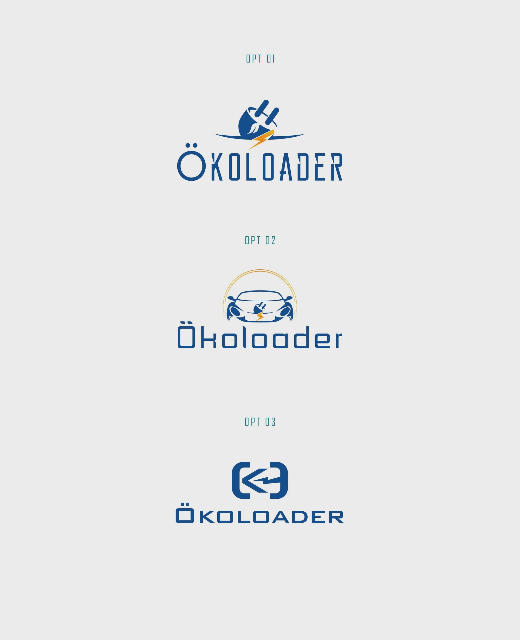
In each variant, the interplay between organic shapes and modern typography served to demonstrate the union of nature and technology. The design team explored imagery that represents electromobility alongside elements that whisper to the quiet strength of natural energy resources.
The Winning Logo: Option Three
From the trifecta of designs presented, option three emerged as the client's preferred choice. This logo distilled the brand's narrative into a single, recognisable emblem that promises a clean environment and sustainable lifestyle.
With its sophisticated curvature and understated elegance, the chosen design elevates Ökoloader's identity. The emblem captures the essence of natural ecosystems intertwined with human innovation.
A Bold Typeface: Bank Gothic
Alongside the logo, the decision to employ Bank Gothic as the typeface reiterated the brand's futuristic aspirations. Known for its robustness and clarity, this typeface conveys modernity and precision.
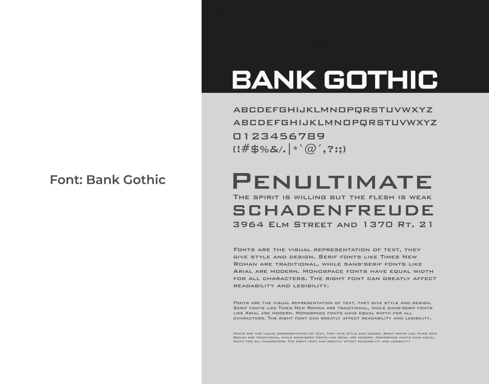
The geometric forms of the typeface offer a sense of agelessness, aligning well with the long-term vision of the brand.
From Concept to Reality: Final Deliverables
The culmination of this creative journey is a suite of promotional and real-world visuals where the logo comes to life. Whether adorning the wall box itself or featured in advertising materials, the logo encapsulates the Ökoloader promise.
Conclusion: A Brand on the Rise
Ökoloader stands poised to lead in the realm of home EV charging solutions with a brand identity that speaks volumes about sustainability and innovation. This logo marks the beginning of a path defined by the thoughtful integration of technology and environmental stewardship.
This branding journey not only reflects a single product’s ethos but serves as a beacon for what modern brands can achieve when they align their core message with the world’s growing demand for sustainable solutions.
Start your brand journey today.
