Noble Lending Group: A Sophisticated Branding Transformation by Noble Design Agency
Explore how Noble Lending Group reimagined its brand with the help of Noble Design Agency to reflect its values in the mortgage and real estate sector.
In the dynamic world of finance, branding is not merely an aesthetic choice; it's a strategic necessity. Noble Lending Group, a burgeoning name in the banking, mortgage, and real estate sectors, embarked on a brand journey that encapsulates the essence of its services and aspirations. This initiative was brought to life with the collaboration of the Noble Design Agency, known for their keen insight into design and market trends.
The Brand Mission
Noble Lending Group envisioned a brand identity that would resonate with its commitment to integrity, reliability, and excellence in the financial sector. With a growing presence in the industry, they recognized the importance of reflecting their core values in every aspect of their public engagement, starting with their logo.
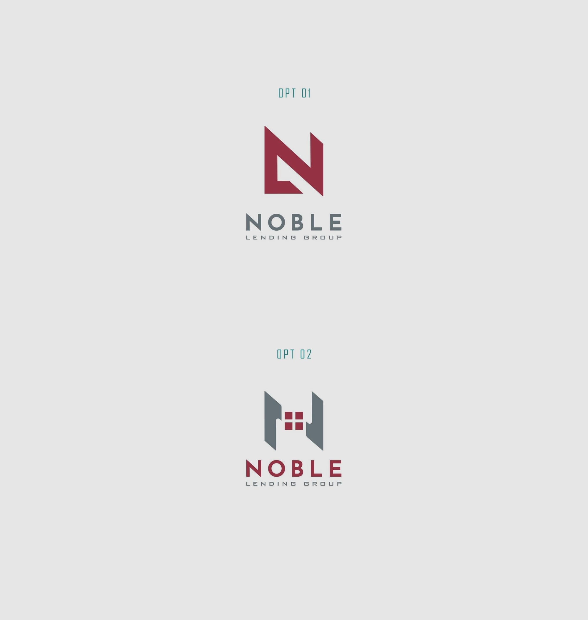
They drew inspiration from Geneva Finance, evident in the color palette that mirrors its professional and trustworthy image. The design brief from Noble Lending Group was succinct: create a logo that merges the concepts of home and banking while incorporating an 'N' and an 'L'. This requirement was both a challenge and an opportunity for innovation.
Design Challenge and Conceptualization
Noble Design Agency, tasked with this project, approached the challenge with a focus on simplicity and symbolism. Their design needed to be more than just visually appealing; it had to communicate the brand’s ethos at a glance. The initial design presentation showcased a variety of logo options, each offering a unique interpretation of the brief.
Noble Design Agency's approach was minimalist yet powerful, focusing on the integration of building imagery with the nuances of the letters 'N' and 'L'. The design language leaned towards modern minimalism, conveying sophistication and clarity which are crucial in the industry.
Client’s Choice and Design Execution
Upon reviewing the diverse options, Noble Lending Group gravitated towards the first option, which they deemed the 'winner'. This logo stood out for its refined blend of the necessary elements and its potential to be both iconic and adaptable across various platforms.
Final Execution and Impact
The final version of Noble Lending Group’s logo incorporates the Josefin Sans font, known for its modern and elegant appeal. Josefin Sans complements the logo's visual structure with its clean lines and balanced aesthetic, enhancing the overall impression of professionalism and approachability.
The rollout of the new brand identity transcends traditional print media to include digital interfaces and everyday touchpoints such as stationery, business cards, and signage. Each application was meticulously crafted to ensure consistency and brand integrity.
Real World Applications
Noble Lending Group’s fresh logo has been applied across various mockups, showcasing its adaptability and strong brand presence. Whether on a corporate building facade, a truck livery, or apparel tags, the logo maintains its distinctiveness while reinforcing the brand's message.
The Road Ahead
Noble Lending Group's brand overhaul speaks as much to their ambitions as it does to their commitment to fostering trust and connection with their clients. This new identity lays a robust foundation for their marketing strategies and penetration into emerging markets.
The story of Noble Lending Group is a testament to how thoughtful design can articulate a brand’s vision and promise. With the right creative partnerships, brands like Noble Lending Group can transform into emblems of their industry, inspiring confidence and driving growth.
This case study not only showcases the meticulous design process undertaken by Noble Design Agency but also serves as a profound example of the strategic importance of design in business today.
Start your brand journey today.
