Navigating Emotions with KOMPAS: A Strategic Visual Identity
Explore how KOMPAS's rebranding reflects its mission to teach emotional intelligence, balancing both professionalism and emotional depth.
KOMPAS, a non-governmental organization, is redefining emotional education in schools through innovative programs aimed at teaching both teachers and students how to effectively manage their emotions. In today's world, where emotional intelligence is becoming increasingly recognized as an essential facet of success, KOMPAS is strategically positioned at the forefront of this educational evolution. Based in Central Europe, KOMPAS serves a diverse audience that includes schools, the Ministry of Education, parents, and extends its reach to big corporations and governmental bodies.
The Rebranding Challenge
Embarking on a mission to reassess its visual identity, KOMPAS required a logo that embodies simplicity, distinction, and universal appeal without being overly soft or childish. With a desire to represent the core idea that managing one's emotions is crucial for success, the brand tasked a creative agency with the design. The logo needed to resonate with a broad range of stakeholders, from educational institutions to larger corporate entities.
Client Vision and Design Overview
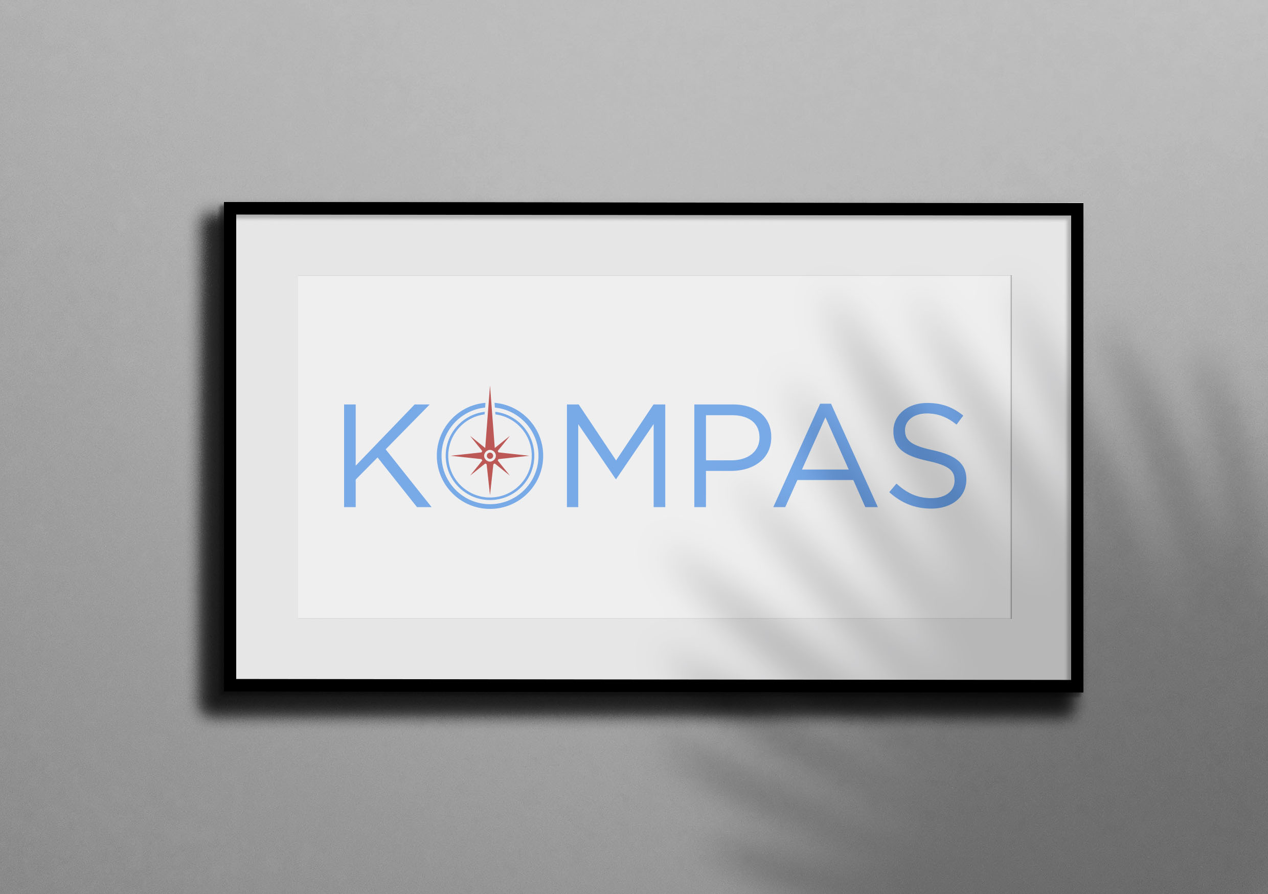
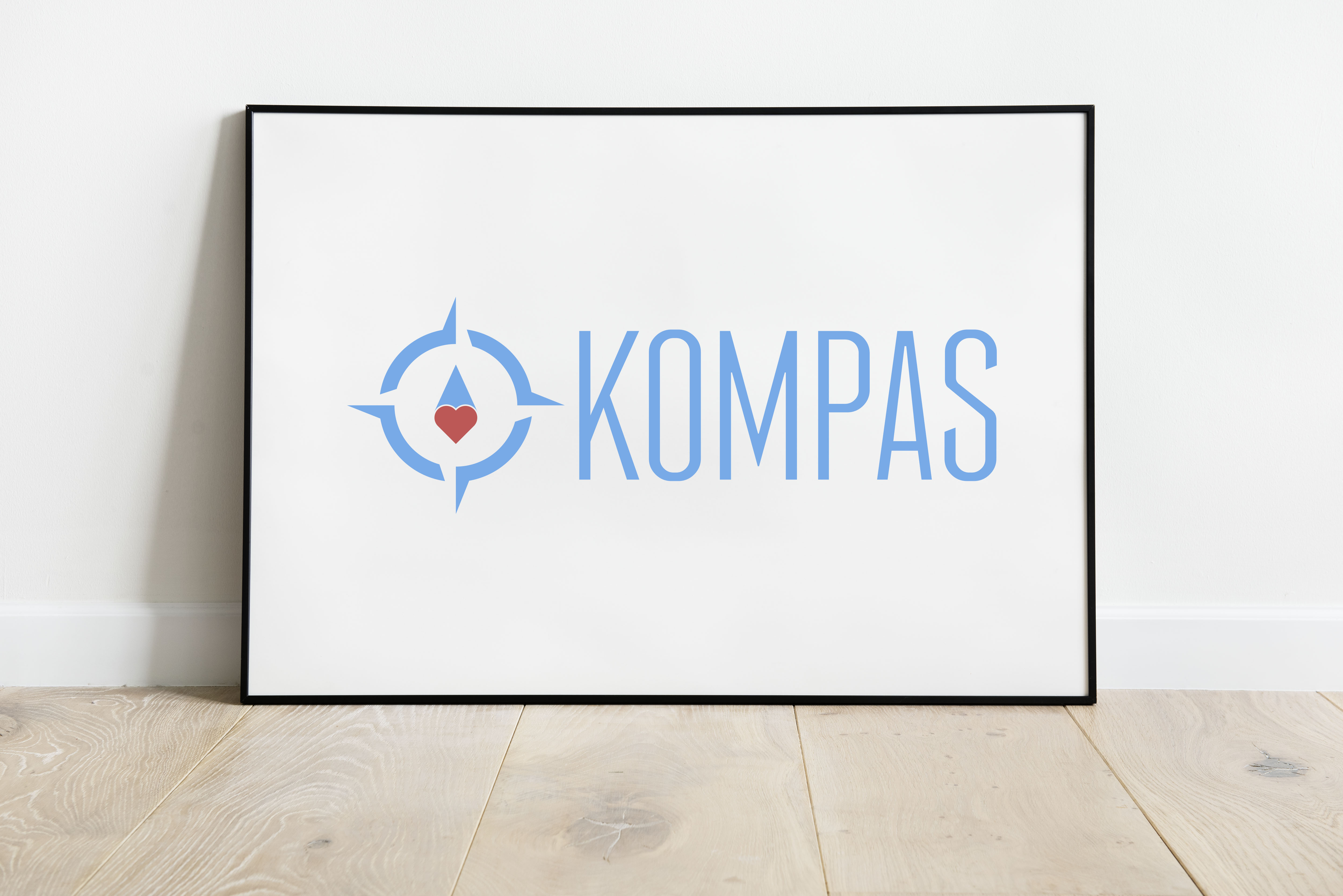
The brief was straightforward yet challenging: create a visual symbol devoid of words that subtly interweaves images like a compass, heart, and potential for growth. KOMPAS emphasized the need to avoid a too "heart-ish" appearance, focusing instead on a seamless blend of their teaching philosophy with the ethos of professionalism. The chosen color palette consisted of a signature blue paired with either a beige or a subtle red, aligning with existing brand materials.
The Creative Journey
The design team, tasked with embodying these nuances, set out to address the duality of emotion and professionalism. The initial logo concepts presented were diverse, each attempting to encapsulate the essence of guidance, empathy, and educational growth. They achieved this through variations that subtly suggested a compass and heart, balancing sensitivity with a sense of direction, akin to the philosophical compass that guides one's inner and outer journey in life.
Feedback and Revisions
KOMPAS's feedback was appreciative of the agency's efforts, indicating the project's progression towards completion. The final deliverables showcase a cohesive logo that strategically aligns with the organization's mission and broader appeal.
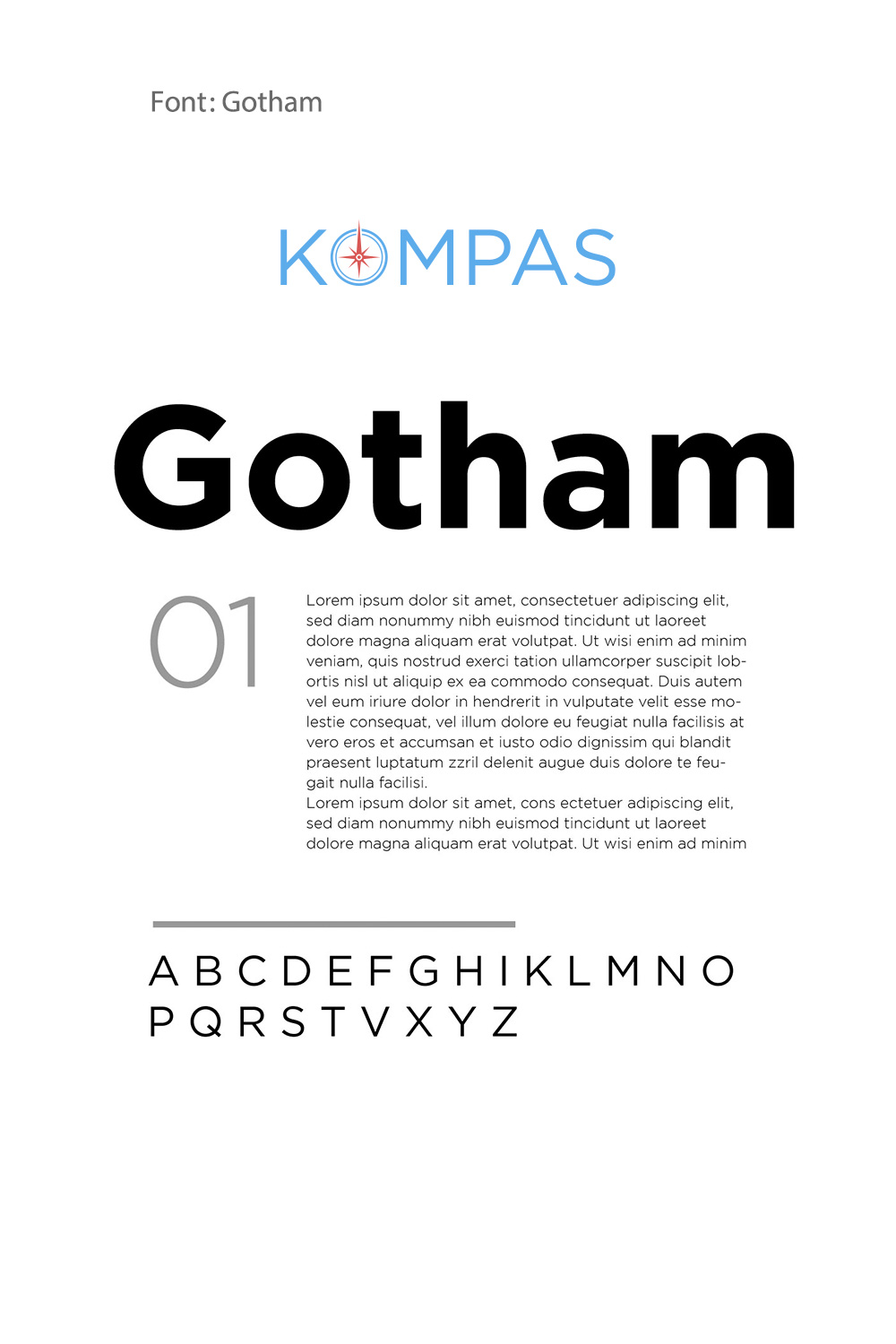
The Gotham Font Choice
The selection of Gotham for the typographic element resonates with the brand's aesthetic demands. Gotham renders a modern, approachable, and versatile quality that complements the NGO's forward-thinking approach, as demonstrated in the font display image.
The design journey was marked by numerous explorations, where early concepts leaned toward either being too abstract or too literal. Through rounds of refinement, the creative team struck a balance between symbolism and clarity, ensuring the mark could live effortlessly across different contexts. The iterative process wasn’t just about form and color, it was about distilling the values of guidance, emotional resilience, and growth into a single recognizable emblem. This stage laid the foundation for a visual identity that could speak to both the intimacy of a classroom and the authority of institutional partners.
A Visual Identity of Purpose
The rebranding of KOMPAS is a definitive stride toward establishing a brand that is not only visually compelling but also resonant with its core purpose. It reaffirms the NGO's dedication to fostering emotional intelligence in the education sector while facilitating essential partnerships with influential entities. This case study underlines the importance of a thoughtful design process that respects the client's vision while delivering strategic and effective branding solutions.
Start your brand journey today.
