Mine Control: Crafting a Visual Identity for the Crypto Sphere
Explore the rebranding journey of Mine Control, a leader in crypto mining software solutions. Discover how a new logo reflects trust and innovation in this fast-paced industry.
In the rapidly evolving realm of cryptocurrency, having a robust and memorable visual identity is crucial. Such is the case for Mine Control, a pioneering software company dedicated to mastering the intricacies of crypto mining. Based in the digital heartland of this burgeoning industry, Mine Control sought to revamp its brand presence with a dynamic logo that would encapsulate its core values of trust, innovation, and technological prowess.
A Vision for Modernization
The journey began when Mine Control approached a talented design team with a clear goal: to create a logo for the software that manages cryptocurrency mining operations. With the pace of technological advancement, the rebranding initiative needed to reflect the swift yet strategic nature of the industry. The absence of a specific color palette or slogan left the design team with vast creative freedom, an opportunity to craft a concept that would resonate not only with the client's vision but also with the expectations of a tech-savvy audience.
From Concept to Creation
The design team set to work, presenting an array of initial concepts that showcased different aspects of modernity and digital transformation, as captured in the following iterations:
The selection process was guided by keen attention to detail and form. The design team's output impressed the Mine Control decision-makers with an option that conveyed simplicity without sacrificing depth. Design Option #03 stood out with its sleek lines and balanced proportions, capturing the essence of a digital frontier poised for exploration.
The Winning Choice
The final decision fell decisively in favor of Option #03. Its design, described as both intuitive and simple, was hailed for effectively communicating the principles that Mine Control upholds. This version emerged as the perfect nod to the fast-paced dynamics of the crypto-mining industry, one where trust and innovation drive operational success.
Font Selection: LEMON MILK
A critical aspect of the finished design was its typographic choice. The font LEMON MILK, renowned for its modern yet timeless appeal, was selected to complement the logo's visual language.
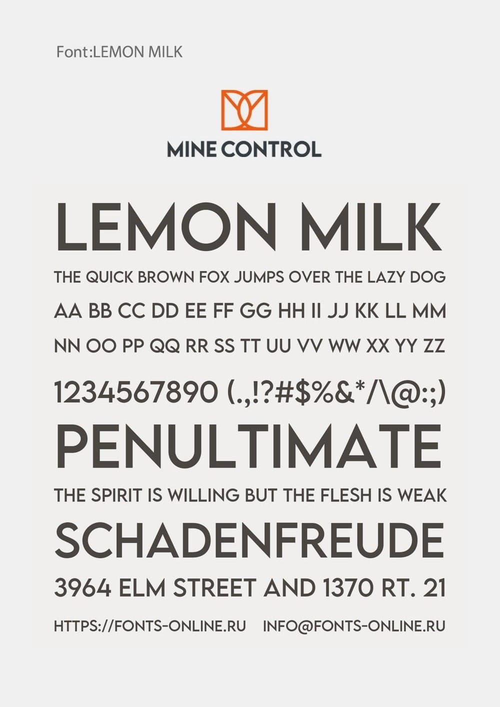
This distinctive font reinforces the clarity and strength of Mine Control's identity, suggesting an unrelenting focus and clarity in purpose, much like the precision required in crypto mining algorithms.
Real World Applications
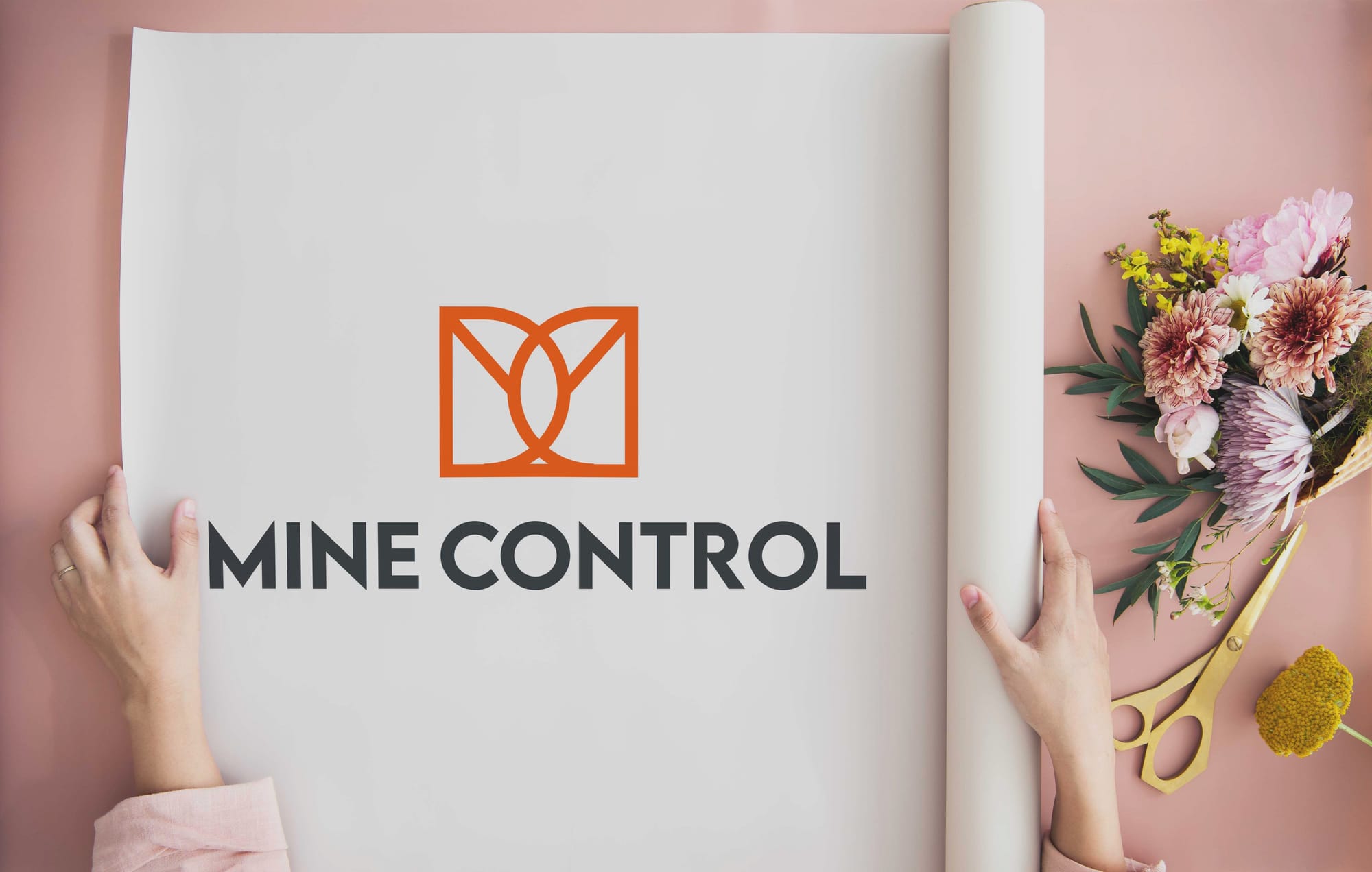
Bringing the approved design into real-world scenarios demonstrated its versatility and impact. From business cards to bold outdoor billboards, the logo's applications reinforced Mine Control's presence as a credible industry player.
Conclusion
The rebranding of Mine Control is a testament to the power of strategic design in shaping perceptions and positioning a brand for success in the digital age. Every aspect, from the logo's minimalist elegance to the choice of typography, echoes the brand's dedication to pushing boundaries in the crypto landscape. This reimagined identity not only reinforces Mine Control's role in the industry but also projects a forward-looking partnership for its clients and stakeholders.
Start your brand journey today.
