Malk: Crafting a Fitness Icon with Edge and Mystery
Explore the design journey behind Malk's logo, merging fitness, mystery, and aesthetic strength in a powerful brand identity.
Building a robust brand identity requires more than just a logo. It demands a subtle yet evocative reflection of the brand's ethos and aspirations. Malk, a burgeoning fitness content creator, understands the power of a well-crafted visual identity. Tasking the design agency with encapsulating the enigmatic and robust character of the brand into a logo was a mission that tested both creativity and insight.
Understanding Malk's Essence
Malk's project began with a request that was both clear and challenging. The brand's aesthetic is steeped in a dark, mysterious strength, embodying an aesthetic that would resonate with fitness enthusiasts who appreciate an air of enigma and power. Malk's initial brief was concise: a logo that could seamlessly adorn fitness merchandise from water bottles to equipment, retaining its identity across contexts.

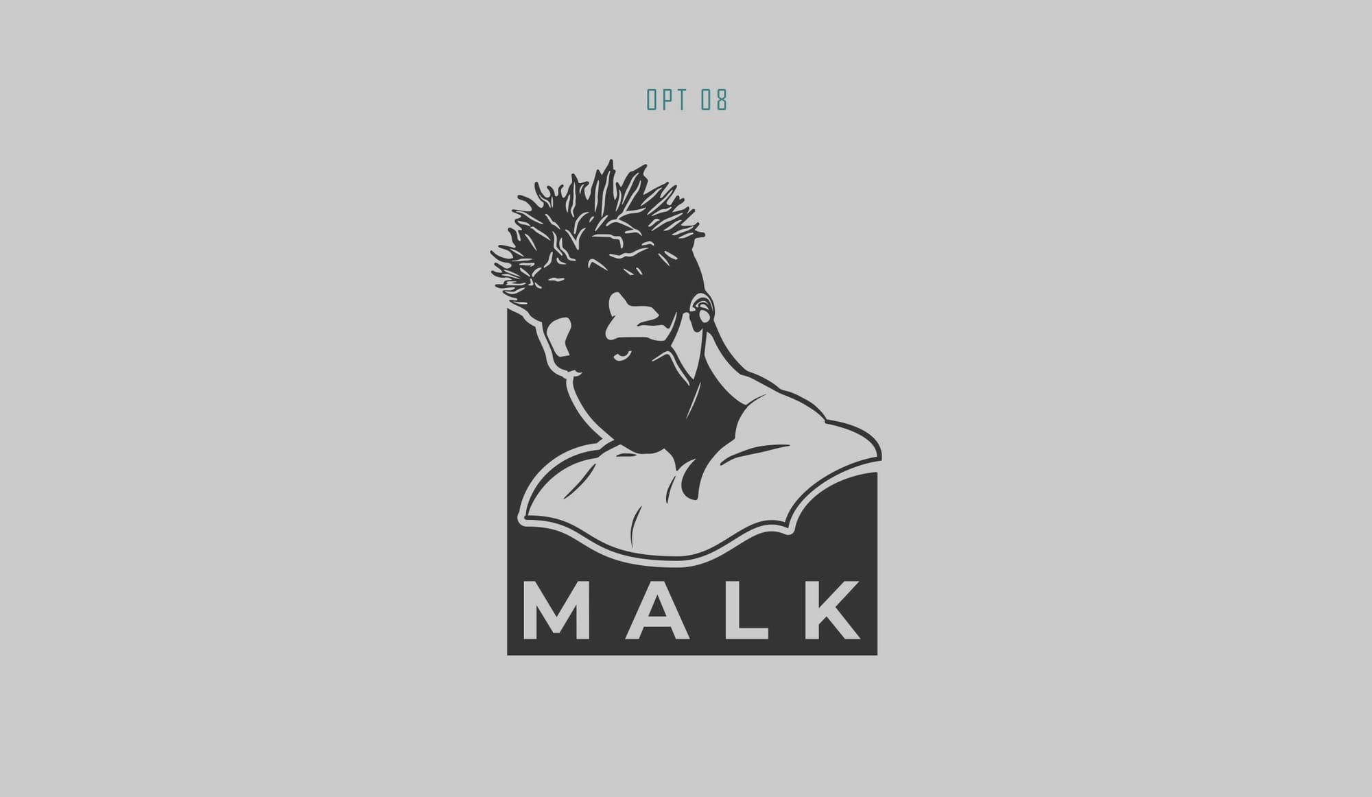
The client provided a rough sketch that hinted at the elements they had in mind, but left room for creative interpretation, inviting the design team to embrace the brand’s unique narrative. Malk's request for including a silhouetted face, featuring the intriguing detail of a masked visage, set the stage for something compelling.
Design Team's Initial Concepts
The design team's initial response was a series of logo options that played with the balance between simplicity and strength. Featuring bold type paired with minimalist character designs, these options explored how the character could relate to the text and vice versa. Malk received several options to consider, each one offering a different lens through which to view the brand's identity.
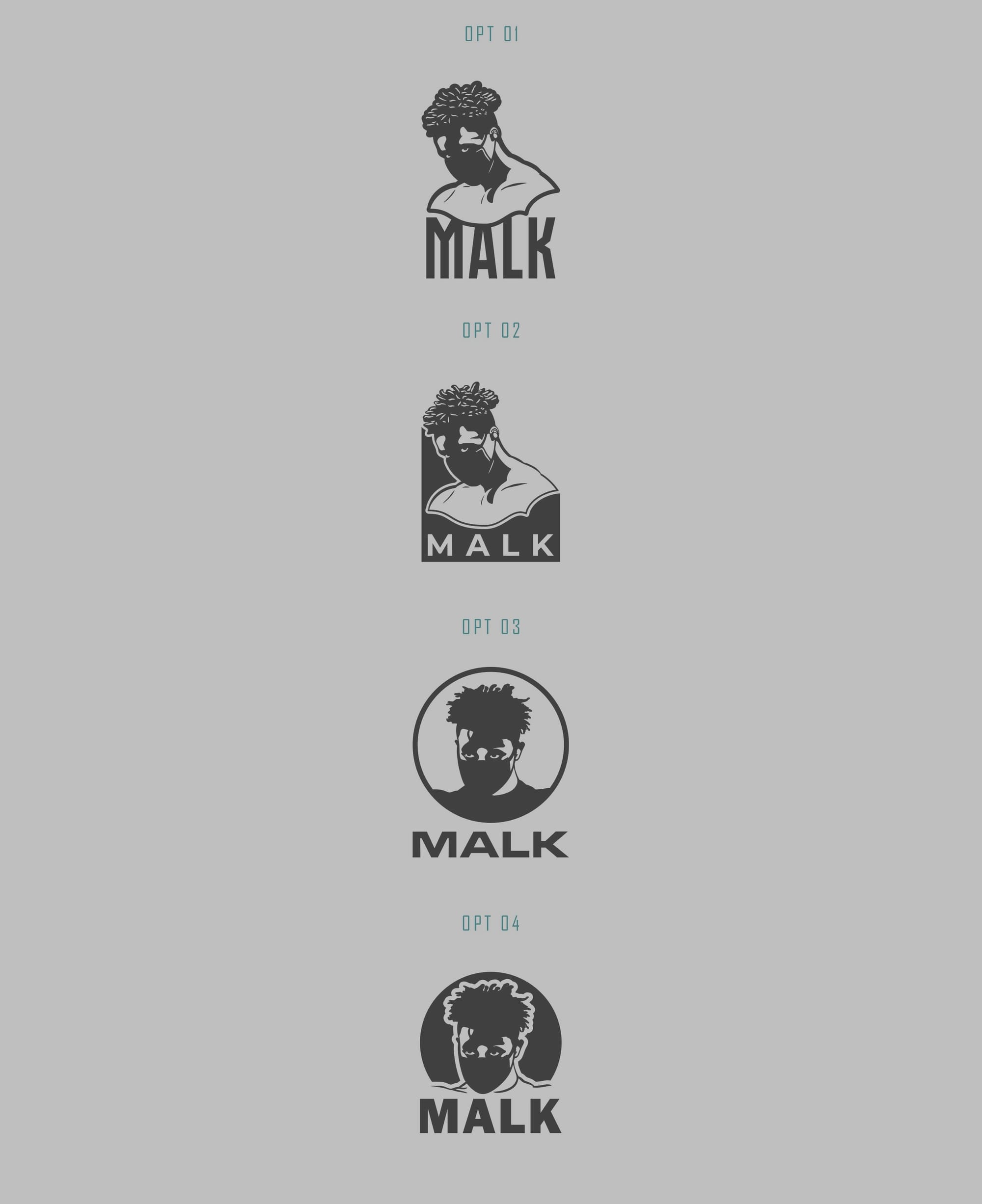
Among the options, one stood out: option two. This design closely aligned with Malk's vision thanks to its sinister flair and stylized embodiment of strength. However, there was room for refinement. Malk requested adjustments to the character’s eyes, body definition, and hair to enhance its villainous aura, infusing it with more muscle and sharper details.

Refinements and Adjustments
The subsequent adjustment phase was crucial in honing the design. Based on Malk's feedback, the design team sharpened the character's features, making the eyes look more intense and the hair more distinctive. These changes were essential in capturing the 'villain character' persona Malk sought, while ensuring the logo remained versatile for application across various merchandise.
A Bold New Identity: Malk's Final Logo
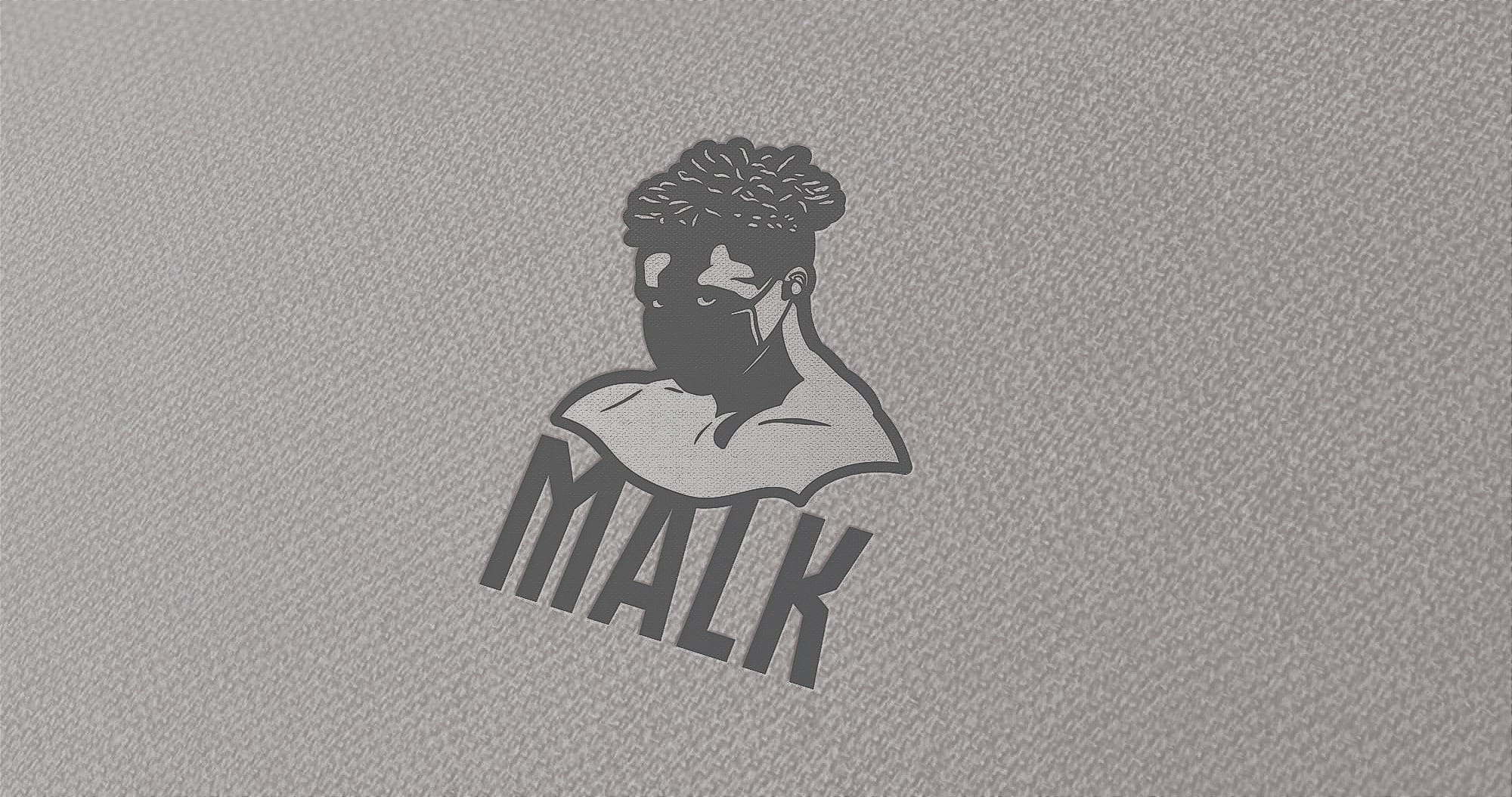
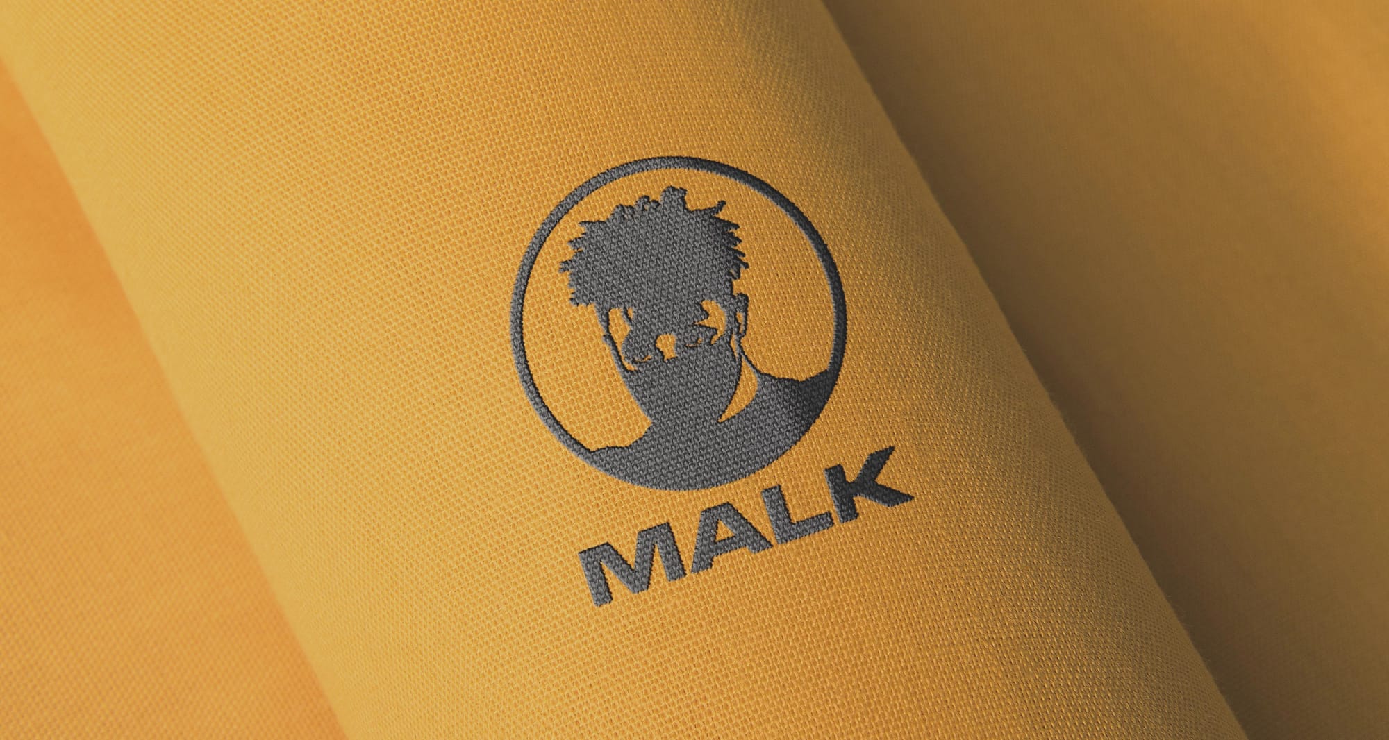
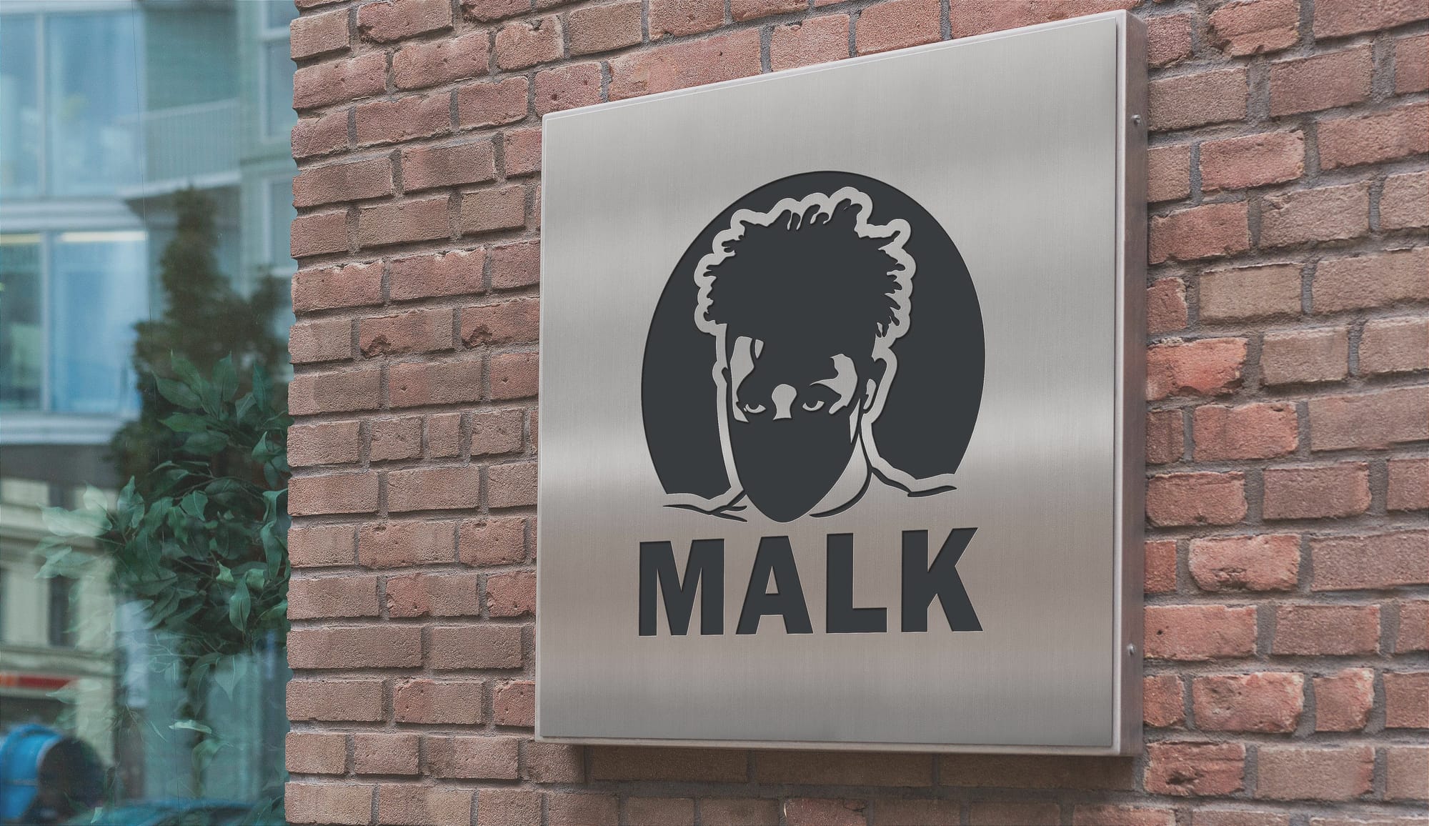
With final approval, Malk's logo encapsulates a dark mystique paired with a sophisticated design, ready to adorn the brand's offerings. It speaks to the brand’s core demographic by channeling a shared sense of strength and mystery. The logo becomes more than an image, transforming into an emblem of an evolving culture in the fitness space.
This design journey, from conception to completion, highlights how important a carefully considered visual identity can be for a brand seeking to make its mark in a competitive industry. Malk’s logo will not only identify its products but will also symbolize the core values around which the brand's community is built.
Start your brand journey today.
