Luxury Living Reimagined: The Atrium's New Visual Identity
Explore the journey of The Atrium's logo redesign capturing the essence of luxury and modern living. A narrative of sophistication embodied in visual identity.
The Atrium, a 112-unit apartment complex, recently unveiled its new logo, epitomizing modern luxury and sophisticated living. Located in a fully renovated space, The Atrium sought a visual identity that would reflect its high-end interiors and exclusive ambiance. The task for the design team was to craft a logo that communicated these qualities with elegance and precision.
Understanding the Brand Identity
The word 'Atrium' inherently evokes images of spacious, light-filled environments, often featuring skylights or open-air designs. This architectural term lends itself to visions of grandeur and openness. The Atrium's name was thus carefully considered in developing a logo that would visually present the apartment complex's distinctive characteristics.
Initial Concepts and Client Vision
The Atrium's team provided a concise yet compelling brief: the logo should exude luxury and modernity, and the color palette was left to the designers' discretion. With these guidelines, the design team embarked on detailing concepts that would encapsulate the essence of The Atrium.
Client's Brief: "The Atrium is a 112-unit apartment complex that is fully renovated. We want the logo to imply luxury and modern living."
The Design Process
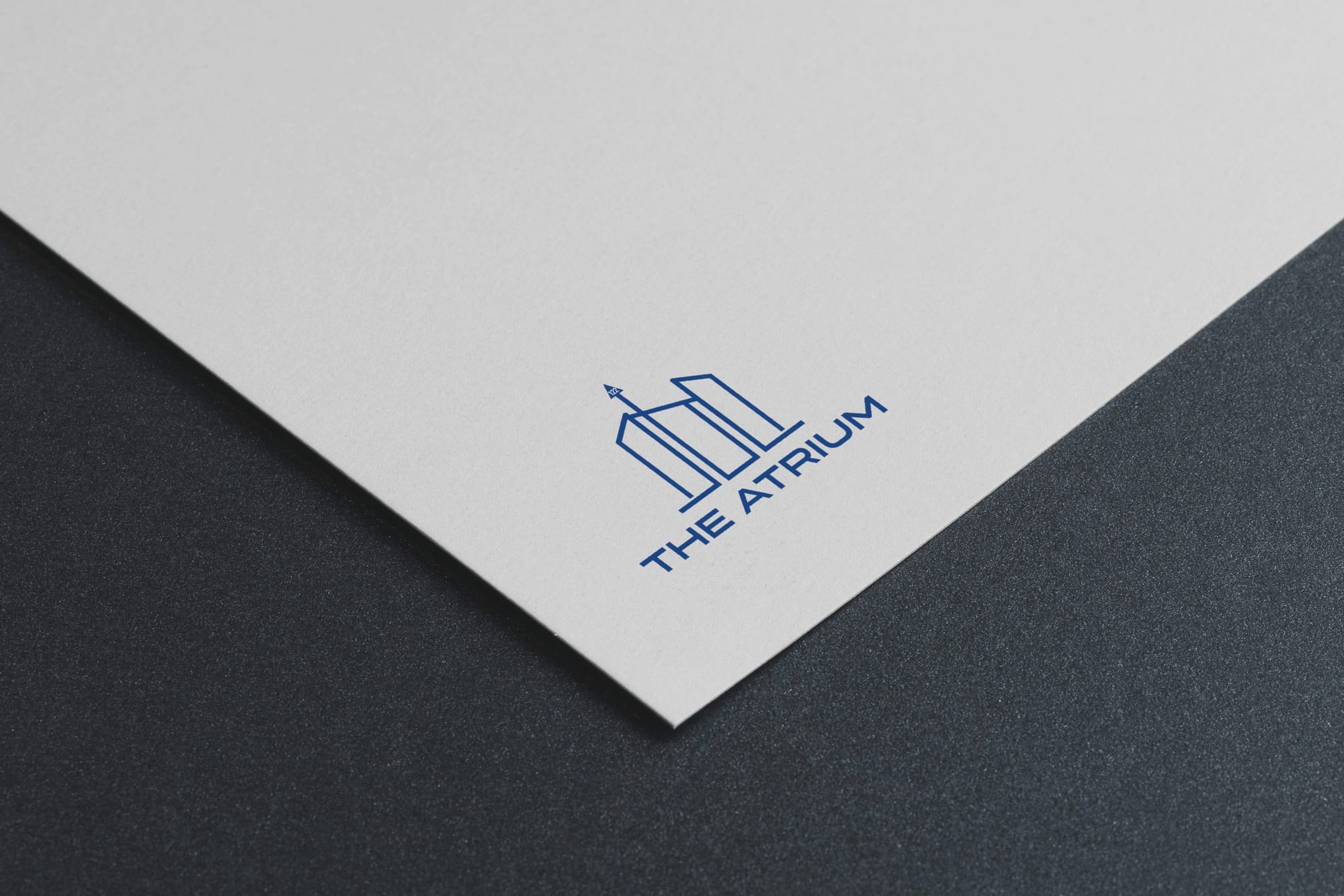
The designers responded with three initial options, each exploring different facets of the luxurious and modern living theme. The designs played with structural elegance, geometric layouts, and subtle color choices, each aiming to resonate with the upscale apartment's brand ethos.
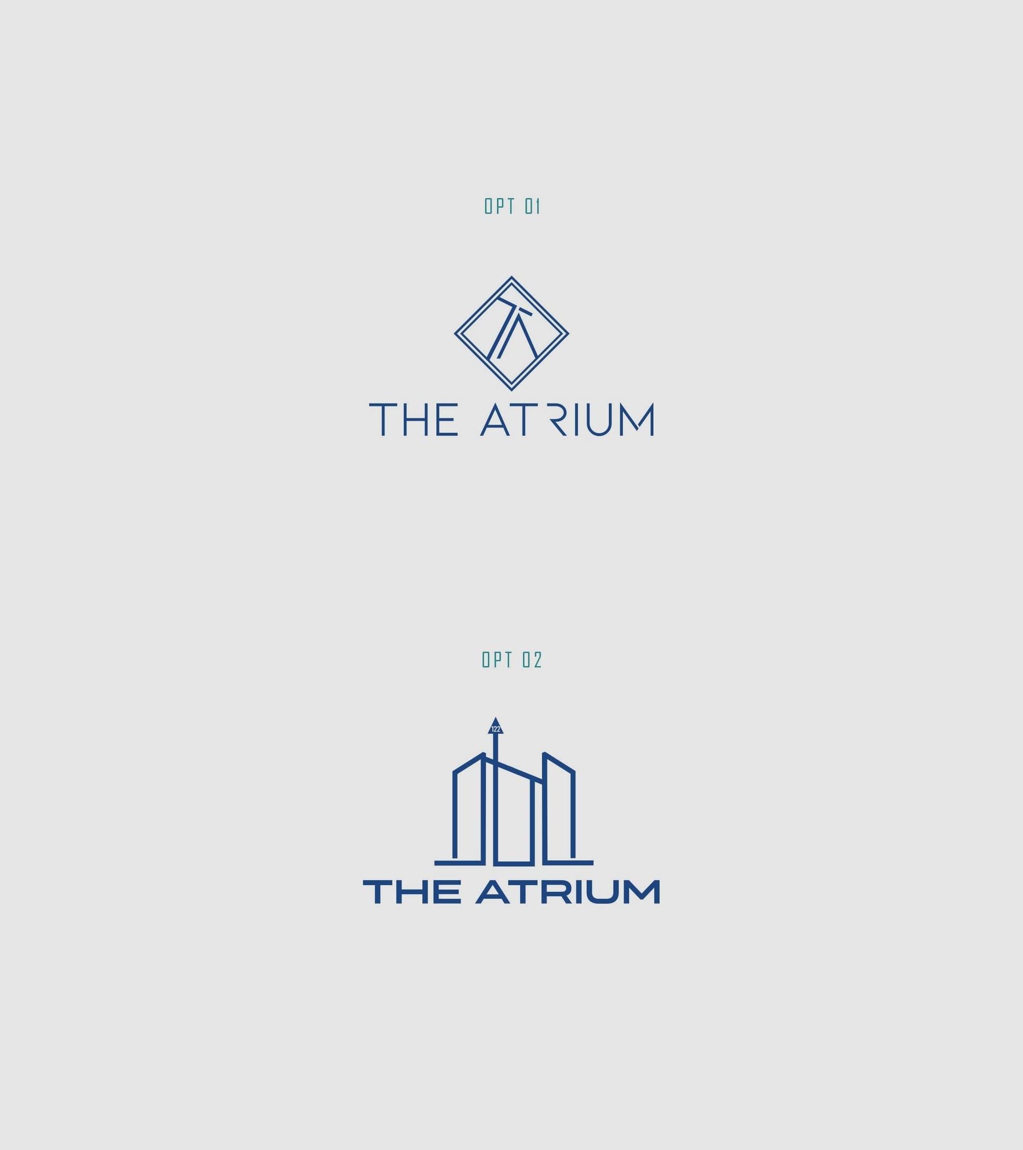
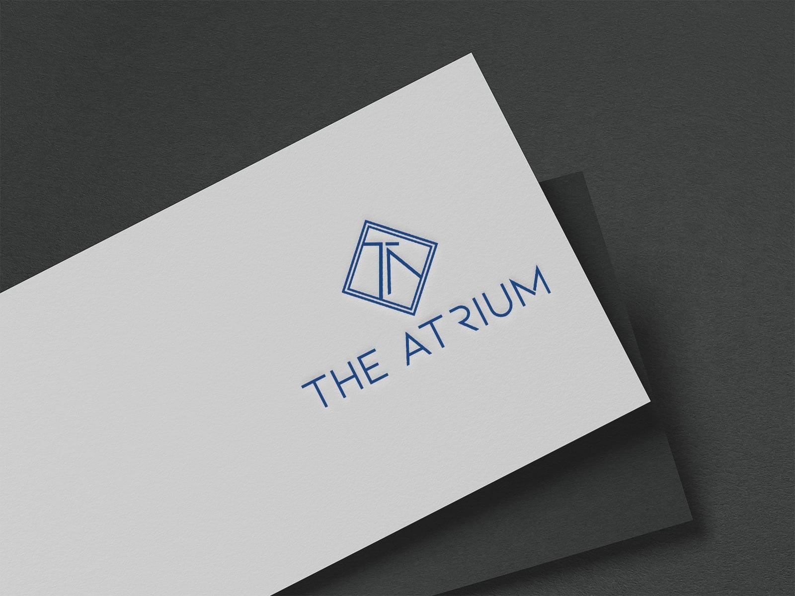
The Chosen Path: Option 1
From the initial options, Option 1 emerged as the frontrunner. This design cleverly merged classic and contemporary elements, effectively conveying the upscale and modern living environment The Atrium provides. The depiction of open spaces and sleek lines suggested accessibility and luxury, resonating well with the client's vision.
The Client’s feedback confirmed the success of the design: "Great job! Option 1 is winner."
Finalization and Typography
For the final logo version, the designers chose the Gotham typeface. Known for its clean lines and professional appearance, Gotham added a layer of sophistication to the depiction of The Atrium. The font's balance between modernity and timelessness mirrored the qualities of the apartment complex seamlessly.
Real-World Applications
With the final logo approved, its versatility was demonstrated across various materials, merchandise, signage, and advertisements illustrating how the logo retains its elegance and clarity in different contexts. The branding mockups showed seamless integration into everyday scenarios, further enhancing The Atrium's brand narrative of luxurious modern living.
A New Chapter for The Atrium
The Atrium's logo successfully marries the concepts of luxury and modern living, creating a cohesive brand identity. By leveraging architectural elements and premium typographical choices, the design team crafted a visual story that resonates with the affluent and contemporary lifestyle The Atrium embodies. This rebrand positions The Atrium as a leader in luxury living, poised for the next chapter of its journey.
Start your brand journey today.
