LovUcha: Crafting a Brand Identity for a Health-Conscious Market
Explore the branding process behind LovUcha, an organic raw kombucha brand, and discover how design storytelling aligns with its health-centric ethos.
In today's wellness-centric world, kombucha has emerged as a staple drink for many seeking a healthier lifestyle. Its probiotic qualities and rich flavors have drawn a diverse audience. Enter LovUcha, a new player in this booming market, keen on establishing a distinct identity that resonates with health-conscious consumers globally. Rooted in tradition yet forward-looking, LovUcha's branding journey provides key insights into the challenges and creativity of designing for the kombucha category.
Identifying the Brand's Core
The task at hand for LovUcha was not merely to craft a logo but to encapsulate the essence of a brand that promises purity, health, and an energy boost. The client sought an image that would stand out, steering clear of existing kombucha imagery dominance. This meant creating a design that, while simple enough to recall, would hint at the brand's organic roots and international aspirations, appealing across age, gender, and dietary preferences.
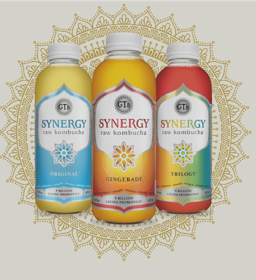
Client provided their preferred visual style and reference.
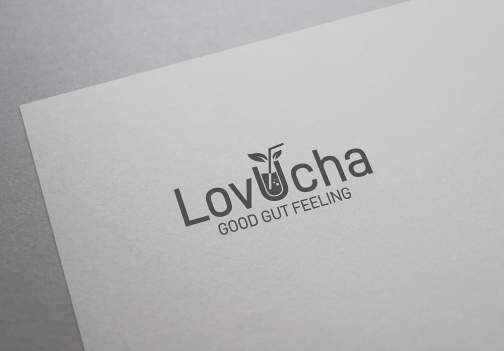
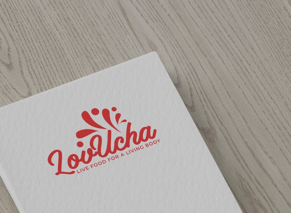
Initial Concepts and Client Feedback
The initial design brief was clear: a logo that not only looks distinct but also feels strong in its identity. Inspirations were drawn from top brands like Kevita and GT's, which the client mentioned as benchmarks. The design team responded with three distinct options, each exploring variations in typography, color, and imagery. The client highlighted several important elements such as readability for non-native English speakers, organic aesthetics like green leaves and bubbles, and the importance of versatility with the slogan 'Good Gut Feeling.'
Challenges and Strategic Revisions
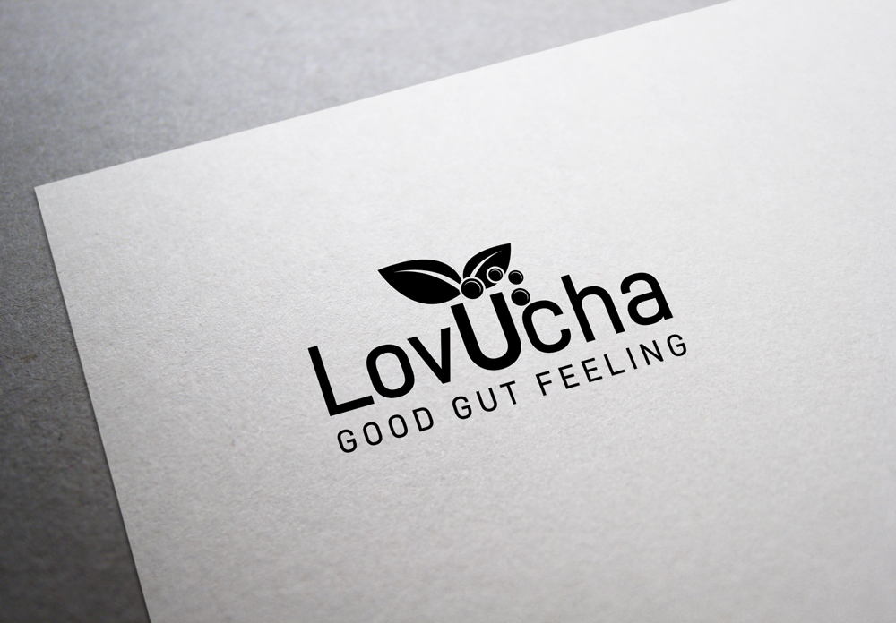
Feedback revolved around simplifying the visual elements while enhancing visibility and recognition. The client pointed out the difficulty in distinguishing the letter 'U' and other letters, and desired an iconic mark that would be memorable even when scaled down. Additionally, suggestions were made to remove any clutter such as the dripping 'L' and confusing extra lines. It was crucial to have a logo that could be easily identified and one that does justice to the brand’s halal, kosher, and vegan dimensions.
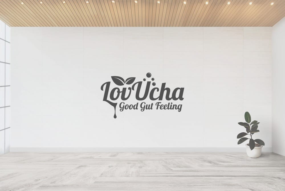
Taking into account the suggested adjustments, the design team reworked the typography, focusing on more pronounced 'U' while using leaves and bubbles to create a distinct and cleaner look. Ensuring that the brand name was legible even to non-native speakers, they centered 'U' more prominently, with a precision that balanced the letters on either side.
The Final Design and Its Impact
Through collaborative iterations, LovUcha's final logo emerged more iconic, harmonizing visual simplicity with an unmistakable nod to its organic essence. The interplay of the green leaves and bubbles around a bold 'U' captured both the raw and refreshing nature of kombucha itself while ensuring trademark versatility with the 'Good Gut Feeling' slogan.
In the competitive landscape of functional beverages, LovUcha's new brand identity sets a benchmark for authenticity and design. It tells a visual story of tradition meeting modern wellness, fortifying its journey into a lifestyle choice. As the organic raw kombucha market continues to grow, LovUcha stands poised not just to participate but to lead with a recognizable identity that speaks to a global audience.
Start your brand journey today.
