Kingdom Catalyst: Bridging Purpose with Design
The unique journey of designing the Kingdom Catalyst logo, a visual identity that symbolizes connection and purpose.

In the world of branding, the challenge of creating a logo that encapsulates both mission and vision can be as intricate as it is rewarding. Enter Kingdom Catalyst, a brand centered around the noble aim of bridging resources to those in need. Their logo design journey is a tale of alignment between philosophy and visual identity, crafted with precision and thoughtful creativity.
The Brand Behind the Design
Kingdom Catalyst is not just a company; it is a mission-driven brand focused on connecting individuals with the tools and solutions they need to fulfill their purpose. With a foundation rooted in providing kingdom solutions, the spiritual and philosophical undertones required a logo that would echo their ethos of being a 'bridge' and a 'connector' without losing its creative flair.
Initial Brief and Design Considerations
The brief from Kingdom Catalyst was clear: a logo that embodies the essence of connection, with a color palette drawing from royal and rich purples, lilac, with motifs that suggest bridges, hands, and the regal symbol of a lion. This direction laid the groundwork for the design team to dive into the conceptual phase, aiming to encapsulate these rich themes in a single visual identity.
Design Team's Approach
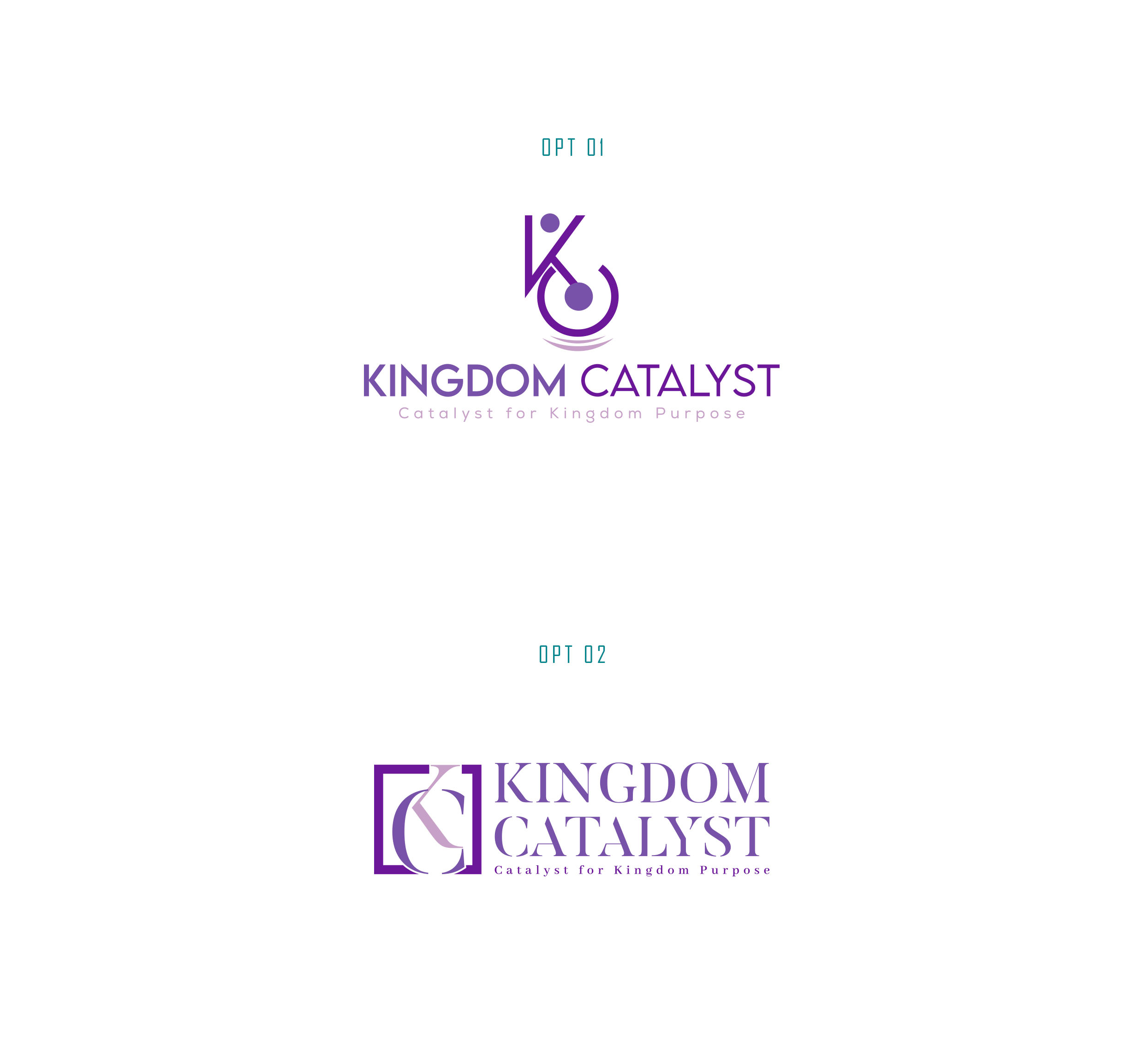
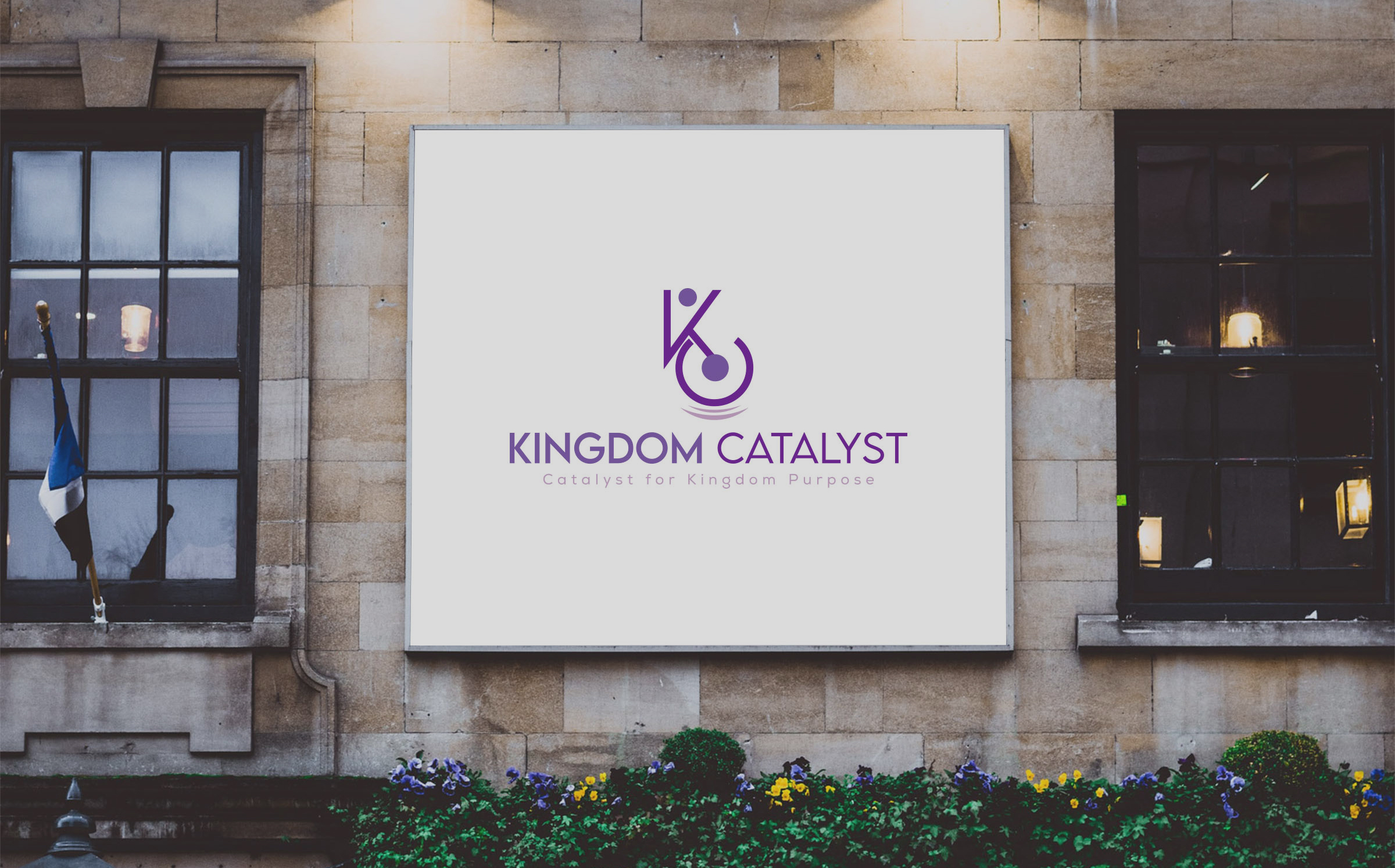
Understanding the gravity of their client's mission, the design team brainstormed how best to represent the 'bridge' concept visually. They explored symbology and typography that would speak to connectivity and purpose, initially presenting two options. Each version sought to weave the theme of a small pair of hands reaching through a bridge to a larger pair, engulfed in the silhouette of a majestic lion representing sovereignty and leadership.
Client Feedback and Iteration
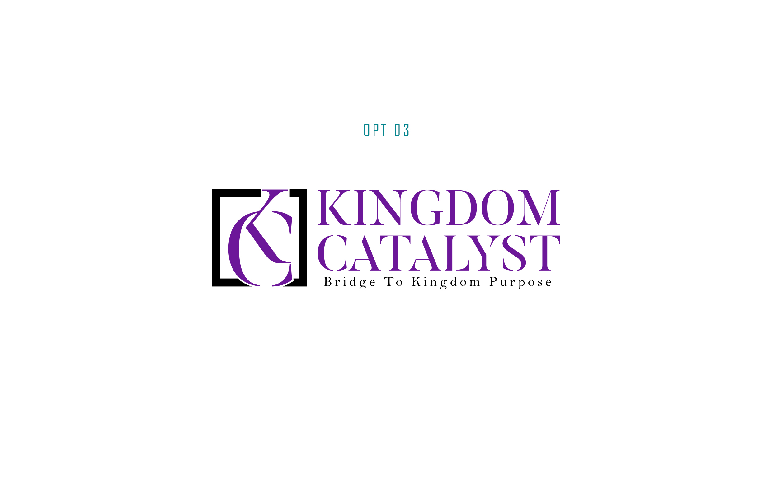
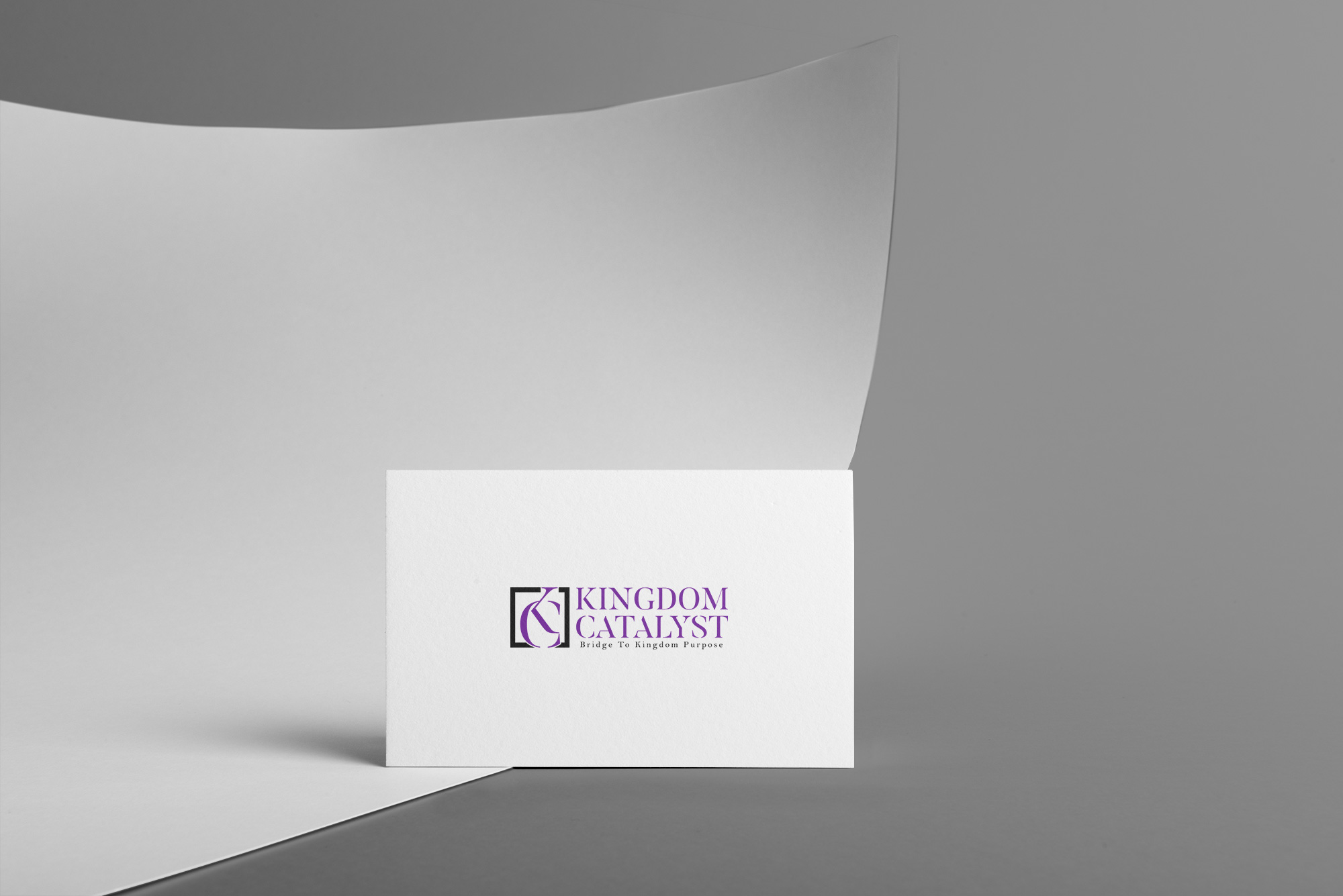
The response from Kingdom Catalyst was swift. Preferring a variation in the color scheme, they requested a shift from purple and lilac to a more contrasting black and purple motif. An additional change reflected the evolving nature of the brand's messaging, with the slogan updated to 'Bridge to Kingdom Purpose'. These changes steered the design team to elaborate on their initial drafts.
The Finalization
With these refinements, the design team was able to create a harmonious blend of color and concept. The introduction of black with purple gave the logo a sense of depth and seriousness, while maintaining its regal and purpose-driven appeal. The bridge and hand motifs subtly connected the elements of the logo, arriving at a final design that Kingdom Catalyst approved with enthusiasm.
Real-World Application
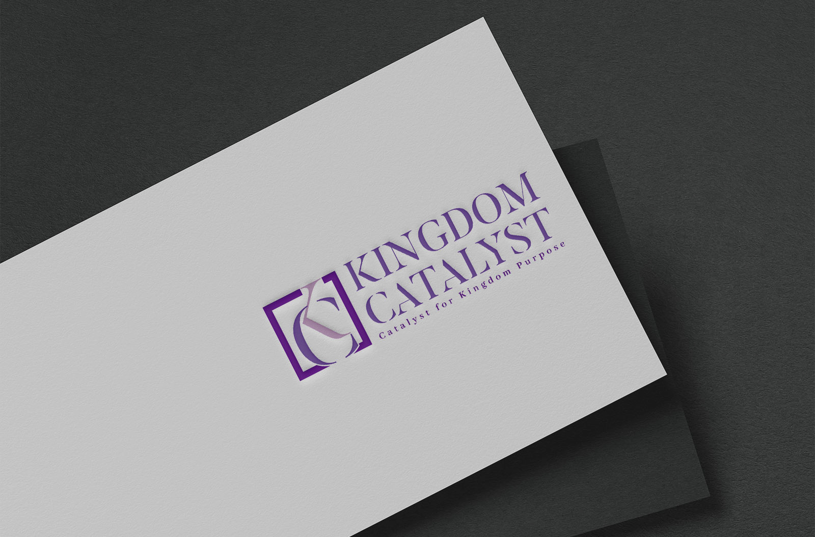
The final logos were showcased on diverse platforms, including fabric applications and conference settings. Each display emphasized how the logo could adeptly represent Kingdom Catalyst's mission across various mediums, reinforcing their dedication to connecting individuals and entities for a greater purpose.

Conclusion: A Design Aligned with Purpose
The Kingdom Catalyst project showcases the symbiotic relationship between purposeful branding and creative design. With philosophically rich elements and a dynamically appealing visual identity, the logo doesn't just represent a company; it narrates a story of purpose, connectivity, and leadership. A design execution that brilliantly bridges the gap between idea and reality.
Start your brand journey today.


