Innovative Rebranding: A Case Study on Vinez Benefits Group
Vinez Benefits Group revitalized its brand with a bold new logo and identity designed to reflect its vision for future growth and innovation.
Vinez Benefits Group, a name that evokes a sense of nurturing and fruitful outcomes, embarked on a transformative journey to redefine its brand appearance through a comprehensive logo redesign. As a well-regarded entity in the financial sector, Vinez Benefits Group offers a suite of services designed to provide protection and tailored solutions to its clients. This revitalization was aimed at shedding its dated look and aligning more closely with the evolving aesthetic expectations of its clientele.
The financial industry, with its dynamic shifts and increasing reliance on digital interfaces, demands a branding presence that is not only visually appealing but also functional across various mediums. Vinez Benefits Group recognized the limitations of its existing logo due to its faded appearance when printed and its inefficacy in digital formats. The newly designed logo not only overcomes these challenges but also foresees the brand’s relevance in the coming years.
The Initial Brief
In initiating the project, Vinez Benefits Group expressed a desire for a marquee identity that felt clean, fresh, and invigorating. The client provided a clear vision, seeking inspiration from examples in the design agency’s portfolio. There was a concise brief to produce a logo that would resist the erosion of time, remaining bold and engaging without frequent updates.
Previous iterations of Vinez’s logo suffered from readability issues, particularly in print. This outlined a critical requirement for the new design to be distinctly readable, whether used on business cards or digital interfaces. The client’s appreciation for certain colors like lighter greens and burnt oranges served as starting points for creating a cohesive color scheme. In addition, there was a unique opportunity to incorporate a slogan. Phrases such as "protection reimagined" would help to communicate the company’s modernized brand ethos.
The Design Process
The design process began with the agency reviewing the client’s references and preferences. The client provided images showcasing both the current logo and preferred styles from the agency’s previous works, offering the design team vital insights into the desired aesthetic direction.
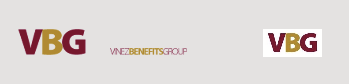
The design team promptly presented the initial options to the client. These options were meticulously crafted to reflect the fresh and invigorating essence Vinez was aiming for. Ultimately, three distinct design options were proposed, each leveraging varying color palettes and typographic styles to align with the initial brief.
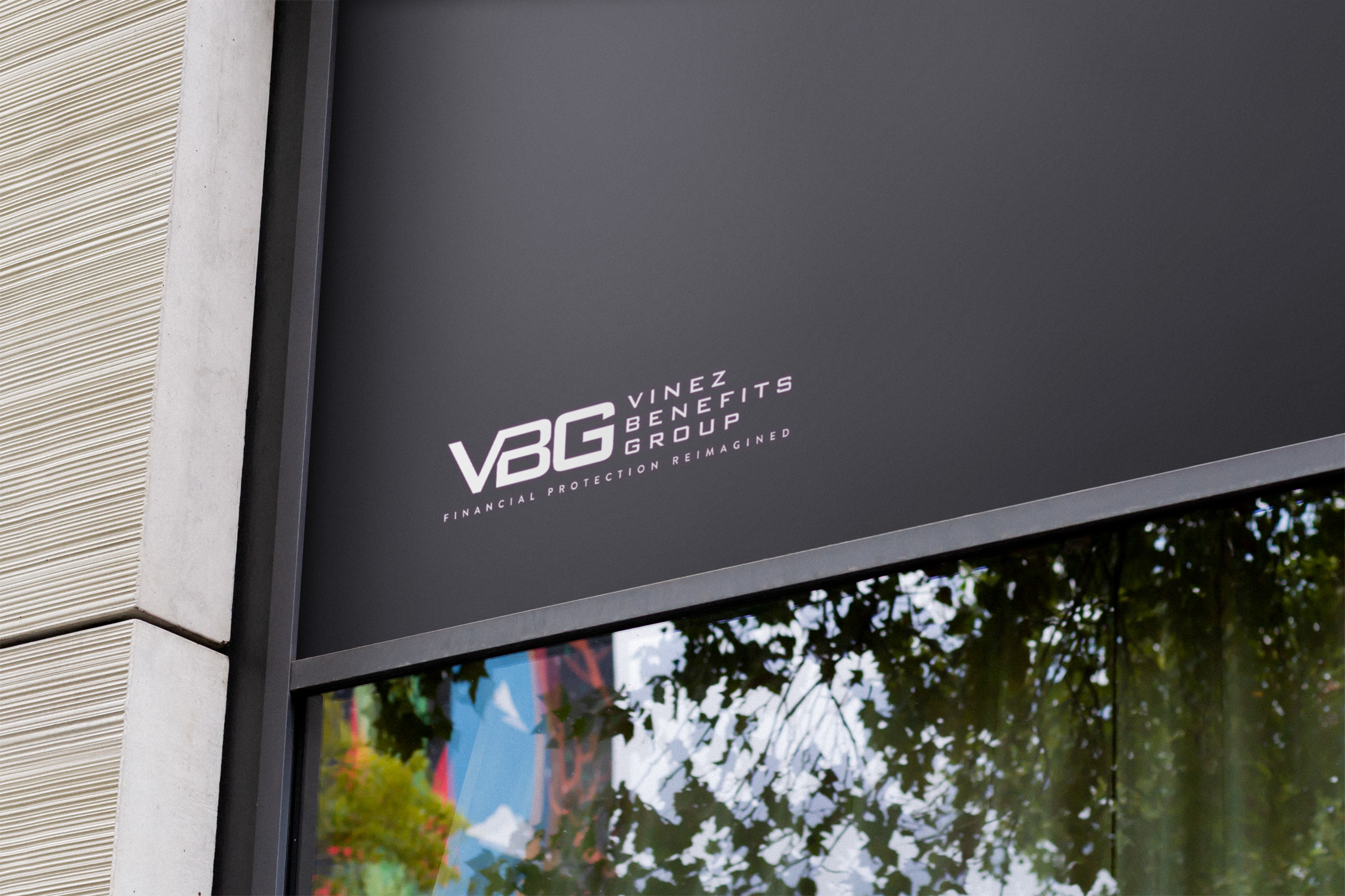
The client took a keen interest in Option 2. This option encapsulated the modern essence they were striving for. With a few tweaks, including the addition of the slogan "financial protection reimagined," Vinez found a symbol that resonated perfectly with their brand narrative.
After these modifications, the final design was approved. The bold, impactful logo used the font Bank Gothic and employed a striking color palette of Orange and black, ensuring vibrancy and legibility across various applications.
The New Identity
The approved logo marks a new chapter for Vinez Benefits Group, establishing a connection with its audience through a modern visual language. The selected colors and typographic choice project strength and reliability, with a nod to innovation through the burnt orange accent.
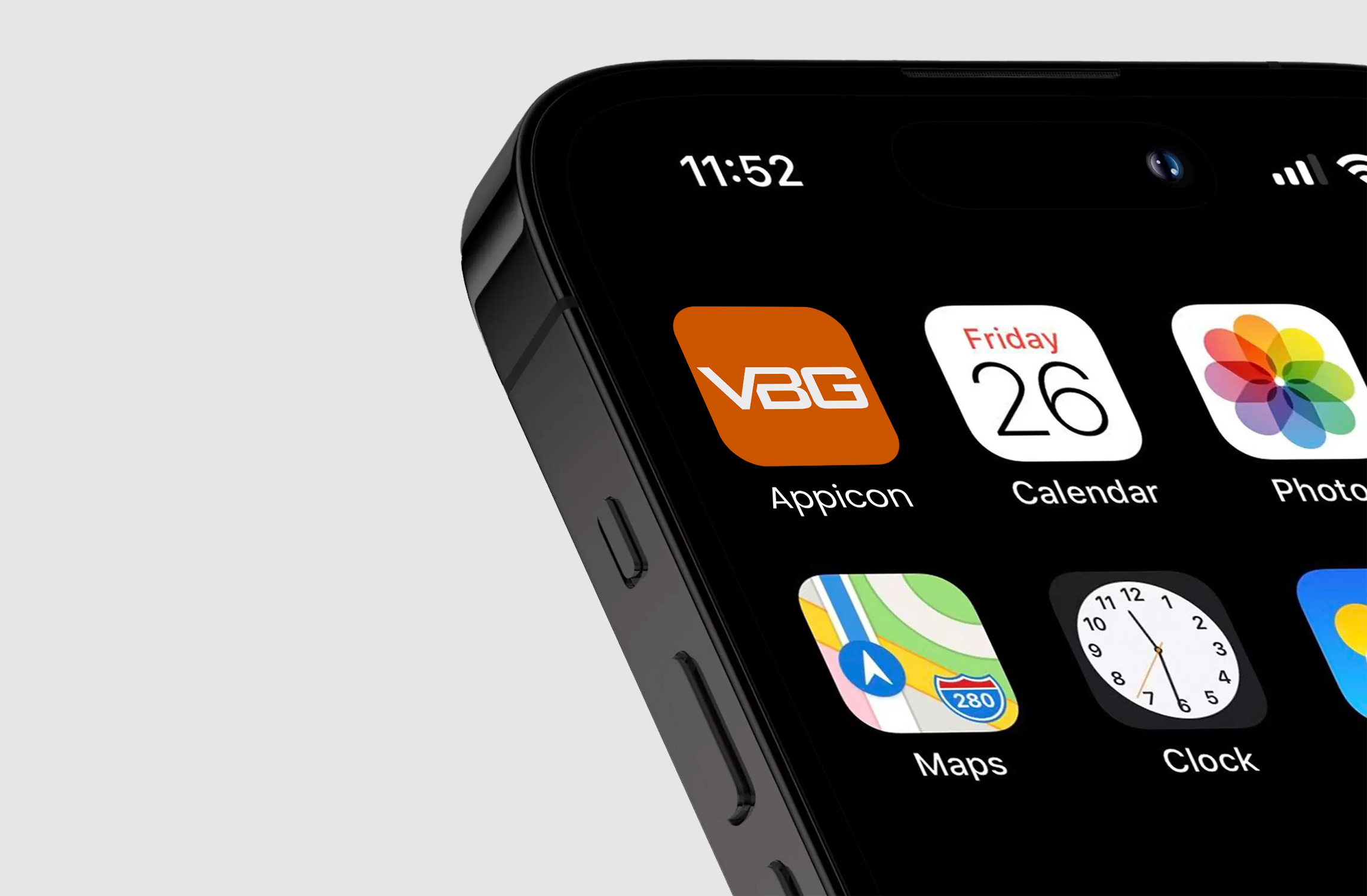
The new logo is designed to be versatile, with considerations for both digital and print media. The revised color scheme ensures the logo looks equally compelling whether on large-scale office fronts or small-scale applications like app icons.
Through this meticulous redesign process, Vinez Benefits Group successfully crafted an identity that mirrors its core values and aspirations. This strategic update positions the company for future growth, ensuring its aesthetic remains relevant and compelling to a modern audience.
Start your brand journey today.
