ID.PD: A Redefinition of Identity and Dialogue Through Design
Discover the thoughtful branding process behind ID.PD, a company championing community, transparency, and trust. Explore their new visual identity.
The design odyssey for ID.PD provides a riveting exploration of how design can encapsulate a brand's ethos and aspirations, revealing insights and milestones that shaped its visual identity. ID.PD, with its philosophical and literate name, strives to offer more than just products; it intends to infuse the core values of community, transparency, and trust throughout its journey.
Understanding ID.PD: A Vision Beyond Borders
With its roots in promoting community and trust, ID.PD seeks to carve a niche where ideas and dialogues create synergy, forming a united front in the business landscape. While the name ID.PD may suggest an amalgamation of Identity and Public Dialogue, it also boldly represents the values it stands on - nurturing a society bound by openness and reliability. This places ID.PD as a pivotal player within its industry.
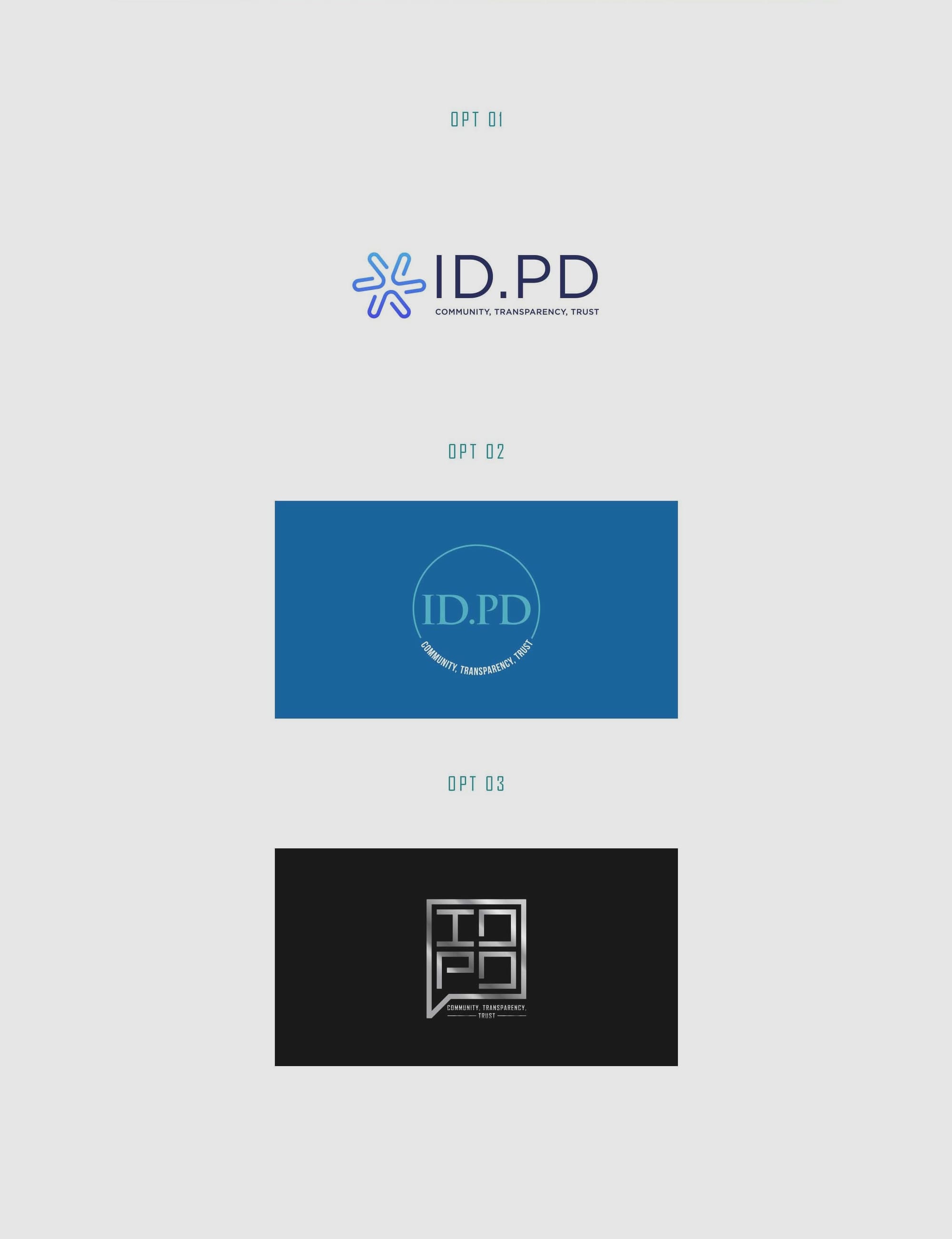
The design agency faced the challenge of generating a distinctive visual mark that communicates ID.PD’s commitment to fostering an authentic community. The process began with designing three logo options, each encapsulating different aspects of ID.PD's multi-dimensional ethos.
Design Exploration and Client Collaboration
The design team’s initial presentation illustrated an array of concepts focused on minimalistic typography and the color scheme preferred by the client - gun metal gray, blue, and black. These colors represent stability, trust, and professionalism, amplifying the essence of ID.PD's vision.
Co-Creating a Modern Identity
The collaborative journey between ID.PD and the design team was marked by feedback loops and creative symbiosis. The client conveyed their enthusiasm for the design process and the attention to detail embodied in each concept. After deliberation and refinement, option #03 emerged victorious, encapsulating the client’s ideals in its sleek, modern design.
The Confluence of Typography and Design
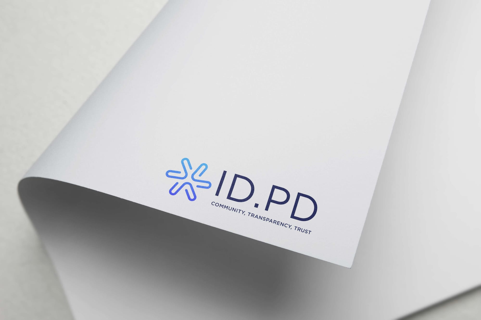
The final design’s utilization of the Agency Fb font brings elegance and boldness, emphasizing clarity and strength. This typeface has been a chosen favorite for brands aiming for a commanding typographic presence, often seen in identities that require authority and the conveyance of strategic importance.
Real-World Application: Mockups and Final Imagery
The application of ID.PD’s logo across various platforms conveys its versatility and adaptability. Whether it be on business cards, mugs, apparel tags, or on digital fronts like laptops and web interfaces, the logo maintains its leverage and communicates ID.PD’s message emphatically.
Conclusion: A Design Legacy Steeped in Trust
ID.PD stands as a testament to what thoughtful design and client synergy can achieve. It embodies a spirit of unity and dialogue through visual language, aiming to echo its title-an exploration of identity and community. As it steps into the market, ID.PD's new visual identity will likely serve as a beacon for its core tenets, promoting trust and transparency among its stakeholders.
Start your brand journey today.
