Holo Diffusion: Illuminating the Future of Advertising with Cutting-edge Design
Discover how Holo Diffusion's new logo was crafted to reflect their avant-garde approach in the holographic advertising sector.
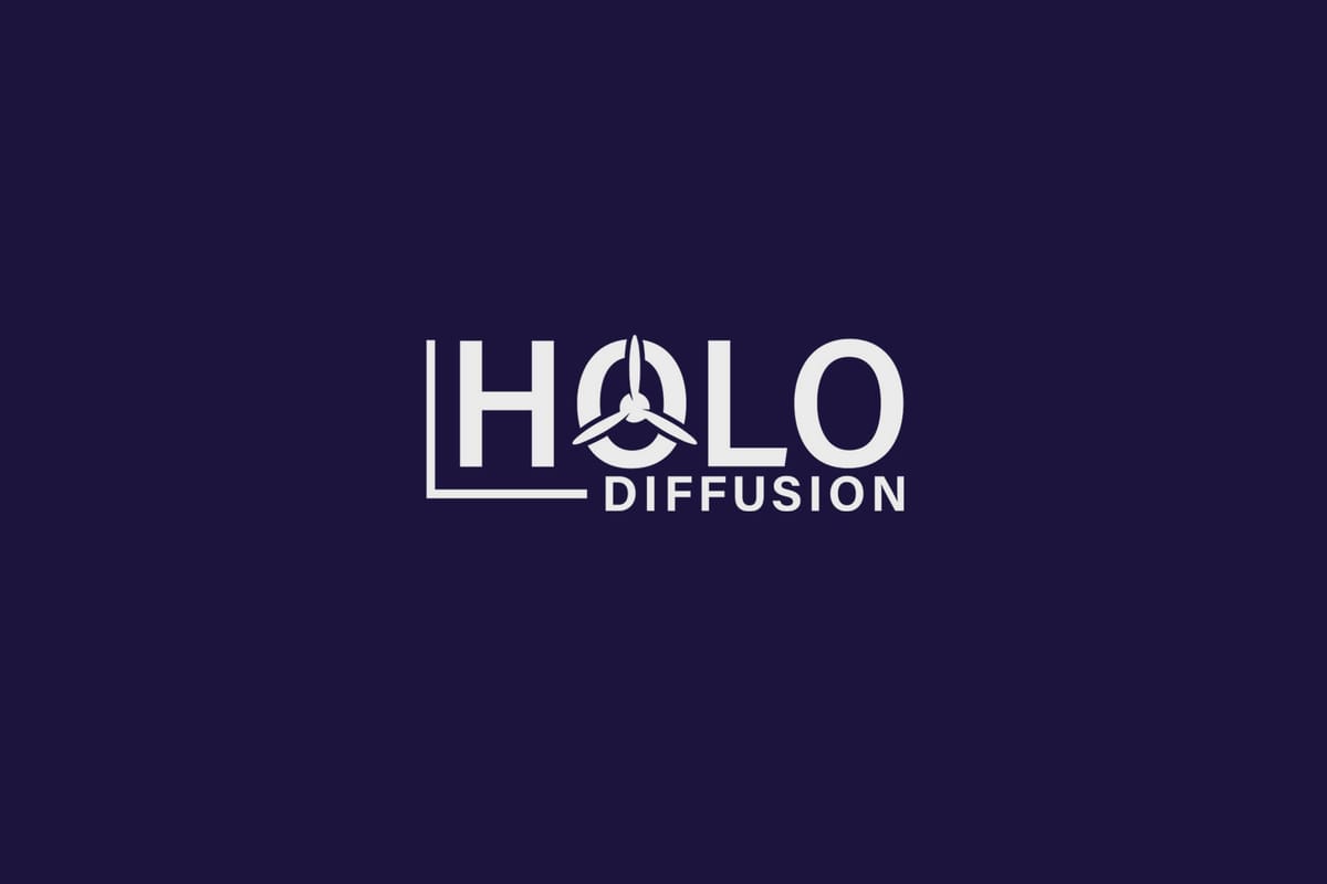
In the realm of next-generation advertising, Holo Diffusion stands as a beacon of innovation and creativity. Specializing in the sale of holographic propellers, the company targets traders, event fairs, and nightclubs, offering an immersive and futuristic experience at the point of sale. The need for a redefined visual identity was crucial for Holo Diffusion as it ventured into a market teeming with potential and competition.
Defining the Vision
The essence of Holo Diffusion lies in its ability to create captivating holographic displays. Therefore, the branding needed to be a synthesis of simplicity and futuristic appeal. The brief was clear: the logo should highlight the 'hologram side' and comprise a palette of white and sky blue to reflect professionalism and innovation.
Exploring the Design Terrain
The initial phase of the project was a deep dive into the visual territories of holography and modern branding. The reference logos provided by the client established a foundational aesthetic, prioritizing minimalist and impactful design principles.
The design team presented a trio of thoughtful options as their initial response:
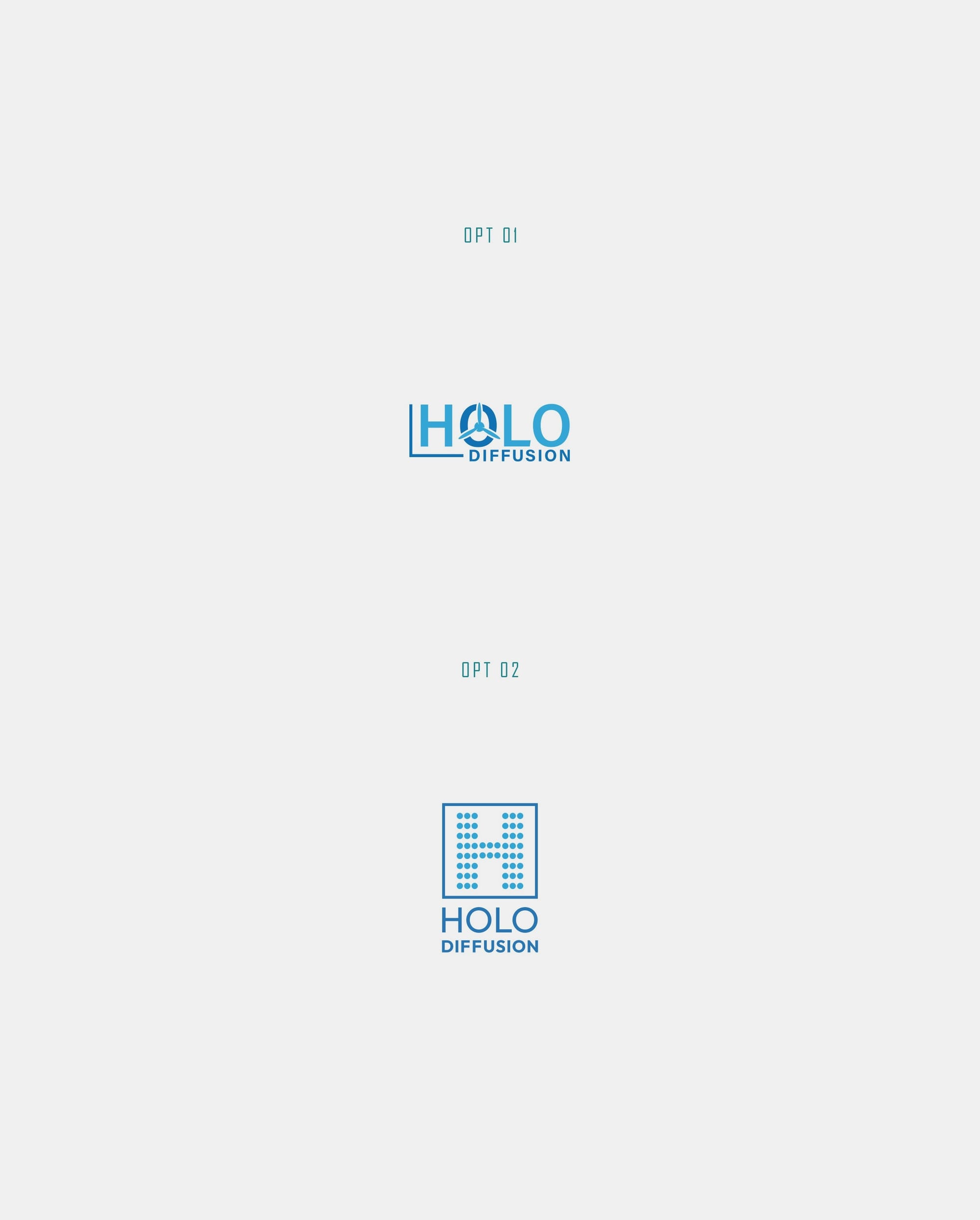
The choices reflected varying degrees of 'holographic emphasis' and adopted clean forms, each leveraged to capture attention and communicate clarity.
Iterative Refinement
Upon reviewing the submissions, the client expressed a preference for the options where the hologram was a focal element, particularly focusing on a design that encapsulated an 'H' rather than 'HD'. This feedback directed the design towards a more streamlined approach, striving to achieve an impactful yet understated visual language.
The Final Manifestation
The process of refinement included ensuring cohesiveness in the use of color, as requested by the client, to harmonize 'Holo' with its counterpart 'Diffusion', creating a unified vibrancy of sky blue and white.
Typography Selection
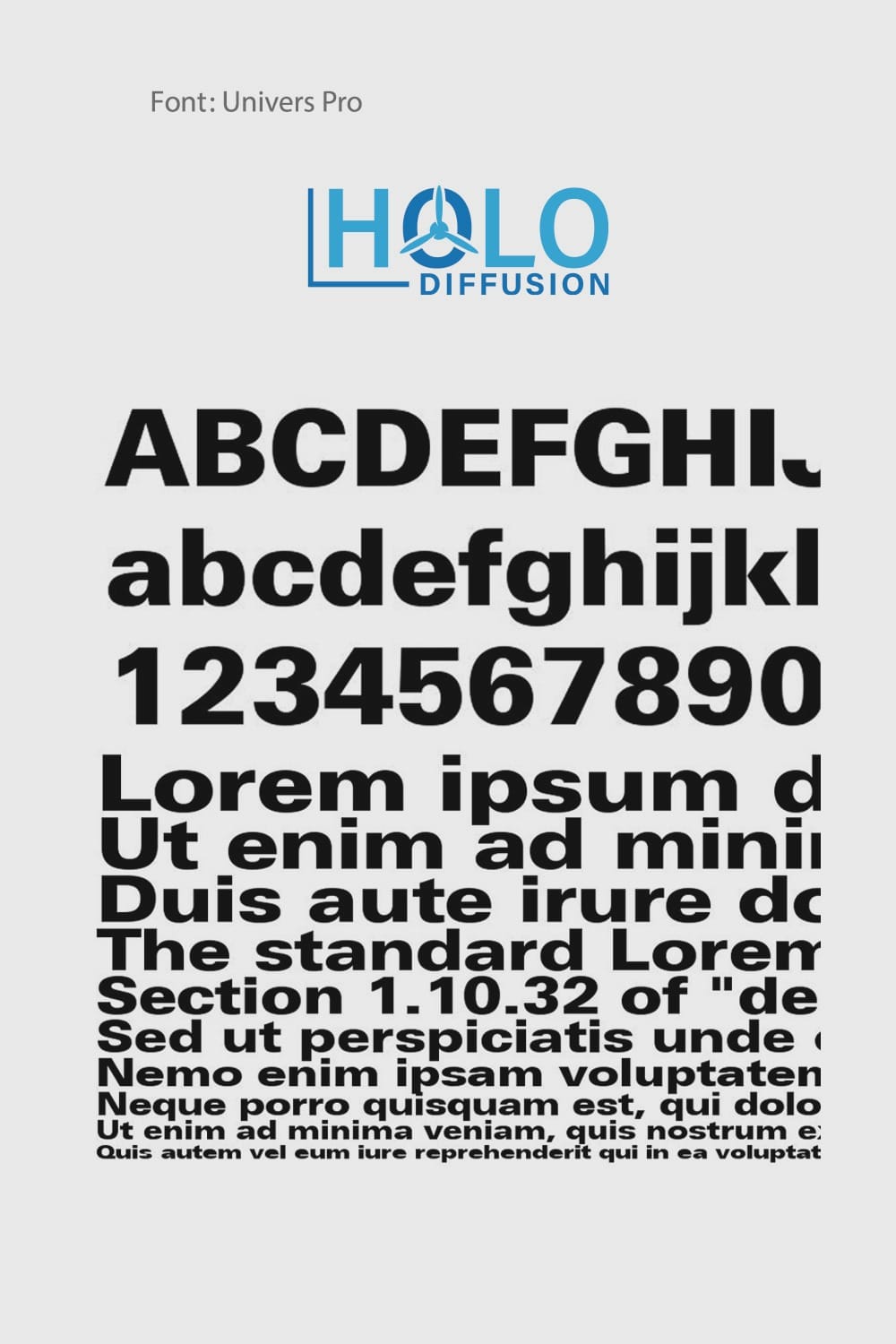
The conclusion of this visual endeavor was met with satisfaction from Holo Diffusion’s leadership. The final choice embodied minimalism while projecting a holographic allure. The decision to employ the font 'Univers Pro' facilitated the desired aesthetic: clear, bold, and distinctly modern.
Mockup Presentation and Brand Visualization
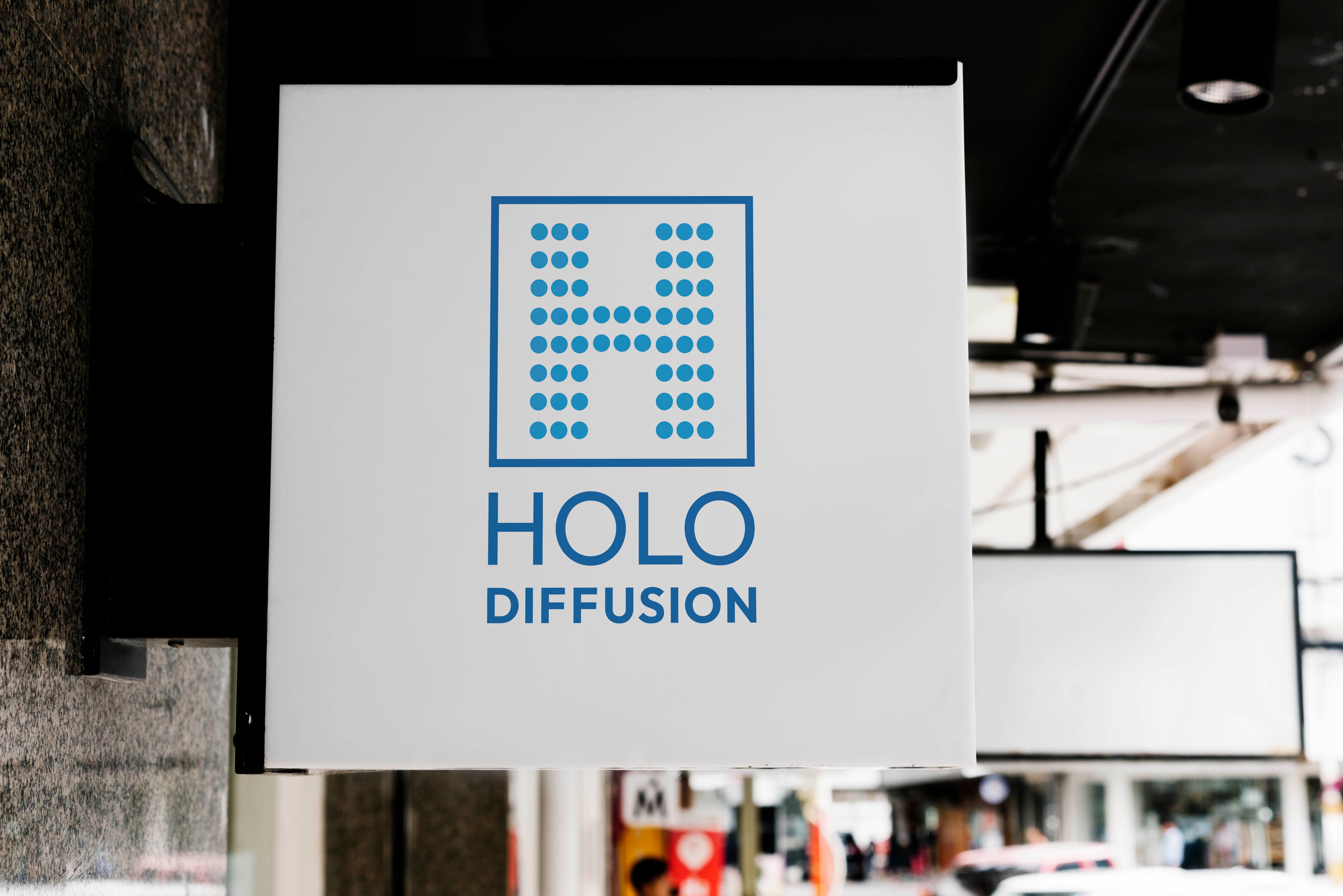
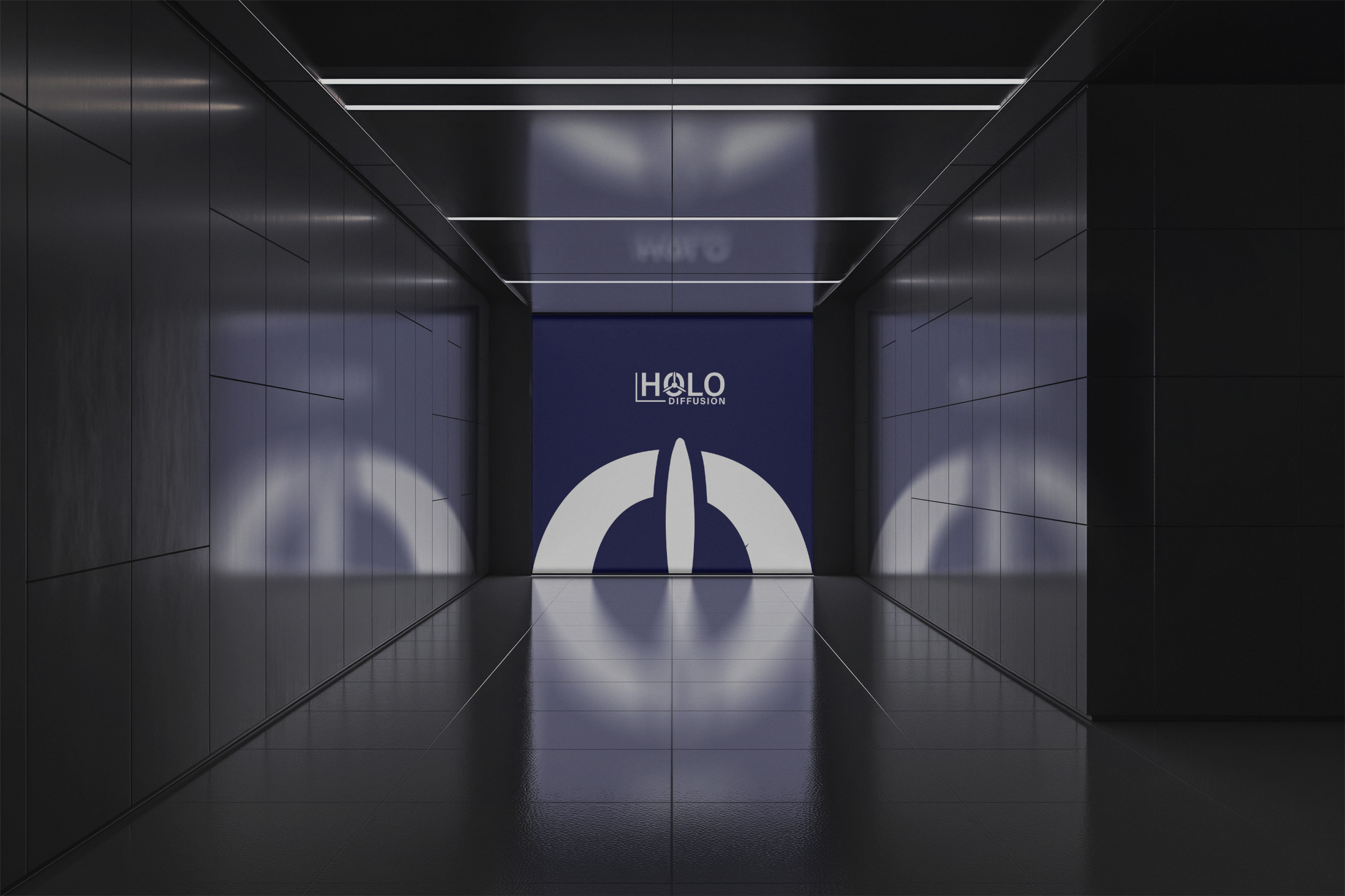
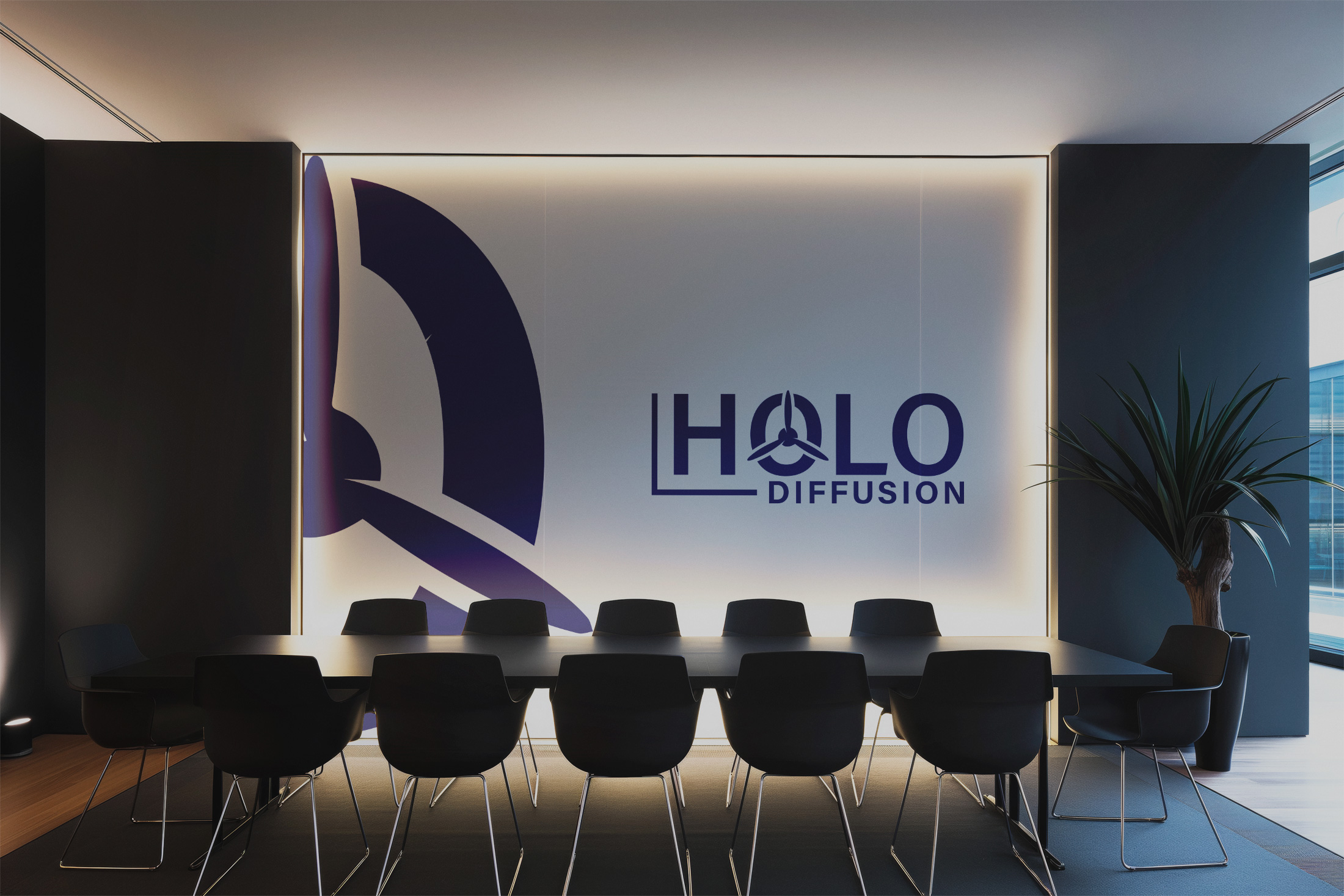
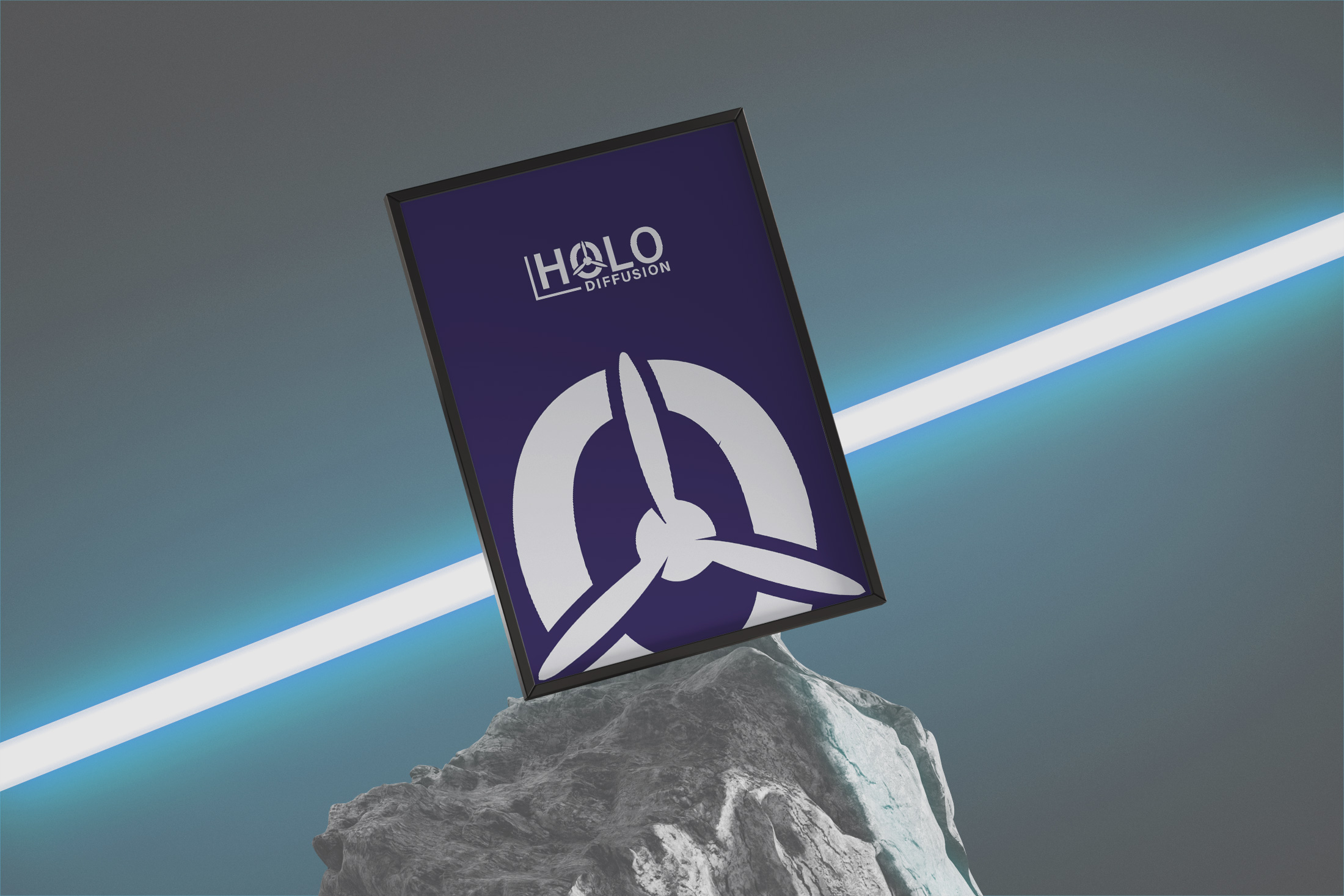
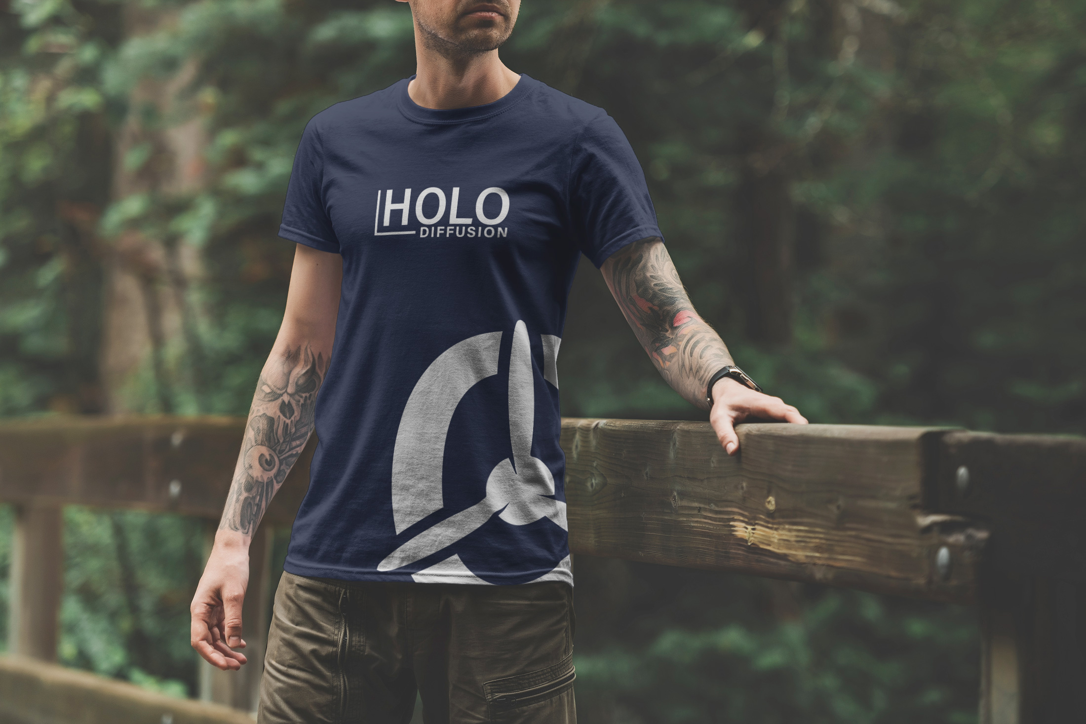
As we survey the final mockups, Holo Diffusion emerges not merely as a brand but as a visionary purveyor of innovative advertising solutions. The final logo, omnipresent across different mediums, reflects the company’s ethos and positions it favorably within a competitive landscape.
Conclusion
In summation, the new branding for Holo Diffusion does not only function as a visual identifier but strategically aligns with the company's innovative aspirations in the marketing industry. With a clean and balanced design that speaks to the modern consumer, Holo Diffusion is poised to transform the future of advertising, one hologram at a time.
Start your brand journey today.


