Hana Home Conciergerie: A Symphony of Subtlety and Elegance in Design
Discover the thought process behind Hana Home Conciergerie's elegant logo rebrand, perfectly capturing professionalism and aesthetic simplicity.
In the heart of the hospitality industry, brand identity is paramount. Hana Home Conciergerie, a budding force in short-term rentals and concierge services, embarked on a rebranding journey that beautifully encapsulates professionalism and subtle elegance. Their challenge was to craft a brand aura that was immediately understandable yet visually arresting, a goal achieved through a harmonious blend of thoughtful color palettes and typography.
The Vision and Foundation
Hana Home's founder sought a logo that would stand as a paragon of their offerings: professional, clean, and direct. Serving an audience that values quality and details, the company's clientele ranges from leisure travelers booking short stays to busy professionals requiring tailored concierge services. With a detailed brief, the objective was clear: evoke sophistication through a palette of nude, pastel, and gold hues.
Initial Concepts and Feedback
The design team presented three initial logo variations to the client. Each option offered unique takes on formality and style while maintaining the core color scheme.
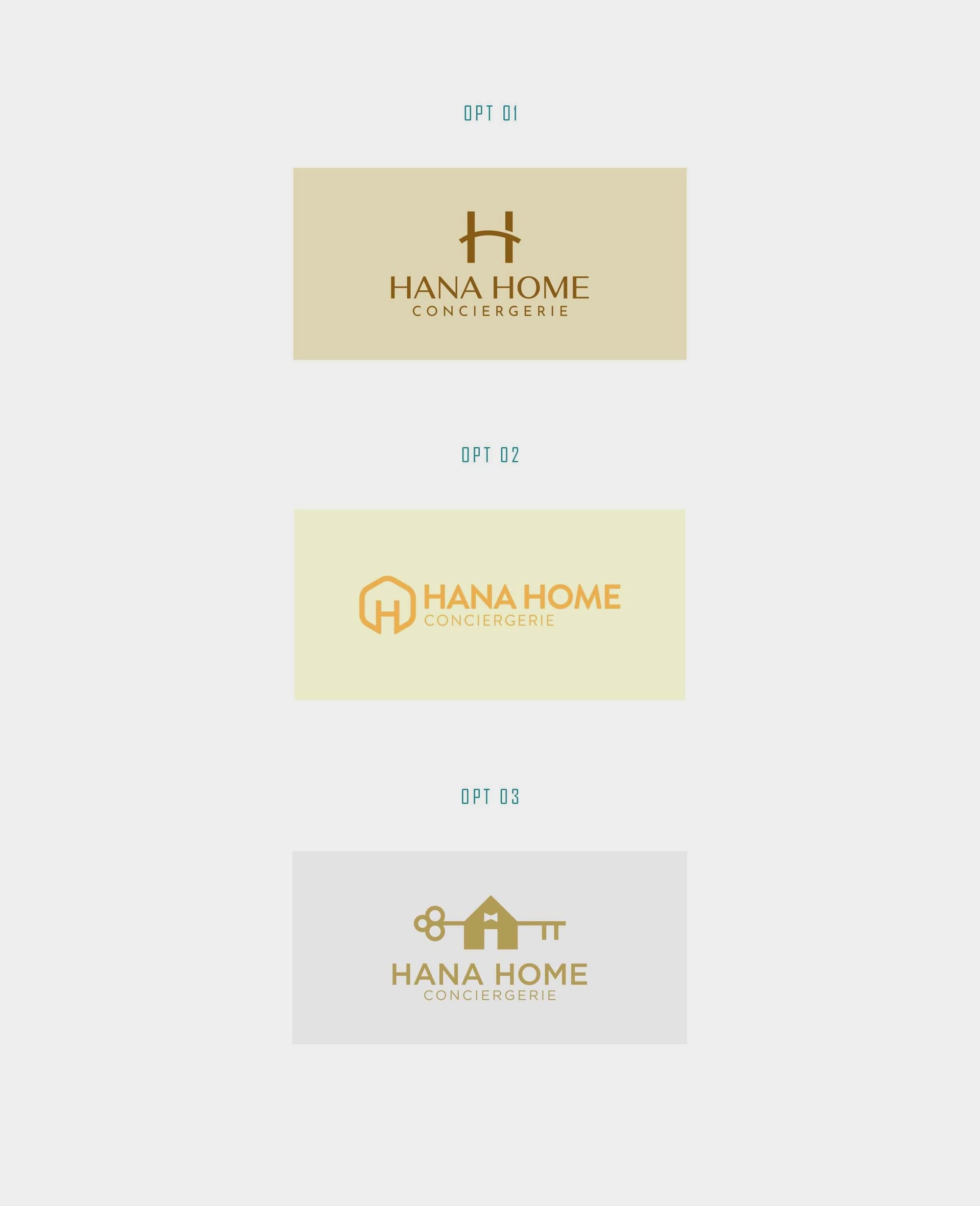
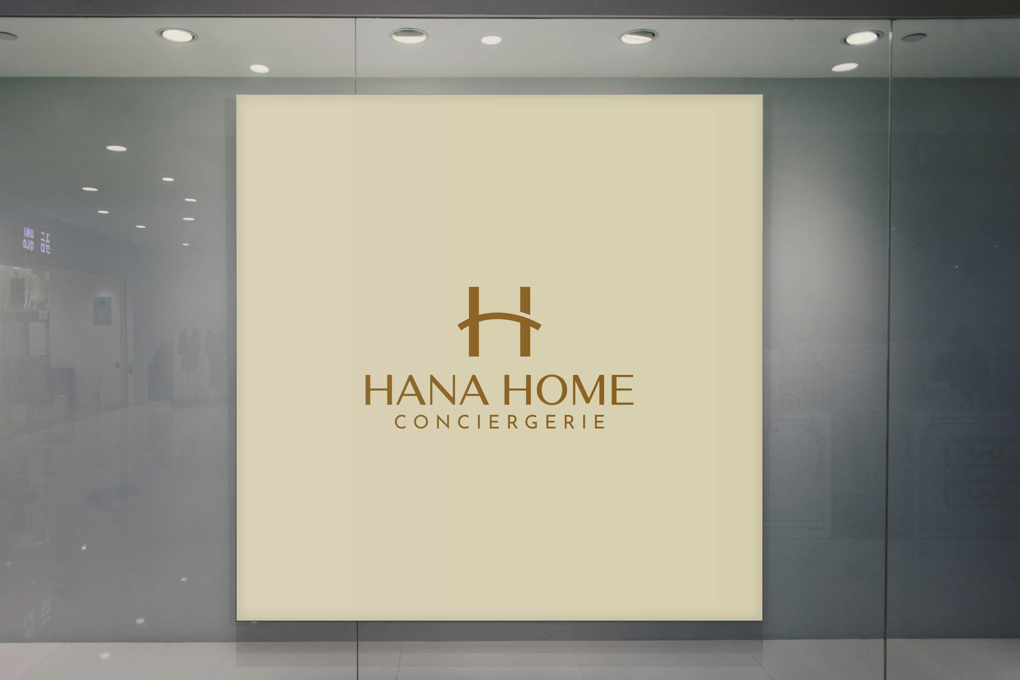
The client expressed a strong preference for the first design, requesting a change in typography for the word 'concierge'. This choice highlighted their inclination towards a design that balances sophistication with clarity. The design team's subsequent revision featured Alethia Pro, a font known for its refined and versatile character, which aligns seamlessly with the ethos of Hana Home's services.
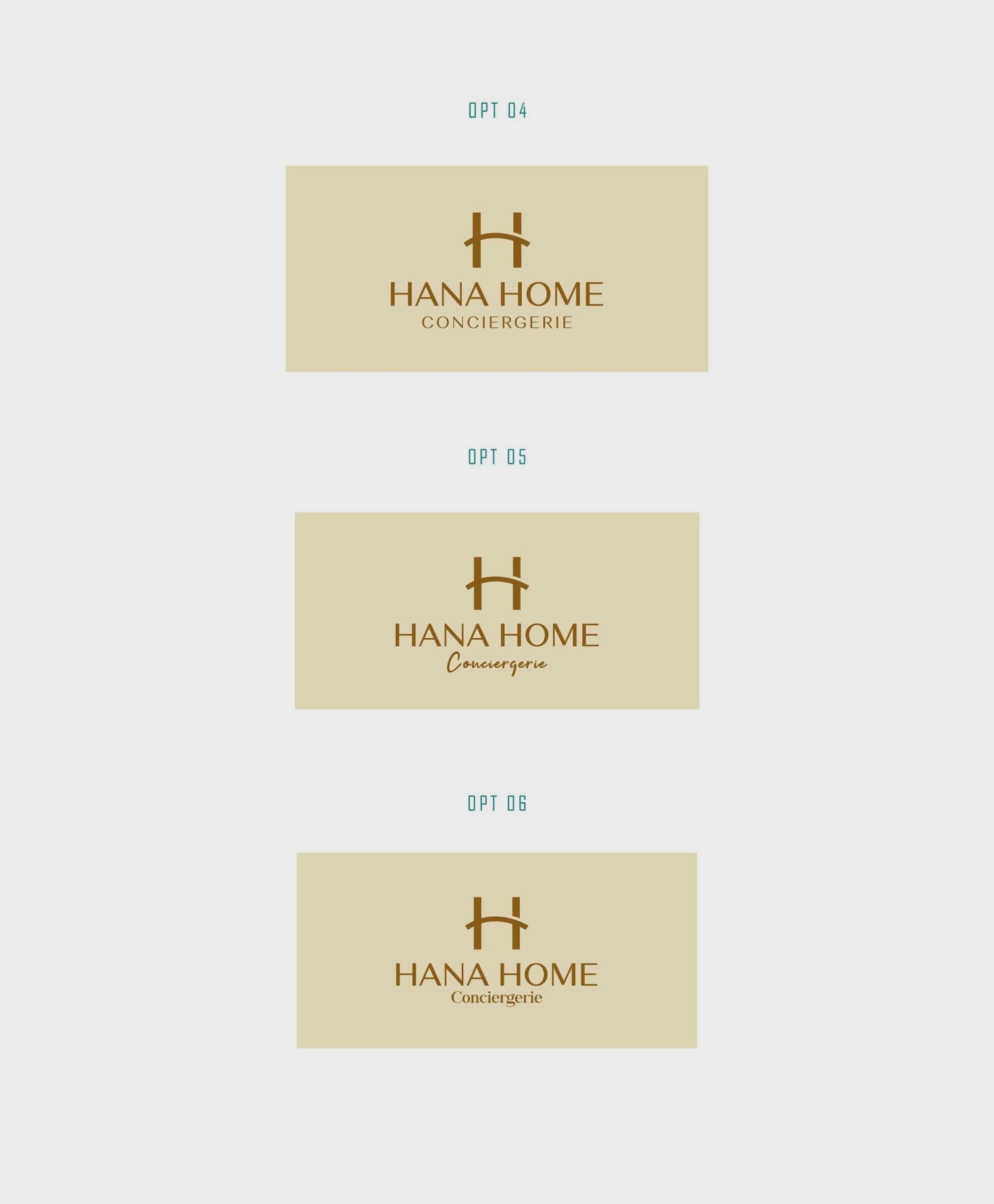
Color Exploration and Finalization
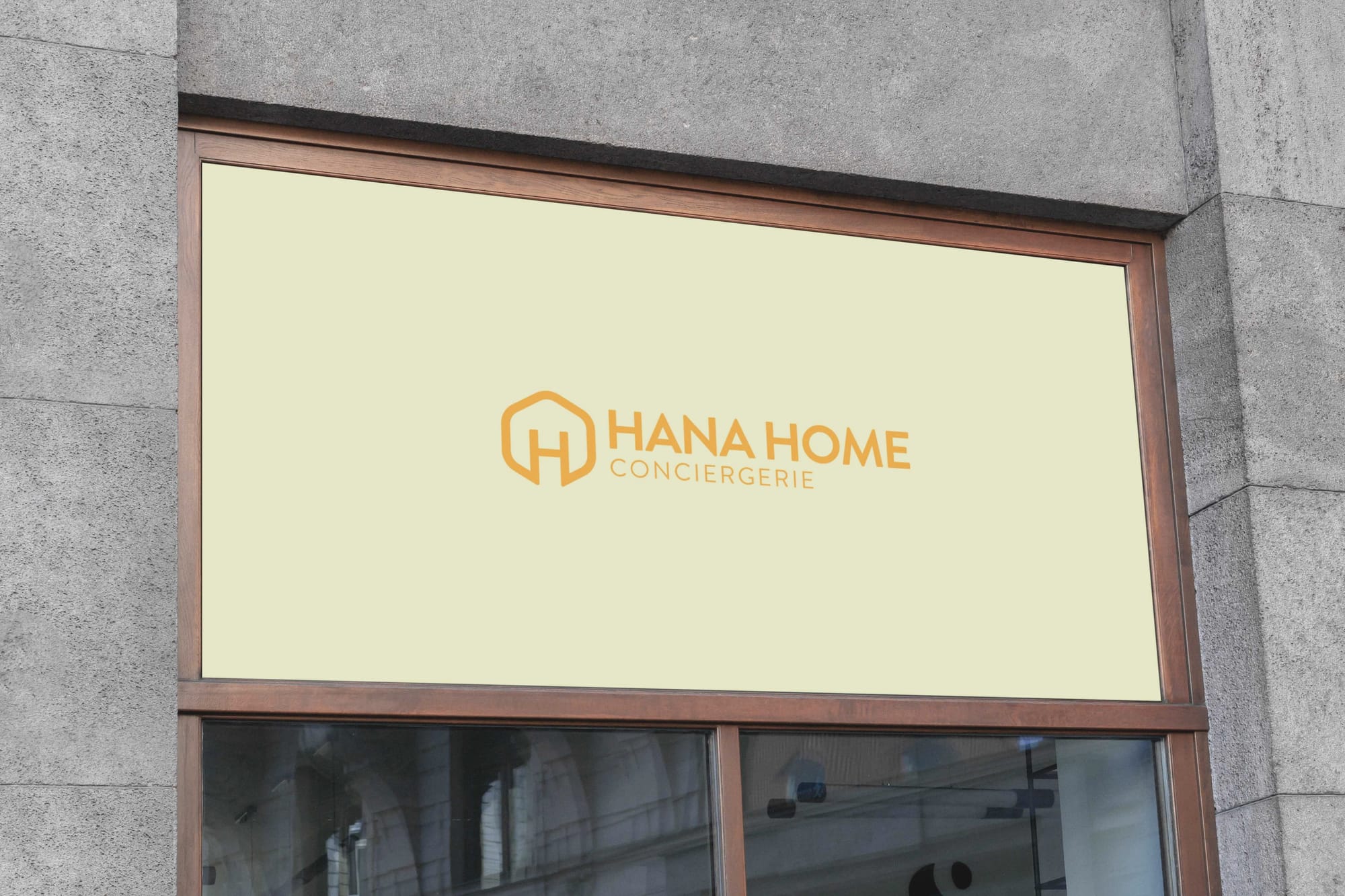
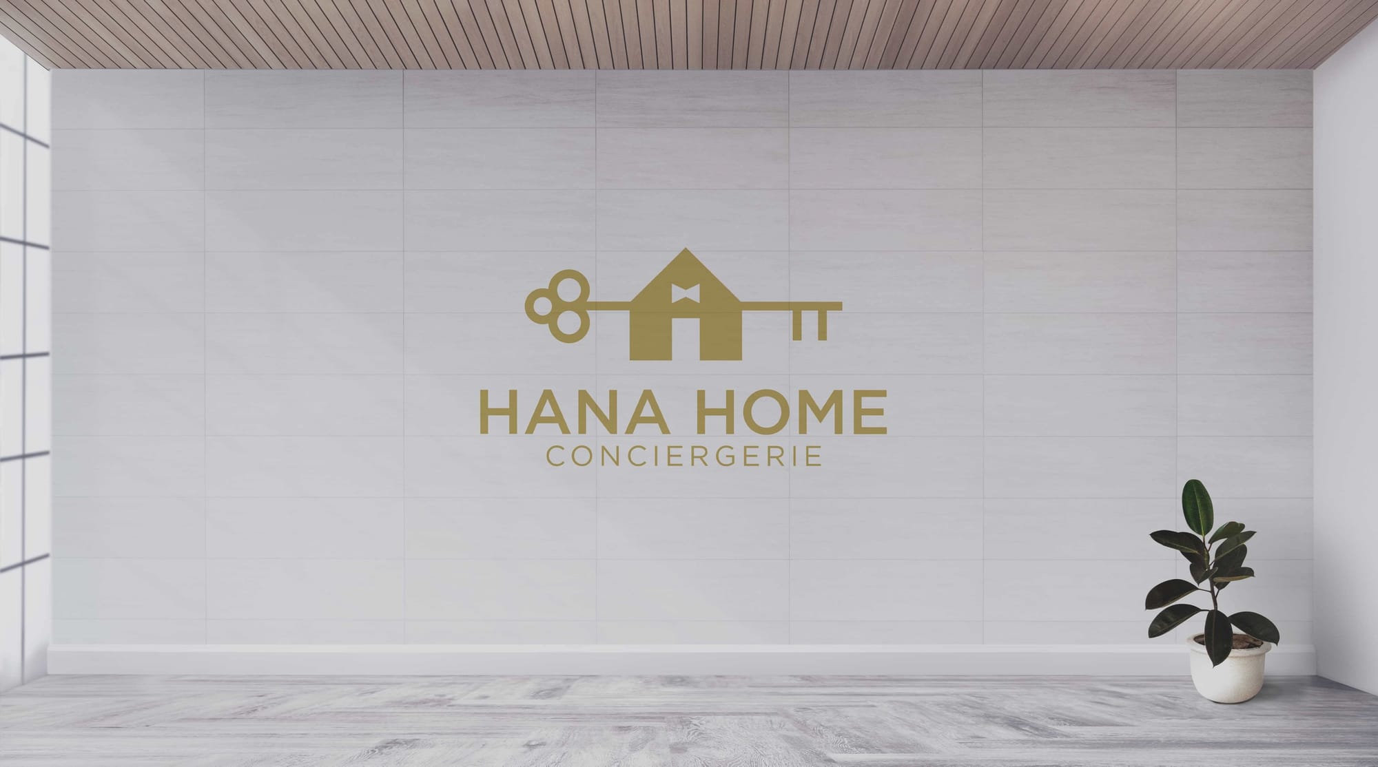
Following the typography refinement, the client requested an exploration of additional natural colors, expanding the visual depth of the logo. Multiple iterations were presented, allowing the client to assess the emotional and aesthetic impact of each hue.
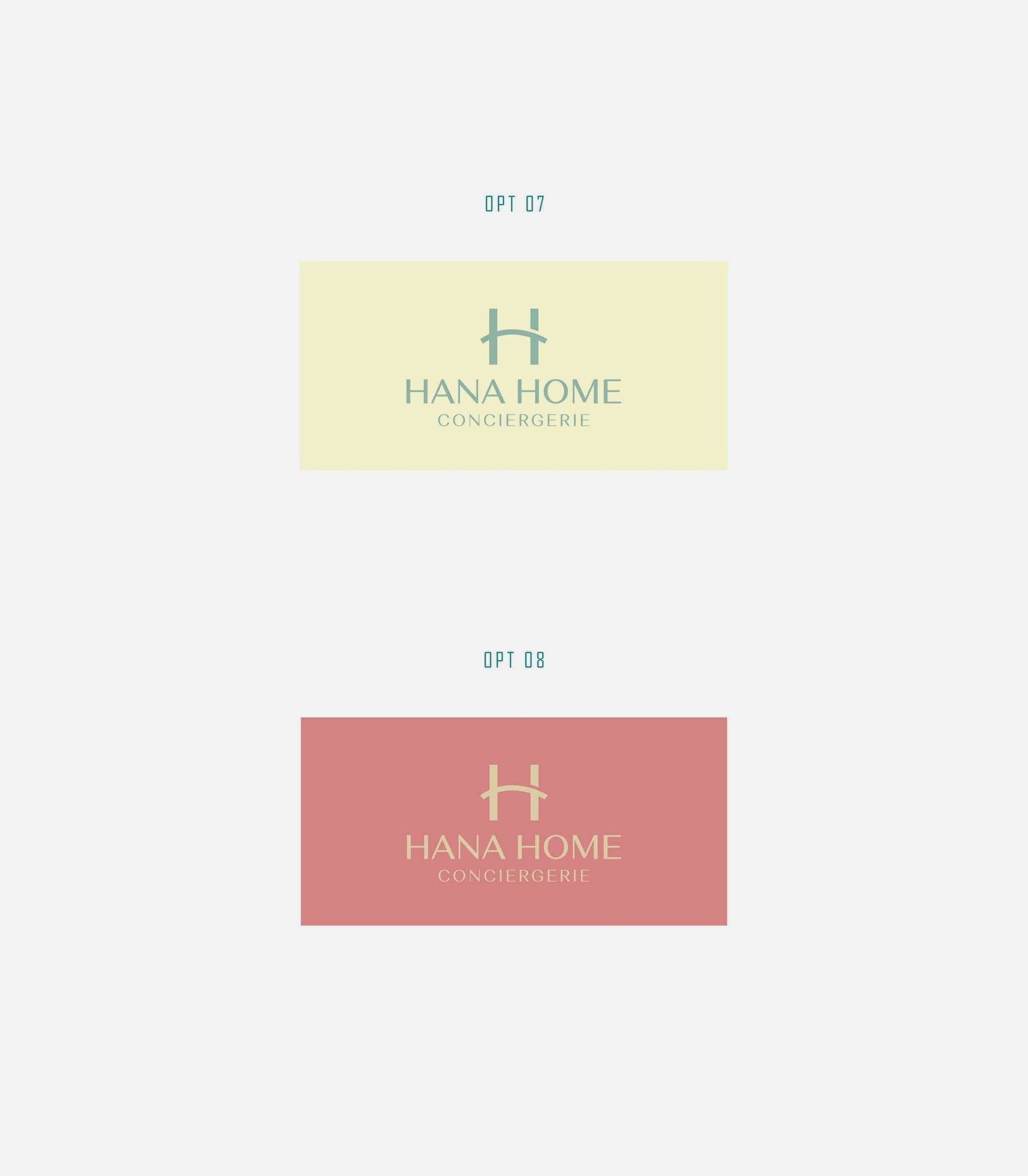
Ultimately, the decision landed on a design that encapsulates a subtle yet distinct identity, harmonizing with the brand's ambition to provide serene and assured service experiences.
Font Details: Alethia Pro
A crucial component of Hana Home's visual identity, Alethia Pro, offers a sense of grace and clarity. Its refined aesthetics contribute a modern, stylish touch, supporting the company’s positioning in the premium segment.
The Final Reveal
With the completion and acceptance of the brand's new identity, the logo was applied across various mediums, providing real-world context and showcasing the design team's creative vision and execution capabilities. The applications included a tote bag, a hotel door tag, cushions, and a framed piece for a lobby, each illustrating how the logo seamlessly integrates into different touchpoints.
Conclusion
The rebranding of Hana Home Conciergerie stands as a testament to the power of subtlety and refined aesthetic in logo design. It marries functionality with beauty, creating an identity that resonates with its target audience. Through careful consideration of color, typography, and application, the brand’s new look firmly positions Hana Home as a distinguished player in the hospitality industry.
Start your brand journey today.
