Get It Done Support: Transforming Tasks into Timely Triumphs
Exploring the visual identity journey for Get It Done Support, embodying a philosophy of efficiency with the new logo design.
iscovering a visual identity that encapsulates a brand's essence requires a deep understanding of its philosophy and mission. Get It Done Support, with its slogan 'Quick, Easy, Concise, Doable,' represents more than just service, it embodies a philosophy of efficiency and clarity. This design journey unveils how a new logo was created to reflect these core values.
The Brand's Essence
Get It Done Support serves various industries, coordinating and simplifying tasks. Their approach is encapsulated in their motto, aiming to transform overwhelming tasks into achievable goals. Each project is handled with the intention of breaking it down into manageable components, making the seemingly impossible, possible.
Logo Design Journey
The design brief began with a thoughtful exploration of colors and motifs, as illustrated in the initial client references. This creative process began with the delivery of three options, striving to capture the brand's identity fluidly.
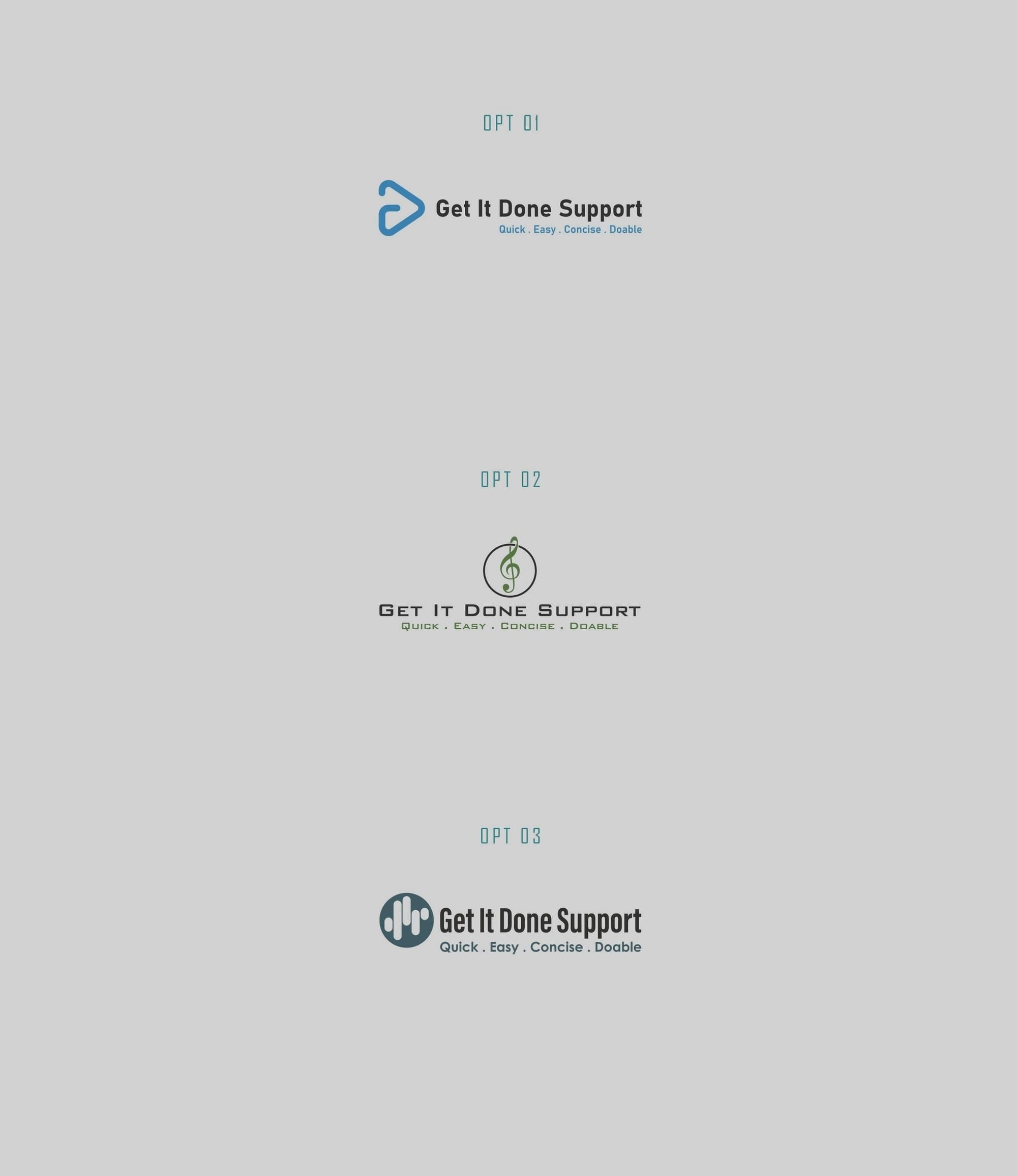
Feedback from the client was crucial, guiding the designs further with specific requests for color integration and graphical refinement. The initial music-themed suggestion was politely declined, redirecting the focus to options that more broadly addressed the diverse clientele.
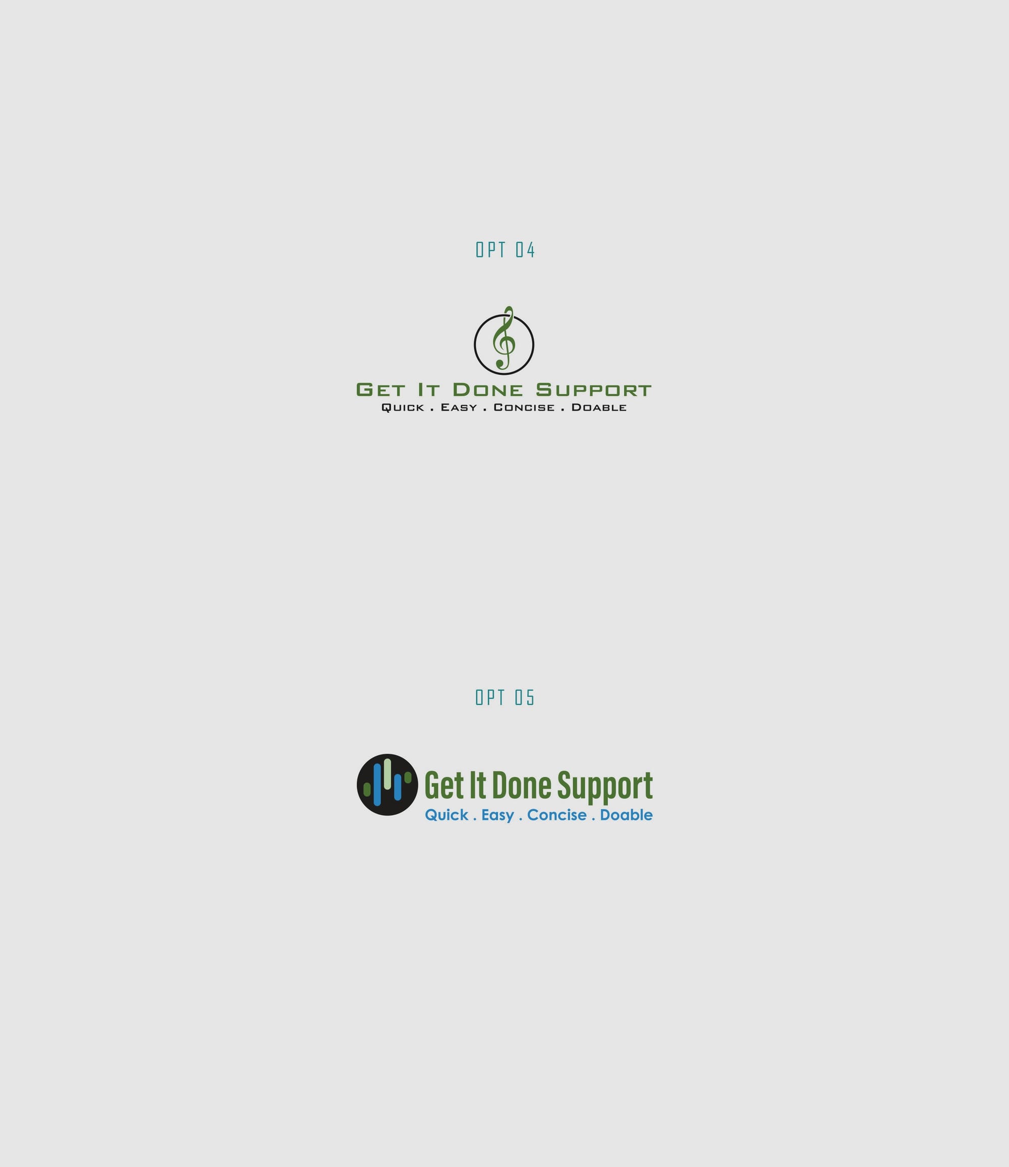
With a clear direction, the next iteration continued to evolve the design. A critical revision requested the inclusion of more hues and a better representation of the selected conceptual elements. Collaboration here was key, ensuring that the chosen design direction was maintained while enhancing its visual reach.
The Final Design
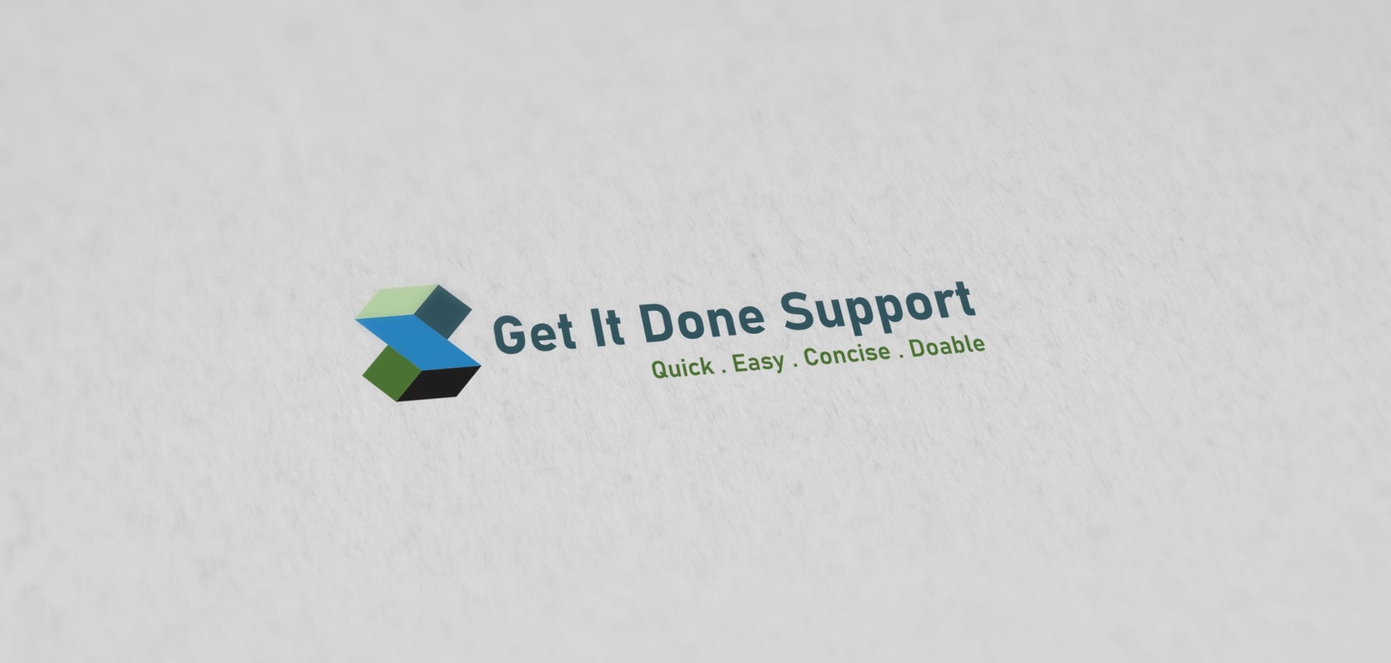
The design process culminated in a modern and versatile logo, encapsulating the essence of Get It Done Support's mission and values. Option #10 was identified as the victorious graphic, having met all the client's desires for inclusivity and broad appeal. This marked an end to the journey with a logo that succinctly tells a story of transformation and possibility.
Typography and Application
The font choice of Bahnschrift lends a contemporary robustness to the logo, enhancing its readability and presence across various formats. Its bold geometry aligns perfectly with the brand's values, furthering the visual impact. The final logo displays its strength across a variety of mediums, from web to physical billboards and individually crafted merchandise.
In conclusion, the Get It Done Support logo represents a successful merger of visual design and brand philosophy. It embodies the promise of 'Quick, Easy, Concise, Doable' in a modern, visually compelling identity. Each aspect, from color to font, was meticulously chosen to create a robust and appropriate representation of the brand's goals and personality.
Start your brand journey today.
