Exploring the Rebranding Journey of JT&T Services: A Case Study in Adaptive Design
JT&T Services rebranded their visual identity to reflect their diversified service offerings, including logistics and more.
In the ever-evolving landscape of business and marketing, having a distinct and versatile brand identity is crucial. JT&T Services, an emerging name in the logistics and multi-service industry, understood this necessity all too well. With aspirations to expand their offerings beyond logistics to include sectors like photography and engineering, JT&T Services embarked on a rebranding journey that culminated in a striking logo that encapsulates their multifaceted services and future ambitions.
Setting the Stage for a Transformation
JT&T Services began its operations primarily in logistics, a field known for its dynamic challenges and vital role in global trade. Recognizing the potential to diversify, they decided to embrace additional domains such as photography and engineering. This shift required a fresh brand identity that would reflect their expanded service offerings and appeal to a broader client base.
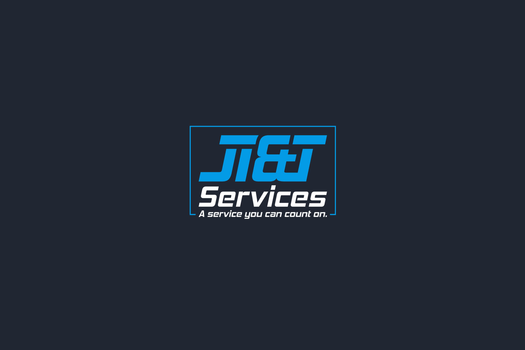
The client’s brief was clear. They wanted the new logo to prominently feature "JT&T" with their slogan, “A service you can count on,” beneath. While light blue was suggested as a primary color, they encouraged creativity in selecting complementary hues. This openness provided the design team with the creative latitude necessary to craft a compelling visual identity.
The Design Process: Conceptualizing and Refinement
The design team's initial response was a comprehensive exploration of concepts. They presented three distinctive logo options, each offering a unique take on JT&T Services’ core values and trajectory. The options were delivered in a detailed logo sheet complemented by individual creative showcases:
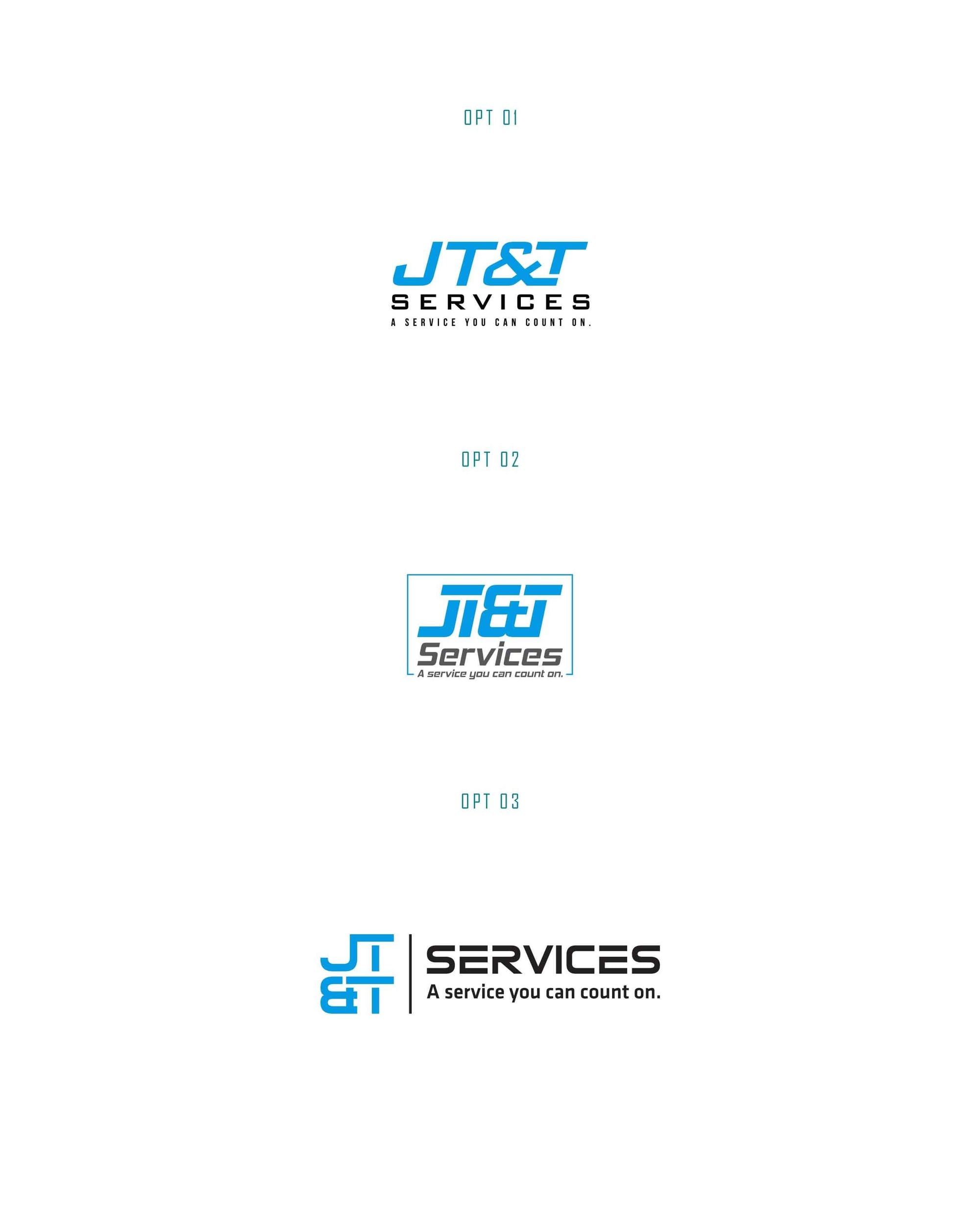
The second option, which ultimately won the client’s favor, balanced modernism with a sense of reliability. It managed to capture the forward-thinking nature of the company while anchoring its roots in trust and dependability.
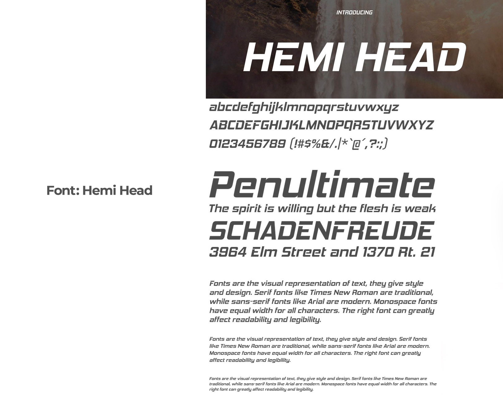
The winning design featured the Hemi Head font, a typeface known for its sleek lines and technical aesthetic. This choice underscored the progressive and multifaceted ambitions of JT&T Services.
Final Deliverables: A Comprehensive Brand Identity
Once the logo was finalized, the design team delivered an array of branding materials to JT&T Services. These included mockups for various practical applications such as business stationary, lobby displays, and transport vehicle branding. The comprehensive approach ensured that the new identity was ready for real-world deployment across multiple platforms.
Conclusion: A Strategic Design for an Expanding Enterprise
JT&T Services’ rebranding journey underscores the importance of adaptability and foresight in business strategy. By selecting a logo that resonates with their ethos of reliability while paving the way for diverse service offerings, the company has established a robust platform for future growth. This case study exemplifies how thoughtful design can play a pivotal role in navigating new market challenges and opportunities.
As JT&T Services continues to broaden its horizons, its new logo stands as a testament to its commitment to excellence and innovation across different industries they venture into.
Start your brand journey today.
