Exploring the Intricacies of MJ Mogul Management LLC's Distinctive Rebranding Journey
Discover the detailed design journey behind MJ Mogul Management LLC's rebranding, showcasing the creativity and collaboration that defined its new visual identity.

Reimagining MJ Mogul Management
MJ Mogul Management LLC, an ambitious venture with a vision for powerful brand representation, embarked on a captivating rebranding project. The collaboration with a forward-thinking design agency resulted in an innovative and impactful visual identity. This case study delves into the strategic and creative decisions that shaped the brand's transformation, emphasizing the intricate interplay between client feedback and design expertise.
Understanding the Client's Vision
The journey began with a clear directive from MJ Mogul Management LLC to reflect an aura of luxury and sophistication through their brand visuals. The initial references provided by the client conveyed a preference for a majestic feel, akin to the luxurious appeal of Maserati. The choice of colors shared by the client set the tone for the design team to commence their exploration.
Setting the stage for the design process, the client provided grayscale images and ideas to reflect a professional yet assertive demeanor. A thoughtful series of exploratory logos were delivered by the design team, each harnessing a unique aspect of the desired aesthetic.

The Pursuit of Perfection
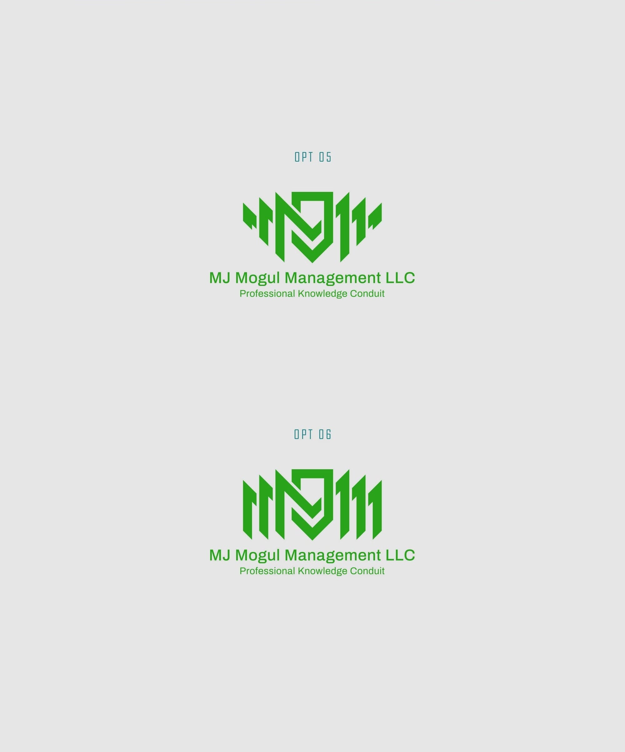
The iterative feedback loop between MJ Mogul and the design team was crucial in honing the brand's identity. The client expressed a keen interest in incorporating three 'M's into the design, a motif that symbolizes synergy and the initials of the company. Several options were presented, each refining the original concept to closer align with the client’s strategic vision.
Opting for refinement in color usage, the client requested additional hues to the chosen option. Subtle adjustments, like making the 'J' black, added contrast and emphasis, resulting in a dynamic yet cohesive color palette.
Elegance in Simplicity: The Final Decision
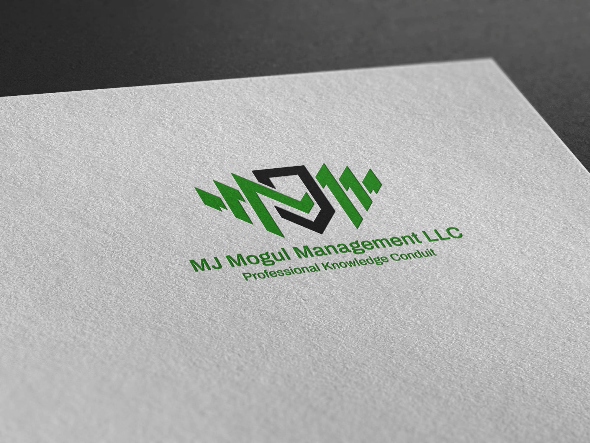
The culmination of this collaborative endeavor was captured in winner option, which elegantly satisfied the client’s creative vision. The design was praised for its blend of professional maturity and modern sensibility, aligning perfectly with the brand's ethos of opulence and management expertise. The final version demonstrated a remarkable balance between striking visuals and functional symbolism.
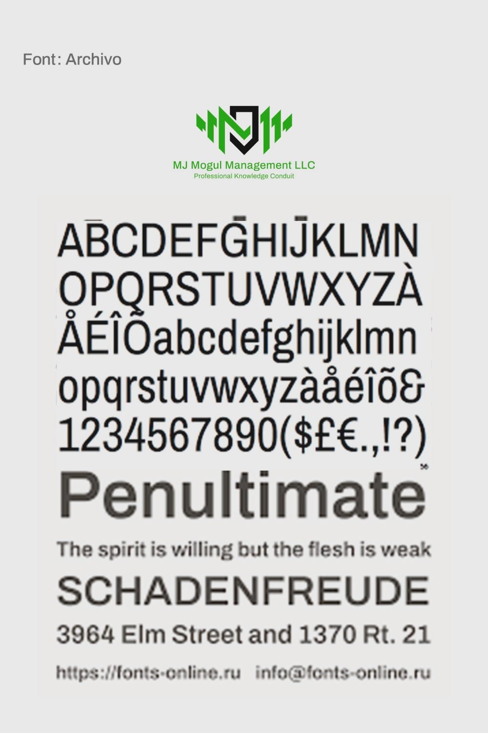
A crucial element to consider was the chosen typeface, Archivo. Known for its versatility and contemporary appeal, it provided a structural basis that accentuated the modernity reflected in the design elements. The font image presents its balanced proportions and refined appearance, enhancing the logo's overall aesthetic impact.
Bringing the Brand to Life
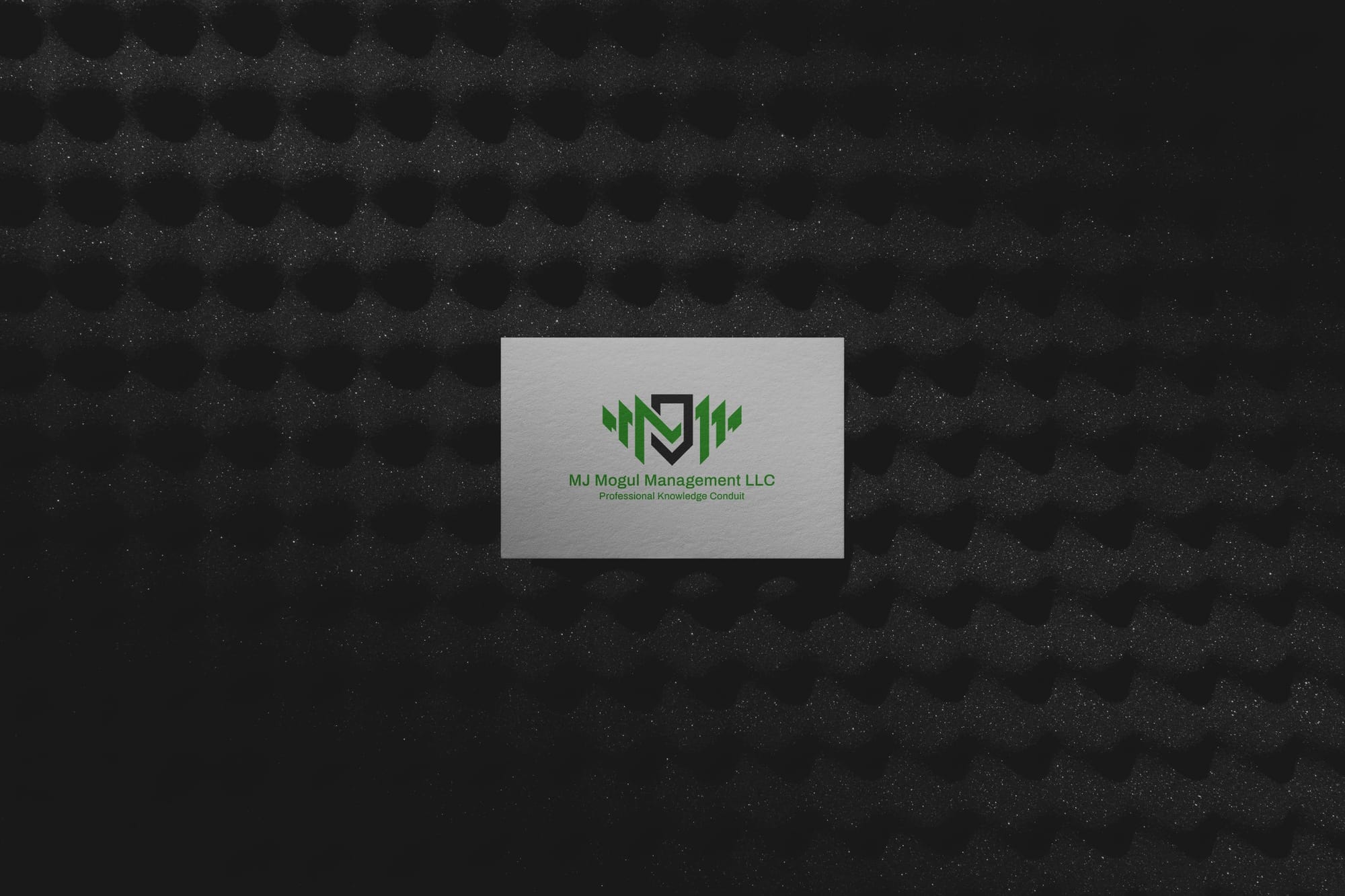
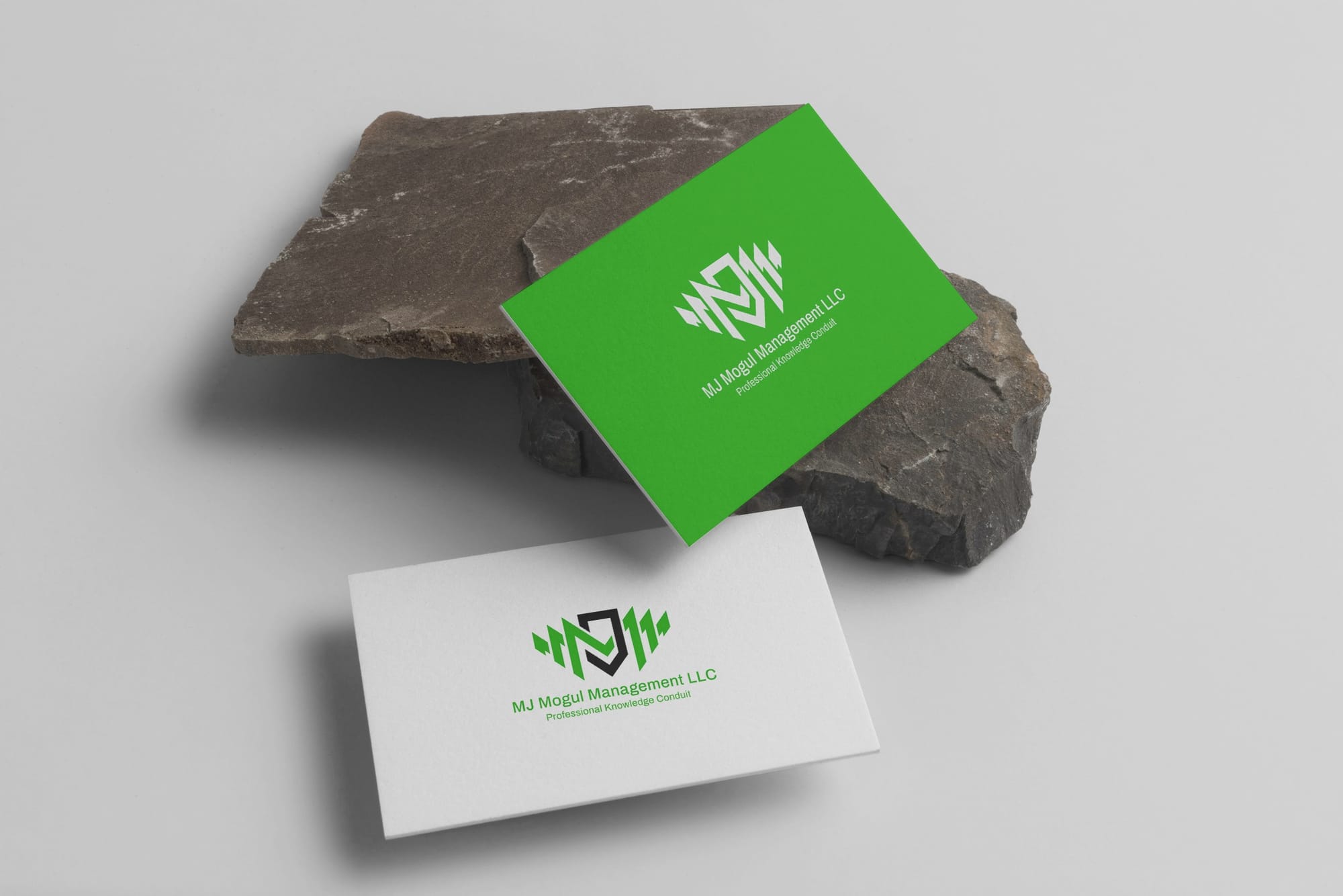
The final deliverables conveyed MJ Mogul Management's aesthetic prowess in real-world applications. Business cards, stationery, and promotional materials captured the essence of the brand, rendering it ready to engage with stakeholders and clients.



Conclusion
The creative journey of MJ Mogul Management LLC’s rebranding effort showcases the potency of collaborative design. By intertwining client vision with thoughtful execution, the new visual identity sets a benchmark for modern branding. The seamless blend of sophistication and contemporary appeal ensures that MJ Mogul stands as a testament to the transformative power of design.
Start your brand journey today.


