Exploring the Creative Foundations of HipTown Development's Branding Journey
Discover the branding process of HipTown Development, capturing their vision of urban luxury through insightful design iterations and thoughtful explorations.
HipTown Development has embarked on a mission to capture the essence of modern high-end living through its new logo design. This branding quest was as much about creative exploration as it was about finding the visual identity that encapsulates the brand's ethos. Herein lies the tale of a logo that narrates a story of urban sophistication, where each element was meticulously crafted to reflect the company's innovative spirit.
The Genesis of HipTown Development
Set amidst the vibrant backdrop of urban growth and transformation, HipTown Development is a burgeoning name in the real estate sector, thriving on the ideals of modernity and contemporary sophistication. Focusing on creating luxurious living spaces, it positions itself as a hallmark of premium quality, resonating with those who value urban elegance.
The company, keen on redefining its visual identity, sought to reflect these attributes through a logo that exudes modernity while maintaining a timeless charm. The challenge: to navigate the confluence of elegance and edge, finding a balance that is both visually arresting and true to their brand vision.
The Initial Exploration: Design Team's Approach
The branding process commenced with the design team receiving a brief that was as succinct as it was significant. HipTown Development desired a logo with a maximum of two colors to maintain a sleek appearance. These constraints fueled creativity, leading the design team to explore concepts centered around harmony between innovation and timelessness.
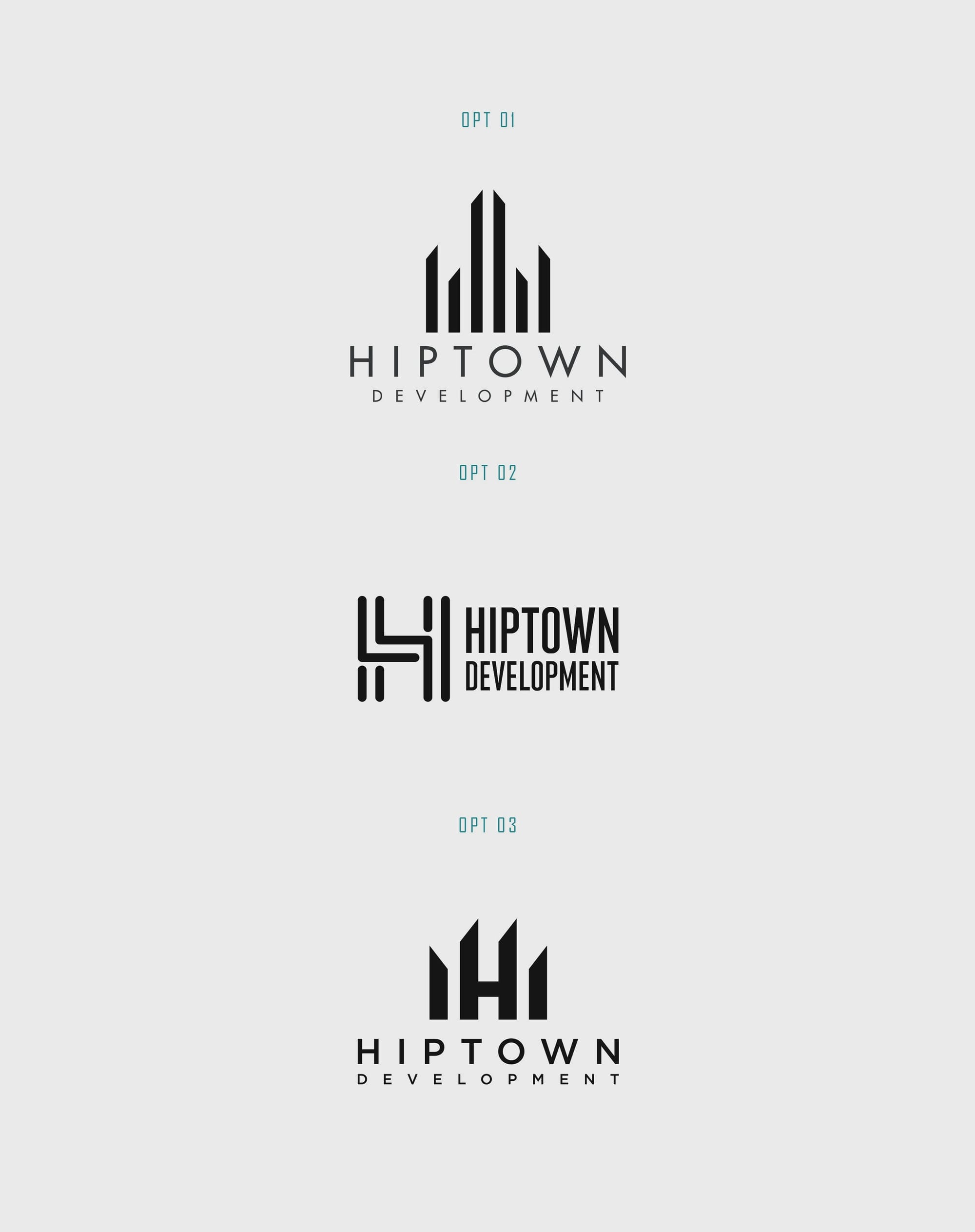
The initial design iterations showcased different aspects of the brand's potential identity, each carrying its own unique vibe and energy. Among them, the third option struck a chord with the client, hinting at a blend of understated sophistication and modern artistry.
Refining the Vision: A Touch of Luxe
Upon receiving feedback from the client, the design team set out to refine the chosen design further. The client expressed a desire for something that felt more high-end, suggesting a three-dimensional touch or a spotlight effect to elevate the logo's luxury appeal.
This feedback led the design team to delve deeper into creating visual depth, seeking to align with the client's vision for a logo that elevates their brand to a premium realm.
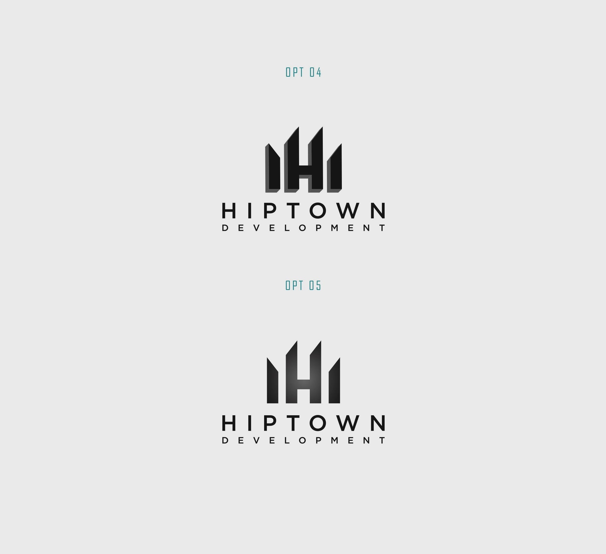

The design iterations evolved to incorporate elements that added dimension and subtlety, contributing to a narrative of urban luxury and sophistication that HipTown Development embodies.
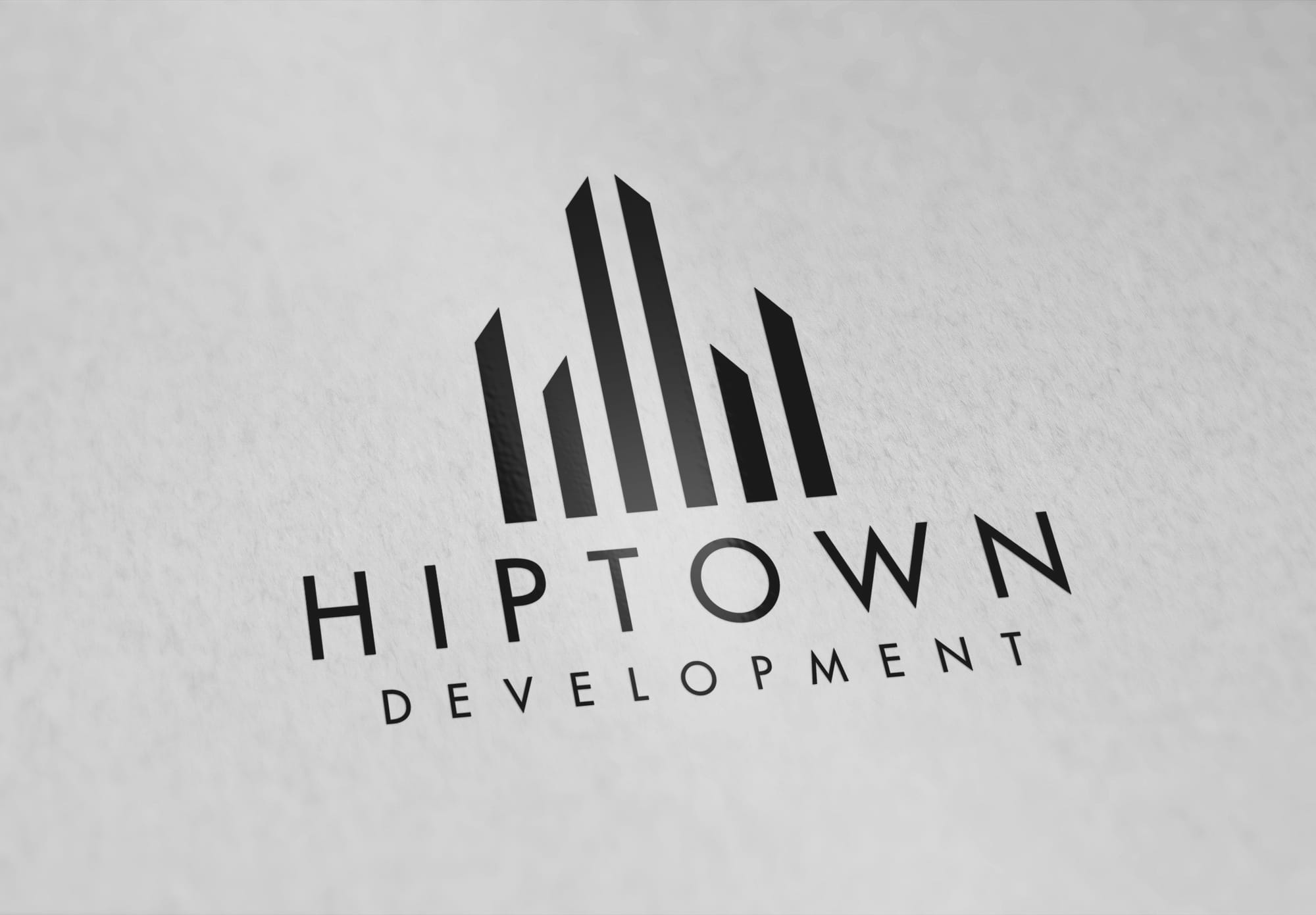
The Culmination: Gotham Font and the Final Design
The final design was a blend of the sophisticated logo mark from the third option and the typeface selection from the first option. The choice of Gotham as the font added a modern yet timeless touch, aligning perfectly with the brand's ethos. Gotham's grounded typography with its geometric, powerful strokes gave a sense of stability and trustworthiness, essential qualities for real estate branding.
The result: a logo that speaks beyond words, encapsulating the luxurious embrace and modern finesse that HipTown Development offers. It stands as a testament to careful curation and thoughtful design choices, reflective of a brand that's well-poised to make an indelible mark on the real estate landscape.
Real-world Application: Transforming Spaces
The final mockups showcase the logo in real-world contexts, echoing the brand's promise of high-end living. Whether gracing the sides of towering buildings or standing tall on billboards, the HipTown Development logo is a beacon of modern urbanism.
Conclusion
In the end, HipTown Development's branding journey is a definitive narrative, bringing together aesthetics and substance. It stands as a striking embodiment of their vision, one that is ready to leap into the urban landscapes of today and tomorrow, defining luxury one space at a time.
Start your brand journey today.
