EONOS: Elevating Healthcare Branding with Confidence
Explore the logo design journey of EONOS—a new beacon in healthcare using design to build trust and modernity. This case study delves into how a sophisticated logo sculpted their brand identity.
In an era where trust and authority are paramount, EONOS, a budding player in the healthcare industry, embarked on a transformative branding journey. Rooted in values of modernity and timelessness, their mission is encapsulated by their slogan, “Building - Better - Healthcare.” This endeavor to establish a strong brand identity through a logo is a testament to their commitment to evoking confidence and a sense of authority. The design odyssey of EONOS, undertaken with meticulous care, unveils insights into the interplay between aesthetics and brand narrative.
The Philosophy Behind EONOS
The name EONOS resonates with a sense of infinity, echoing the Greek word “aeon,” signifying an age or a lifetime. This philosophical undertone is pivotal in conveying the company's dedication to lasting impacts in healthcare. As a healthcare visionary, EONOS desires to intertwine the perpetual evolution of healthcare with their brand image, fostering a continuous cycle of trust and innovation.
Initial Inspirations and Client Vision
The client initiated the creative journey with a clear vision for their logo a design that blends the influences of tech giant Tesla and the professional gravitas of Blackrock or McKinsey. They articulated a preference for a color palette allowing black, white, and gold, which artfully relates to notions of professionalism, purity, and prestige respectively.
A reference image provided by the client, which featured elements typical of brands that exude modernity, served as a guiding motif. The request for a logo that invokes confidence is evident in the selection of the minimalistic and authoritative designs seen in their inspirations.
Design Process: An Exploration of Form and Meaning
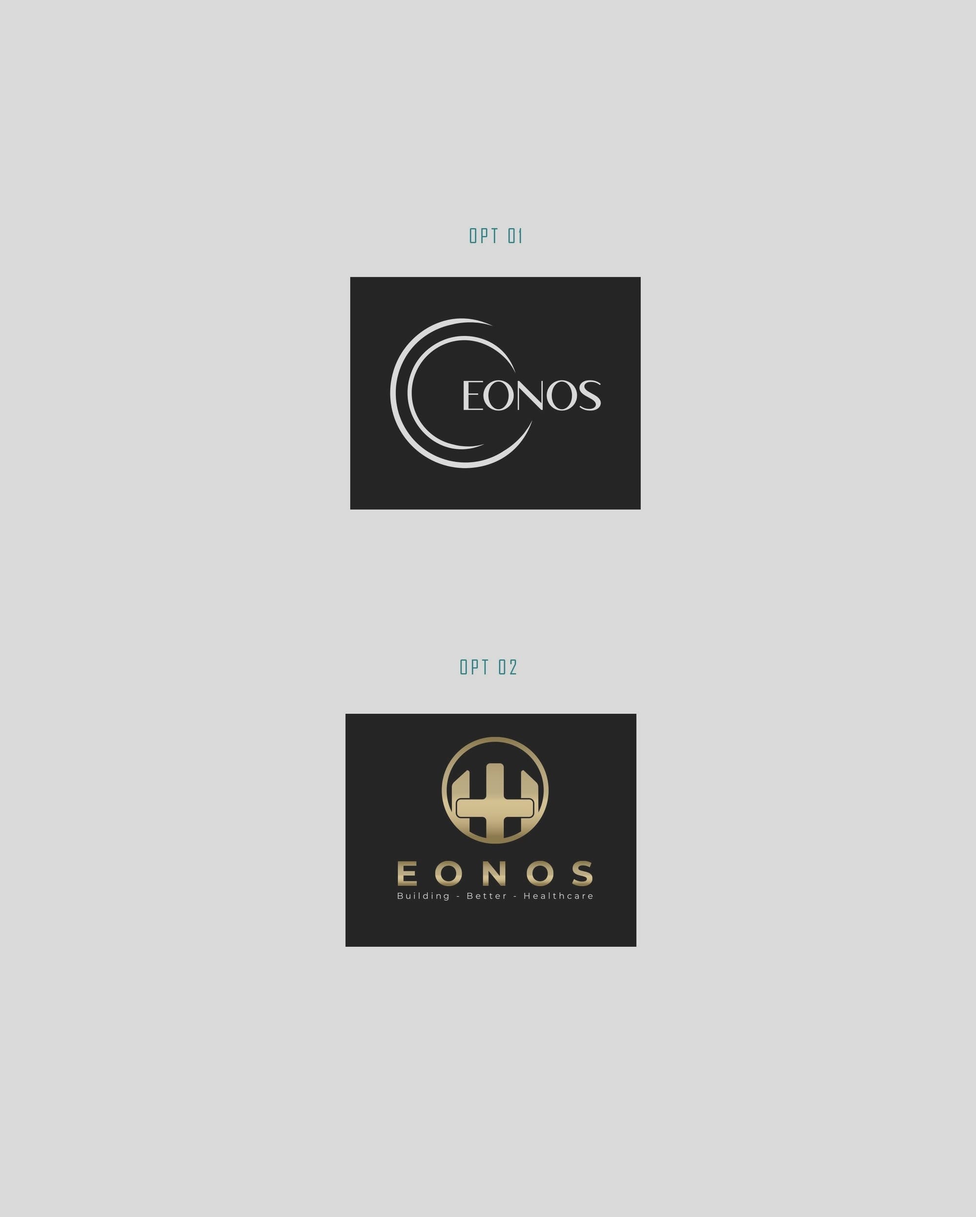
The design team embarked on the project by exploring initial concepts that reflected the client’s desires. These concepts were distilled into two primary options differing in form yet unified by the overarching theme of creating a modern and authoritative visual statement.
The first round of initial designs showcased a series of bold typographic logos. Notable among them was the use of sharp, futuristic lines to hint at progression and innovation, aligning with EONOS’ vision for a forward-thinking brand identity.
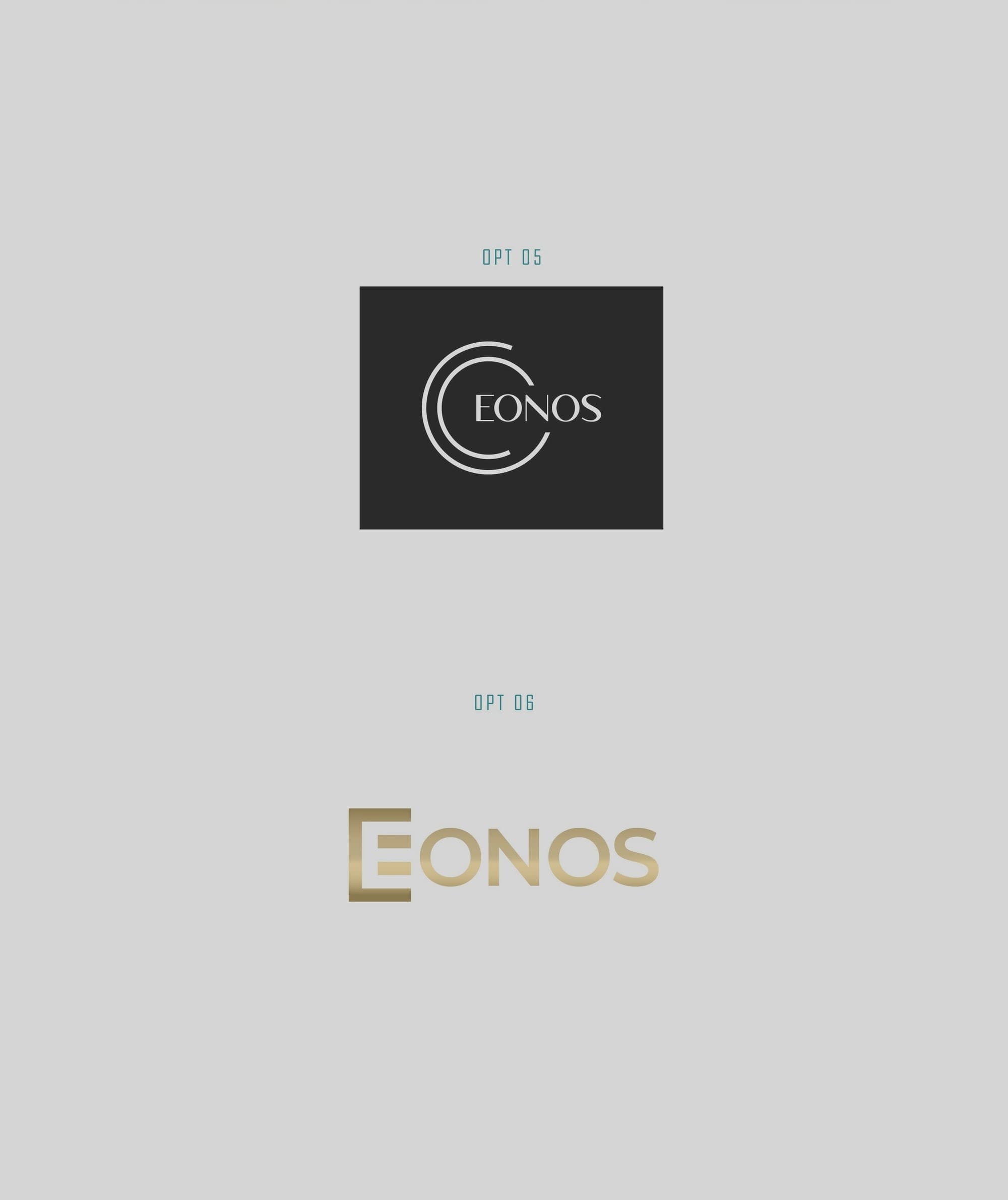
Fine-Tuning: Balancing Sharpness and Softness
Feedback played a pivotal role in refining these concepts. The client expressed a particular fondness for one version but suggested eliminating overly sharp edges to avoid any perceptions of harshness, ensuring that the logo mirrored the gentle care inherent to healthcare.
With these insights, the design team iterated on the favored concept, subtly modifying angular elements, using the Montserrat font to add a reassuringly rounder touch to the typography, further contributing to its inviting quality.
Final Flourish: The Power of Typography
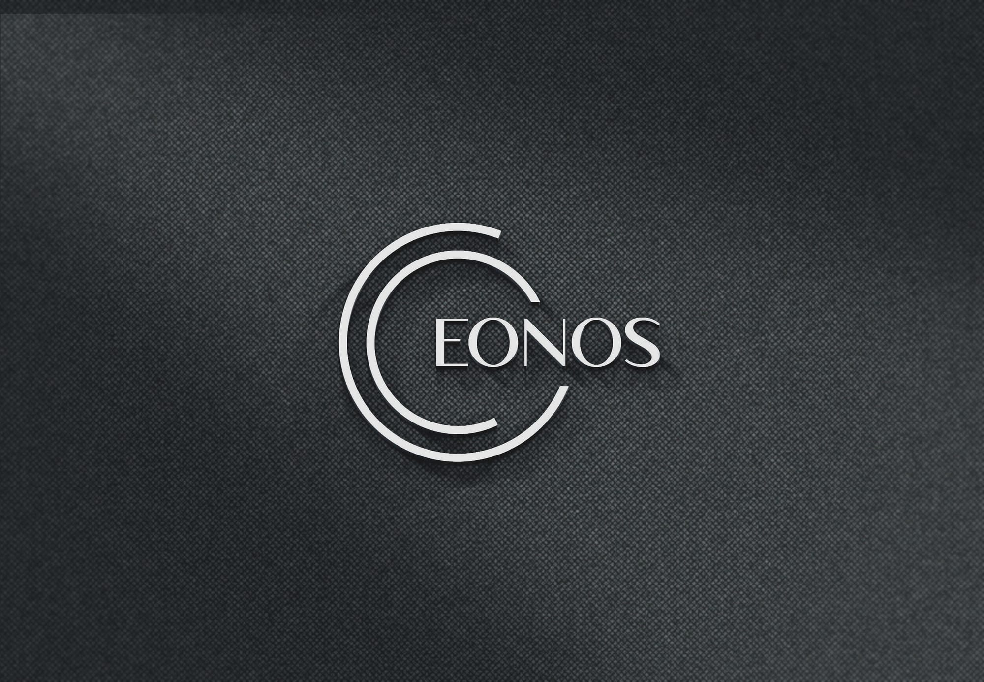
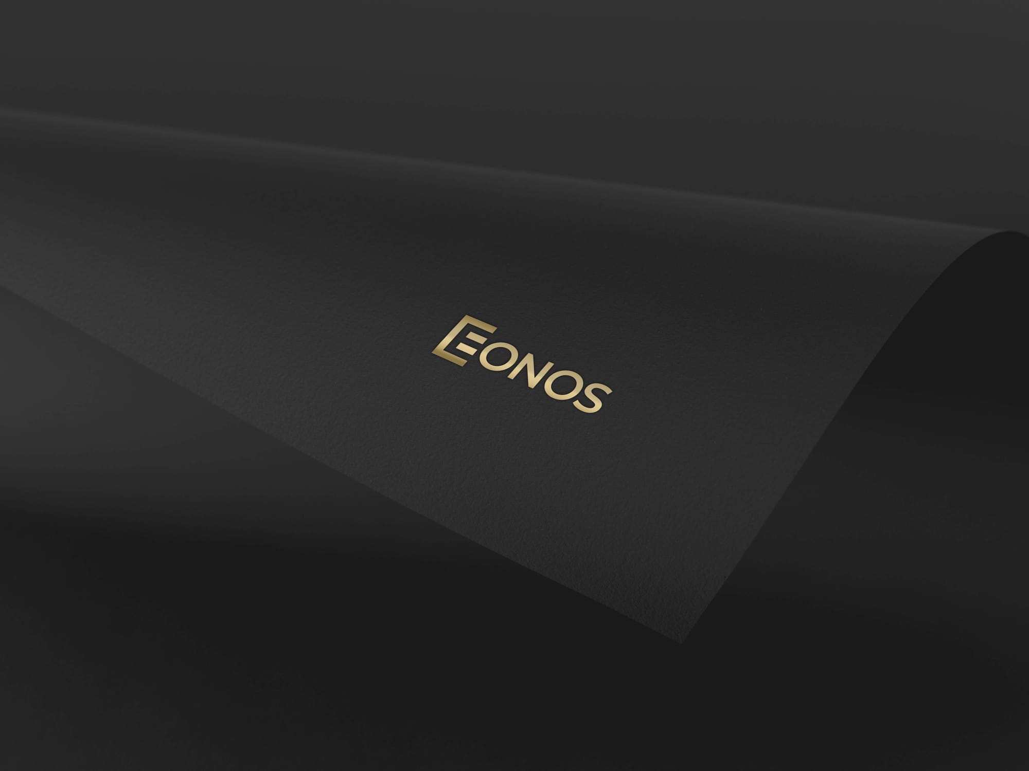
Ultimately, the design journey culminated in a logo that elegantly encapsulates the brand ethos of EONOS. The final selection is a study in sophisticated simplicity, employing a streamlined font and subtle design elements that convey both confidence and clarity. At the heart of this visual identity stands Montserrat, a font renowned for its geometric precision and versatile aesthetic, qualities that parallel EONOS’ mission of precision in healthcare delivery.
The transformation journey of EONOS’ logo is emblematic of what their brand promises, a seamless blend of fidelity and forward-thought, garnished with the gold of trust and the black of authority. As EONOS strides into the future, their logo stands as a beacon, illuminating their path towards enriching the fabric of healthcare.
Through this thoughtful process, EONOS’ logo evolved into more than just a visual identity, it became a strategic asset embodying trust, innovation, and longevity. The final mark reflects the company’s forward-thinking ethos while honoring its timeless commitment to healthcare excellence. As with any successful branding journey, the outcome is not merely a logo but a narrative in motion, ready to grow alongside the organization and strengthen its presence in an ever-changing industry.
Conclusion: A Lasting Impression
EONOS now emerges with a logo that not only meets their initial aspirations but exceeds them, creating a visual identity as enduring as their ambition in healthcare. With an impactful brand presence backed by thoughtful design, EONOS is set to leave a significant imprint on the industry’s horizon.
Start your brand journey today.
