Embracing the Nut Butter Revolution: Oddishh's Brand Journey Through Logo Redesign
Discover how Oddishh redefined its identity in the nut butter industry with a remarkable logo redesign that mirrors its innovation and ethos.
In an era where consumers seek authenticity and innovation in the simplest of things, Oddishh makes its mark in the nut butter industry with a premise to think outside the jar. A homegrown brand dedicated to crafting gourmet nut butters, Oddishh ventured into a significant transformation, beginning with the heart of its identity, the logo.
The Vision: Beyond Conventional Nut Butters
Oddishh isn't just another nut butter company. Their mission is clear: break free from conventional thinking and offer something distinctly flavorful and wholesome. The client came with a vivid idea of what Oddishh should stand for. They were drawn to earthy tones, inspired by nature and gastronomy, aiming to create an emotional connection with their audience through color and form.
From Ideation to Execution
In their initial stages, the design team was provided with a playful handmade font to set the creative process in motion. The task was both challenging and exciting, demanding a balance between novelty and timelessness to be hit with precision. The design team responded with a variety of design sketches, each reflecting different facets of Oddishh's identity.
Initial Design Concepts
Early sketches and digital drafts focused on defining a clear visual language, balancing creativity with functionality. Various directions were tested, from bold geometric compositions to minimal, refined interpretations, each aiming to capture the essence of the brand’s purpose. This exploratory stage was not about perfection but discovery, allowing ideas to evolve organically until a distinct and meaningful direction began to emerge
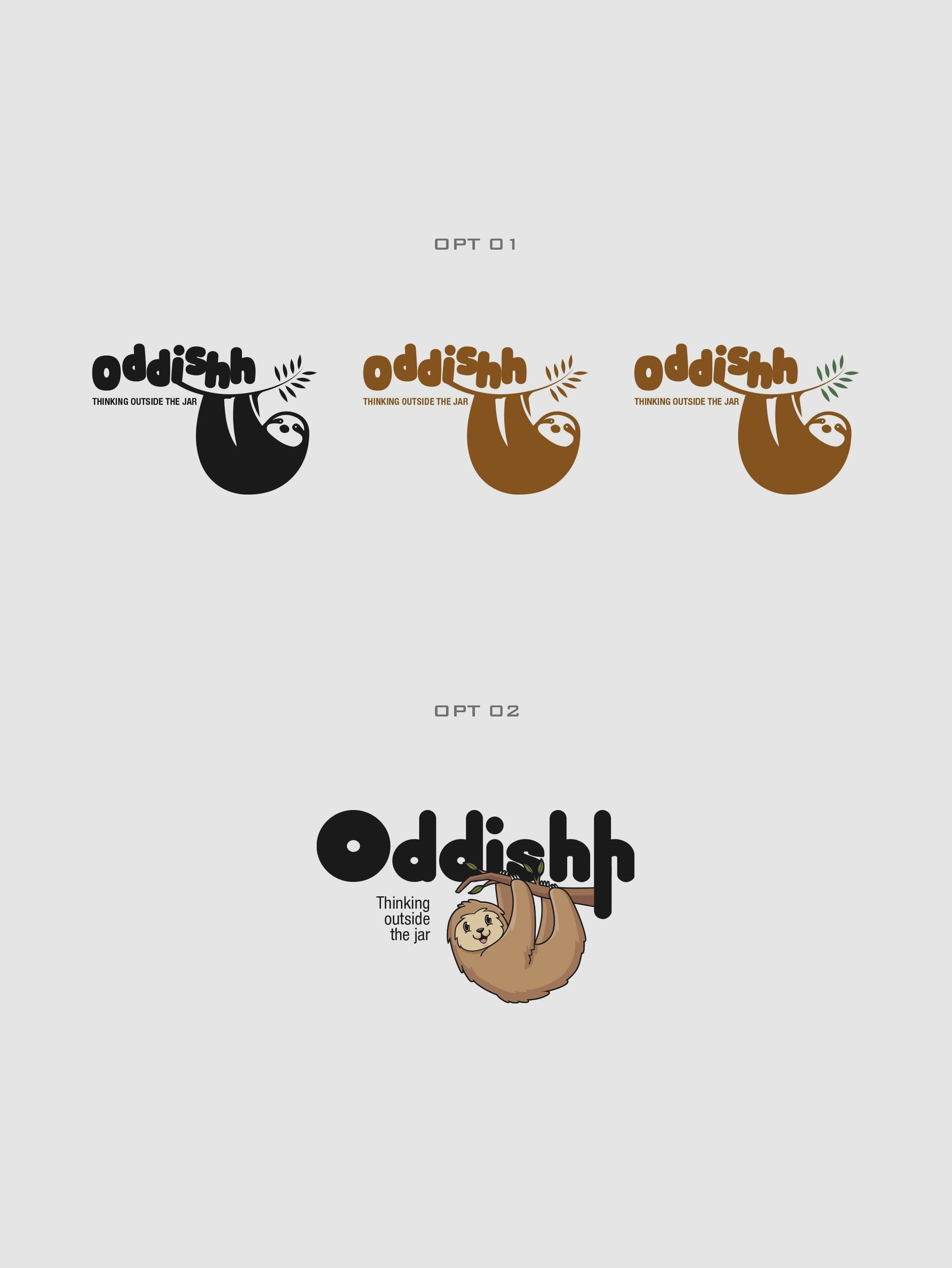
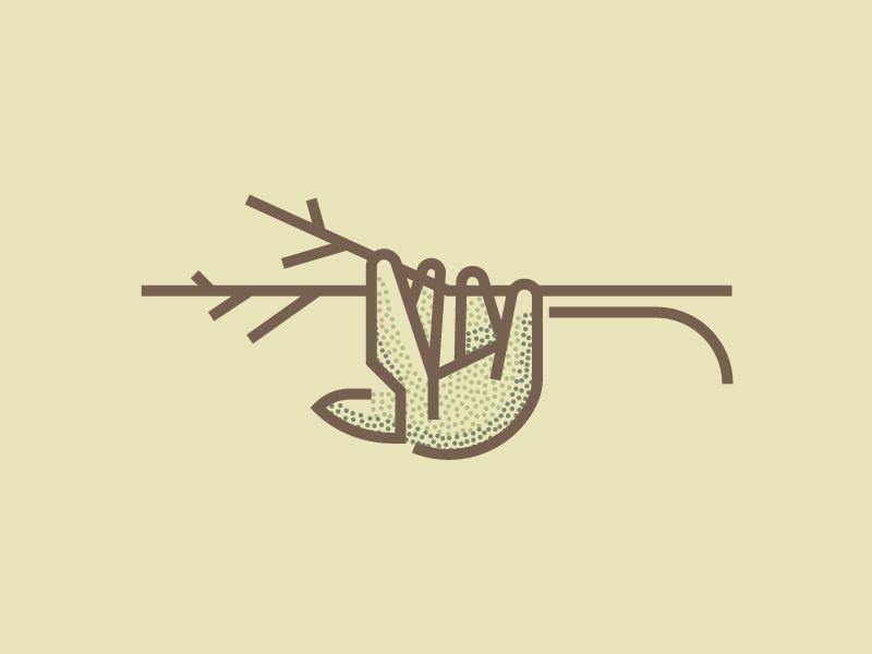
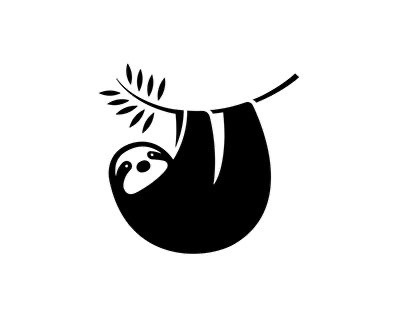
The client's feedback was precise, focusing on the nuances and the meaningful intersection of elements a branch stretching from the letter 'S' symbolized the organic nature of their product. The design team's initial iterations met the client's enthusiasm with intrigue, sparking further refinement and conceptualization.
It was the amalgamation of this collaborative spirit that led to the creation of an emblem that resonates deeply with Oddishh’s brand values. The client remarked about an Octopus logo providing inspiration for the kind of 'coolness' they envisioned for Oddishh a testament to the eclectic inspirations shaping their brand identity.
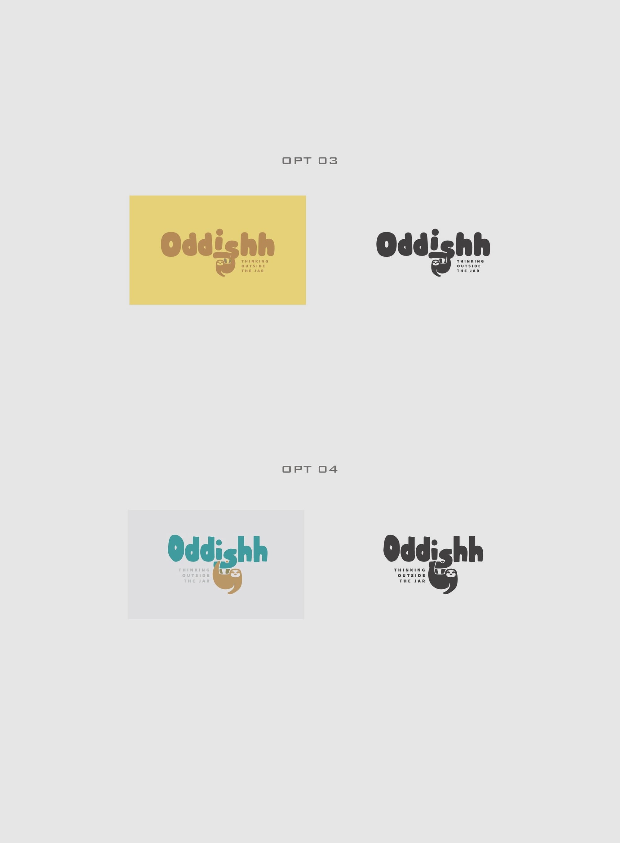
The approval moment arrived when the client chose Option #04 as their definitive logotype, proclaiming it as the victorious embodiment of their vision. This option succinctly captured the desired aesthetics while ensuring functionality in diverse applications from digital interfaces to the rustic backdrop of market stalls.
Achieving Precision in Design
In capturing the brand’s essence, the font Knicknack brought a robust personality to the table. Its bold nature and unique curvature complemented the reinterpretation of Oddishh’s vibrancy and grounded approach. The strategic combination of this typeface with the natural motifs and colors coalesced into a striking symbol of quality and curiosity.
The Result: Oddishh Reimagined
Oddishh's new identity is much more than a logo, it's a narrative condensed into a symbol that speaks volumes. Their commitment to crafting a product that stands out in the nut butter sector is palpable in every stroke and color choice of their redesigned logo. The journey provides a blueprint for brands aiming to enrich their identity with authenticity and inventiveness while remaining true to their roots.
The final deliverables, showcasing the logo across various settings like vintage wood signs, shop facades, and product packaging, paint a picture of versatility and appeal, reinforcing the logo’s relevance in everyday consumer landscapes.
Conclusion
Oddishh's bold step into a visual rebranding encapsulates more than an aesthetic leap. It reflects a strategic foresight into customer engagement and market presence, cementing their status in the nut butter world as innovative, creative, and undeniably unique.
Start your brand journey today.
