Elevators Of Texas: A New Dawn for a Classic Brand
Elevators Of Texas' rebranding journey, detailing design iterations and logo applications, combining Texas heritage with a modern approach.
Elevators Of Texas, Inc., a stalwart in the elevator industry, has been synonymous with reliability for over 35 years. As a company rooted in the rich industrial heritage of Texas, it faced the challenge of modernizing its brand identity while retaining the trust and tradition it had built over the decades. This intricate dance between heritage and modernity set the stage for a remarkable branding journey.
Client's Vision and Requirements
From the outset, Elevators Of Texas expressed a desire for a logo that would succinctly communicate its core values. With a compelling slogan "Trusted for over 35 years," they aimed to encapsulate their long-standing reputation in a modern aesthetic. The preferred color palette of cobalt blue and deep yellow was chosen to subtly weave corporate colors into the design, striking a balance between familiarity and innovation.
The client also had specific requirements: a horizontal layout and the incorporation of the iconic Texas state image, which speaks volumes about their regional pride and operational focus.
Exploration and Initial Design Concepts
The design team's initial response came in the form of a collection of bold and divergent logo concepts. Three distinct options were presented, each exploring different facets of potential brand representation.
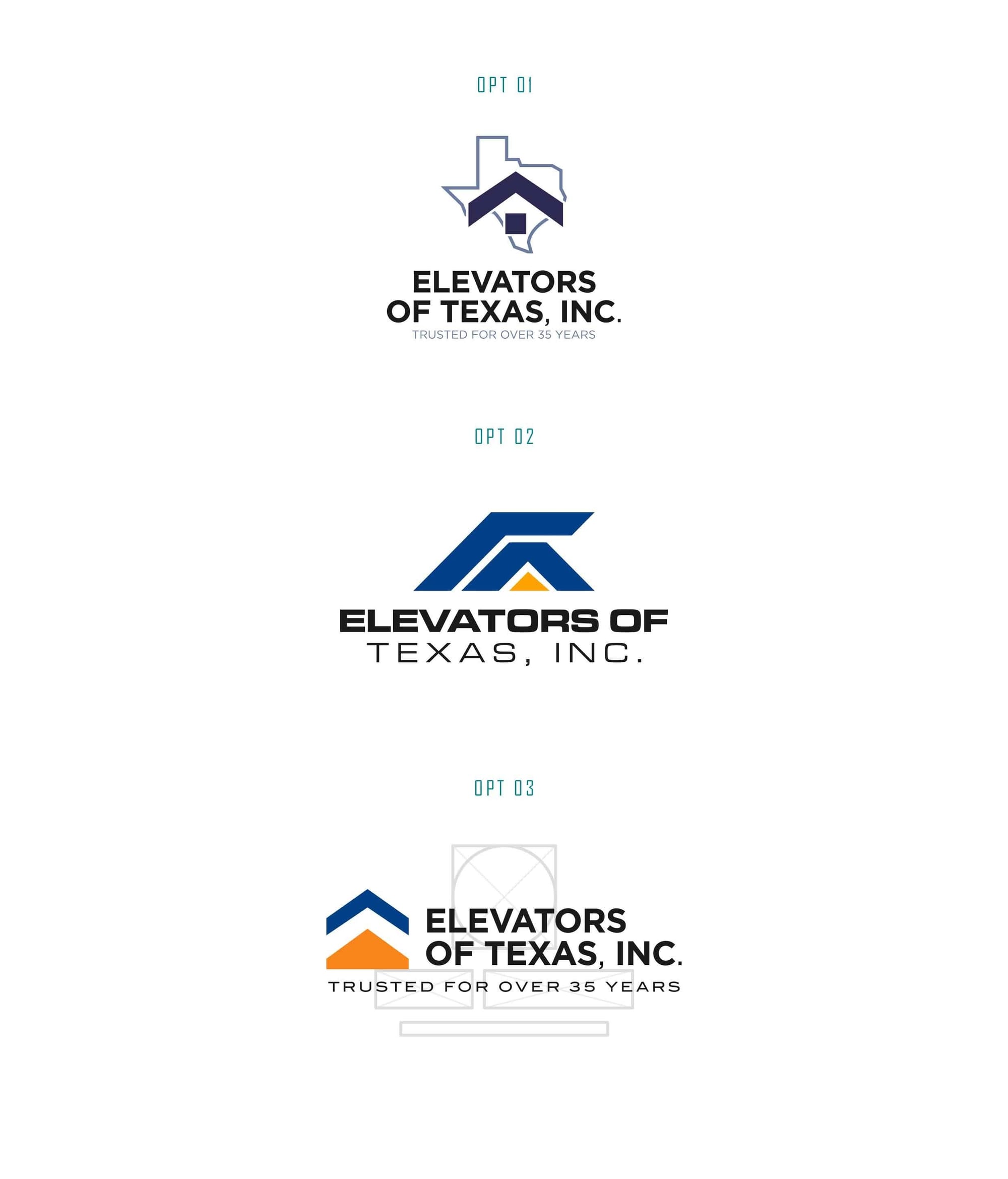
Among these, the client gravitated towards the first option, noting its suitability yet seeking enhancements. Their feedback highlighted a preference for the state-arrow graphic featured in the third option, requesting to adapt it to the chosen concept for a unique amalgamation.
Refining the Vision
The design team attentively adapted the client's insights, producing a refined version that encapsulated their feedback. This iteration elegantly balanced the chosen graphic with the desired color dynamics, offering a cohesive narrative of the brand.
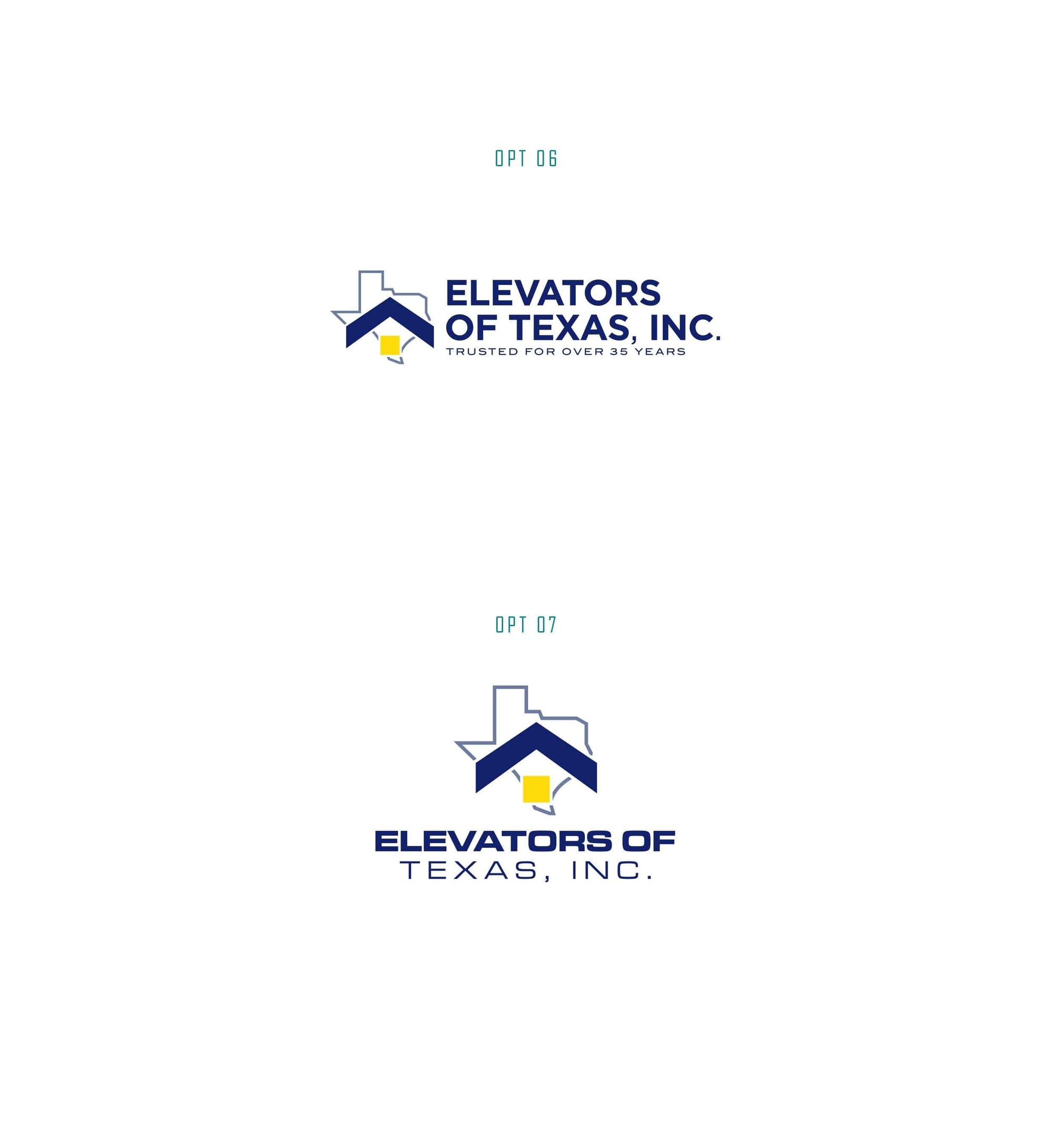
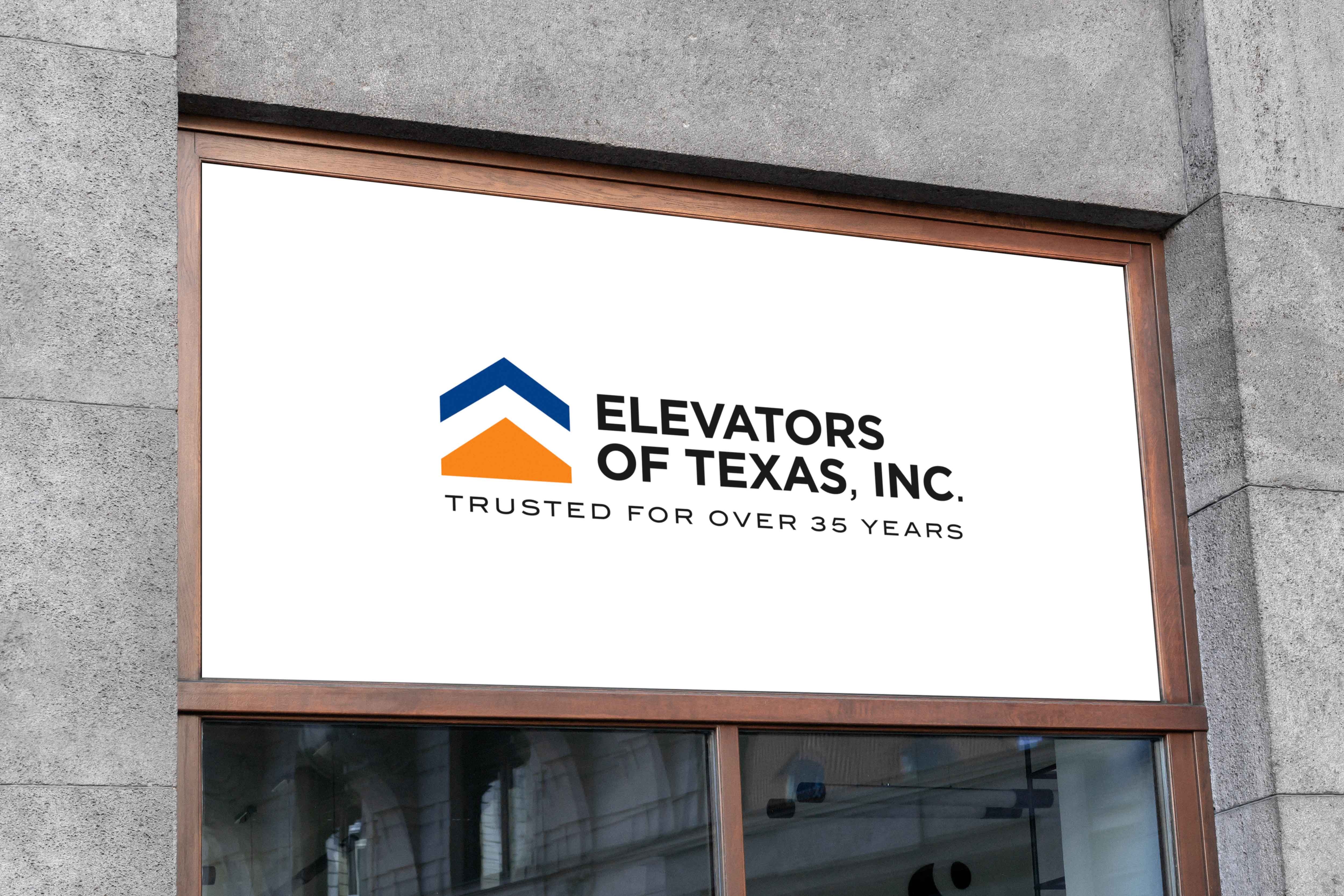
Ultimately, the client selected the seventh option, resonating deeply with its modern serif typeface and the majestic blend of graphic elements. The design adeptly infuses the essence of Texas with forward-thinking appeal, bridging the historical with contemporary elegance.
The Winning Typeface: Gotham
The final version employed the Gotham typeface, renowned for its timeless clarity and professional finish. This font, celebrated for its architectural quality, reinforces the company's stability and innovative focus.
Real-World Application and Future Prospects
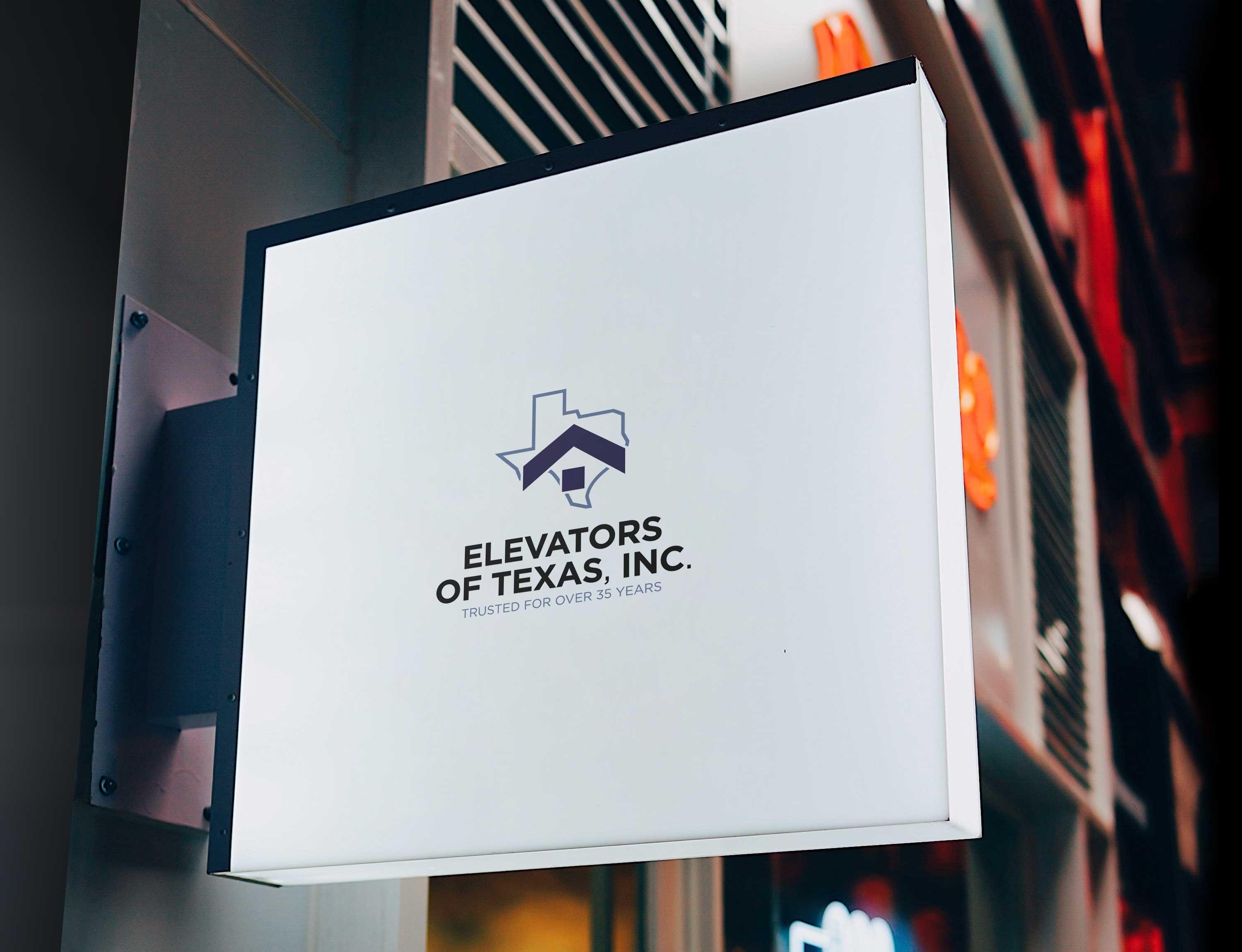
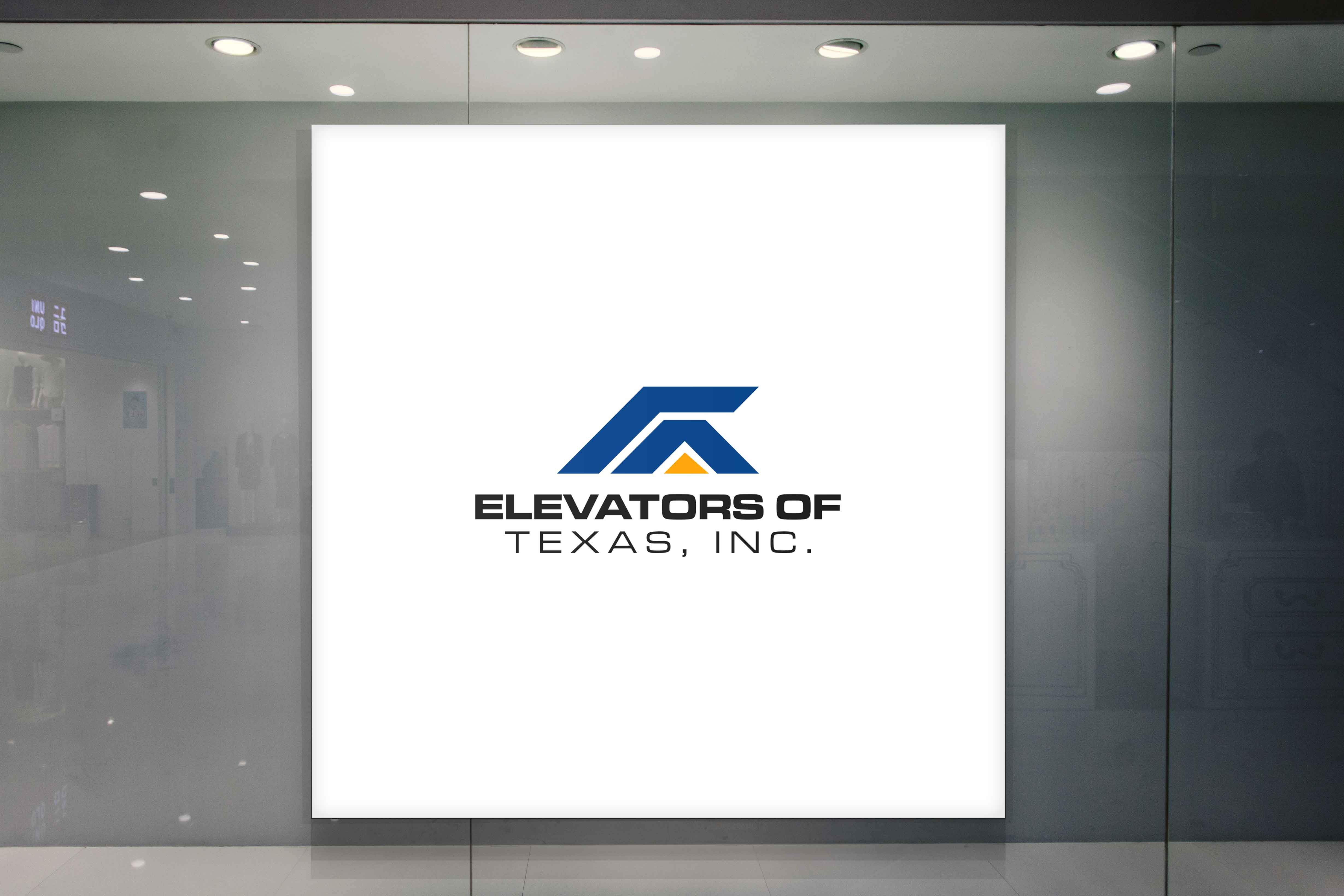
The rebranded Elevators Of Texas logo has since found its home across various brand touchpoints, from marketing materials to merchandise. Each application reflects the brand's commitment to modernity and historical pride, fostering a renewed connection with its audience.
As the company embarks on this newly branded journey, with a strong foundation and renewed visual identity, it is well-poised for continued growth and industry leadership within the Lone Star State and beyond.
Start your brand journey today.
