Designing Hope: The Visual Identity of the H.I Syndrome Foundation
Explore the journey behind the H.I Syndrome Foundation logo, capturing hope for children with rare disorders.
The H.I Syndrome Foundation embarked on a transformative journey to establish a new visual identity, reaching out to a creative design agency to craft their logo. Dedicated to assisting children with Hypomelanosis of Ito and other rare disorders, the foundation's branding required a sensitive yet impactful approach. This case study explores the thought process, design iterations, and final emblem that represents hope and support in the foundation's endeavors.
Understanding the Foundation's Mission
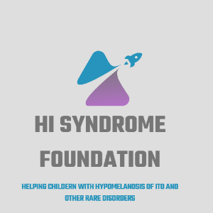
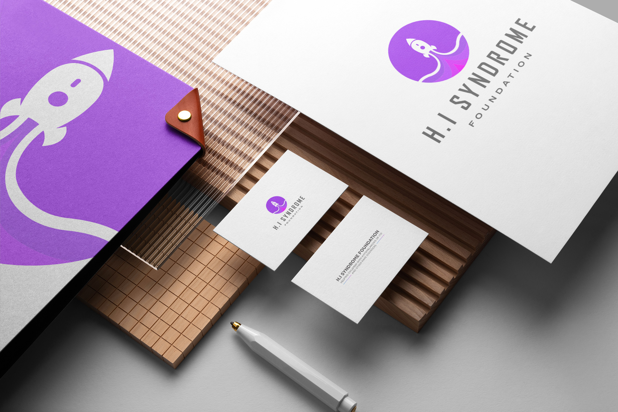
The foundation's mission is noble and urgent. It seeks to provide aid and awareness for children with Hypomelanosis of Ito, a rare genetic condition. With this spirit in mind, the foundation's slogan 'Helping Children with Hypomelanosis Of Ito and other rare disorders' needed a visual counterpart capable of uplifting spirits and conveying a message of hope and care through every stitch in its logo. Their colors of choice, purple with teal or light blue, illustrate compassion and calmness, essential emotions for the foundation's work.
The Initial Design Vision
The design brief was clear. The foundation envisioned a rocket ship, symbolizing a journey filled with vibrant colors bursting forth. This image resonates with the idea of shooting for the stars in providing support for these children. The reference logo given by the client underscored this vision, aiming for a sense of motion and optimism.
Design Team's Initial Response
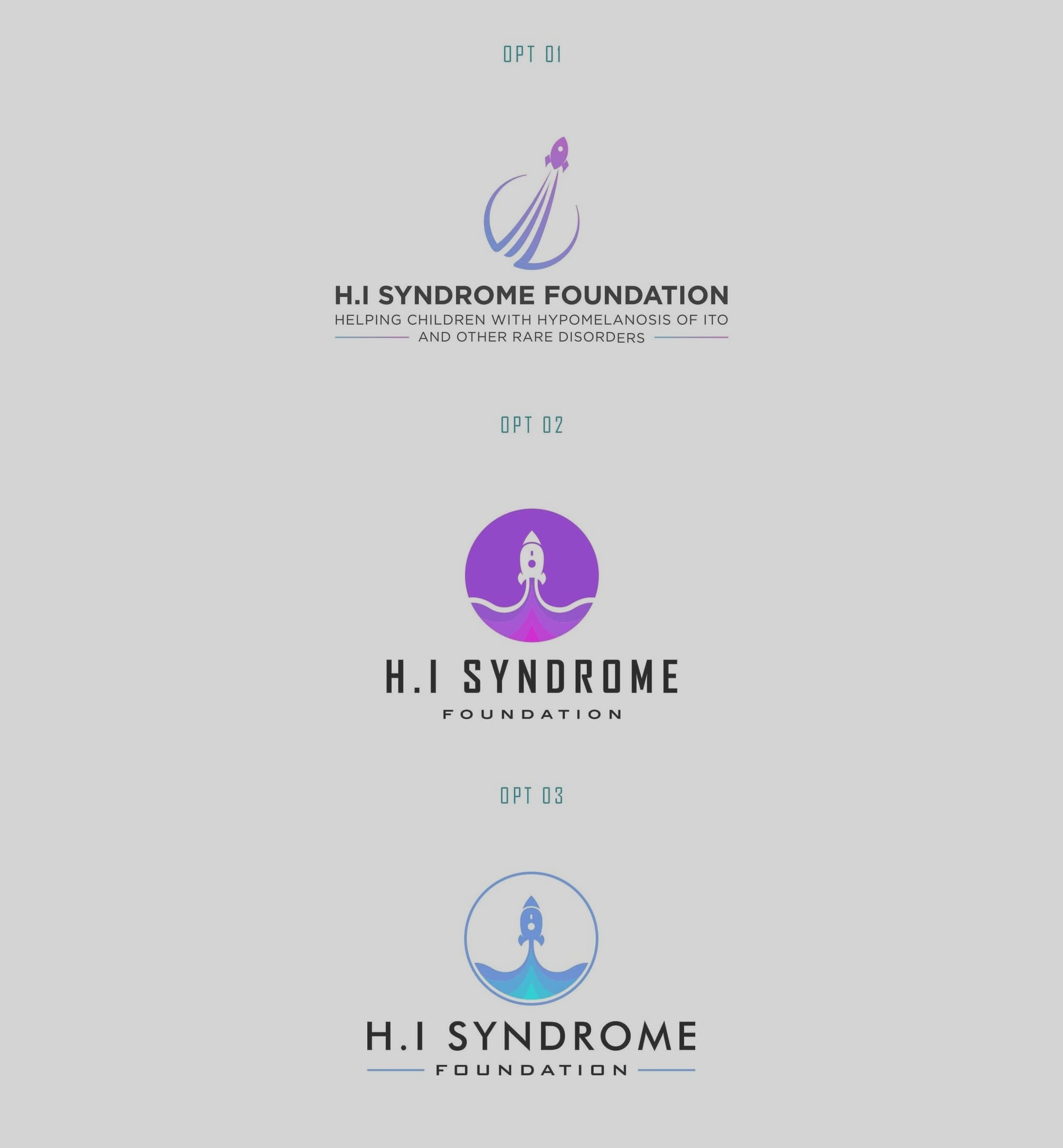
The design team's first concept was presented in a logo sheet. Seamlessly blending the rocket's symbolism with the chosen colors, the initial design captured both movement and sentiment. The team's design philosophy revolved around creating a logo that did not just represent, but also motivated.
Final Design Deliverables
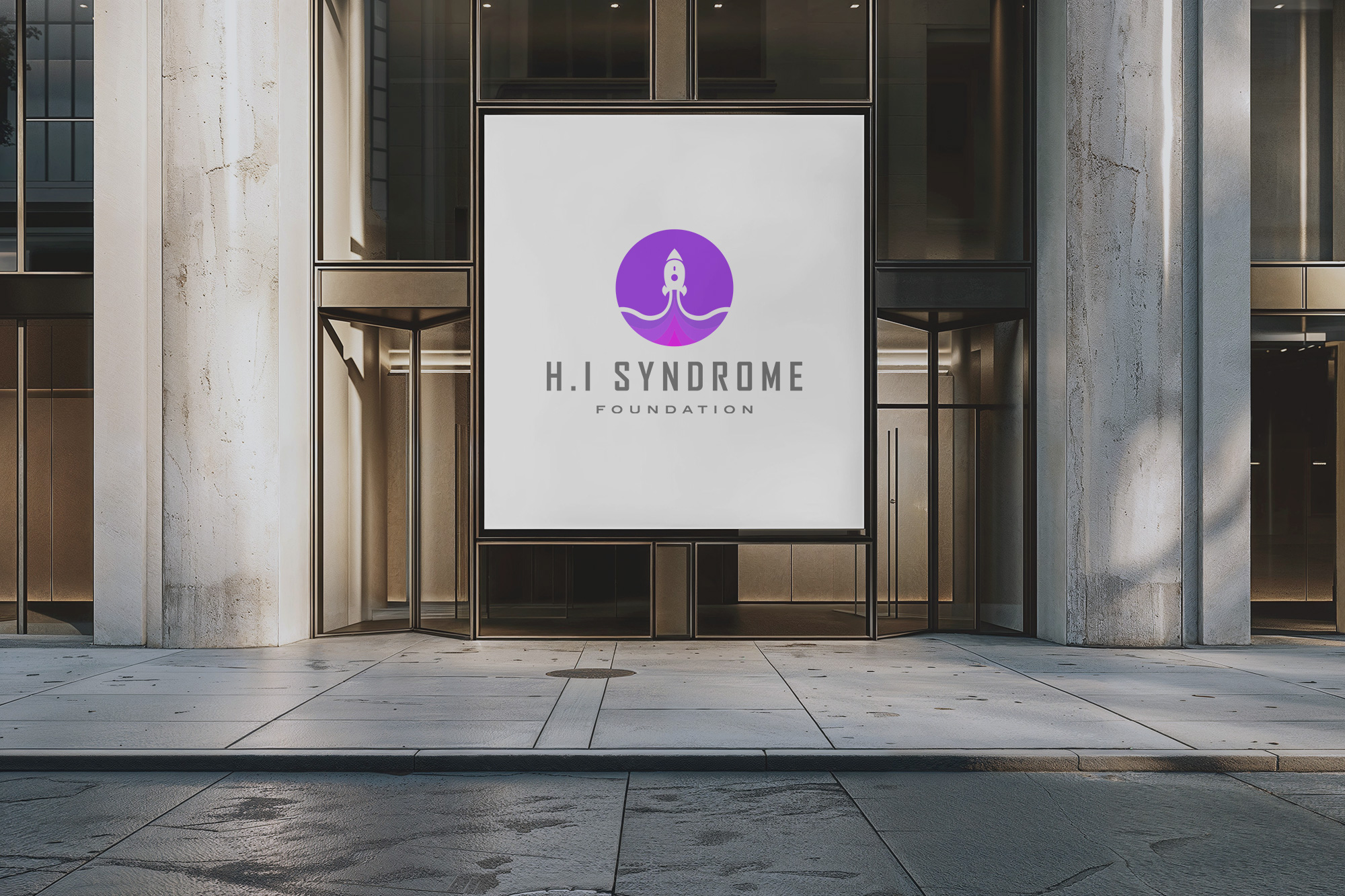
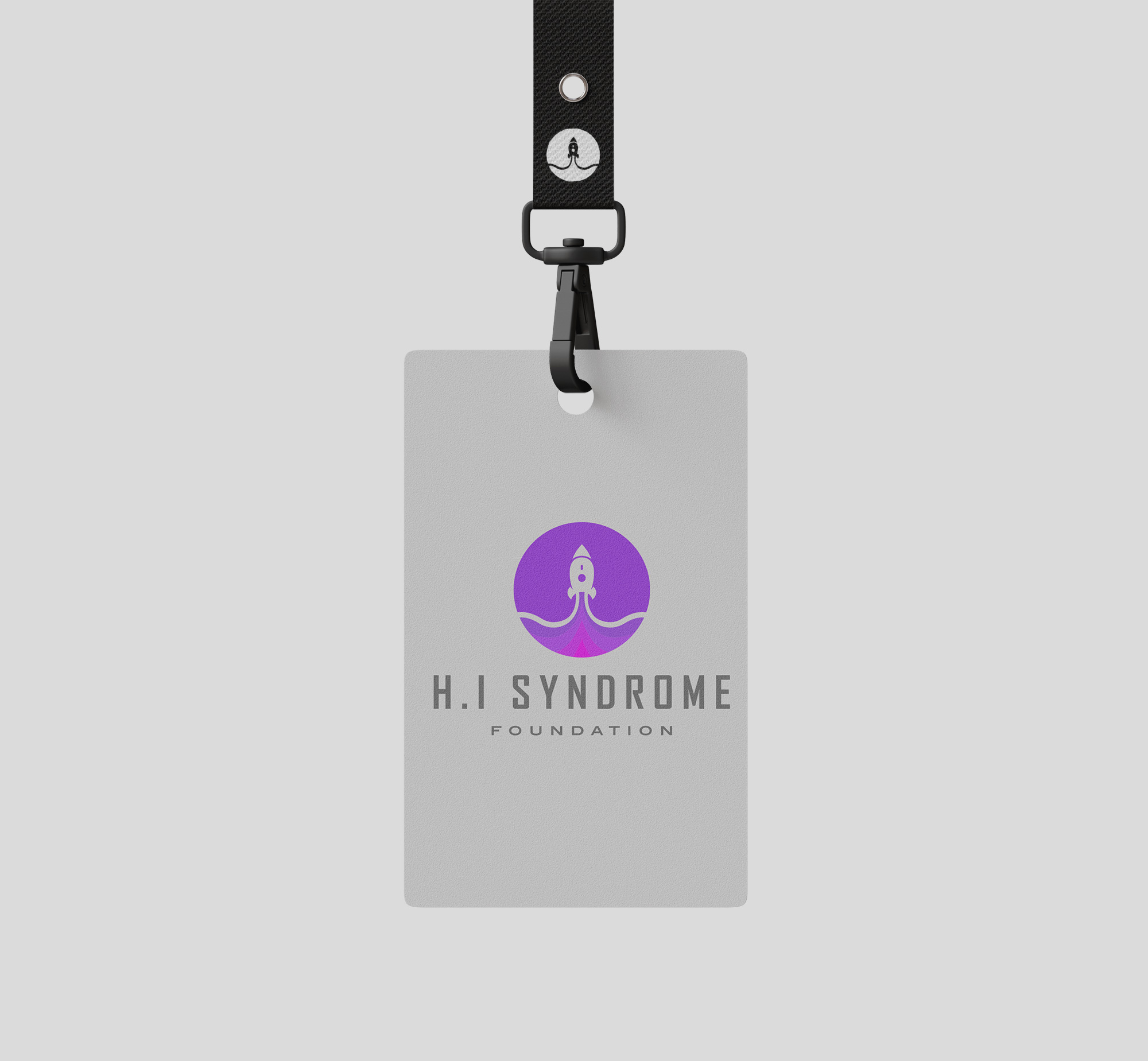
The project culminated in a logo that resonated with the foundation's mission and values. The final version, approved without a needing a second glance, encapsulated the essence of the journey, symbolized by the rocket's upward trajectory. A perfect interplay of purple, teal, and light blue hues, the logo beautifully mirrors a promise of care and encouragement.
A Beacon for the Future
The H.I Syndrome Foundation's new logo is more than a mere visual identifier. It is a symbol of hope and a promise that no journey needs to be undertaken alone. The foundation now gleams with an emblem reflective of its mission, crafted with the utmost thought and care. As the foundation pushes forward in its efforts to help children with Hypomelanosis of Ito and other rare disorders, this visual identity stands as a testament to strength, compassion, and an unyielding belief in a better tomorrow.
Start your brand journey today.
