Decoding the Brand Identity of Agent-17: A Fusion of Futurism and Mystery
Explore the enigma of Agent-17 through its sleek, elite, and futuristic logo design, combining the essence of mystery and clandestine sophistication.
In a world teeming with content, standing out becomes not just a challenge but a necessity. For Agent-17, a nameless executive label in the content creation space, this meant developing a brand identity that mirrors its clandestine operations. With a mission to scout top prospects and present them to their most sustainable communities, Agent-17 sought a logo that exudes mystery, power, and sleek sophistication.
The Essence of Agent-17
The name 'Agent-17' itself evokes thoughts of secret operations and elite agencies. A name reminiscent of classic spy thrillers and secretive organizations, it conjures images of covert missions and shadowy figures operating behind the scenes. But instead of espionage, Agent-17's mission lies in the creative realm, operating within the vast digital landscape to empower its client base.
The brief provided to the design team was clear yet evocative. The keywords: sleek, elite, powerful, mysterious, secretive, and sharp, set a distinct tone for the design process. Inspired by futuristic visions of the FBI or CIA, and the enigmatic aura surrounding the hacker group 'Anonymous,' Agent-17's logo needed to capture the essence of a narrative that is both commanding and elusive.
The Design Process: From Concepts to Approval
The design team began this project with an acute understanding of the client's needs, armed with the color palette of black, emerald, and silver. This combination hints at luxury while maintaining an understated power. The initial design proposals provided two different options, each exploring various facets of the brand's multifaceted personality.
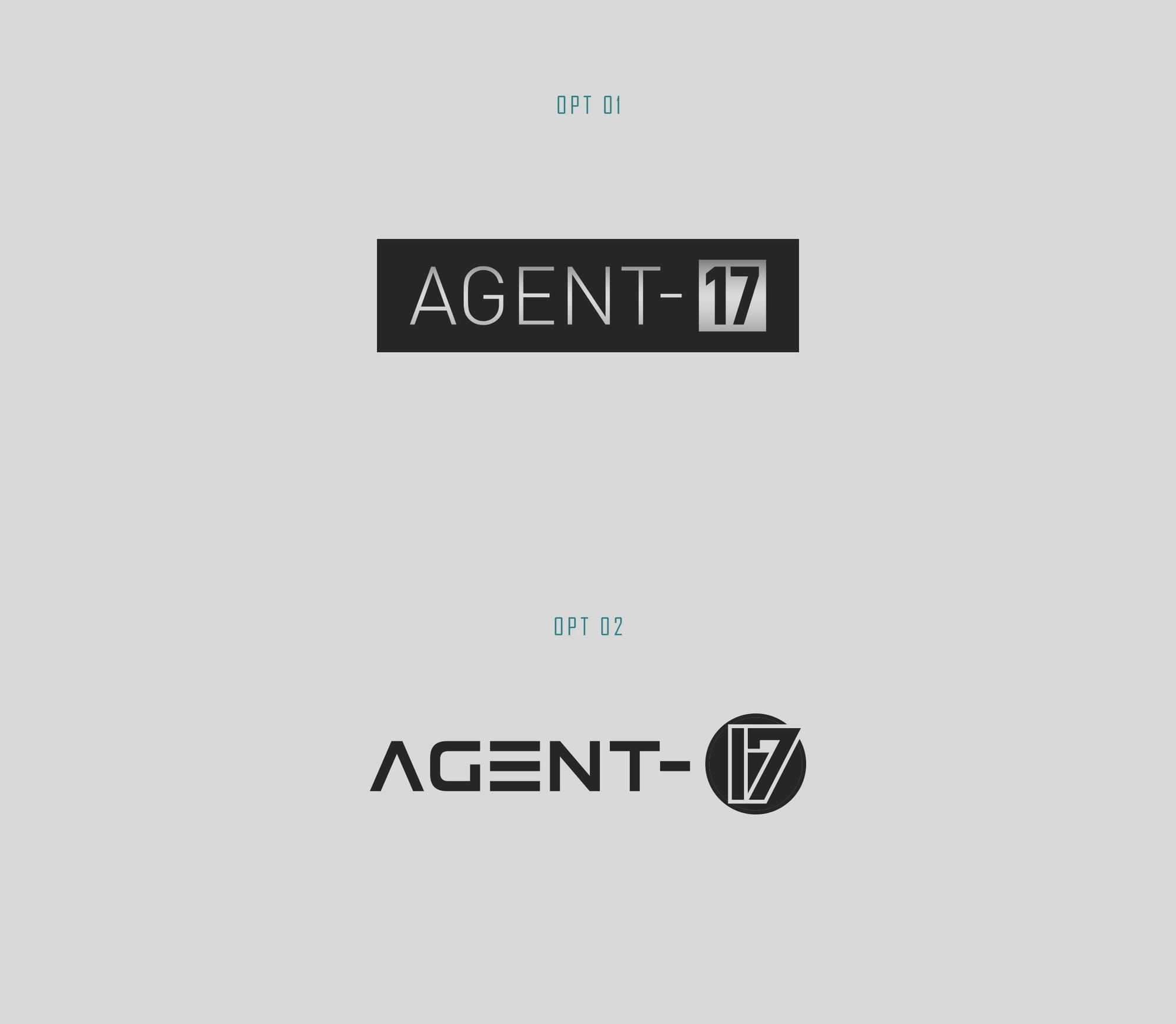
These initial designs were characterized by sharp angles and futuristic typography, evoking the contours of a world where technology meets tradition. Each option refines the idea of secrecy, intelligence, and strategic clarity, carefully constructed to establish an immediate visual identity.

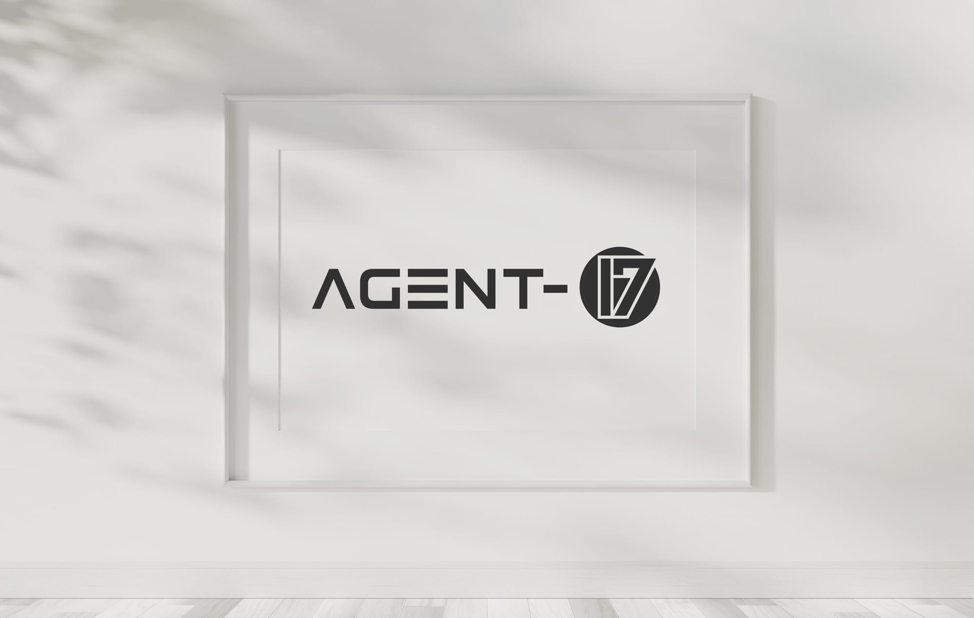
The Final Touch: Real-world Application
The approved logo encapsulates Agent-17's elite stance and unique mission. It communicates the duality of the brand's function: to remain hidden while showcasing the prowess of those they represent. The final deliverables include versatile applications of the logo on various platforms and mediums.
The interaction of black, emerald, and silver across mediums such as business cards and tote bags highlights the adaptability of the design, ensuring that the logo remains impactful across different settings. This adaptability is a crucial asset for a brand that thrives on extending its influence through digital and offline environments alike.
Conclusion: An Identity Concealed in Plain Sight
Agent-17's branding journey is emblematic of the agency’s paradoxical nature - a prominent figure in the shadows, a beacon of creativity armed with the subtlety of anonymity. Through this compelling design evolution, Agent-17 not only refines its public persona but also embeds an enigmatic signature into the creative industry, setting the stage for future endeavors that promise both innovation and intrigue.
Start your brand journey today.
