Cultivating Wellness: The Prodigious Branding Journey of Casa de Asclépio
The emblematic rebranding of Casa de Asclépio, a sanctuary of wellness nestled amidst hazelnut plantations, and the thoughtful design process that captured its essence.
In an era where holistic health and sustainable living increasingly drive consumer choices, the rebranding of Casa de Asclépio emerges as both timely and insightful. Nestled amidst rolling terrains and spreading over ten hectares of hazelnut plantations, Casa de Asclépio resonates with a profound promise of health, care, and well-being.
The rebranding project for Casa de Asclépio is more than just about creating a visual identity. It is a journey into encapsulating the philosophy of Asclepius—a nod to the Greek deity associated with healing and medicinal arts—combined with the rustic charm synonymous with Portugal's picturesque landscapes.
The Lure of the Land
Casa de Asclépio is not just a place, but an experience—a luxury villa offering rooms for tranquil retreats, complemented by lush gardens and inviting pools. At its heart lies a working hazelnut plantation, celebrated for its natural health benefits such as reducing the risk of colorectal cancer. In conceptualizing a logo to encompass these diverse yet interconnected facets, the task was monumental yet invigorating.
Client's Vision
The client, an accomplished doctor with an affinity for numbers rather than abstract creativity, yearned for a logo that embodied the luxurious essence of a villa, the nurturing spirit of a farm, and the therapeutic allure of nature.
The brief conferred upon the design team was clear and complex: a desire for simplicity in color usage, a preference for motifs akin to those found on fine wine labels, and an openness to the artist’s creative magic—trusting the expertise of the design team to manifest an emblematic crest suitable for Portugal's cultural fabric.
Design Iterations
The design process commenced with a series of emblematic iterations. The first submissions featured motifs including snakes and hands, common to Asclepius’ iconography, but these fell short of capturing the luxurious and serene vision the client held. Feedback steered the creative direction towards embodying the essence of a luxury experience interwoven with the grounded authenticity of a productive farm.
The Emblem Takes Form
After thoughtful consideration and redesigns, the winning iteration emerged—a sophisticated crest that balanced all desired elements with elegance. What stood out was the crest's versatility and timeless appeal, featuring a rod and snake subtly represented, encapsulating both ancient traditions and modern connotations of healing.
This final version was not merely a logo but a visual lexicon narrating the story of Casa de Asclépio’s refuge of tranquility and wellness.
The Typeface Choice
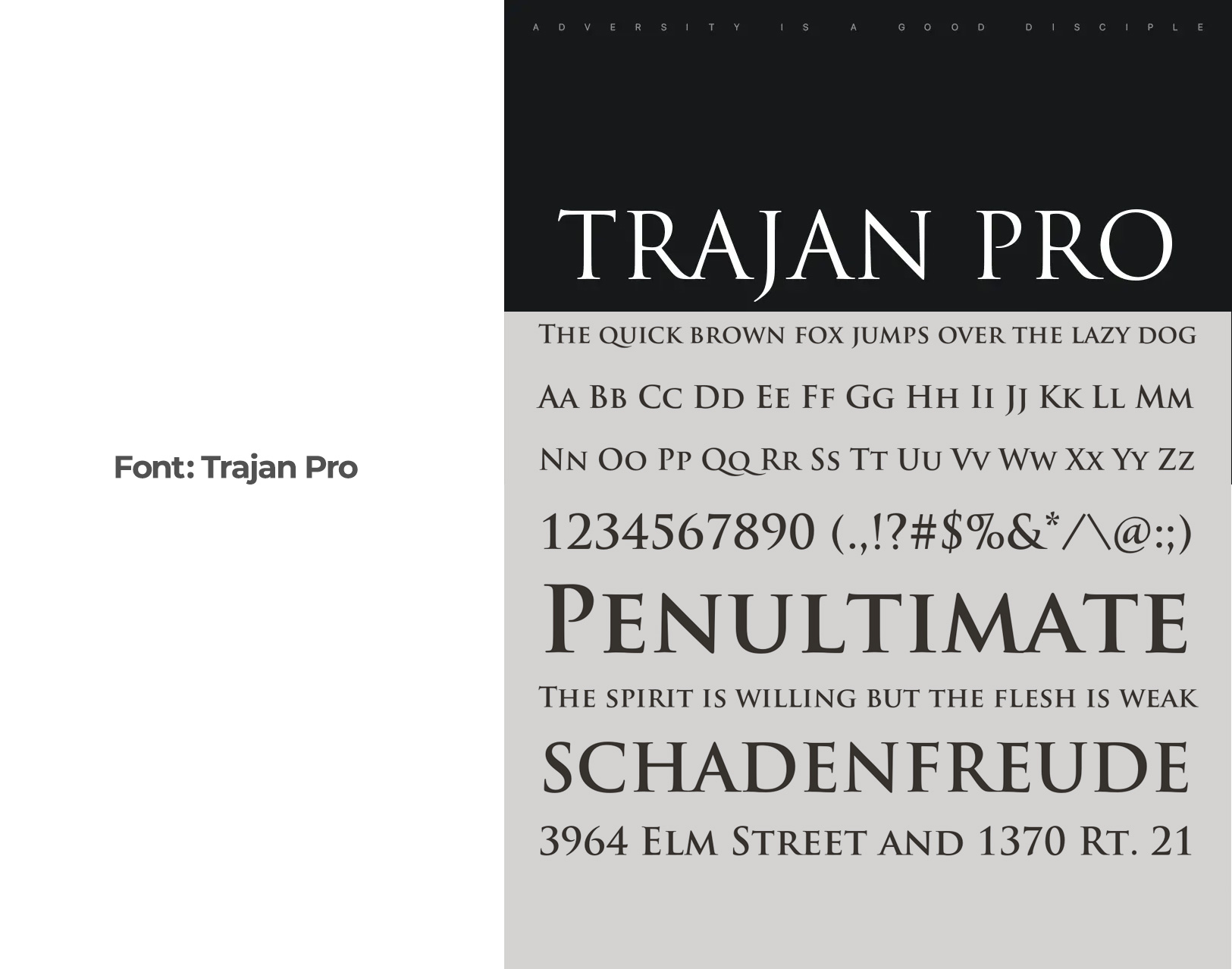
Critical to the identity was the choice of font, where Trajan Pro came to the forefront. Renowned for its classical yet understated dignity, Trajan Pro harmonizes perfectly with the ethos of Casa de Asclépio—solidifying its stature among prestigious brands.
Final Execution
The carefully crafted identity was showcased across various mediums, encapsulating its utility and appeal from metal plaques for entrance signage to understated elegance on room linens and hazelnut packaging.
A Testament to Timeless Design
Casa de Asclépio’s emblematic rebranding stands as a testament to the power of cultural symbols, thoughtful design, and a relentless focus on authenticity. Beyond a mere visual identity, this project delivers a coherent brand story that is sure to resonate with its clientele, those in search of a serene escape where luxury meets nature’s healing embrace.
Start your brand journey today.
